Christian Louboutin Unveils Colorful Summer 2026 Collection
A review of the Christian Louboutin Summer 2026 womenswear collection
written MALCOLM THOMAS
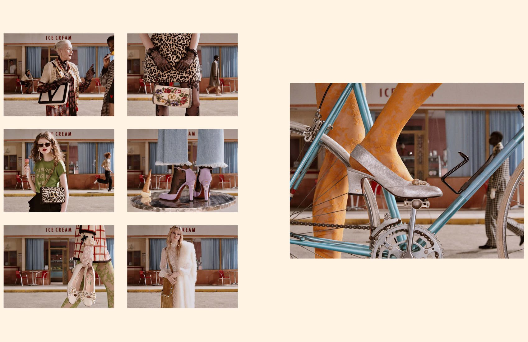
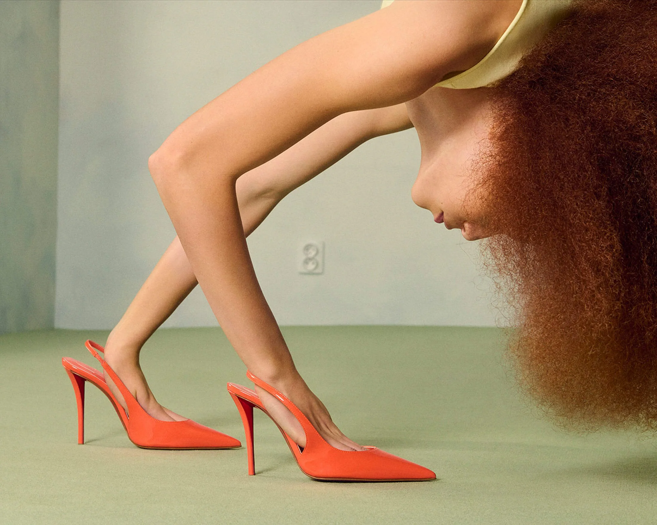
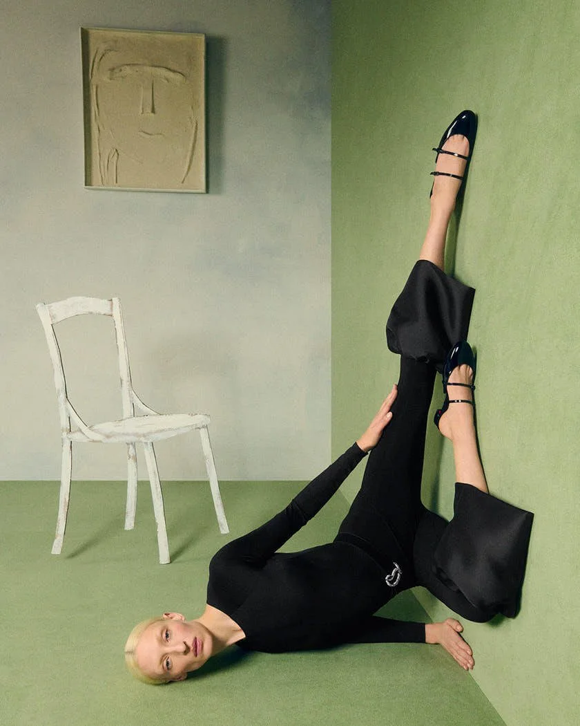
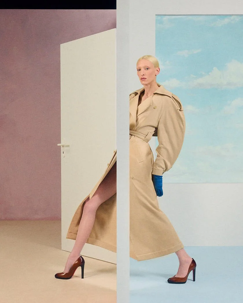
On Tuesday, Christian Louboutin unveiled its sunny summer 2026 collection. Inspired by Louboutin’s lifelong admiration for the stage—the set reminiscent of the interior of a René Magritte, supported models propped in playful poses in the candy-colored collection.

CHRISTIAN LOUBOUTIN
Summer 2026 Collection
CHRISTIAN LOUBOUTIN
Summer 2026 Collection
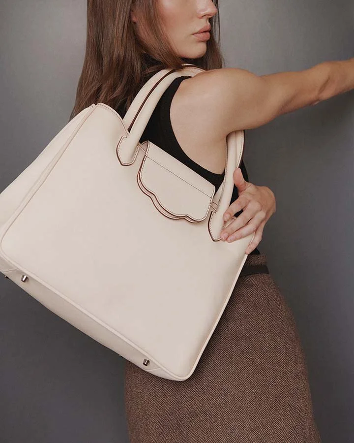
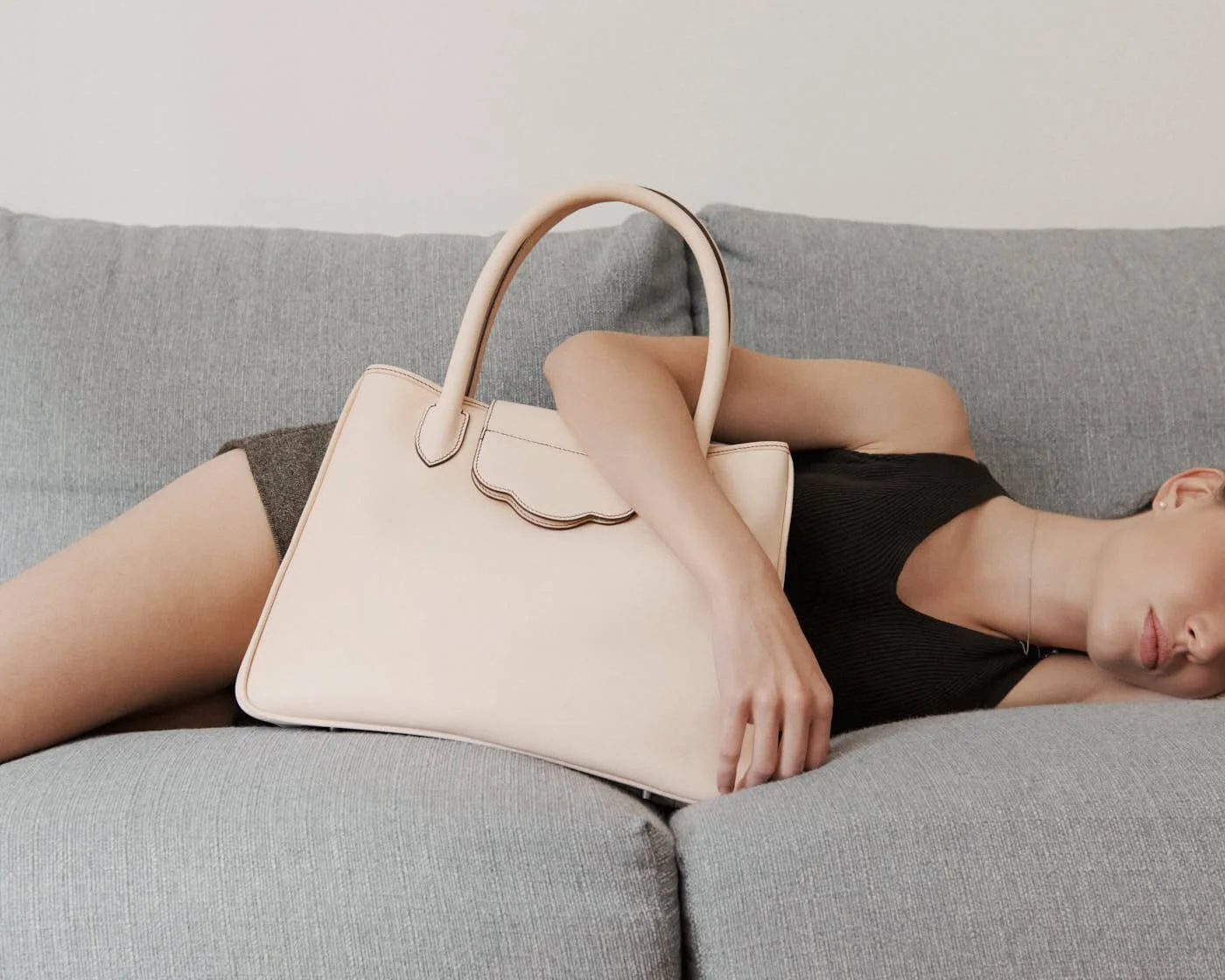
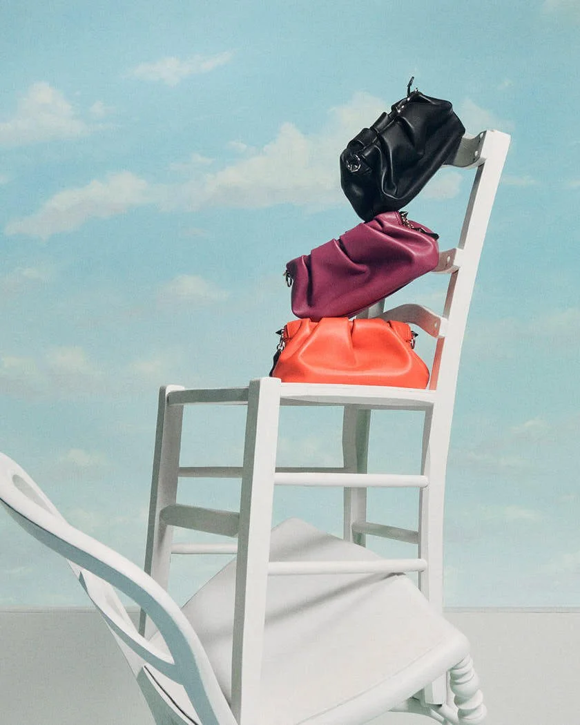
Debuting a new line of bags, dubbed the Venus after the Greek goddess of love, a range of styles from tote to mini-crossbody, with a focus on timeless luxury and pragmatic functionality, are sure to add a bit of excitement to the everyday.
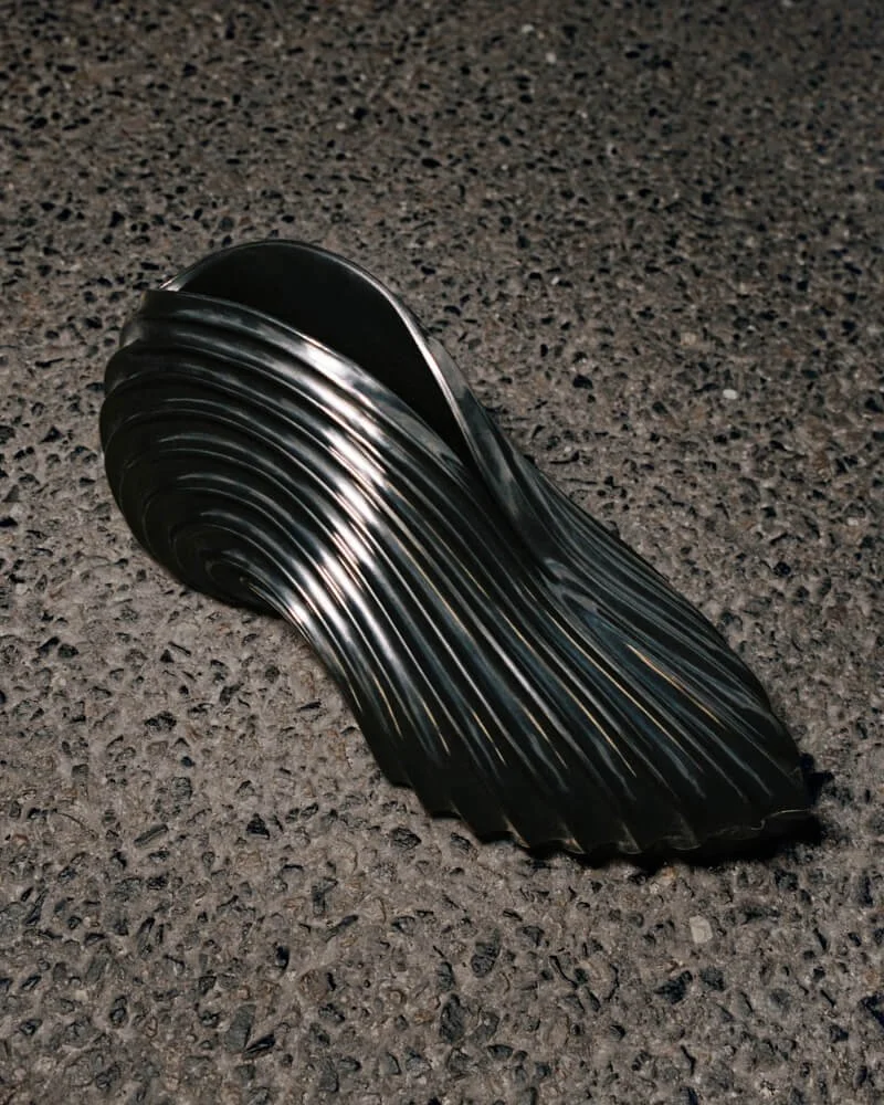
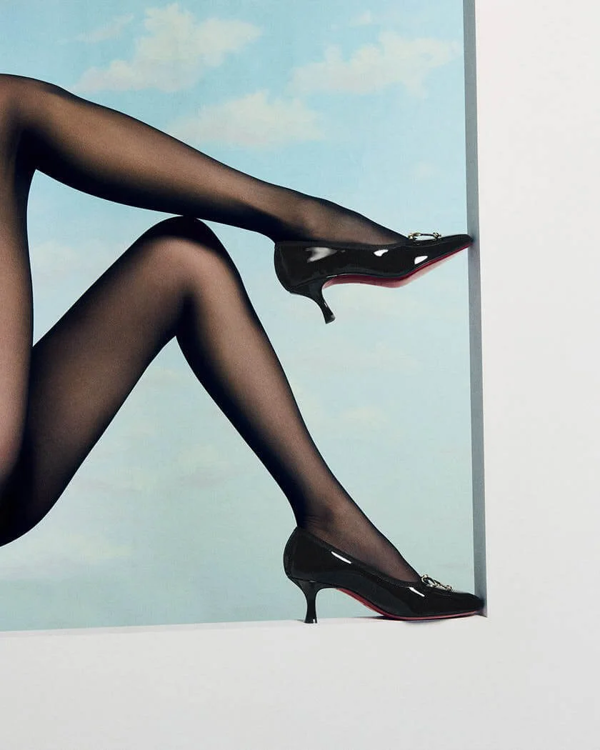
Just in time for high summer, Christian Louboutin’s new footwear offerings are abundant. Meet Mulazee, a taffeta kitten-heel mule featuring a delicate ton-sur-ton bow that highlights the feminine décolleté. It’s high-heeled cousin Cassia, and its ankle-boot counterpart Pavolva will also be making their debuts in leather and crepe satin, both complementary additions to smart eveningwear.
CHRISTIAN LOUBOUTIN
Summer 2026 Collection
CHRISTIAN LOUBOUTIN
Summer 2026 Collection
CHRISTIAN LOUBOUTIN
Summer 2026 Collection
CHRISTIAN LOUBOUTIN
Summer 2026 Collection
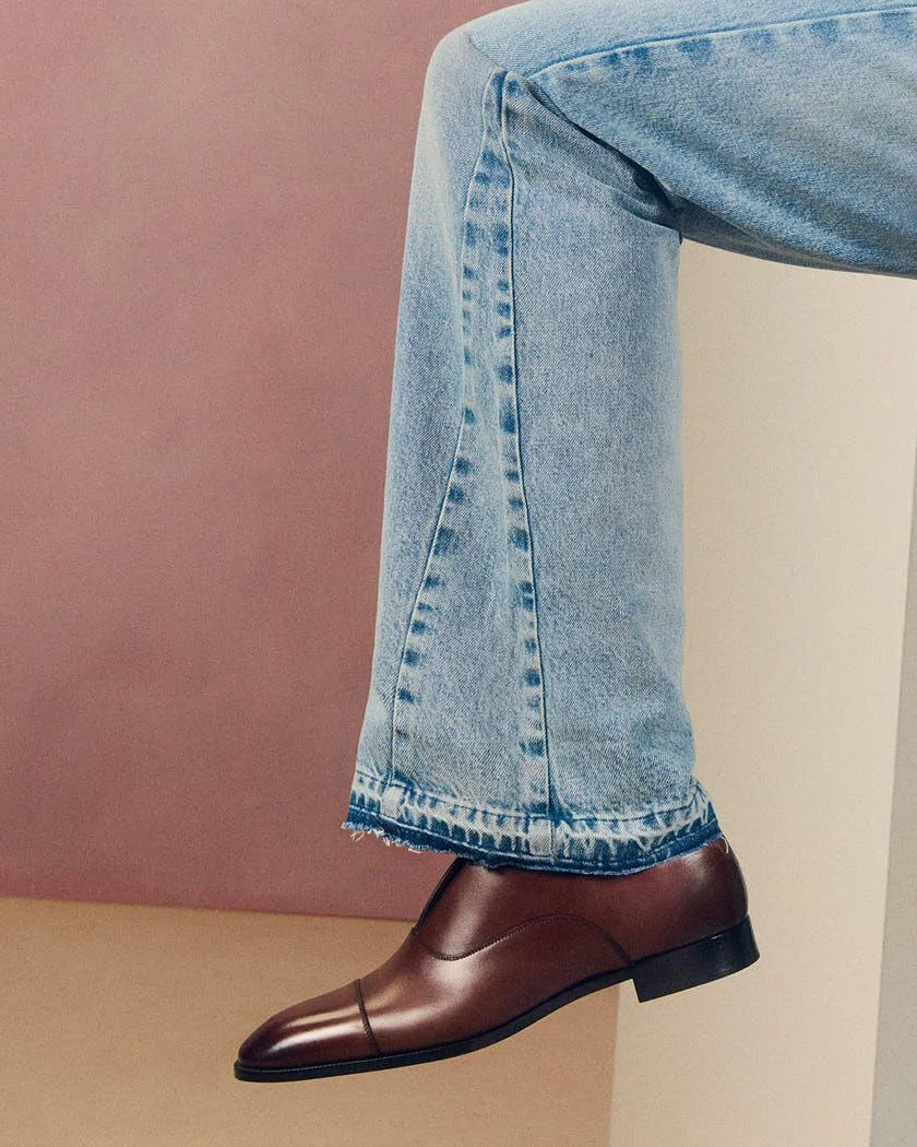
Finally, the classic Chambelimoc and Chambelimonk silhouettes return in embossed crocodile-style burgundy calf patina leather, rounding out a collection that promises bright days (and fun nights) ahead.
all visuals
CHRISTIAN LOUBOUTIN SS26