Viewing entries tagged
design

HAKA beja - Material-Driven Approach to Contemporary Menswear

HAKA beja - Material-Driven Approach to Contemporary Menswear

.specials
A Jacket, a Shirt, a Coat — Nothing More, Nothing Less

HAKA beja and a Material-Driven Approach to Contemporary Menswear


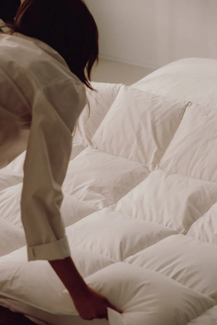
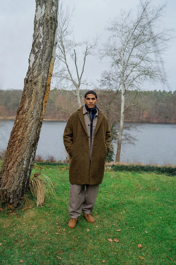
At HAKA beja, each jacket remains tied to the availability of its fabric, and that condition already says a great deal about how the work is made. In a fashion system organised around calendars, images and recurring releases, clothing usually enters circulation with its timing already decided. Material follows the idea, quantity follows the plan, and the garment arrives as part of a larger visual proposition, while HAKA beja operates from a different starting point. Here, availability sets the terms, fabric determines direction, and a piece reaches release only once its form, construction and proportion have settled over time. What results carries a quiet clarity that feels increasingly rare in contemporary menswear, as these are clothes whose value does not depend on novelty at the moment they appear but on whether they remain convincing once they are worn, handled and returned to.

 
HAKA beja by designer Benjamin Seeßle 2026 Fashion Brand photo by Leo Köhler LE MILE Magazine
 
 
HAKA beja by designer Benjamin Seeßle 2026 Fashion Brand photo by Leo Köhler LE MILE Magazine
 

That orientation did not emerge from a conventional fashion trajectory. Textiles were present early on through family connections to the industry, and Benjamin Seeßle had originally intended to train as a tailor for menswear. During a dual degree in fashion management, he spent his practical phases at a long-established retailer in Lower Bavaria whose history lay in trouser production. The people around him understood fabric, construction and quality with real precision. At the same time, he found himself unable to connect to either standard retail fashion or the codes of high fashion, which led him to begin making his own pieces from leftover cloth within that environment. Those first samples were developed as a private practice, shaped by an interest in traditional menswear and by a desire for clothing that could retain simplicity without becoming generic.

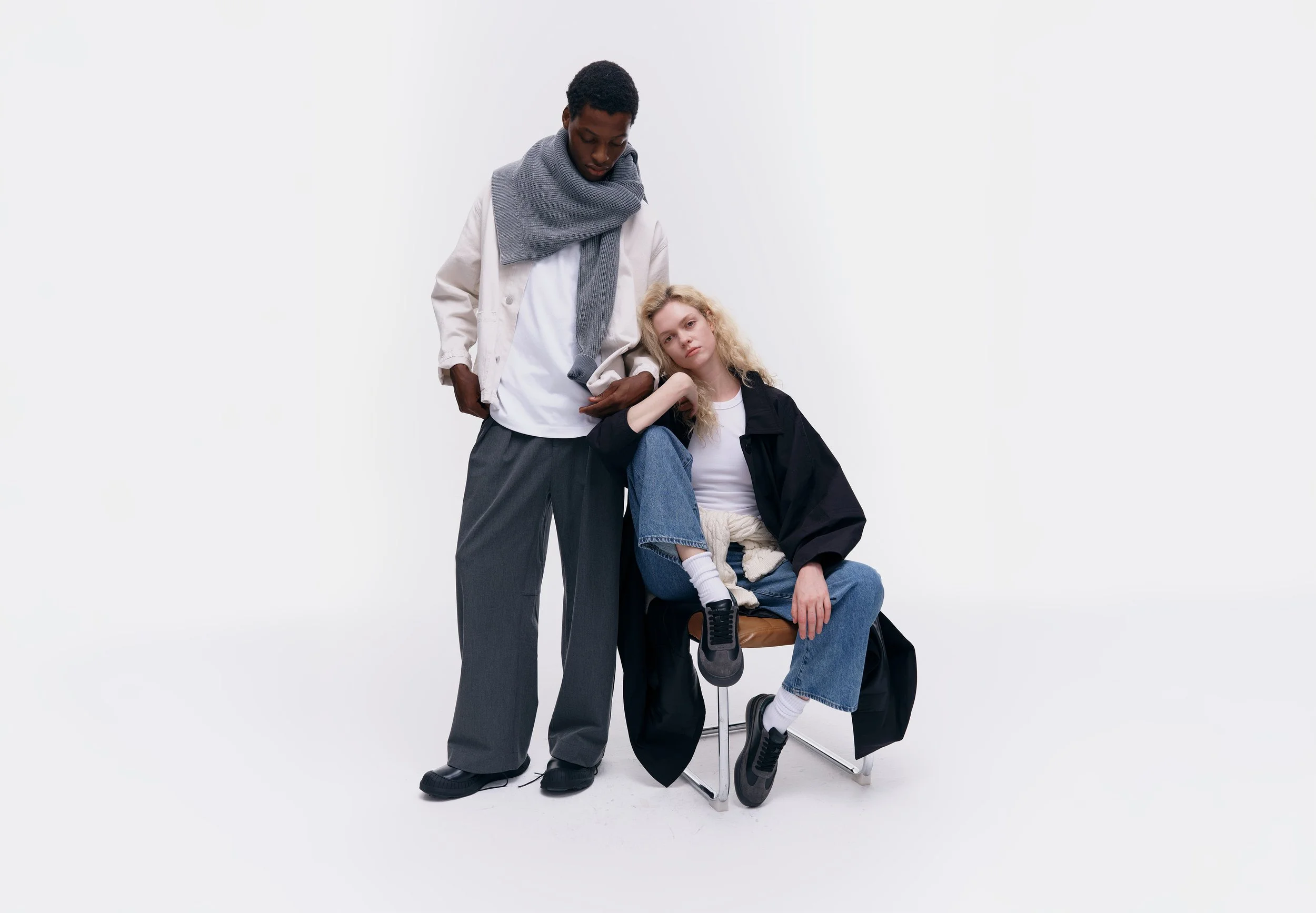
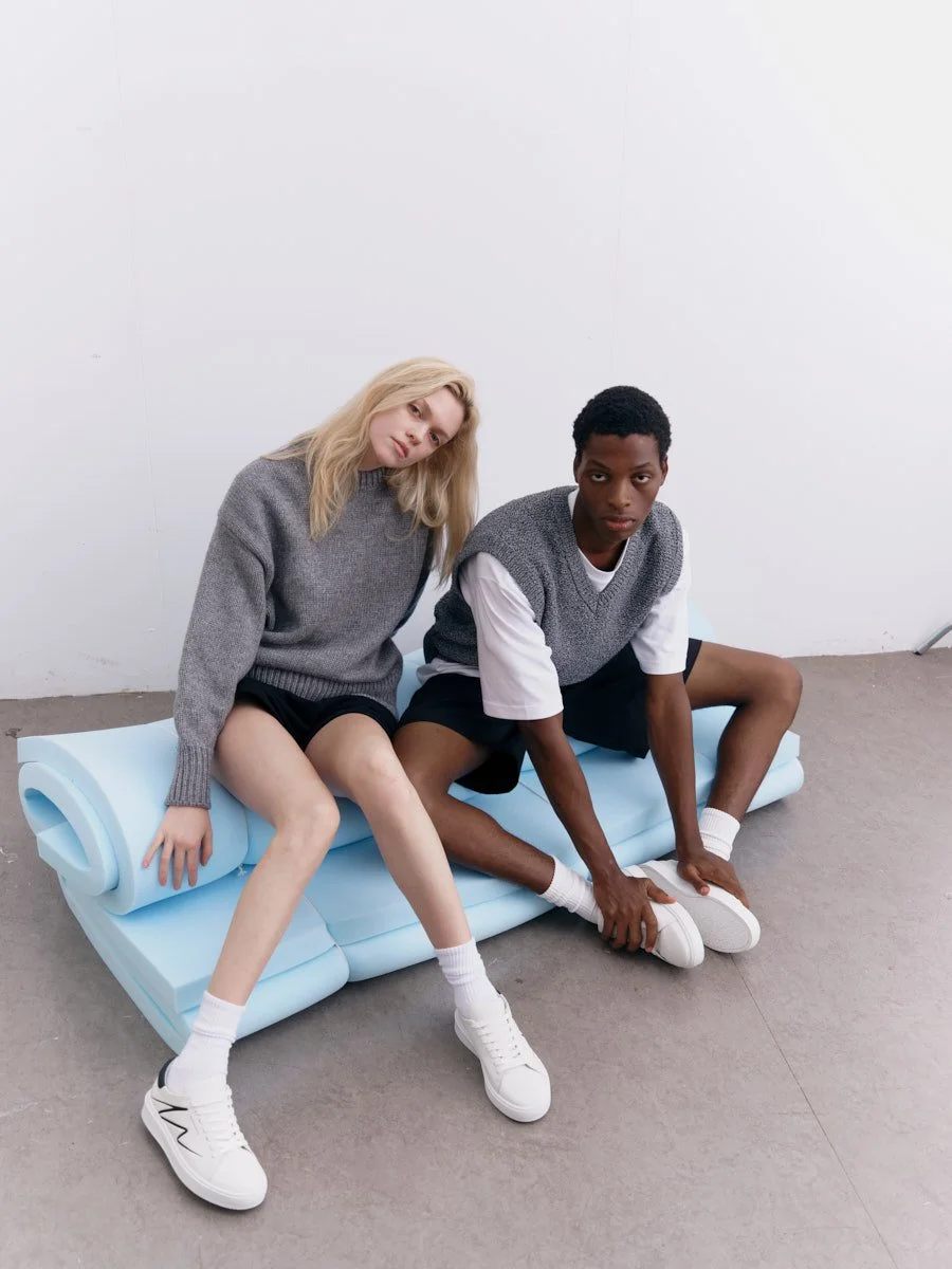
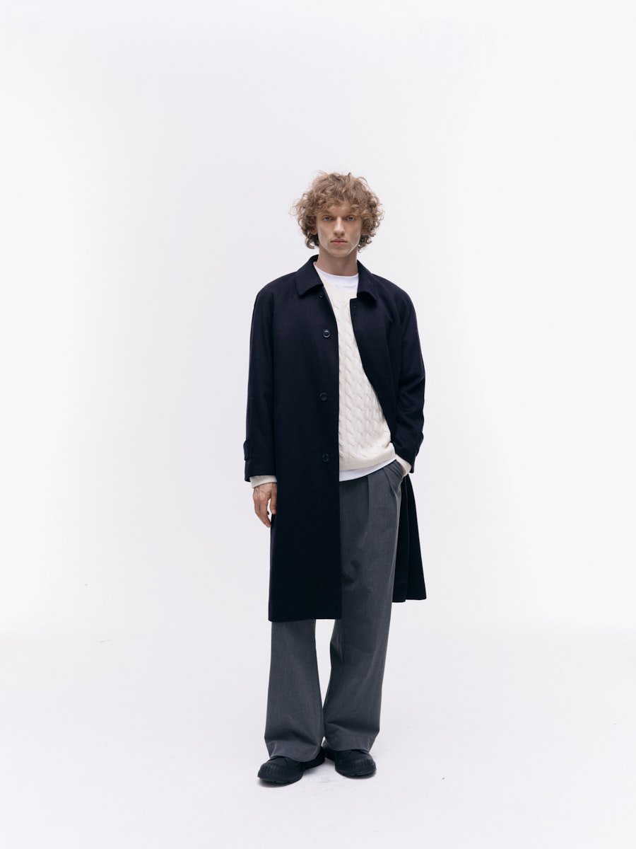
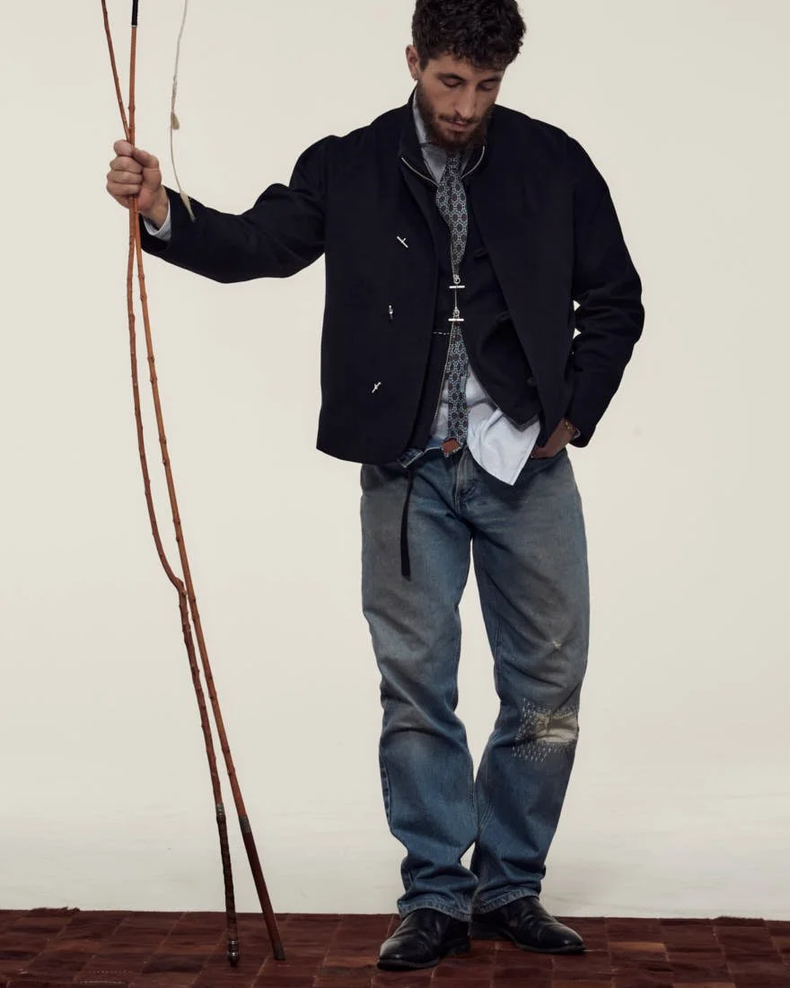
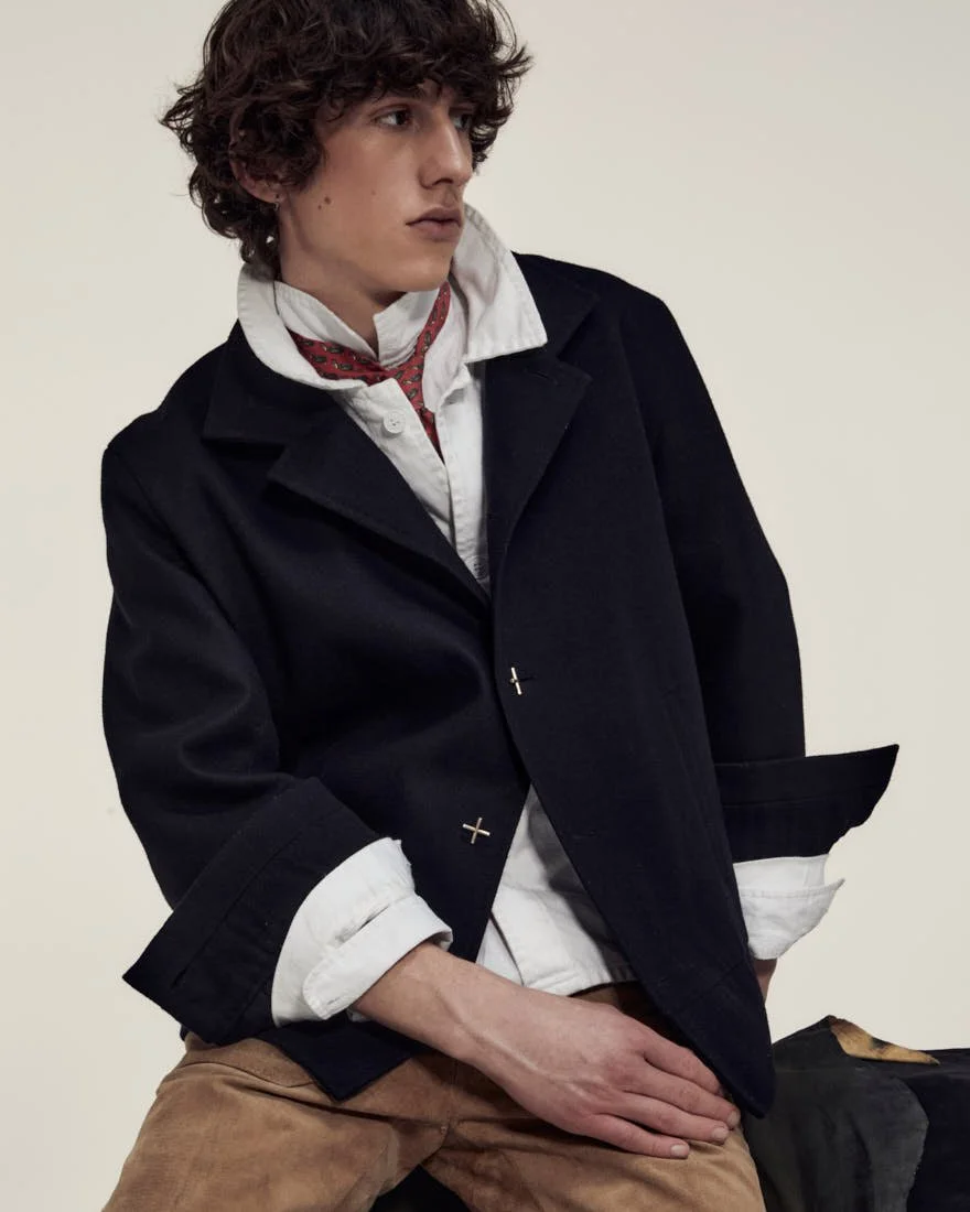
That sense of simplicity remains central to the brand and is easy to misread, as HAKA beja does not chase extravagance and does not rely on conceptual overload to produce significance around the object. Seeßle describes the outcome with almost disarming directness as simply a jacket, a shirt, a coat, a phrasing that shifts attention away from inflated authorship and back toward the garment itself. These pieces are designed with precision, but they do not perform design as spectacle, and their authority comes from material, cut, hardware and use.


The structure of the brand follows the same logic. There are no classical seasonal collections, no complete SS or FW proposals assembled for a date on the calendar, no artificial limitation staged as scarcity, as HAKA beja instead works in individual products developed independently of a fixed release structure. Overproduced luxury fabrics are sourced first and used until they are gone, which establishes the central condition under which each piece is developed. Availability does not enter at the end as a practical restriction but acts at the beginning and shapes what can come into being at all. Quantity is therefore limited by actual supply, and each piece remains bound to the specific fabric from which it was developed, so that once that material is gone, the exact constellation of material, cut and finish cannot simply be repeated.


HAKA beja by designer Benjamin Seeßle 2026 Fashion Brand photo by Leo Köhler LE MILE Magazine
 
HAKA beja by designer Benjamin Seeßle 2026 Fashion Brand photo by Leo Köhler LE MILE Magazine


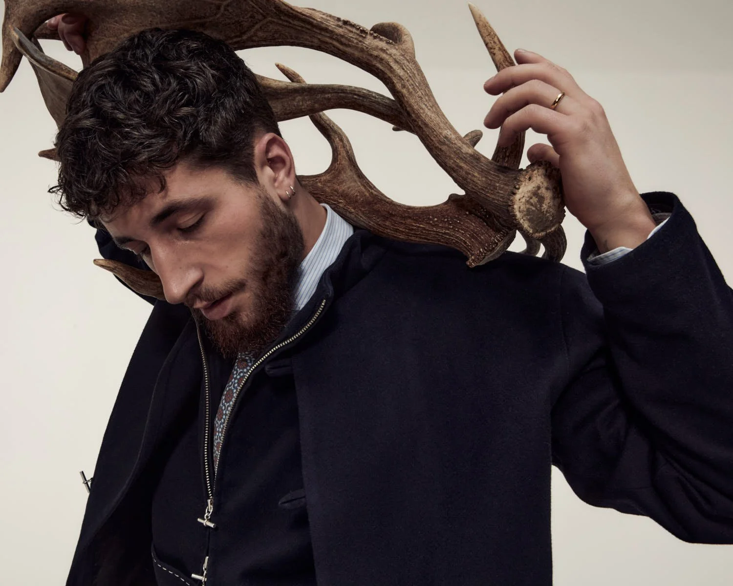
This results in a different temporality, as garments are not created to complete a line-up or to satisfy the expectation of seasonal renewal, but develop over months through vision, modelling, tailoring and adjustment until they hold together. Influences enter from far beyond fashion in any narrow sense, with references ranging from film, personal environment and hunting to craft, gardening, everyday labour and food culture. The language of classic menswear and the Alpine region remains visible throughout, though never in the form of costume or citation, appearing instead as discipline in silhouette, restraint in proportion and a functional clarity that leaves room for variation.

Food culture is especially important here, and it gives the brand one of its most useful images. Seeßle speaks of the laid table with friends or family as a guiding idea behind HAKA beja. The image works because it is less metaphor than method. A good meal prepared for others depends on the quality of ingredients, on manual work, on time and on care in presentation, while it also establishes a difference between consumption and appreciation. The host selects well, prepares carefully and plates with attention, creating a situation in which everyone present responds accordingly, as pace changes, perception sharpens and behaviour follows. Within that setting, clothing enters the same field of respect, where one dresses properly for such an occasion to acknowledge the people around the table and the effort that has gone into what is being shared.


HAKA beja by designer Benjamin Seeßle 2026 Fashion Brand photo by Leo Köhler LE MILE Magazine

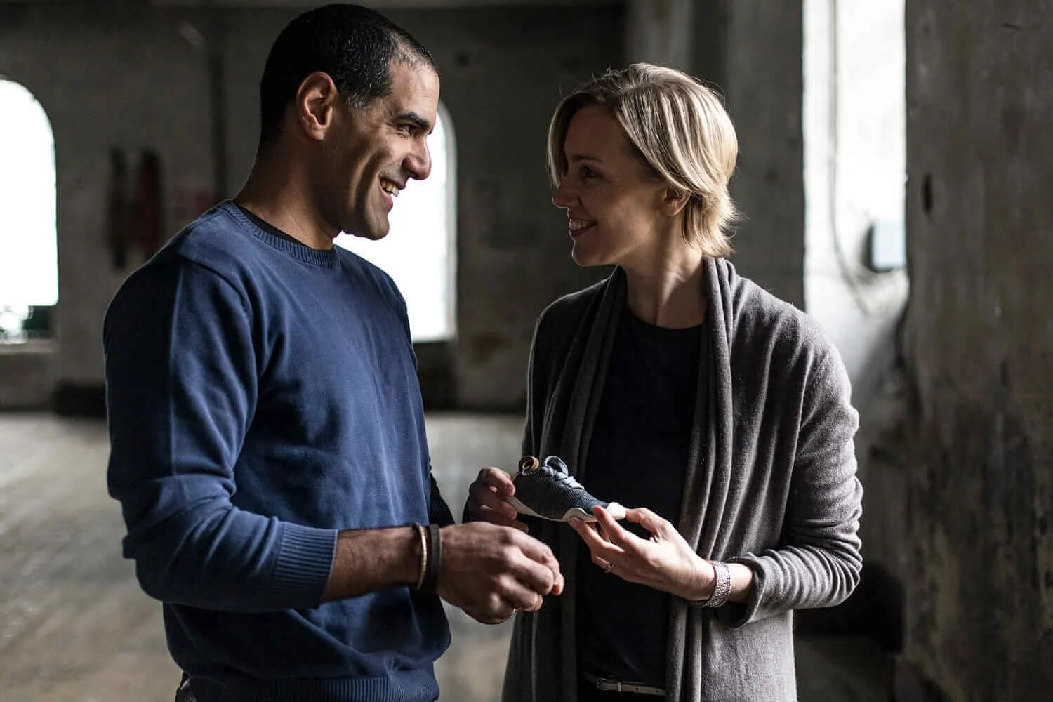
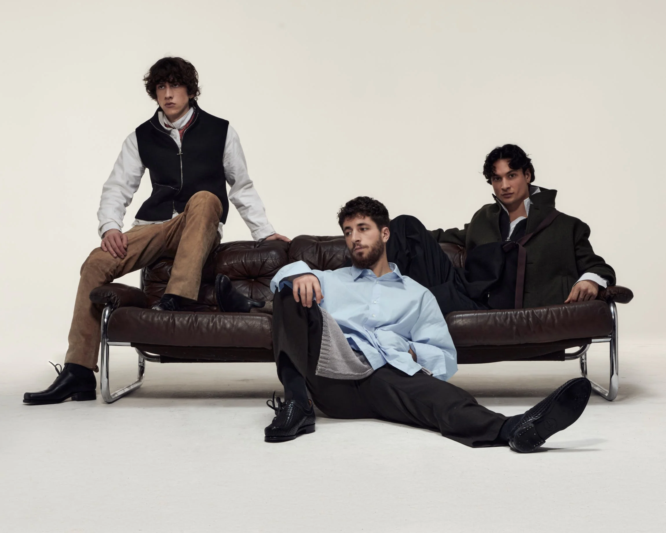
photographer LEO KÖHLER / stylist NATALIA WIERZBICKA / assistant DOMINIK EHRENGRUBER / hair + make up EVA HERBOHN / studio OAT MILK STUDIOS / models PAOLO FIORE, ADRIAN GABOR VITUS VON ZOLYOMI, JANIS BITARAF


From that perspective, HAKA beja becomes easier to understand, as the garments do not ask to be read through fashion images first but belong to a larger idea of conduct in which material quality, craft and presentation shape how an object is received and how one behaves in relation to it. This is also why the brand’s simplicity feels substantial rather than reductive. It is grounded in selection and preparation, where good natural ingredients, manual work and careful presentation form the basis of thinking and making. The analogy to cooking remains direct and extends from product development to the way a finished piece enters life.

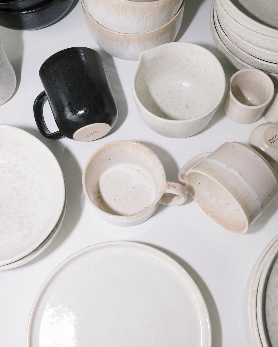
The process begins with material, as only natural fibres are used, chosen for durability, tactile presence and the way they record wear over time, while wool, cotton and silver form the basis of the work. The fabrics often come from overproduced stock originally made for major luxury houses, sourced through European suppliers such as Nona Source in France. Sampling takes place in Germany, silver components are produced through jewellery foundries and goldsmiths in southern Germany, and construction is handled by tailoring partners in Italy and neighbouring European contexts. The phrase Made in Europe is often used loosely in contemporary branding, but here it refers to a production chain that remains concrete, localised and traceable.


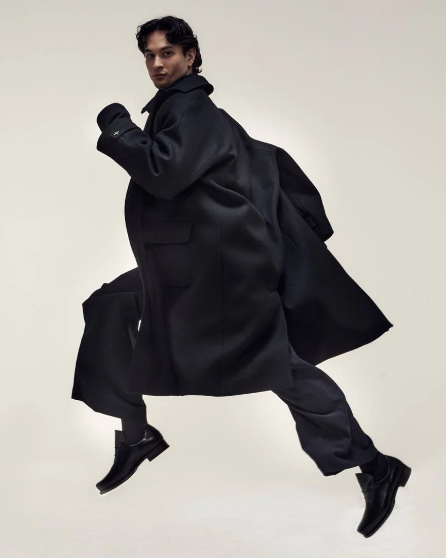
What distinguishes HAKA beja is that this material logic does not announce itself through overt virtue signalling, as the garments do not read as proofs of concept for sustainability discourse but stand on their own as resolved objects. Dense wool fabrics with a firm hand allow jackets and outer layers to hold shape with striking assurance, while proportions are handled with intelligence, often through shorter lengths that shift visual weight upward and subtly alter the movement of the body. Shirts, ties and tailored references persist, while workwear and Alpine dress introduce a different register of utility and familiarity, so that the result sits in a precise zone of tension once described as roughness and elegance, remaining materially legible.

 
HAKA beja by designer Benjamin Seeßle 2026 Fashion Brand photo by Leo Köhler LE MILE Magazine
 
HAKA beja by designer Benjamin Seeßle 2026 Fashion Brand photo by Leo Köhler LE MILE Magazine


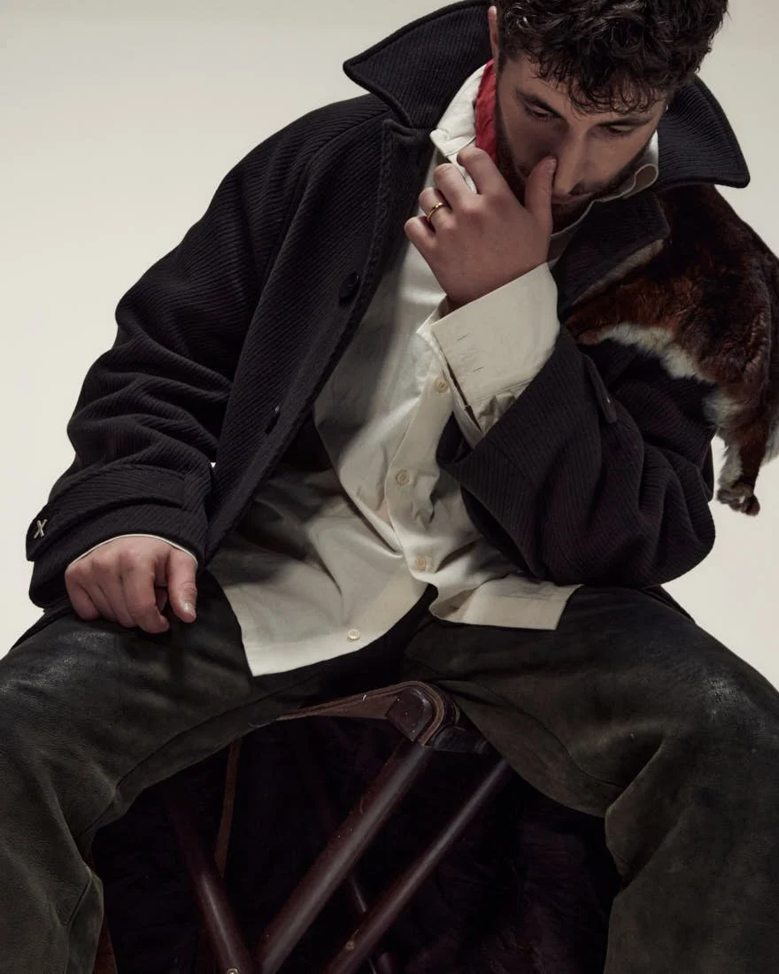
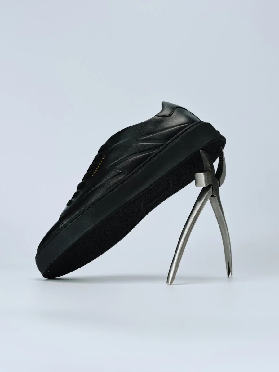
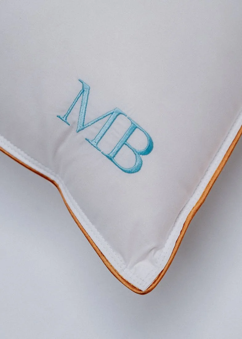
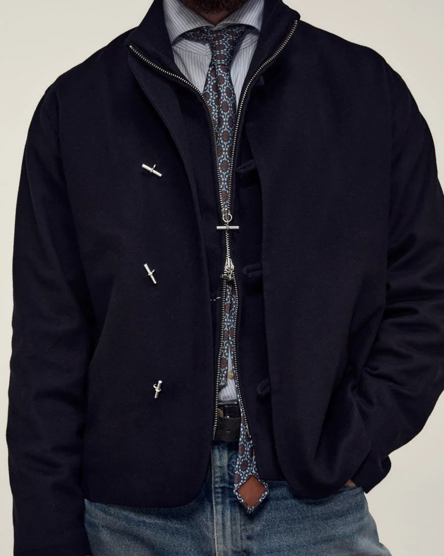
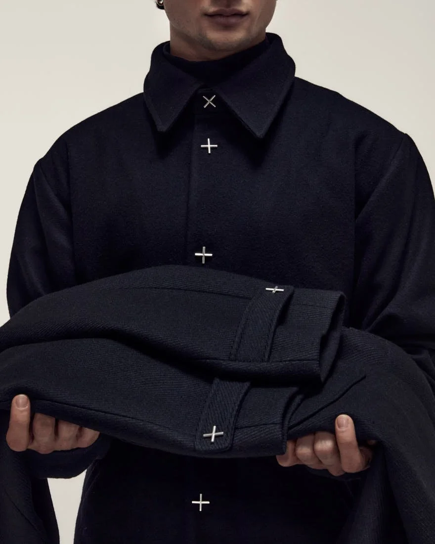
This tension becomes particularly visible in the silver elements, where fine cross-shaped fastenings in 925 silver appear on several jackets with exact placement, functioning as closure and structural point at once. The act of opening and fastening carries a slight resistance, making wear a more deliberate interaction, while each element retains its own material character and remains visibly marked. The relationship between textile and metal stays legible instead of dissolving into styling effect, and Seeßle’s preference for silver over gold, expressed with notable directness, reflects a clear distinction in perception, where silver reads as genuinely valuable without becoming loud. Even the naming system refuses unnecessary narrative inflation. Terms such as Korpus, Rumpf, Kittel or Sack do not construct mythology around the product but simply identify types. A jacket remains a jacket, a vest remains a vest, and variation takes place through cut, material and handling, which keeps attention on labour and execution rather than on storytelling frameworks imposed from the outside.

What emerges from all this is a practice with a rare degree of internal consistency, in which material, time and use remain closely aligned throughout. The pieces do not rely on collection logic, on theatrical image production or on the designer’s self-mythology to establish relevance, but instead shift the focus toward a more demanding question of whether a garment can remain persuasive through construction, touch, proportion and repeated wear. At HAKA beja, clothing does not gain value by appearing, but proves itself through use over time, as garments are worn, returned to and recognised for the consistency of their material, construction and form.


images (c) HAKA beja

DISCOVER HAKA beja: haka-beja.de
Explore Made in Europe garments released in small series, with a focus on raw natural materials, craftsmanship and contemporary design.

HIDDEN WHITE - The Recalibration of luxury Footwear

HIDDEN WHITE - The Recalibration of luxury Footwear

.specials
HIDDEN WHITE and the Recalibration of luxury Footwear

A London Brand focused on Material, Durability and Value


Any footwear label working with a reduced visual language faces a fundamental condition from the outset, since the absence of dominant branding places the full burden of identity on construction, proportion, material and finish. HIDDEN WHITE operates precisely within that constraint, building recognition directly through the object, where material, structure and proportion define authorship in a way that does not rely on amplification.

 
HIDDEN WHITE Footwear Brand LE MILE Magazine Dylan White Black Leather Trainers

HIDDEN WHITE
Dylan White Black Leather Trainers


HIDDEN WHITE Footwear Brand LE MILE Magazine Dylan Black Leather Trainers

HIDDEN WHITE
Dylan Black Leather Trainers


Founded in London in 2024, the brand is structured around a clearly defined conceptual frame, yet its relevance is determined by how consistently that frame is translated into product. White functions here as a tool for surface precision and visual clarity, while the notion of the hidden introduces a second layer that directs attention toward embedded elements. This relationship is resolved through construction. Stitch lines follow the contour of the foot with clear intent, panel transitions remain controlled, and the connection between upper and sole is handled in a way that keeps the form continuous and visually stable.

The Morse code translation of H and W serves as the most specific identifier within this system. Its application is integrated into the structure of the shoe through embossing, linear detailing or subtle graphic placements that remain part of the construction. Repeated across models, this code forms a quiet but consistent signature that can be recognised without relying on overt branding.


Across the collection, this approach takes shape through a range of silhouettes that extend beyond a single core product. Trainers such as Dylan and Dara establish the foundation through clean leather uppers, measured proportions and restrained graphic intervention. Asure introduces a more pronounced toe construction and a sharper outline, shifting the visual weight forward, while certain versions move further into a more expressive register through material contrast and surface treatment. Asher translates the language into an oxford structure supported by a heavier sole unit, and Aura carries it into boots. Taken together, the collection operates as a system, though not a uniform one, with quieter models sitting alongside more assertive interpretations that test how far the underlying design logic can be extended.


HIDDEN WHITE Footwear Brand LE MILE Magazine Asure Black Leather Trainers

HIDDEN WHITE
Asure Black Leather Trainers

 
HIDDEN WHITE Footwear Brand LE MILE Magazine Asher Gunmetal Patent Leather Oxford Shoes

HIDDEN WHITE
Asher Gunmetal Patent Leather Oxford Shoes


The context in which HIDDEN WHITE operates is already densely populated. Minimal leather sneakers, reduced branding and controlled palettes have become a shared language across a wide range of premium labels over the past decade. Under these conditions, restraint alone no longer produces distinction. What becomes relevant is whether a brand can develop a recognisable internal structure, one that remains identifiable through proportion, construction and repeated design decisions, not through external markers. HIDDEN WHITE builds that distinction through a combination of coded detailing, clearly weighted silhouettes and a material-led approach that holds together across different product categories, giving the collection a level of internal definition that remains legible even as individual models shift in tone, and making it increasingly difficult to read the brand as interchangeable within this segment.

This extension across categories reflects a broader development within contemporary footwear, where the distinction between casual and formal continues to dissolve and categories increasingly overlap. HIDDEN WHITE addresses this through a shared construction logic, allowing elements to move across trainers, more formal silhouettes and boots without appearing displaced.


HIDDEN WHITE Footwear Brand LE MILE Magazine Asure Grey Leather Trainers

HIDDEN WHITE
Asure Grey Leather Trainers


Material decisions reinforce that structure at a functional level. Full-grain leather, structured linings and solid rubber sole constructions define how the shoes respond to movement and pressure. The surfaces maintain clarity while adapting through wear, and the internal construction supports extended use through a balance of cushioning and stability. This is further supported by a comfort-focused insole system that introduces a more technical layer to the product, shaping how the shoe performs over longer periods of wear. The product is built to hold its form over time and gradually adjust to the foot through repeated use.

At the same time, HIDDEN WHITE sits within a broader recalibration of how value is defined in footwear. Material quality, durability and long-term usability are gaining weight in a market where visual status signals carry less relevance than they once did. This shift is reinforced by increasing scrutiny around production standards and product lifespan, placing greater emphasis on how things are made and how long they last. In that context, a focus on full-grain leather, structured construction and wear over time moves beyond aesthetic positioning and becomes part of a wider conversation about what constitutes a valuable product today. Positioned between legacy luxury and more accessible design-led brands, HIDDEN WHITE reflects a segment that combines material quality with a more attainable entry point.


This physical definition remains central to how the shoes are perceived. The soles carry a certain mass, the materials retain density, and the overall construction prioritises substance. That decision shapes appearance and experience, giving the shoes a grounded presence and a more direct, supportive feel in wear. The visual language follows the same logic, with a restrained palette that still allows the shoes to maintain a clear presence through proportion, toe shape and panel definition. Individual elements are positioned with precision, allowing variation without disrupting the overall reading of the collection.

 
HIDDEN WHITE Footwear Brand LE MILE Magazine Dara Different Trainers

HIDDEN WHITE
Dara Different Trainers

HIDDEN WHITE Footwear Brand LE MILE Magazine Dara Different Trainers

HIDDEN WHITE
Dara Different Trainers

 
HIDDEN WHITE Footwear Brand LE MILE Magazine Asher Burgundy Leather Oxford Shoes

HIDDEN WHITE
Asher Burgundy Leather Oxford Shoes


The strongest moments in the collection appear where proportion, construction and material align with clarity. Models such as Dylan and Dara show how this balance can hold in its most reduced form, while Asure and selected Asher variations demonstrate how the same logic can be extended into more pronounced silhouettes without losing definition.

HIDDEN WHITE’s strength lies in its ability to maintain that balance across a growing range of products. The brand does not depend on a single defining model, but builds its identity through a consistent set of decisions that remain visible across different categories, which gives the collection stability while leaving enough room for development, positioning HIDDEN WHITE as a label that is not searching for direction, but actively shaping it.


images (c) HIDDEN WHITE

DISCOVER HIDDEN WHITE: hiddenwhite.com
Explore leather sneakers and footwear focused on construction, durability and material quality.

Portofino Ceramica - The Structure of Contemporary Tableware

Portofino Ceramica - The Structure of Contemporary Tableware

.specials
Where Objects take their Place

Portofino Ceramica and the Structure of Contemporary Tableware


Ceramic objects rarely stand alone as they enter use immediately, shaping how food is placed, held, and perceived, and defining situations through weight, proportion, and surface. At Portofino Ceramica, that condition informs the work from the beginning.

 
Tablewear by Portofino Ceramica LE MILE Magazine Coffee Bento Cups

Portofino Ceramica
Bento Cups

 
Tablewear by Portofino Ceramica LE MILE Magazine black Bento Diner Plates

Portofino Ceramica
Bento Diner Plates

Portofino Ceramica
Elsa & Bento Tablewear


The brand traces back to a family business founded around thirty years ago, originally centred on the trade of Italian ceramics. Now led in second generation by Phil and Zoi, the company continues its family structure while gradually redefining its design direction. Production moved to Portugal as the European ceramic landscape evolved, placing the work within a production context shaped by technical precision and long-standing ceramic know-how. What defines the process is gradual refinement, with forms adjusted over time and decisions building on what already exists.

Design takes shape through close exchange with the producers, as ideas originate within the brand and develop further through technical knowledge and an understanding of clay that shapes proportion, feasibility, and finish. Form does not arrive fully resolved but stabilises between intention and material behaviour, shaped by both.


This dynamic continues directly in production, where material behaviour determines each stage. The initial forms are cut from clay plates and shaped by hand, giving each piece its slightly irregular contour. Stoneware is then refined and finished by hand, dried to stabilise its structure, then fired at high temperatures to establish durability. In some cases, drying takes place under natural conditions before firing. Glazes are applied manually and reach their final state only in the second firing, where surface, tone, and texture settle. Subtle variations remain visible in colour and reflection, with the overall character remaining consistent.

 
LE MILE Magazine Portofino Ceramica Alvo Vase

Portofino Ceramica
Alvo Vase


Tablewear by Portofino Ceramica LE MILE Magazine Rio Vase

Portofino Ceramica
Rio Vase


These differences give the collection variation within a coherent whole, reflecting the nature of hand-applied processes and raw material behaviour. They become perceptible in handling and light, allowing objects to exist together without becoming identical. In the Elsa series, this approach translates into a precise, tactile form. The matte exterior absorbs light and stabilises the object visually, while the reactive glaze inside introduces depth and variation. Its qualities are most evident in use, in the way heat is retained, the surface responds, and the object settles in the hand.

Bento shifts the emphasis towards surface interaction, where matte and glossy glazes meet within each piece and shift with movement and light. Reflections change, edges soften or sharpen, and the surface remains active while retaining its restraint. The palette of beige and black reinforces this direction.


Tablewear by Portofino Ceramica LE MILE Magazine Bento jug

Portofino Ceramica
Bento Jug


On the table, the pieces relate through proportion and spacing, with plates, bowls, and vessels aligning without hierarchy and allowing arrangements to emerge from context. They remain adaptable, moving between everyday use and more composed settings without adjustment.
This flexibility is sustained by a material structure designed for continuity in use, as high firing temperatures ensure durability and resistance to regular handling, including dishwashing, while weight, edge definition, and surface remain perceptible, allowing the objects to continue registering physically in use.

The same thinking extends to sourcing, packaging, and logistics. Manufacturing in Portugal concentrates specialised knowledge and keeps material sourcing regional, while packaging and distribution in Germany maintain control over handling and reduce plastic use, with a focus on durability, responsible production, and reduced material waste. They form part of the same overall approach.


A different emphasis appears in the vases, where use becomes less central and silhouette takes on greater presence. In pieces such as Rio, Alegra, or Alvo, vertical proportions and more pronounced forms define space more directly, allowing material and surface to be read without mediation.


Tablewear by Portofino Ceramica LE MILE Magazine Dining Bento Bowl

Portofino Ceramica
Bento Bowl

 
Tablewear by Portofino Ceramica LE MILE Magazine Dining Tablewear Elsa

Portofino Ceramica
Elsa Tablewear


Across the collection, refinement remains continuous, with forms reduced until they hold, surfaces calibrated until they stabilise in light and use, and variation contained within a narrow range.

The collection settles into everyday contexts through repetition and continued handling, carrying a clear identity through proportion and material presence. Its coherence lies in how pieces relate in use, through scale, spacing, and surface, forming a system that can be extended over time. In practice, the system stays open, shaped by how it is arranged, adapted, and lived with over time.


images (c) Portofino Ceramica seen by Aimilia Theofilopoulos

DISCOVER PORTOFINO CERAMICA: portofino-ceramica.com
Explore contemporary tableware, stoneware ceramics, and handmade collections including plates, bowls and vases.

Sweef Modular Sofas - Scandinavian Design for the Modern Living Room

Sweef Modular Sofas - Scandinavian Design for the Modern Living Room

.specials
Why Modular Sofas Are Redefining the Living Room
— A Look at Sweef


In many interiors, the sofa occupies the largest wall or the most obvious corner. Yet its presence shapes the entire room, setting the space in motion and determining where the eye settles, how a conversation is staged, and how the body lands at the end of the day.


Sweef Modular Sofa LE MILE Magazine Kamelen Hos Foretag

Sweef
Modular Sofa Kamelen

 
Sweef Modular Sofa LE MILE Magazine Valen

Sweef
Modular Sofa Valen

Sweef Modular Sofa LE MILE Magazine Dromedaren red

Sweef
Modular Sofa Dromedaren


Few objects carry so much spatial consequence while appearing so familiar. This quiet spatial authority explains why the sofa has become one of the most telling objects in contemporary interior design, functioning less as an accessory of domestic life and increasingly as a form of soft architecture.

This shift is especially visible in the renewed interest in modular seating. As homes become less fixed in their routines and more layered in their use, the sofa is increasingly expected to do more than remain in place. It has to absorb change, adapt to new spatial conditions and continue to make sense across different phases of living. The most compelling systems therefore combine comfort with a design clarity that allows them to structure a room with confidence.


Sweef approaches the home from exactly this territory, with the sofa at the centre of its thinking. Founded in 2011, the Swedish brand emerged through e-commerce and developed around the idea that customers should be able to build a piece around their own sense of comfort, proportion and material preference instead of choosing from a narrow set of fixed outcomes. Much of the collection is made to order, with extensive fabric and colour options shaping the final expression of each piece.

 
Sweef Modular Sofa LE MILE Magazine Dromedaren cow

Sweef
Modular Sofa Dromedaren


Sweef Modular Sofa LE MILE Magazine Hajen

Sweef
Modular Sofa Hajen


One of the clearest examples is Valen, a sofa whose appeal lies in its deep seat, low horizontal emphasis and generous, almost compressed softness. It reads immediately as a piece designed around staying rather than perching. The proportions are substantial without becoming heavy, and the silhouette remains calm even when the upholstery shifts the mood from neutral linen to saturated velvet. Colour plays a decisive role here, as a sofa upholstered in deep green velvet creates a very different spatial gravity than the same piece in pale linen or textured bouclé. Within contemporary interiors, upholstery increasingly carries the visual weight of a room, giving colour and texture a more defining role in the overall composition.

Where Valen establishes the core language, Mammuten expands it into a fuller spatial proposition. Presented by Sweef as a modular sofa series, it strengthens the idea of the sofa as an evolving landscape within the home. That is where Sweef becomes especially relevant within the current interior conversation. Modular furniture is being reconsidered as a long-term domestic framework capable of moving with its owners, absorbing changing habits and maintaining continuity while the surrounding life shifts. Sweef’s modular presentation of pieces like Mammuten and Dromedaren speaks directly to that logic.


Sweef Modular Sofa LE MILE Magazine Dromedaren brown living room

Sweef
Modular Sofa Dromedaren


Material plays a central role in how this logic is perceived and in how the object enters the room. Sweef’s universe is built around velvets, linen blends, bouclé-like textures and a notably broad palette of colours, allowing fabrics to act as spatial markers within the room instead of functioning merely as upholstery. Contemporary interiors are increasingly described as layered environments in which different materials, surfaces and tones build atmosphere through depth and tactility. In such spaces the sofa often becomes the strongest textile element in the room, anchoring the composition visually and atmospherically.

This renewed attention to material also intersects with a broader shift in how furniture is valued. In contemporary interiors, quality and longevity increasingly function as indicators of luxury, encouraging homeowners to select pieces that justify their presence over time. Sweef’s made-to-order production, emphasis on durable upholstery materials and repair-oriented service logic position the sofa as a long-term object designed to evolve with its owners across changing living situations.


Sweef’s showrooms give this philosophy a spatial dimension and allow the furniture to be experienced beyond digital imagery. Locations in Stockholm, Oslo and Berlin present the sofas within fully realised interior settings where scale, proportion and tactility become immediately legible. The newest of these spaces opened in Berlin-Kreuzberg on Prinzessinnenstraße 14 and introduces the collection to the German market within a setting that makes Sweef’s Scandinavian language of comfort, material and proportion physically legible.

 
Sweef Modular Sofa LE MILE Magazine Mammuten Sarah Bengtsson

Sweef
Modular Sofa Mammuten


Sweef Modular Sofa LE MILE Magazine Dromedaren dots

Sweef
Modular Sofa Dromedaren


Within these showrooms, the relationship between sofa and space becomes clearer. Walking around a modular piece reveals how its proportions define circulation through the room. Sitting down exposes the depth of the seat and the structure of the cushions. Fabrics shift character depending on light and distance, and configurations that once appeared online begin to read as spatial structures.

Seen from this perspective, Sweef resonates with a broader return to interiors that value adaptability, material character and emotional permanence. The best sofas offer comfort while establishing order and atmosphere within the room. They anchor the interior and provide a stable centre of gravity for everyday life. Sweef understands this well. The contemporary sofa is no longer only where living happens. It increasingly becomes the structure that allows living to take shape at all.


images (c) Sweef

DISCOVER SWEEF MODULAR SOFAS: sweef.de
Explore Sweef’s modular sofa collections, materials and colour configurations.

SENSES .THE LABEL - Spring/Summer 2026 Collection

SENSES .THE LABEL - Spring/Summer 2026 Collection

.specials
SENSES .THE LABEL 

Why Colour becomes the defining Structure of the Collection


written SARAH ARENDTS


In many current womenswear collections, colour rarely appears all at once. Often it appears as a tonal shift that subtly alters the mood of otherwise familiar silhouettes. 
In the Spring Summer 2026 collection by SENSES .THE LABEL this dynamic becomes visible through a series of carefully placed colour accents within a stable wardrobe vocabulary. One of the clearest appears in the drop Vanilla Sky, where butter yellow enters through textured knitwear and relaxed layering pieces. Set against a palette of soft neutrals and fluid tailoring, the tone warms the collection without disturbing its calm composition.


SENSES The Label Vanilla Sky LE MILE Magazine

SENSES .THE LABEL
Vanilla Sky Drop

 
SENSES The Label Vanilla Sky LE MILE Magazine

SENSES .THE LABEL
Vanilla Sky Drop


The Spring Summer season is organised through six drops released gradually over time. Vanilla Sky, Neon Nectar, Riva Mare, Tropical Edit, Gym and Cin Cin introduce shifts in colour, pattern and material while remaining anchored in the same design language. Feminine silhouettes, streamlined shapes and casual structures define garments that move easily through everyday life.

Each drop subtly recalibrates the visual atmosphere of the wardrobe as the season progresses. Cin Cin introduces a vivid orange that becomes the collection’s most direct colour accent, while Riva Mare adds maritime striping in white and Spicy Red whose graphic rhythm brings structure to otherwise fluid silhouettes. Tropical Edit expands the palette with saturated blues and lighter summer prints, Neon Nectar deepens the chromatic range, and Gym leans further into the collection’s sport-inflected dimension. Butter yellow in Vanilla Sky remains the softest tonal intervention within this evolving palette.


Across these variations the underlying construction remains consistent. Wide trousers, soft tailoring and lightweight knitwear establish pieces that transition easily across different moments of daily life. Many pieces rely on relaxed proportions and clean cuts, allowing fabric, colour and silhouette to carry the visual identity of the wardrobe.

 
SENSES The Label Neon Nectar LE MILE Magazine
 

SENSES .THE LABEL — Explore the full Spring/Summer 2026 collection at www.sensesthelabel.com


SENSES The Label Neon Nectar LE MILE Magazine

SENSES .THE LABEL
Neon Nectar Drop


Knitwear plays a particularly important role within this structure, with lightweight pullovers, cardigans and fine-gauge layers appearing throughout several drops as flexible elements within the seasonal wardrobe. Positioned between structure and softness, knitwear becomes an ideal surface for colour within the collection’s tonal system. Shades such as butter yellow or aqua can appear clearly without overwhelming the silhouette itself.

The drop structure reinforces this gradual approach. Instead of presenting the season as a single visual statement, the collection evolves through smaller tonal adjustments across the different chapters. Each drop introduces a new colour impulse or graphic element while leaving the broader wardrobe language intact.

Within contemporary womenswear this modular approach has gained relevance as wardrobes increasingly favour garments that circulate easily across different contexts of everyday life. SENSES .THE LABEL adopts this structure with particular clarity, organising the season through a sequence of focused colour interventions. Collections built through smaller releases introduce colour, pattern and material in clearly defined moments throughout the season. Each drop concentrates these elements within a specific phase of the collection, allowing the wardrobe to develop through successive shifts in colour and material.

 
SENSES The Label Senses LE MILE Magazine

SENSES .THE LABEL
Neon Nectar Drop

 
SENSES The Label Riva Mare LE MILE Magazine

SENSES .THE LABEL
Riva Mare Drop

 
SENSES The Label Cin Cin LE MILE Magazine

SENSES .THE LABEL
Cin Cin Drop


SENSES .THE LABEL uses this rhythm to position colour as a guiding element of the season. Aqua, orange, butter yellow, Spicy Red and deep blue appear as distinct accents before receding into the collection’s quieter tonal field. The wardrobe evolves through a sequence of tonal adjustments that unfold gradually across the season. Each shift introduces a subtle change in atmosphere as the underlying silhouette language remains stable.

A measured rhythm runs through the collection as calm base tones establish orientation and precisely placed colour accents guide the movement of the season. Relaxed silhouettes remain consistent throughout the wardrobe as colour gradually reshapes the atmosphere of familiar forms.

Sustainable Luxury Footwear by AGAZI

Sustainable Luxury Footwear by AGAZI

AGAZI - Sharpens Footwear with Redefined Design Intelligence

Plant-Based Innovation and European Workshop Production Redefine Contemporary Footwear


written LE MILE


Luxury houses invoke craftsmanship while expanding production across global markets, and sustainability is framed as urgent even as most brands remain embedded in accelerated supply chains. Contemporary footwear operates within this visible tension, balancing heritage narratives with industrial scale and ethical ambition with logistical reality. Design, material responsibility and manufacturing logic frequently coexist without fully converging. Founded in 2023 in Poland, AGAZI does not position itself as manifesto or corrective intervention. It advances a quieter alignment in which design, material responsibility and workshop production operate within the same structural framework.


AGAZI Mule Haze Shoes Poland made LE MILE Magazine

AGAZI
Mule Haze


The alignment becomes evident before it is explained, as a sharp red pump elongates the foot without exaggeration and a cut-out heel structured through latticework reveals skin in measured intervals, its geometry deliberate and controlled. The silhouettes feel composed, shaped by proportion and restraint rather than seasonal impulse. Visually, the collection aligns with contemporary runway imagery while maintaining its own internal clarity, inviting assessment through line, surface and balance first.

This matters because the high heel remains one of fashion’s most exacting objects, it exposes hesitation in construction, magnifies imbalance and leaves little room for material compromise. In this context, responsibility cannot remain theoretical. The IVO line sharpens the classic pump through disciplined colour blocking and clean edges. DANCE YOUR WAY introduces negative space without disrupting internal precision, allowing the heel to move, flex and be tested in motion. Durability, craftsmanship and comfort under pressure become intertwined standards. Techniques such as Strobel construction and certification for sensitive feet reinforce a commitment to longevity that extends beyond appearance. Within a fashion culture long oriented toward image, comfort increasingly signals seriousness, as the intention shifts toward refining how the heel performs rather than tempering its authority.


In Łuków, eastern Poland, a family-owned workshop with more than thirty years of experience forms the operational core of AGAZI, where performance remains inseparable from place. Now led by the founder’s son, the factory has introduced systems that reduce material waste and tighten the relationship between design intent and resource use. More than ninety percent of the workforce are women, shaping a locally rooted company structure marked by social awareness. At a moment when progress in fashion is often equated with geographic expansion and layered supply chains, maintaining a contained production model becomes a deliberate position. Growth is pursued through refinement and selective positioning. Oversight remains immediate, decisions travel shorter distances, and European manufacturing functions as an operational condition informing each stage of development.

 
AGAZI IVO MIDI Red Poland made LE MILE Magazine

AGAZI
IVO MIDI Red

STEP INTO PLANT-BASED FOOTWEAR
agazi.eu
Vegan shoes handcrafted in Poland from certified plant-based leather alternatives.


AGAZI High Heels IVO Green Pink Poland made LE MILE Magazine

AGAZI
IVO Green Pink


Material innovation appears without spectacle, as plant-based alternatives such as apple leather derived from juice industry waste, grape leather sourced from wine production residues, bamboo-based components and natural cork, paired with sugar cane soles, are integrated directly into the construction process. Over the past decade these materials have moved from experimentation to credible industrial application. The decisive question concerns their capacity to sustain uncompromising quality in practice. At AGAZI, their use remains controlled, with surfaces kept precise, finishes refined and colour saturation deliberate. Sustainability operates as a foundational condition of production, while aesthetic expression retains its autonomy.

The resulting collection resists seasonal volatility through measured proportions and restrained embellishment. Structural play remains disciplined, preserving formal clarity. The shoes appear conceived to settle into a wardrobe and accompany daily life over time, allowing durability to function simultaneously as material property and stylistic stance. Longevity concerns not only the endurance of a sole but the continued relevance of a silhouette.

 
AGAZI LOUISE Matte Brown Poland made LE MILE Magazine

AGAZI
LOUISE Matte Brown

 
AGAZI High Heels Dance Your Way Toffi LE MILE Magazine

AGAZI
Dance Your Way Toffi

 
AGAZI High Heels Dance Your Way Toffi LE MILE Magazine

AGAZI
Dance Your Way Toffi


This coherence extends into the Second Life programme, through which worn pairs can be returned, cleaned, repaired and redirected in collaboration with local foundations. Responsibility extends beyond the moment of purchase and informs how products are conceived from the outset. Material choice, construction method and lifecycle form a continuous design consideration across the lifespan of each pair.

AGAZI positions itself within European luxury through a measured, structurally grounded approach, acknowledging the realities of an industry defined by scale. Its strength lies in coherence. By aligning thoughtful design, uncompromising quality, material accountability and a contained European production framework, the brand articulates a model that feels internally resolved. Within the contemporary fashion landscape, such resolution carries weight. As a European label with a clearly articulated ethical orientation and a design language shaped by precision and aesthetic sensitivity, AGAZI commands attention not through volume but through structural clarity and refined design intelligence.


credits for images:
IVO black&caramel, IVO green&pink, IVO jeans, IVO #2, DANCE YOUR WAY (black & toffi), MULE HAZE, NOMAD MOON, NOMAD SUN
photographer Mateusz Grzelak
stylist kasiamioduska kasiamioduska + Filip Janiak
beauty Kasia Olkowska
set design Dagmara Kazimiera Stępień


CARMEN, IVO midi red, LOUISE (black & matte brown)
photographer Julia Niedospiał

That’s Engineering in Men’s Grooming
 with Brooklyn Soap Company

That’s Engineering in Men’s Grooming
 with Brooklyn Soap Company

That’s Engineering in Men’s Grooming

Brooklyn Soap Company extends its Grooming System with the Brooklyn Blade Pro


written MARK ASHKINS


Brooklyn Soap Company introduces the Brooklyn Blade Pro as the most technically defined device in its grooming range to date. Positioned alongside the Brooklyn Blade trimmer, the Brooklyn Shaver for foil shaving and the Brooklyn Body Blade for waterproof body grooming, the Pro advances the brand’s shaping phase through material density, mechanical precision and service-oriented construction.


Brooklyn Soap Company
Brooklyn Blade Pro


Over the past decade, men’s grooming has settled into a disciplined routine shaped by precision and repetition. Beard length, neckline definition and calibrated fades are maintained with an attention that treats the bathroom mirror as a recurring checkpoint. In this environment, devices gain significance because consistency over time defines the result as clearly as the initial cut. Construction and mechanical integrity therefore move to the centre of evaluation. Weight, balance and torque influence handling during trimming, while material stability determines how cleanly contours can be drawn and how reliably a chosen length can be reproduced across weeks of use.

The Brooklyn Blade Pro is built around a full metal housing sealed for waterproof operation. Inside, a brushless professional motor delivers sustained torque engineered to reduce mechanical wear over time. The precision blade is specified at 0.35 millimetres, enabling controlled edge definition and tighter line work. Runtime is listed at up to three hours per charge, supported by an exchangeable battery system designed for extended lifecycle use. Nine magnetic attachment combs ranging from 2 to 20 millimetres create a stable interface between blade and beard, reducing micro movement during trimming and supporting uniform length control.


These specifications position the Pro within an engineering-led understanding of grooming. A rigid metal body stabilises grip during detail work. Magnetic guards help maintain consistent pressure along the skin. Sustained motor performance supports even cutting from the first pass to the last, embedding accuracy in the mechanics of the tool itself.

 
Brooklyn Soap Company Brooklyn Blade Pro product full LE MILE Magazine male model shaving with trimmer

Part of Brooklyn Soap Company’s expanding grooming system — explore the Brooklyn Blade Pro at www.bklynsoap.com


Brooklyn Soap Company Brooklyn Blade Pro product full LE MILE Magazine trimmer detail

Brooklyn Soap Company
Brooklyn Blade Pro


The release also reflects the structural development of Brooklyn Soap Company as a brand. Founded on beard and shaving formulations, the company gradually articulated a phased grooming system structured around cleansing, shaping and conditioning. Care products such as Beard Shampoo, Beard Oil in variants including Classic and Cedarwood, face and beard cream and aftershave treatments establish the supportive layer around form and skin balance. The trimmer defines shape; the surrounding formulations maintain texture and comfort once that shape is set.

Across its cosmetic portfolio, the brand references formulations developed with natural ingredients and produced without microplastics or silicones under a Made in Germany designation. In hardware, the emphasis on durable metal construction and replaceable components extends this framework from cosmetic composition to industrial design. Longevity emerges as a shared principle across both liquid and mechanical categories.

 
Brooklyn Soap Company Brooklyn Blade Pro product full LE MILE Magazine

Brooklyn Soap Company
Brooklyn Blade Pro

 
Brooklyn Soap Company Brooklyn Blade Pro product full LE MILE Magazine

Brooklyn Soap Company
Brooklyn Blade Pro

 
Brooklyn Soap Company Brooklyn Blade Pro product full LE MILE Magazine

Brooklyn Soap Company
Brooklyn Blade Pro


Within the contemporary men’s care sector, evaluation criteria increasingly centre on specification and service life. Motor type, battery concept and housing material influence purchasing decisions as strongly as scent or surface finish. Against this backdrop, the Brooklyn Blade Pro operates as a structural reinforcement within the grooming system, strengthening the shaping phase through material solidity and mechanical stability. Engineering becomes the defining language of daily beard maintenance.

Muller Van Severen - Inside the Belgian Design Duo

Muller Van Severen - Inside the Belgian Design Duo

.specials
How Muller Van Severen Built One of Today’s Most Influential Furniture Studios


Fien Muller and Hannes Van Severen began working together in 2011, bringing two independent artistic backgrounds into a shared studio. Fien trained as a photographer, developing a precise understanding of composition, surface, and colour, while Hannes studied sculpture and focused on spatial structure and the behaviour of materials in three dimensions. The partnership formed through ongoing conversations about objects and through a gradual interest in how furniture could serve as a direct extension of their artistic processes.

 
LE MILE Magazine furniture design by Muller Van Severen images round aluminium tubes bench

ALLTUBES Bench by Muller Van Severen, part of the ALLTUBES series
(c) Muller Van Severen

 
LE MILE Magazine Belgian artists Fien Muller and Hannes Van Severen Muller ALLTUBES cabinet high

ALLTUBES Cabinet High + Chair 2 by Muller Van Severen
(c) Muller Van Severen

 
LE MILE Magazine furniture design by Muller Van Severen images round aluminium tubes detail of storage

Detail of the ALLTUBES Wall Cabinet L by Muller Van Severen
(c) Muller Van Severen


The development of each piece begins with material examination and simple construction tests. Metal rods are bent or joined to explore tension, leather is suspended to understand curvature, and polyethylene sheets are evaluated for their stability and chromatic presence. Decisions emerge from these practical studies rather than from conceptual narratives. Lines, joints, and surfaces remain visible because every part of the object reflects the steps that shaped it. This approach creates furniture that carries the clarity of studio experimentation without decorative additions or concealed elements.

Colour selection follows the same principle of directness. Polyethylene retains the industrial tones originally used for classification in food-processing environments; metals age at their natural pace; leather develops patina through use. These properties guide the design process and influence the proportions and combinations of materials. Instead of treating colour as a secondary layer, the duo integrates it at the earliest phase of development, allowing it to act as a structural element within the work.


Diversity within their oeuvre arises from the range of functional questions they address. Seating pieces examine how minimal surfaces can maintain comfort through tension alone. Tables often incorporate lighting, creating merged objects that organise spatial arrangements through a single construction. Shelving systems explore vertical extension and load distribution, while carpets translate the duo’s sense of balance into textile form. Variations come from the specific technical requirements of each task, not from shifts in style. The relationship between Fien and Hannes remains central to the evolution of their work. Drawings, scale models, and continuous dialogue form the basis of their process, with both artists contributing to each stage until a coherent solution emerges. The studio functions as a place for daily testing and refinement, and this environment shapes the calm, straightforward presence found in their finished pieces.


LE MILE Magazine furniture design by Muller Van Severen images day bed creative and colorful

Daybed designed by Muller Van Severen for Kvadrat’s “Divina: Every Color Is Divine” exhibition, 2014
(c) Muller Van Severen

 
LE MILE Magazine furniture design by Muller Van Severen portrait image of Belgian artists Fien Muller and Hannes Van Severen

Hannes Van Severen + Fien Muller
Muller Van Severen


A recent development in their practice is the opening of a dedicated showroom near Ghent, accessible by appointment. This space allows architects, collectors, and design professionals to encounter the work in a precise and controlled setting. The showroom presents their furniture in a scale and context aligned with its intended use, giving visitors the opportunity to study materials, proportions, and constructions directly. This addition extends the studio’s reach without altering its foundational methods, and it offers a clear view of the ongoing investigations that anchor their work.


LE MILE Magazine Sculptural cabinet from Muller Van Severen’s Bridges collection for BD

Bridges cabinet series by Muller Van Severen for BD Barcelona
(c) Muller Van Severen


Collaborations with production partners, including long-term work with valerie_objects, extend their designs into international contexts while preserving the essential principles of the studio. Manufacturers follow material guidelines that reflect the duo’s priorities: clearly defined geometries, unaltered surfaces, and structural transparency. These partnerships allow the work to circulate more widely without shifting the foundation of the practice.


Muller Van Severen continues to build a body of furniture that reflects an uninterrupted engagement with material behaviour, proportion, and the practical demands of construction. Every object contributes to an ongoing exploration of how form and function can be approached with artistic precision, and the resulting work introduces a steady presence to interiors through disciplined use of colour, material, and structure.


LE MILE Magazine furniture design by Muller Van Severen images two-seater with lamp light

Duo Seat + Lamp by Muller Van Severen, presented at Design Brussels in 2011
(c) Muller Van Severen

 
LE MILE Magazine LE MILE magazine Belgian artists Fien Muller and Hannes Van Severen Muller Van Severen lacquer cotton pillow sofa

Pillow Sofa designed by Muller Van Severen, created with KASSL Editions and reimagined by BD Barcelona
(c) Muller Van Severen


header image credit

Crossed Double Seat (2012), designed by Muller Van Severen for the Future Primitives series at Biennale Interieur
(c) Muller Van Severen

Maintaining Clean Floors in Modern Homes: A Comprehensive Guide to Floor Care Strategies

Maintaining Clean Floors in Modern Homes: A Comprehensive Guide to Floor Care Strategies

.specials
Maintaining Clean Floors in Modern Homes:
A Comprehensive Guide to Floor Care Strategies


Clean floors serve as the foundation of any healthy, welcoming home, yet countless homeowners find themselves caught in an endless cycle of ineffective cleaning routines. The real challenge isn't just the physical act of cleaning—it's understanding how different methods work in harmony to deliver lasting results. Success hinges on finding the right balance of techniques, equipment, and timing that matches your unique flooring and lifestyle demands.


Different Floors, Different Care: Tailoring Your Cleaning Approach

Whether you're wielding a traditional broom, operating a cordless vacuum, or experimenting with other cleaning tools, grasping the complete picture of floor care empowers you to make smarter decisions about your cleaning approach.

Your flooring material dictates everything about how you should clean it. Hardwood floors demand a delicate touch—gentle, pH-neutral cleaners and minimal moisture are essential to prevent warping and preserve those protective finishes you've invested in. Tile and stone surfaces can withstand more aggressive cleaning, but those grout lines become magnets for dirt and bacteria that require special attention.

Laminate and vinyl flooring might seem bulletproof, but moisture control becomes critical since water can seep through seams and cause irreversible damage. Carpet and area rugs present their own puzzle—wool fibers need gentler care than synthetic materials, while plush, high-pile carpets trap debris in ways that low-pile options simply don't.

Each flooring type has its Achilles' heel, and recognizing these vulnerabilities shapes your entire maintenance strategy. Think of material identification as your roadmap—without it, you're cleaning blind.


Prevention First: Reducing Dirt and Damage Before Cleaning Becomes Necessary

The smartest floor care strategy starts at your front door, not your cleaning closet. Strategic doormat placement inside and outside every entrance can slash tracked-in debris by up to 80%—a simple investment that pays dividends daily. Taking it a step further with a shoes-off policy in high-traffic zones keeps outdoor contaminants from ever reaching your floors.

Furniture pads and protective barriers act as insurance policies for hardwood and laminate surfaces, preventing those heartbreaking scratches and dents that seem to appear overnight. Meanwhile, immediate spill response isn't just good housekeeping—it's damage control that prevents stains from becoming permanent fixtures.

Families with pets or children can benefit enormously from designated eating and play zones equipped with washable rugs. These contained spaces turn inevitable messes into manageable cleanup tasks rather than floor-wide disasters. Don't underestimate the power of regular walk-throughs either. Catching potential problems early—when they're still small and inexpensive to fix—beats dealing with major damage later.

 
Dyson Floor Care Guide LE MILE special article

(c) Dyson Press


Cleaning Techniques: From Traditional Methods to Modern Equipment

The most effective floor cleaning isn't about choosing between old-school and high-tech methods—it's about knowing when to use each approach. Manual cleaning techniques like sweeping and mopping remain irreplaceable, especially for delicate surfaces that need a gentle human touch. Master the art of systematic sweeping by working from room edges toward the center, and match your broom type to your surface for optimal results.

Mechanical cleaning equipment brings efficiency and consistency to the table. Upright vacuums excel at extracting deep-seated dirt from carpets, while robotic cleaners handle daily maintenance for time-strapped households. Handheld devices shine where their larger cousins can't reach—stairs, tight corners, and around furniture legs.

The secret lies in strategic deployment rather than blind loyalty to one method. High-traffic areas might need daily mechanical attention, while your grandmother's antique hardwood might prefer gentle weekly hand-cleaning.

Selecting Appropriate Cleaning Solutions: Safety, Effectiveness, and Sustainability

pH levels aren't just chemistry class trivia—they're the difference between clean floors and damaged ones. Alkaline cleaners slice through grease like nobody's business, but they'll wreak havoc on natural stone. Acidic solutions dissolve mineral deposits beautifully, yet they can permanently etch marble surfaces.

Natural cleaning solutions crafted from pantry staples like white vinegar and baking soda offer powerful, safe alternatives for many cleaning challenges. But don't assume "natural" means "foolproof"—even these gentle giants need proper dilution and application to avoid unintended consequences.

Safety becomes non-negotiable in homes with children and pets. Always test new products in hidden spots first, and never skimp on ventilation when using any cleaning chemicals, natural or otherwise.


Creating a Maintenance Routine: Balancing Frequency and Effectiveness

Sustainable floor care thrives on consistent daily habits paired with strategic deep-cleaning sessions. Your daily routine might include sweeping high-traffic zones and tackling spills the moment they happen. Weekly deep cleans address every floor surface, while monthly intensive sessions target those areas that need specialized care.

Seasonal flexibility keeps your routine realistic—muddy spring months and holiday entertaining seasons naturally demand more frequent attention. Pet owners and parents typically need tighter cleaning schedules, while empty nesters might stretch intervals between major cleaning sessions without consequence.

Bringing It Together: Your Path to Consistently Clean Floors

Mastering floor maintenance means recognizing how prevention, proper techniques, suitable products, and smart scheduling work together as a unified system. The most successful homeowners don't rely on any single miracle solution—they blend multiple strategies that fit their specific circumstances.

Start small by implementing one or two preventative measures and watch how they transform your cleaning routine. Clean floors dramatically enhance your home's health and comfort, making every effort you invest in proper care practices worthwhile. Remember, there's no universal "best" approach—evaluate your unique situation and adapt these strategies to create a system that actually works for your lifestyle.

onomao - Handcrafted Ceramics

onomao - Handcrafted Ceramics

.specials
onomao

*within Portuguese Craft Culture


written SARAH ARENDTS


onomao began in 2018 with a clear intention to bring traditional Portuguese craftsmanship into a contemporary context. The brand collaborates with small manufactories that work with regional clay and long-established production methods.


Every piece is shaped, glazed, and finished by hand, which creates subtle variations in surface and form. These variations are part of the identity of the objects and underline the direct connection to the people who make them. Packaging materials are reused, and shipments remain free of plastic.


onomao LE MILE Magazine small bowl pura rosa

onomao
small bowl pura rosa

 
onomao LE MILE Magazine aberta hand-painted orange

onomao
aberta hand-painted orange


The founders Arthur and Felix Wystrychowski grew up in Munich and developed an early interest in Portugal. Their regular travels for surfing brought them into contact with local workshops and with the atmosphere of regions where craft is part of everyday life. Arthur studied landscape architecture in Berlin and strengthened his interest in materiality, spatial order, and quiet design solutions. Felix trained as a cook in Portugal, later moved toward graphic design, and gained experience in visual communication. Their combined perspectives shaped the direction of the brand and guided their search for small manufactories that value continuity, responsibility, and fairness.


The collections show a broad range of forms and colors. onomao does not work with a single design language. Instead, the assortment includes tableware with sculptural silhouettes, soft curves, and straight lines, depending on the collection. The best-known line is called Traditional. It features pieces with a clear structure, balanced proportions, and glazes that reflect the character of Portuguese ceramic traditions. Other collections explore different approaches. Some use matte surfaces in warm earthy tones. Others bring in more saturated colors or glossy textures that highlight the material. The diversity in the assortment allows each piece to stand on its own while still fitting into a cohesive visual family.


onomao LE MILE Magazine large bowl deep plate natural white

onomao
large bowl deep plate natural white


onomao
www.onomao.com

based in Cologne, Germany and working with small Portuguese manufactories to produce handcrafted ceramics and homeware

onomao Traditional Collection average price range: 12 € – 45 €


onomao understands tableware as part of the everyday situations in which people pause, cook, and sit together. Meals often form the central moments of a household, and the founders see ceramics as one of the elements that quietly supports these routines. The collections differ in shape, color, and finish, yet they share a steady and unobtrusive presence that works in simple weekday settings as well as in larger gatherings. Forms range from strict lines to softer curves, and the glazes include muted tones, natural textures, and more saturated colors. This variety reflects the different ways kitchens function and how people choose to organize their daily rhythm.


It also reflects the founders’ interest in creating objects that remain practical while offering a sense of calm and order on the table.
Their collaboration with small Portuguese workshops follows the same principles. The manufactories work with regional clay and long-established methods, and the production decisions are shaped by continuity, material awareness, and respect for craft. These relationships have grown over time and form the foundation of onomao’s approach to design. New pieces are introduced carefully, without compromising the pace and structure of the workshops. This approach allows the assortment to evolve in a steady and deliberate way, keeping a clear connection to the people and regions involved in the production.

 
onomao LE MILE Magazine small and large plate natural white

onomao
small and large plate natural white

 
onomao LE MILE Magazine salad bowl sapphire blue classic

onomao
salad bowl sapphire blue classic

 
onomao LE MILE Magazine aberta hand-painted blue

onomao
aberta hand-painted blue

SECRID and the Culture of the Pocket

SECRID and the Culture of the Pocket

.specials
SECRID
*Industrial Design for Everyday Carry


written MONICA DE LUNA


Since 1995, SECRID has focused on pocket-sized accessories shaped by industrial design, clarity and careful material work.


Founded by René and Marianne van Geer in the Netherlands, the brand continues to produce locally, with assembly done in collaboration with social enterprises. This setup supports consistent quality and a transparent, regionally rooted production model.


SECRID Cardprotector hamerstones LE MILE Magazine

SECRID
Cardprotector Hamerstones

 
SECRID Chalk Combination of the Emboss Diamond and Chalk Edition LE MILE Magazine

SECRID
Chalk Combination of the Emboss Diamond and Chalk Edition


The Cardprotector introduced a compact aluminium format with a mechanical access system for cards. Its patented Autolock mechanism regulates the controlled release of cards and supports single-handed use. This simple movement aligns with everyday situations shaped by contactless payments, transit systems and workplace access. The Cardprotector became the structural foundation for the entire SECRID collection and continues to define its handling experience.

The Cardprotector+, introduced in 2025, strengthens this foundation. An internal reinforcement plate supports frequent use while maintaining the familiar format and lever operation. It forms the core of the premium+ collection — a fully vegan line that focuses on refined materials, structured surfaces and long-term usability.


Hammerstone adds a distinct material expression to the collection. It uses recycled aluminium finished through an industrial impact technique that produces a matte, textured surface. Available in Charcoal, Azure and Navy, Hammerstone supports a lifestyle shaped by movement, daily commuting and travel, where a stable, durable surface performs well and integrates naturally into routine handling.


SECRID FW25 Cardprotector+ Fluted Cashmere LE MILE Magazine

SECRID
Cardprotector+ FW25 Fluted Cashmere


Prices from €34,50 for the Cardprotector, €39,95 for the Cardprotector+, €44,95 for Hammerstone, and €64,95 for the Emboss Diamond Chalk Edition

— explore the full collection at www.secrid.com


Emboss Diamond Chalk presents another direction within the premium+ collection. The geometric embossing, created with high-precision steel tools, forms a consistent pattern across the leather. Chalk introduces a controlled, mineral-like tone designed for visual clarity. Each model in this category is centred around the Cardprotector+ mechanism, linking the structured surface to SECRID’s most advanced internal construction.


SECRID’s relevance today lies in how its products support the organisation of everyday essentials. Many people move between physical cards, digital identities and various access systems throughout the day. A compact format that structures these elements reduces friction and creates a steady, predictable flow in daily use — whether at transport hubs, in shops, in offices or while travelling. SECRID’s accessories are designed to fit directly into this rhythm, remaining discreet in size and consistent in handling.
Across all categories, SECRID maintains local production and close material oversight. The brand works with European suppliers under strict environmental standards and assembles its products in supervised, inclusive workshops. The result is a collection shaped by Dutch industrial thinking, material discipline and a focus on pocket formats that support modern life with clarity and intention.

 
SECRID FW25 Cardprotector+ Premium Fluted Orange LE MILE Magazine

SECRID
Cardprotector+ FW25 Fluted Orange

 
SECRID FW25 Cardprotector+ Premium Fluted Orange LE MILE Magazine
 
SECRID FW25  Cardprotector+  Premium Fluted Orange Cashmere Silver Teal Black LE MILE Magazine

SECRID
Cardprotector+ FW25 in Fluted Orange, Cashmere, Silver, Teal, and Black

OKM - The Heritage of Sleep

OKM - The Heritage of Sleep

.specials
The Heritage of Sleep with OKM 

*Eight Decades of German Bedding Craftsmanship


written SARAH ARENDTS


For almost eighty years, OKM has stood for precision, craftsmanship, and enduring quality in the production of bedding. Founded in 1946 and based in Altenberge, in Germany’s Münsterland region, the family-run manufacturer continues to operate where it began, guided by values of responsibility, transparency, and mastery of the craft. Every of their products is made in-house, by hand, combining traditional expertise with advanced manufacturing processes.


OKM luxury handcrafted down and feather bedding le mile magazine
 
OKM luxury handcrafted down and feather bedding le mile magazine

OKM pillows bring handcrafted comfort and quiet precision to contemporary interiors.

OKM luxury handcrafted down and feather bedding le mile magazine
 

The company’s history reflects continuity and dedication to excellence. Over the decades, OKM has cultivated a clear identity focused on bedding that meets the highest technical and sensory standards. Each duvet and pillow is cut, filled, and finished under one roof through a sequence of precise manual steps. Quality accompanies every stage of production, supported by a controlled process that ensures consistency and reliability.

At the core of OKM’s philosophy lies an uncompromising approach to materials. The company works exclusively with new, Class I goose down and feathers from certified, traceable sources that comply with the DOWNPASS standard for ethical sourcing and full transparency. The fabrics that encase the fillings are tightly woven cotton of the highest grade, certified according to OEKO-TEX® Standard 100 and suitable for sensitive skin. The dense weave of the cotton covers meets NOMITE® criteria, creating an environment ideal for people prone to allergies and ensuring lasting purity in daily use.


This focus on material integrity defines OKM’s idea of quality. Each product is created with precision, technical skill, and attention to long-term performance. The brand’s visual language follows the same clarity: calm, refined, and functional. Every piece is conceived for comfort, tactile harmony, and durability.

OKM’s collection consists of two lines, Signature and Bespoke. The Signature line represents the essence of the brand — superior materials, handmade precision, and immediate availability within a few days. The Bespoke line extends the experience through full customization. Customers can configure every element of their bedding, from size and firmness to piping color and embroidered initials. This personal detail echoes the atmosphere of luxury hotel bedding and introduces a sense of individual refinement to the home.


The process of personalization turns bedding into an individual composition of comfort and identity. Each configuration allows the user to select their preferred balance of softness and support, adapting the product precisely to their sleeping habits. The Bespoke service brings together the principles of craftsmanship and hospitality, translating artisanal expertise into a contemporary form of service.
Behind every piece lies a clear vision, to combine traditional handcraft with sustainability and transparency. OKM works with natural, renewable materials and maintains European production standards that favor longevity and ethical responsibility. The company operates with measured scale, ensuring full control of production and maintaining a level of quality that reflects its heritage.

 
OKM luxury handcrafted down and feather bedding le mile magazine

Down filling being measured by hand. Each pillow is precisely filled with ethically sourced down to achieve the desired softness.

 
OKM luxury handcrafted down and feather bedding le mile magazine

Essential materials for OKM’s handcrafted pillows — fine cotton fabric, pure down, feather filling, and sewing tools prepared for precise hand assembly in the Altenberge manufactory.


OKM
www.o-k-m.com

based in Altenberge, Germany

producing handcrafted down and feather bedding — made from certified natural materials in their own manufactory

 
OKM luxury handcrafted down and feather bedding le mile magazine

Custom-made 3-chamber pillows by OKM. Each piece combines a supportive feather core with soft down layers and can be personalized with size, firmness, and embroidered details.

OKM luxury handcrafted down and feather bedding le mile magazine
 

Today, OKM continues to uphold its reputation for precision and trustworthiness. All product leaving the factory in Altenberge carries a distinct signature of German handcraft, attention to detail, and a dedication to lasting comfort. The brand stands for refined bedding that performs to the highest standard and preserves a tradition of excellence passed through generations. Enjoy restful nights with OKM.

SALZWASSER - Lennart Henze on Sustainable Fashion

SALZWASSER - Lennart Henze on Sustainable Fashion

.specials
From the Coast to the Studio

*How SALZWASSER Turns Simplicity Into a Design Language


written SARAH ARENDTS


SALZWASSER was born where the wind carries salt across the shore and the horizon never ends. Founded in 2019 on the North Sea island of Norderney, SALZWASSER marks its sixth anniversary. What began on the coast has grown into a Hamburg-based studio that continues to work within Europe, maintaining short production routes and close collaborations.


Each piece starts with material selection: Merino wool, organic cotton, linen. Natural fibers chosen for their quality and origin. Production takes place in Italy, Portugal, and Germany, where every step is clearly defined and carried out with consistency. The result is clothing designed to last, made without synthetics, focused on fit, proportion, and longevity. The current collection continues this approach with knitwear made entirely from Merino wool — soft, breathable, and structurally stable for years of wear.

 
E MILE Magazine SALZWASSER sustainable fashion hamburg herren troyer aus merinowolle in dunkelblau
 
LE MILE Magazine SALZWASSER sustainable fashion hamburg Lennart Henze

SALZWASSER
founder: Lennart Henze


Sarah Arendts
What was the starting point for the special quality that defines the brand today?

Lennart Henze
For me, it all begins with a deep love for good products — for things that stay with you for a long time and get better every day. I realized early on that true quality is never a coincidence; it comes from patience, care, and the courage to leave nothing to chance.
I’m fascinated by materials, construction, and tactile experiences — how a fabric falls, how a knit breathes. SALZWASSER was born out of this dedication: the ambition to create clothing that feels substantial, is impeccably crafted, and is not designed for just one season but for a life full of good moments.

The new knit styles made from 100% Merino wool expand your core collection. How did the idea for this collection develop?

The collection emerged from the desire to use natural materials in their purest form.
Merino comes with natural properties: temperature-regulating, soft, breathable — and without any synthetics, it performs better than many technical fibers.
After our more distinctive, technical-looking half-zip sweaters, we wanted to create knits that are even more reduced: simple crewnecks with subtle knit structures — understated and timeless.
Once again, made as a mono-material: no synthetics, 100% Merino wool. For us, this was a logical step — moving away from synthetics and towards a pure, natural material world that harnesses the best performance nature has to offer.

Your half-zip sweaters have long become synonymous with SALZWASSER. When did you realize they were more than just a classic pullover?

When I noticed that we hadn’t just adapted a classic half-zip — we had reimagined it.
The half-cardigan structure, used inside-out, the modern, slightly looser cut — that’s what made it unique. Bolder, more contemporary. And then came the decision to produce entirely without synthetics and even achieve GOTS certification — something rare in this category.
The fact that the sweater was so well received and that we were able to expand it twice through crowdfunding showed us that people value the full package: natural fibers and sustainability, quality, and European production.

Italy, Germany, Portugal — what connects these places for you?

First of all: quality and craftsmanship. Each of these countries has its own textile handwriting, and we value them all. Germany is our home, where everything began — on Norderney, in the far north. Portugal is a place of longing and inspiration for me — the coast, the light, the calm. Italy brings its own warmth and elegance — and a precise textile tradition.
And, of course, there’s something else connecting them: a transparent European supply chain.
Shorter routes, more personal relationships, responsible production. These places are part of our identity — reflected in our colors, our aesthetics, and our sense of nature and timelessnes.

 
LE MILE Magazine SALZWASSER sustainable fashion hamburg nachhaltige mode
 
LE MILE Magazine SALZWASSER sustainable fashion hamburg nachhaltige mode


How do you prevent sustainability from becoming rhetoric?

By not treating it as marketing, but as a mindset. And by enabling people to understand what real responsibility means: natural materials, European manufacturing, transparency. For us, sustainability isn’t a concept — it’s our starting point.

Where does design begin for you?

Design begins for us with reduction and responsibility. We follow a circular textile design approach, focusing on mono-materials, natural fibers instead of synthetics, and long-lasting construction. At the same time, we aim to create a stronger emotional connection to each piece — through timeless, minimalist forms that people can truly live with.
We don’t think in seasonal cycles or collections, but work on a continuous range. Our vision is clear: Focus on Essentials. Design evolves through subtraction — until only what is meaningful, beautiful, and lasting remains.

Timelessness — more about endurance or calm?

For me, timelessness is calm — and from that, endurance follows. A calm cut, reduced details, natural tones that never shout.

What role do places play — sea, light, the North?

SALZWASSER was born on the rough northern coasts. Coasts have always been places of longing and calm. Traditionally, people living by the sea have mastered a slow, minimalist, and simple way of life. They value durable gear and meaningful experiences with nature — they focus on what truly matters. With a contemporary design approach, SALZWASSER translates this lifestyle and mindset into modern everyday clothing — for city, countryside, and coast. It reminds people of moments of longing and allows a return to what’s essential. Focus on Essentials.

What should people feel when they wear SALZWASSER?

Freedom.

Calm.

And focus on what truly matters.


LE MILE Magazine SALZWASSER sustainable fashion hamburg nachhaltige mode pullover
LE MILE Magazine SALZWASSER sustainable fashion hamburg nachhaltige mode pullover and jeans
 
LE MILE Magazine SALZWASSER sustainable fashion hamburg nachhaltige mode salzwasser fw25
 

SALZWASSER
www.salzwasser.eu

based in Hamburg, Germany
designing timeless essentials from natural fibers — all made in Europe


At SALZWASSER, sustainability means durability, repairability, and transparent production within Europe. Every decision, from the yarn to the finished garment, follows this logic. The aesthetic remains consistent, defined by quiet lines, natural tones and functional clarity. As the brand enters its sixth year, SALZWASSER reaffirms its commitment to creating garments built for purpose and time.

 
LE MILE Magazine SALZWASSER sustainable fashion hamburg nachhaltige mode salzwasser fw25
 
LE MILE Magazine SALZWASSER sustainable fashion hamburg nachhaltige mode salzwasser fw25

Inside Shop Like You Give a Damn - Sustainable Fashion

Inside Shop Like You Give a Damn - Sustainable Fashion

.specials
SHOP LIKE YOU GIVE A DAMN
*A Department Store for the Future of Compassion


written AMANDA MORTENSON


Shop Like You Give a Damn was founded by Alex Jansen, Kim van Langelaar, and Stephan Stegeman to make ethical choices straightforward. Early on, the team tried to verify the ethical claims of brands they admired and discovered that reliable data to separate intention from reality was missing.


Together with a tech partner, they built an AI-supported assessment framework and tested it on a selection of the most ethical brands, but none met every criterion. The lesson became their principle of better, not perfect. The platform has been 100 percent vegan since day one and curates brands around three non-negotiable pillars of animals, people and planet. Its goal is progress backed by proof, with transparency throughout the production chain, fair labour and a smaller footprint. The team has assessed thousands of labels, works closely with more than 150 of them and continues to raise the bar through dialogue, evidence and clear standards.

 
LE MILE Magazine Shop Like You Give A Damn Brand DAWN FW25

DAWN


Shop Like You Give A Damn founding team Kim van Laar, Stephan Stegeman, and Alex Jansen

Shop Like You Give A Damn
founding team: Kim van Langelaar, Stephan Stegeman, and Alex Jansen


Amanda Mortenson
“Better, not perfect” is a central idea behind what you want to communicate. How did this become a guiding philosophy for Shop Like You Give a Damn, and how do you embody it in your decisions?

Stephan Stegeman
“Better, not perfect” became our mantra after an eye-opening experience early in our journey. About five years ago, we set out to verify every ethical claim our brands were making. We give a damn about animals, people and the planet, so it was crucial to ensure every brand on our platform truly aligned with our values — always vegan, fair and as sustainable as possible.

But we quickly hit a roadblock: there wasn’t enough reliable information to say with confidence which brands were genuinely better than conventional fast fashion. That uncertainty kept us up at night. Then a tech startup approached us with an AI-driven tool to verify sustainability claims. We worked together for six months to build a framework and tested it on what we thought were the hundred most ethical brands. The results were humbling — not a single one met all our criteria.

That experience crystallised our philosophy. If we chased perfection, we’d have no brands left to support, and that helps no one. So we decided to champion progress — brands that are proudly vegan, treat workers fairly and work to minimise their environmental impact. Every decision we make starts with asking: is this better for animals, people and the planet? If yes, it’s on the right path. We’ve now assessed over two thousand brands, using that knowledge to keep raising the bar and helping good ones get even better.

In your view, what are the biggest misconceptions people have about “sustainable fashion” and veganism?

One of the biggest misconceptions about sustainable fashion is that it’s actually sustainable. It isn’t — at best, it’s a less harmful version of regular fashion. Producing new clothing always consumes materials, water and energy, and generates waste and emissions. The fashion industry still accounts for around ten percent of global carbon emissions — more than all international flights and shipping combined.

The most sustainable choice is not buying new clothes at all. Using what you already have longer and consuming less is the best way to reduce impact. After that comes reusing, swapping or buying second-hand. If you must buy new, choose responsible brands that use better materials and fair production.

When it comes to vegan fashion, many people don’t realise it’s more than diet — it’s also about what we wear. Materials like wool, silk and leather all involve animal suffering and serious environmental costs. Wool, for instance, often involves painful procedures like mulesing and enormous water use. Leather isn’t just a by-product of meat — it’s its own industry, with chemical-heavy tanning that harms both workers and ecosystems. True vegan fashion means avoiding all animal materials and choosing plant-based or innovative alternatives, from organic cotton to apple, mushroom or cactus leather. It’s not impact-free, but it’s far less harmful.

When you look at materials, what trade-offs do you see most often, and which ones surprise people the most?

When you start really looking into materials, you realise there’s no such thing as a perfect one. Every fabric comes with trade-offs — it’s about choosing what does the least harm while moving the industry in a better direction.
Many people are surprised to learn that most vegan leathers still include some form of plastic, like polyurethane. That’s not ideal, but compared to animal leather — which involves suffering, toxic tanning and high emissions — a responsibly made PU- or bio-based leather is still a better choice.

The same goes for plant-based fabrics. Cotton sounds sustainable because it’s natural, but conventional cotton is extremely water- and pesticide-intensive. Organic cotton is better, but not perfect. Recycled fibres and low-impact blends help, yet they depend on proper recycling systems that don’t exist at scale.

What surprises people most is that natural doesn’t automatically mean sustainable, and synthetic doesn’t always mean bad. A “natural” fibre like wool or silk can have major animal rights and environmental issues, while a recycled polyester might have a smaller footprint if it’s kept in circulation.

At Shop Like You Give a Damn, we try to navigate those grey areas honestly. We look for what’s vegan, fair and more sustainable — accepting imperfection while supporting innovation. Real progress happens not when we find one flawless material but when the entire industry shifts its mindset from exploitation to responsibility.

How do you draw the line between what’s “good enough” and what’s still too problematic?

For us, the line starts with being 100 percent vegan — that’s non-negotiable. From there, we ask whether something is genuinely better than the mainstream alternative. That means no greenwashing, no empty buzzwords — just real, evidence-based improvement.

We have clear internal guidelines on what materials we accept. Products must be made from fabrics that are not harmful to animals and significantly less harmful to people and the planet. On labour, it gets more complex. Ideally, every worker earns a living wage, but not every region is there yet. Sometimes a verified minimum wage plus transparent progress toward a living wage can be acceptable for now. The key word is progress.

So “good enough” doesn’t mean perfect; it means effort, transparency and direction. If a brand is vegan, pays fairly and uses better materials, we’re happy to stand behind them. But if any of those pillars — animals, people or the planet — are missing, it’s not good enough.

You require sellers to adhere to your values. How do you support them in improving over time?

When we assess brands, we ask a lot of difficult questions and explain why certain choices don’t meet our standards yet. Even if a brand isn’t ready to join us right away, we often see them come back after improving.

We’re now working with over 150 brands, so we have a good understanding of where they tend to struggle and what helps them grow. Our goal is to use that shared knowledge to bring brands together, because this isn’t a competition. If we want to change the fashion industry, we need to do it collectively. One twig breaks easily, but a bundle doesn’t. That’s how we see ethical fashion — as a community. In the near future, we want to invest even more in that network, helping brands learn from each other and expand our collective impact.

 
LE MILE Magazine Shop Like You Give A Damn Brand KnowledgeCotton Apparel

KnowledgeCotton Apparel

 
LE MILE Magazine Shop Like You Give A Damn Brand Kings of Indigo AW25

Kings of Indigo


How do you communicate nuance or “imperfection” to your customers, without alienating or confusing them?

We try to be as factual and transparent as possible. That means saying we’re “more sustainable,” not “sustainable.” It might sound small, but it matters. Every product has an impact, and the goal is to make that impact smaller — not to pretend it doesn’t exist.

We remove vague or misleading claims like “eco-friendly” unless there’s real proof. And we make sure our language never excludes or offends anyone. Ethical shopping should feel approachable, not moralising. When people buy from us, we want them to know they’re making one of the best choices available — not a perfect one, but a conscious one that’s better for animals, people and the planet.

Recently, Shop Like You Give a Damn acquired the website of NOAH Italian Vegan Shoes. What motivated that move, and how will you integrate its legacy?

Our decision came from deep respect for NOAH’s pioneering role in vegan fashion and a shared desire to carry its mission forward. Founded in 2009, NOAH spent sixteen years proving that high-quality design can be completely vegan and ethical. It was one of the first brands we partnered with after our launch in 2018 and had long been a pillar of the community.

When NOAH announced its closure, we didn’t want that legacy to disappear. By acquiring its website, we can ensure that everything it built continues — its vision of compassionate, high-quality vegan fashion will live on and reach new audiences.

As you scale, what are the hardest tensions you face?

One of the hardest parts of running a sustainable company is making choices that are good for sustainability but bad for business. We’ve onboarded brands that customers love but later had to remove because they no longer met our standards.

It’s tough, because building a truly ethical business is difficult. Many brands and platforms have disappeared for that reason. But to make a real impact, a company also needs to earn enough to sustain its team. Only then can it continue to drive change. Balancing credibility and survival is never easy, but it’s essential.

What keeps you and your team motivated?

Most people in our company are vegan for the animals, and that shapes everything we do. It’s about compassion — making sure we don’t exploit people or destroy the planet. Even in hard times, when resources are tight or things get complicated, those values keep us inspired and focused on why we started this in the first place.

Looking ahead five to ten years, what do you dream Shop Like You Give a Damn could become?

I hope that in the next decade we’ll be the leading vegan, fair and sustainable fashion marketplace in the world. I want us to continue raising awareness about the problems in fast fashion while offering people an easy, enjoyable and trustworthy alternative.


LE MILE Magazine Shop Like You Give A Damn Brand KOMODO AW25

KOMODO

 
LE MILE Magazine Shop Like You Give A Damn Brand SUITE13LAB

SUITE13LAB


SHOP LIKE YOU GIVE A DAMN
www.shoplikeyougiveadamn.com

based in Amsterdam, The Netherlands
offering over 20,000 vegan, fair and sustainable products


A recent step reflects that approach with the acquisition of the website of NOAH Italian Vegan Shoes, preserving the legacy of a pioneer in vegan fashion and keeping its mission accessible. For Stephan, it comes down to building a credible way to buy with less harm, buy better and keep compassion at the center of commerce.

 
LE MILE Magazine Shop Like You Give A Damn Brand Kuyichi

Kuyichi

 
LE MILE Magazine Shop Like You Give A Damn Brand Thinking MU AW25

Thinking MU

LE MILE Magazine Shop Like You Give A Damn Brand Rotholz AW25

Rotholz

One House - Art of Modular Homes

One House - Art of Modular Homes

.specials
ONE HOUSE
*Crafting Modular Living with Precision and Purpose


written SARAH ARENDTS


Form and precision meet in silence as ONE HOUSE unfolds its idea of how furniture should live with people. The German brand shapes a language of modular design, where every line and material decision grows from clarity and calm.


From its workshops in Germany, ONE HOUSE carries a spirit of Dutch-inspired minimalism through regional craft, building sofas, tables, and chairs that feel considered, measured, and alive. The phrase Dutch Design made in Germany describes a method where design is aesthetic and ethical, an approach that holds production and thought within the same gesture.

 
LE MILE Magazine One House Design Furniture Maatje Lounge Chair

ONE HOUSE
Maatje Lounge Chair

 
LE MILE Magazine One House Design Furniture Meester Sofa

ONE HOUSE
Meester Sofa


The foundation rests on three principles—local production, original design, and transparent pricing. Together they form a system that resists haste and honors the slow rhythm of making. Each piece feels like an open surface waiting for its owner’s life to fill it. The restraint of its forms creates room for rhythm, conversation, and quiet occupation.

The modular sofa collections trace this logic in movement. Every element connects through proportion, expanding and reducing with ease. A living space becomes many rooms inside one, shifting with the needs of work, rest, or gathering. The construction is meticulous, the seams deliberate, the volumes soft yet precise. The language of ONE HOUSE remains visible in these alignments, where comfort becomes composition and the gesture of sitting holds structure and care.


Ethics are woven into every layer of production. The principle of No Fast Furniture moves through the workshops like a silent code. Materials are sourced through local networks, every decision tied to the idea of longevity and traceable making. Dining tables hold the weight of daily life with grace, their wooden or metal frames shaped for continuity. Chairs stand nearby, attentive to their surroundings. Rugs and accessories add small changes of tone, creating rooms that breathe easily and hold light.

The identity of ONE HOUSE builds gradually through repetition and attention. Each action in the company, from the way fabrics are presented to how spare parts are supplied, speaks through openness. The showrooms in Hamburg and Munich extend that clarity into space, offering a kind of lived transparency. The furniture can be touched, reconfigured, and understood without distance.

 
LE MILE Magazine One House Design Furniture Hoogland Dining Table and Mattje Chairs

ONE HOUSE
Hoogland Dining Table + Mattje Chairs

 
LE MILE Magazine One House Design Furniture Maatje Chairs

ONE HOUSE
Maatje Chairs


Among the collections, the Bolder sofa has become emblematic of the brand’s sense of proportion and restraint. The design has received recognition from design institutions, yet the work inside ONE HOUSE continues with the same steady rhythm. Every new project returns to the same questions of scale, material, and structure. The home remains the field where design and use meet in quiet collaboration.

The word house carries more than architectural meaning. It holds belonging, continuity, and presence. ONE HOUSE turns this word into practice, creating furniture that forms part of the daily choreography of life. Sofas that shift with time, tables that anchor memory, chairs that translate rest into geometry. The pieces align with the lives around them, forming small frameworks of stability inside movement.


To sit on a ONE HOUSE sofa is to sense the intelligence of the joinery, the balance of the stitching, the calm held in its weight. Each surface has been thought through until it reaches stillness. The result is a furniture language that values patience over noise and persistence over novelty. This patience becomes its own form of elegance, measured not by spectacle but by duration.

ONE HOUSE exists inside the rhythm of everyday life. The furniture follows that rhythm, adjusting to it quietly. The designs speak in proportion and tactility. They reward attention, not urgency. They invite touch, not display.

For readers of LE MILE, the appeal lies in this ongoing conversation between craft and presence. ONE HOUSE creates pieces that grow with the people who use them, furniture that welcomes time rather than resists it. Every surface, joint, and contour speaks the same language of grounded modernity.


The collection includes adaptable sofas, dining tables, and chairs built with precision and longevity in mind. Every piece follows the brand’s No Fast Furniture ethos, crafted in Germany with traceable materials and calm design logic.

Prices from: sofa modules €790, dining chairs €320, dining tables €1,290, accessories €95.

Explore the full collection: www.onehouse.de

 
LE MILE Magazine One House Design Furniture Marbe Table

ONE HOUSE
Marble Side Table

LE MILE Magazine One House Design Furniture ONE HOUSE Marble Side Table
 

The idea of one house extends through every decision. It brings together maker and dweller, production and experience, design and use. The result is a home that feels both structured and free, a place that carries memory while remaining open to change. In this rhythm, design becomes a state of attention. Rooms unfold with purpose. Life arranges itself around lines that endure. This is ONE HOUSE—a study in clarity, movement, and the calm persistence of form.

ART BRÜT
 - Berlin Perfume House

ART BRÜT
 - Berlin Perfume House

.specials
Inside ART BRÜT

*A Berlin Perfume House Expands Its World with Je Ne Regrette Rien


written SARAH ARENDTS


Berlin drifts through the senses like a half-remembered song, full of movement and invention, and somewhere within its steady pulse, Daniel Matousek builds ART BRÜT.


A perfume house that treats scent as a raw language of experience rather than decoration, a medium that carries emotion the way light carries dust. Founded in the heart of Europe, ART BRÜT unfolds through intuition and intellect in equal measure, through a curiosity that refuses to settle, through a creative rhythm that treats imperfection as its truest form of grace.

 
LE MILE Magazine ART BRÜT Parfums Berlin Chasing Ghost Clouds
 
LE MILE Magazine ART BRÜT Parfums Berlin
 

Daniel Matousek, trained through years of beauty and fashion photography, learned early that every image holds a scent and every scent carries an image. His transition into perfumery followed the same inner tempo, he began shaping atmospheres instead of frames, moods instead of compositions, always in pursuit of what he calls the essence of freedom. ART BRÜT emerged from that pursuit as a studio where fragrance becomes reflection, where luxury translates into awareness, and where the material of scent functions as a bridge between instinct and intellect. Every perfume starts its journey at the rice board in Berlin, where Daniel Matousek sketches emotion in notes and gestures, later carried to Paris and refined in collaboration with the perfumers of FLAIR. The partnership flows like a shared language — a conversation about precision and imagination, about the ways chemistry and intuition can occupy the same space without hierarchy. The process ends in Bavaria, at the Dirnberger Mühle, a family atelier whose patience and craftsmanship turn formulas into tangible presence. This triad — Berlin, Paris, Bavaria — forms the invisible structure of ART BRÜT’s world: trust, craft, creation, each relying on the other with quiet devotion.


Among the house’s creations, JE NE REGRETTE RIEN, composed by Amélie Bourgeois, stands as a declaration of vitality. The name reads like a raised glass, a pulse, a line spoken into the night. Bourgeois builds the fragrance around tension and release, drawing from the rhythm of excess that follows celebration. The opening carries the electricity of bergamot, lemon, grapefruit, and fresh ginger — a kinetic burst that floods the senses and settles into the velvet warmth of rose and geranium. Beneath this brightness lies an earthy heart of black truffle, surrounded by white musks, cashmere wood, and sandalwood, a structure that holds the perfume in a slow and luminous breath. The composition behaves like a city at dawn, where the air glows from the residue of movement and every molecule holds light and weight.

Daniel Matousek speaks of perfume as a mirror, and each formula reflects a state of being rather than a mood; each bottle exists as an artifact of process. ART BRÜT’s design language follows that thought — heavy glass with matte surfaces, typography reduced to its essential rhythm, labels printed with slight irregularities that reveal the trace of human touch. Nothing within the brand asks for perfection; everything exists through presence, through the physical fact of its making.


LE MILE Magazine ART BRÜT Parfums Berlin Je Ne Regrette Rien 50ml Packaging

ART BRÜT
scent: Je Ne Regrette Rien 50ml

The philosophy of ART BRÜT finds its clarity in this cycle — conception, collaboration, creation, reflection. Every element exists within continuity, each action leads to another. The perfumes record these movements, leaving traces of human thought embedded in material form. JE NE REGRETTE RIEN embodies that continuity. The fragrance moves without pause, carrying a single direction — forward. It expresses acceptance through abundance, strength through sensitivity, art through scent. Within its trail lives a single affirmation: the moment already holds everything. And in that affirmation, ART BRÜT speaks the language of freedom — a language built from curiosity, devotion, and the unrepeatable pleasure of experience itself.

check more: www.artbruet.com


LE MILE Magazine ART BRÜT Parfums Berlin White Musks Creative
 
LE MILE Magazine ART BRÜT Parfums Berlin German Angst Scent 50 ml Collage

ART BRÜT
scent: German Angst 50ml


The ethical dimension of ART BRÜT runs parallel to its aesthetics. Each fragrance is vegan, cruelty-free, CITES certified, shaped through a supply chain that lives entirely within Europe — caps from Poland, bottles from Italy, perfume oils from France — a network built around conversation. This European fabric defines the texture of the brand: transparent, interconnected, human. Every bottle carries that geography in its weight.

JE NE REGRETTE RIEN functions as perfume and statement, it channels the exhilaration of the incomplete moment, a sensory architecture that invites the body to inhabit time more fully. Bourgeois writes emotion into structure — a circular composition where citrus dissolves into wood, where brightness folds into gravity, where the scent remains suspended between pulse and calm. The result feels continuous, fluid, never ornamental, always alive.


Inside ART BRÜT’s philosophy, art belongs to life, and life enters art without threshold. The house extends beyond fragrance into installations, collaborations, and experiments like AI AM JESUS, a multisensory work with the artist BASD-ART that merged poetry, image, and scent into a single space of perception. These gestures reflect the same purpose that moves through the perfumes themselves: to open awareness, to transform observation into intimacy. For Daniel Matousek, creation acts as a gesture of trust. Each project grows from friendship, each collaboration from conversation. ART BRÜT is less a company, more a collective rhythm held by people who share an affection for authenticity, for things made with care and consequence. That affection runs through JE NE REGRETTE RIEN, giving it the quiet dignity of work created in faith — faith in craft, in emotion, in the moment that follows excess and still breathes light. And when applied, the fragrance settles into the skin like a memory still unfolding, expanding through warmth rather than projection. The scent aligns with the body’s own rhythm, forming a personal tempo that changes with air, time, and pulse. In this intimacy, the perfume performs its purpose: it turns awareness into experience.


LE MILE Magazine ART BRÜT Parfums Berlin Wet Dreams Scent 50 ml

ART BRÜT
scent: Wet Dreams 50 ml


all visuals (c) ART BRÜT


MAY Citybike

MAY Citybike

.specials
MAY Ltd.
*Bicycles in Their Purest Form


written SARAH ARENDTS


In Zurich, a graphic designer began rethinking how a bicycle could look and feel in the context of city life. What started in 2017 as a personal design study became a refined approach to everyday movement.


The first models appeared in 2018, shaped by the idea that precision and simplicity can coexist. From this, MAY developed, focused on proportion, quality materials, and on clarity of form. The bicycles quickly found an audience that values understatement and careful design.

 
MAY Minimalist Citybikes Urban Commuter Bikes Le Mile Magazine
 
 
MAY Minimalist Citybikes Urban Commuter Bikes Le Mile Magazine
 

Since 2023, Alex and Timo have continued this direction, they work from Zurich, where they design and coordinate production. The bicycles are assembled in Portugal and distributed through warehouses in Switzerland and Germany. Each step reflects the brand’s approach, a timeless design and functional purpose.
The YIWU+ continues this line of thinking, its steel frame with lugged forks refers to classic racing geometry while adapting it for today’s city use. The inspiration reaches back to the 1970s Giro d’Italia, when bicycles combined efficiency with elegance.


The model is available in Petrol Grey and Chrome, the frame weighs 11.3 kilograms and is equipped with an eight-speed Shimano system. Slightly wider tires add stability and comfort in urban traffic, each element is built for function and long-lasting use. The YIWU+ is designed for balance, between agility and stability, between strength and weight. The frame lugs add visible reinforcement, expressing the construction.


MAY Minimalist Citybikes Urban Commuter Bikes Le Mile Magazine
 
MAY Minimalist Citybikes Urban Commuter Bikes Le Mile Magazine
 

MAY’s work follows three ideas of timeless aesthetics, functional design and direct production. Timeless aesthetics remove everything unnecessary and keep what defines the bicycle’s character, functional design connects form and performance and components such as the 8-speed shifting or the precise welds are chosen for reliability and clean execution.
Direct production means involvement at every stage, ensuring traceable quality and consistent results.


The YIWU+ moves easily through the city, the gearing responds directly, the frame stays quiet and stable, and the proportions feel deliberate. MAY keeps refining the way a bicycle moves, shaping a rhythm where design and use merge into one continuous experience. Enjoy Yourself.


MAY - Minimalist City Bicycles
www.may-ltd.com

Operating from Zurich, Switzerland
Assembly: Portugal
Models: YIWU+ (Petrol Grey | Chrome) • YIWU (Chrome | Night Blue | Bordeaux | Rosé Pearl)


LUNETTES Selection Berlin - Vintage Eyewear

LUNETTES Selection Berlin - Vintage Eyewear

.specials
The LUNETTES SELECTION Experience
*Vintage Eyes, Modern Rituals


written AMANDA MORTENSON


In the quiet hum of a Berlin street, a visitor steps into LUNETTES SELECTION and enters a different time. Eyeglasses carry identity, memory, and design. Since its founding, LUNETTES SELECTION has built a world where frames communicate, spaces respond, and vision unfolds as a poetic act.


LUNETTES SELECTION emerged from a pursuit almost cinematic in its specificity: to find frames that do not yet exist in one’s wardrobe, to uncover exceptions. Its archive of never-worn vintage eyewear — salvaged from opticians’ inventories and manufacturers’ storerooms — constitutes a measured museum of form. Each piece acts as an invitation, in Berlin and across other cities, LUNETTES SELECTION gathers collectors, costume designers, and seekers of individuality who explore its “archive eyewear” with a sense of ceremony.

 
Lunettes Selection Vintage Eyewear in Berlin Le Mile Magazine
 
Lunettes Selection Vintage Eyewear in Berlin Le Mile Magazine
 

In 2011, LUNETTES SELECTION introduced its own line, the LUNETTES Kollektion, conceived in Berlin, handcrafted in Italy. These frames, realised in Mazzucchelli cellulose acetate, bear the same reverence for material, color, and detail that animates the vintage curation. The collection progresses with quiet confidence, never loud, tethered always to vision as a personal narrative.

LUNETTES SELECTION extends beyond eyewear into the experience between object and wearer, between object and space. Its Berlin boutiques in Mitte, Charlottenburg, and Prenzlauer Berg exist as stages for vision and interior. Each location carries shared elements—linoleum floors, a tactile palette in harmony with acetate tones—and reveals its own architecture of encounter.


The Charlottenburg store, realized by designer Oskar Kohnen, functions like a refined mise-en-scène. A pastel-green apothecary cabinet climbs to the ceiling, drawers that invite curiosity and discretion. A white-cube shell frames iconographic furnishings: a Hank Kwint side table, a Jacques Adnet rolling cart, two Pierre Paulin “Butterfly” chairs. Underfoot, restored 1970s marble floors gleam, while a sculptural lamp by Sebastian Summa asserts presence without dominance. The atmosphere carries poetry and precision, forming an architectural lens for viewing eyewear.
At the Torstrasse location, Kohnen’s transformation creates a chamber of wonder. The space unfolds as a blue-toned dialogue, where frame histories appear as curated curiosities. Marienburgerstrasse’s boutique, defined by polished concrete, card catalog–style cabinets, and vintage lighting, presents a cinematic rhythm.

 
Lunettes Selection Vintage Eyewear in Berlin Le Mile Magazine
 
Lunettes Selection Vintage Eyewear in Berlin Le Mile Magazine
 

Behind every frame is an eye test conducted with care and LUNETTES SELECTION reclaims the slower, handwritten craft of subjective refraction, inviting patrons into a relation with their own perception. This act aligns with the brand’s ethos that intimacy with the instrument of vision is itself part of the aesthetic.

Through its Journal, LUNETTES SELECTION narrates alliances — with makers, artists, stories. Highlights from Petites Lunettes, its children’s eyewear initiative, appear beside collaborations, archival essays, and explorations of optical heritage. The text gestures outward, placing LUNETTES in dialogue with design, film, even myopia management.


The brand speaks through calm precision, it listens, collects, edits, and opens space. Within this dialogue between object and subject, LUNETTES SELECTION shapes a quiet insistence, choosing how we see becomes a reflection.

Stepping outside, the visitor carries a trace of the place — a resonance where design, history, and vision meet. LUNETTES SELECTION exists as an interface, curated and alive to the gaze. Enjoy Yourself!


LUNETTES SELECTION Vintage and Handmade Eyewear www.lunettes-selection.de

Locations: Torstrasse 172 | Marienburgerstrasse 11 | Bleibtreustrasse 55, Berlin / Prices range from Optical frames €280, sunglasses €320, vintage archive pieces from €220.


Wildling Shoes - Sustainable Barefoot Shoe

Wildling Shoes - Sustainable Barefoot Shoe

WILDLING
*Ten Years Barefoot in Motion

written SARAH ARENDTS


It all began with a step. Ten years of Wildling. Ten years barefoot, from the very start. Anna and Ran Yona founded the label in Engelskirchen in 2015, reimagining what shoes could be. Shoes that feel like no shoes at all. Unrestricted, agile, radically minimal.


The idea did not emerge from a business plan, it emerged from children running barefoot across tiles, meadows, sand. When the German climate demanded sturdier shoes, there were no models that gave the same freedom. So Anna and Ran built them. A wooden last shaped from their daughter’s foot, a designer sketching from afar, a small factory in Portugal producing the first prototype. A crowdfunding campaign brought the first pairs to life. And quickly the question arose: could this be done for adults too?

 
LE MILE Magazine Wildling Shoes 10 Years Anna Ran photo Dirk Bruniecki

Anna and Ran
photo by Dirk Bruniecki

 
LE MILE Magazine Wildling
 

Today, people across the world wear Wildlings. The bestseller Tanuki alone has been sold over half a million times. Yet Wildling has never measured success in numbers. Success here means circularity, regionality, radical transparency. It means partners who want to reshape the textile world from its very roots. Three partnerships embody this vision: Nordwolle, Virgo Coop, and Itoitex. Each one tells of a future built from old knowledge, reimagined. Nordwolle begins in the pastures of northern Germany. Hardy breeds like the Pomeranian Landsheep graze the fields, preserving biodiversity. Their wool was once dismissed as too coarse, too rough. Now it is washed, combed, spun. No dyeing, no bleaching. A material that warms, breathes, and speaks against synthetic fibers, against microplastics, against faceless supply chains. Since 2015 Wildling has used Nordwolle, crafting models like Kindur entirely from it. When shoes are returned, the wool is recycled — a closed loop, rare in footwear.


Virgo Coop works in southern France. Three founders, an old weaving mill, a young team. Reviving the craft of European hemp and linen processing, long abandoned. Machines designed anew prepare the fibers into fine yarns. Hemp grows with little water, no pesticides, enriching the soil as it matures. Wildling invested in Virgo’s machines, helping save the weaving mill. Today, Nordwolle sends fibers to Virgo, and Virgo weaves fabrics in return. A regional cycle, sustaining knowledge once thought lost.

And then Itoitex. Two emails crossing paths — one from Germany, one from Japan. Anna Yona and Mr. Itoi recognized a shared possibility in Washi paper. Traditional Japanese paper, refined into yarn. Wrapped around a polyester core, woven into fabric. Lightweight, breathable, antibacterial. From it came the Tanuki. A shoe with a thin, flexible sole, inspired by Japanese Tabi footwear. A design that connects the body to the ground, it´s a symbol of cultural exchange and the courage of improbable ideas.

 
LE MILE Magazine Wildling Shoes 10 Years Anna and Ran photo by Sarah Pabst

Anna and Ran
photo by Sarah Pabst

 
LE MILE Magazine Wildling Lago Kids Lisa Pitz

photo by Lisa Pitz


Ten years of Wildling means ten years of radical textile research. Wool from Rügen, hemp from southern France, paper yarn from Japan. Each material is part of a larger story. A story about circular economies, collective innovation, and textile self-determination in Europe and beyond. A story about footwear as a vessel of vision, carrying ideas of how to live with the earth.

Wildling remains barefoot. From the beginning. And for the future.


discover more www.wildling.shoes

RESLIDES - Modular Slides

RESLIDES - Modular Slides

RESLIDES
*Modular Slides for a World in Flux

written AMANDA MORTENSON


RESLIDES arrives from Zurich with clear intent, a lucid system for feet and pace, authored by designer Benno Reichard and released to the public in Spring 2025. The project speaks in clean lines and steady rhythm, offering footwear as an editable experience and style as a living practice.


The brand presents a commons of fashion-conscious people who move through daily life with self-determination, who treat the planet with care and curiosity, and who welcome new ideas for living and consuming in a constant state of flux.

The message lands with clarity; DIVERSE – ADAPTABLE – SELF-DETERMINED. A pair of RESLIDES enters the wardrobe either pre-assembled and ready to walk or delivered as a kit for hands that enjoy process, order, and the small ceremony of building. Each element carries longevity in its brief. Components fit, refit, and return to service with ease, and the design welcomes repeated touch. Uppers and straps drop in regular waves through collaborations with artists, designers, and like-minded brands, turning the slide into a platform for edits, experiments, and mood shifts that follow the body through a day, a week, a season.

 
LE MILE Magazine Reslides 2025 Modular Slides Swiss Made

(c) pictures by Johanna Saxen

 
LE MILE Magazine Reslides 2025 Modular Slides Swiss Made

RESLIDES modular slides


The formal language orients on Dieter Rams principles and holds a timeless posture. Edges read calm, proportions feel balanced, and the silhouette glides through studio floors, café tiles, summer concrete, quiet corridors, garden paths. The wearer becomes an editor of detail: a textured upper for evening air, a monochrome strap for a stripped-back moment, a pattern that hums through errands and conversation. The system encourages change through choice, and choice arrives through parts that click into place with reassuring precision.

MODULAR – DURABLE – CIRCULAR. RESLIDES runs on update culture. Straps and uppers rotate, repair unfolds with purpose, and retired components loop back to the brand with rewards that close the circle. The promise is simple: material stays in play, style continues, waste loses its spotlight. A slide becomes a toolkit for personal evolution, and every selection writes another line in a growing archive. The act of exchange—one strap for another, one upper for a new texture—feels immediate and grounded, a small action with a steady consequence.


The community sits at the center. RESLIDES gathers people who claim their taste with confidence and craft, who enjoy a design that listens and responds. The brand talks in the first person plural for a reason; the project lives through shared choices, through images and gestures that pass from one pair of hands to another. The visual world surrounding the footwear stays close to real rooms and lived moments. The rhythm continues on Instagram at @reslides.official where fragments and process offer a window into the practice.

For those seeking a clear entrance, explore modular slides at RESLIDES. The site opens the system, the kit, the ready-to-wear path, the collaborations, and the return cycle that keeps materials moving through many lives. A wardrobe gains a living instrument: build, adjust, repeat, document, evolve. Each pair becomes a working notebook, each strap a fresh line, each return a quiet affirmation of care.

 
LE MILE Magazine Reslides 2025 Modular Slides Swiss Made

(c) pictures by Johanna Saxen

 
LE MILE Magazine Reslides 2025 Modular Slides Swiss Made

(c) pictures by Johanna Saxen

LE MILE Magazine Reslides 2025 Modular Slides Swiss Made

(c) pictures by Johanna Saxen


Zurich gave the project its first pulse and Spring 2025 the first release, yet the rhythm already escapes time and place, carried forward through the people who wear and rewear, who assemble and disassemble, who send parts back and wait for the next drop, who treat the slide as an ongoing conversation between body and object, surface and ground, past step and next step. RESLIDES is less an item to be owned than a process to be lived, a modular cadence where every exchange of straps and uppers becomes a gesture of care, every return a small ritual in circular design, and every walk a reminder that fashion can remain open, responsive, generous. Update over waste, and movement writes the rest. Enjoy yourself!


discover more www.reslides.ch