SALZWASSER - Lennart Henze on Sustainable Fashion

SALZWASSER - Lennart Henze on Sustainable Fashion

.specials
From the Coast to the Studio

*How SALZWASSER Turns Simplicity Into a Design Language


written SARAH ARENDTS


SALZWASSER was born where the wind carries salt across the shore and the horizon never ends. Founded in 2019 on the North Sea island of Norderney, SALZWASSER marks its sixth anniversary. What began on the coast has grown into a Hamburg-based studio that continues to work within Europe, maintaining short production routes and close collaborations.


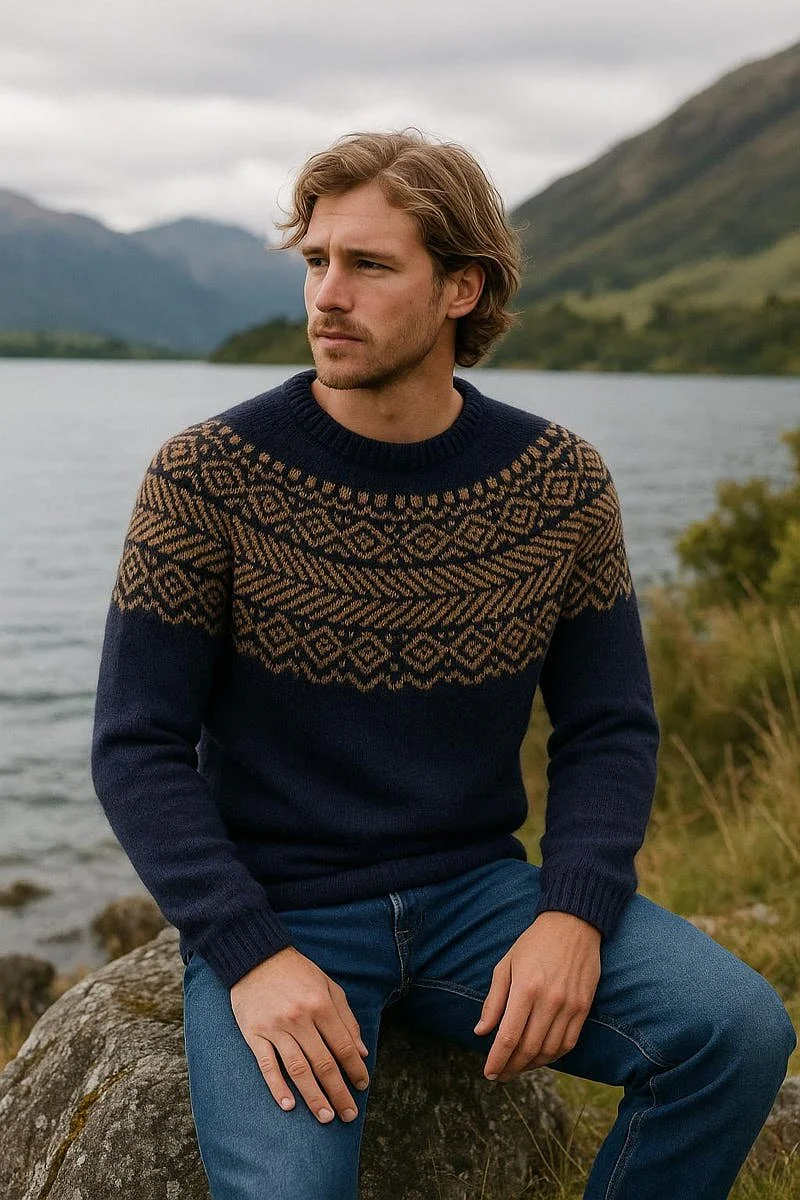
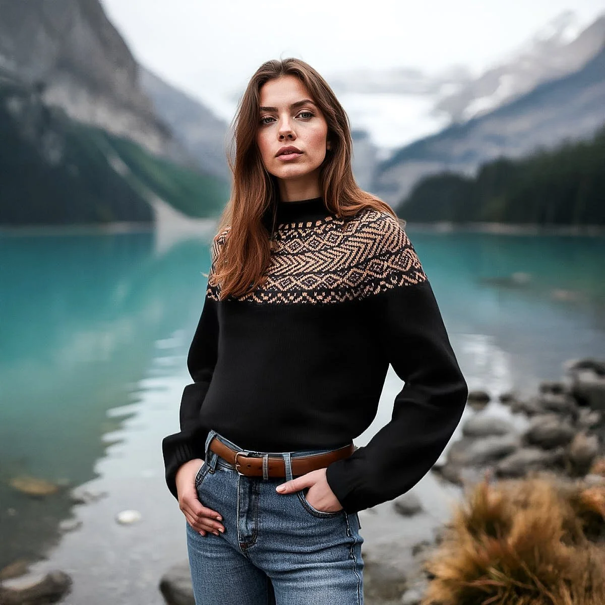
Each piece starts with material selection: Merino wool, organic cotton, linen. Natural fibers chosen for their quality and origin. Production takes place in Italy, Portugal, and Germany, where every step is clearly defined and carried out with consistency. The result is clothing designed to last, made without synthetics, focused on fit, proportion, and longevity. The current collection continues this approach with knitwear made entirely from Merino wool — soft, breathable, and structurally stable for years of wear.

 
E MILE Magazine SALZWASSER sustainable fashion hamburg herren troyer aus merinowolle in dunkelblau
 
LE MILE Magazine SALZWASSER sustainable fashion hamburg Lennart Henze

SALZWASSER
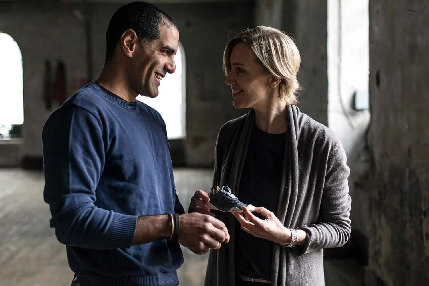
founder: Lennart Henze


Sarah Arendts
What was the starting point for the special quality that defines the brand today?

Lennart Henze
For me, it all begins with a deep love for good products — for things that stay with you for a long time and get better every day. I realized early on that true quality is never a coincidence; it comes from patience, care, and the courage to leave nothing to chance.
I’m fascinated by materials, construction, and tactile experiences — how a fabric falls, how a knit breathes. SALZWASSER was born out of this dedication: the ambition to create clothing that feels substantial, is impeccably crafted, and is not designed for just one season but for a life full of good moments.

The new knit styles made from 100% Merino wool expand your core collection. How did the idea for this collection develop?

The collection emerged from the desire to use natural materials in their purest form.
Merino comes with natural properties: temperature-regulating, soft, breathable — and without any synthetics, it performs better than many technical fibers.
After our more distinctive, technical-looking half-zip sweaters, we wanted to create knits that are even more reduced: simple crewnecks with subtle knit structures — understated and timeless.
Once again, made as a mono-material: no synthetics, 100% Merino wool. For us, this was a logical step — moving away from synthetics and towards a pure, natural material world that harnesses the best performance nature has to offer.

Your half-zip sweaters have long become synonymous with SALZWASSER. When did you realize they were more than just a classic pullover?

When I noticed that we hadn’t just adapted a classic half-zip — we had reimagined it.
The half-cardigan structure, used inside-out, the modern, slightly looser cut — that’s what made it unique. Bolder, more contemporary. And then came the decision to produce entirely without synthetics and even achieve GOTS certification — something rare in this category.
The fact that the sweater was so well received and that we were able to expand it twice through crowdfunding showed us that people value the full package: natural fibers and sustainability, quality, and European production.

Italy, Germany, Portugal — what connects these places for you?

First of all: quality and craftsmanship. Each of these countries has its own textile handwriting, and we value them all. Germany is our home, where everything began — on Norderney, in the far north. Portugal is a place of longing and inspiration for me — the coast, the light, the calm. Italy brings its own warmth and elegance — and a precise textile tradition.
And, of course, there’s something else connecting them: a transparent European supply chain.
Shorter routes, more personal relationships, responsible production. These places are part of our identity — reflected in our colors, our aesthetics, and our sense of nature and timelessnes.

 
LE MILE Magazine SALZWASSER sustainable fashion hamburg nachhaltige mode
 
LE MILE Magazine SALZWASSER sustainable fashion hamburg nachhaltige mode


How do you prevent sustainability from becoming rhetoric?

By not treating it as marketing, but as a mindset. And by enabling people to understand what real responsibility means: natural materials, European manufacturing, transparency. For us, sustainability isn’t a concept — it’s our starting point.

Where does design begin for you?

Design begins for us with reduction and responsibility. We follow a circular textile design approach, focusing on mono-materials, natural fibers instead of synthetics, and long-lasting construction. At the same time, we aim to create a stronger emotional connection to each piece — through timeless, minimalist forms that people can truly live with.
We don’t think in seasonal cycles or collections, but work on a continuous range. Our vision is clear: Focus on Essentials. Design evolves through subtraction — until only what is meaningful, beautiful, and lasting remains.

Timelessness — more about endurance or calm?

For me, timelessness is calm — and from that, endurance follows. A calm cut, reduced details, natural tones that never shout.

What role do places play — sea, light, the North?

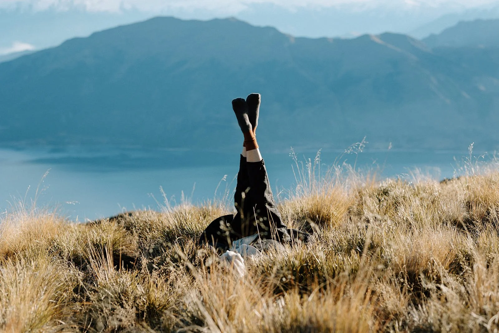
SALZWASSER was born on the rough northern coasts. Coasts have always been places of longing and calm. Traditionally, people living by the sea have mastered a slow, minimalist, and simple way of life. They value durable gear and meaningful experiences with nature — they focus on what truly matters. With a contemporary design approach, SALZWASSER translates this lifestyle and mindset into modern everyday clothing — for city, countryside, and coast. It reminds people of moments of longing and allows a return to what’s essential. Focus on Essentials.

What should people feel when they wear SALZWASSER?

Freedom.

Calm.

And focus on what truly matters.


LE MILE Magazine SALZWASSER sustainable fashion hamburg nachhaltige mode pullover
LE MILE Magazine SALZWASSER sustainable fashion hamburg nachhaltige mode pullover and jeans
 
LE MILE Magazine SALZWASSER sustainable fashion hamburg nachhaltige mode salzwasser fw25
 

SALZWASSER
www.salzwasser.eu

based in Hamburg, Germany
designing timeless essentials from natural fibers — all made in Europe


At SALZWASSER, sustainability means durability, repairability, and transparent production within Europe. Every decision, from the yarn to the finished garment, follows this logic. The aesthetic remains consistent, defined by quiet lines, natural tones and functional clarity. As the brand enters its sixth year, SALZWASSER reaffirms its commitment to creating garments built for purpose and time.

 
LE MILE Magazine SALZWASSER sustainable fashion hamburg nachhaltige mode salzwasser fw25
 
LE MILE Magazine SALZWASSER sustainable fashion hamburg nachhaltige mode salzwasser fw25

DEPORTES MEN SKINCARE - The Discipline of Clarity

DEPORTES MEN SKINCARE - The Discipline of Clarity

.specials
DEPORTES MEN SKINCARE

*The Architecture of Active Skin


written AMANDA MORTENSON


From the first light of morning to the slow stillness of evening, care takes on the form of ritual. Performance Meets Purity — a philosophy that defines DEPORTES Men Skincare with precision and calm purpose.


Founded on a science of structure and endurance, the brand constructs a system of skincare that feels architectural in its balance and measured in its intent. Every formula, every surface, every gesture aligns with a single idea — that skin, like movement, thrives through consistency.


LE MILE Magazine Deportes Mens Skincare

Deportes
Mens Skincare

 
Deportes Mens Skincare Products

Deportes
Mens Skincare


he name carries the tone of vitality. Drawn from the Spanish word for sport, Deportes speaks of discipline, clarity, momentum. The brand approaches skincare as part of a broader physical culture, an extension of the body’s intelligence and an essential part of a healthy, high-performing lifestyle. Within its collection, the gestures of cleansing and hydration echo the rhythm of training, rest, and recovery. The focus remains steady — to maintain balance, sustain energy, and strengthen the surface in tune with the pulse beneath it.

Formulas built from niacinamide, hyaluronic acid, and panthenol create the foundation of this quiet structure. Developed through clinical research and produced sustainably in Europe, each composition follows the skin’s own logic, enhancing its ability to retain moisture, regulate texture, and rebuild strength. The Daily Face Cleanser begins the sequence — a soft foam that clears and resets. The Active Face Cream continues with even tone and moisture retention, sealing resilience into the skin’s structure. The Hydra Gel introduces cool clarity, while the Eye Roll-On restores focus and energy through touch. Together, they form a disciplined rhythm of renewal, each step leading seamlessly into the next.


Design follows the same philosophy. The collection’s visual language unfolds in white and silver, a study of proportion and tactility. Smooth matte textures catch the light with quiet assurance, the logo pressed into the surface rather than printed across it. The result feels essential and composed — objects that belong on a shelf yet carry the intimacy of tools. Every element functions with precision, from the weight of the bottle to the angle of the typography, balancing surface and substance. Laboratory production in Germany ensures integrity at every stage; each product is vegan and dermatologically tested, formulated without parabens, silicones, microplastics, or synthetic dyes. Transparency and ethical responsibility are integral to the process — translating awareness into the texture of daily care.

 
LE-MILE-Magazine-Deportes-Mens-Skincare

Deportes
Mens Skincare

 
LE MILE Magazine Deportes Mens Skincare

Deportes
Mens Skincare


Through each gesture, the brand proposes a new form of attention. Application becomes a pause in motion — a moment where skin and mind align. The textures interact with temperature and breath, creating continuity between body and awareness. Nothing feels added for effect; everything functions as part of a larger movement that begins with contact and ends in equilibrium. Over time, repetition becomes rhythm, and rhythm becomes presence.


The world of DEPORTES lives at the intersection of architecture and performance. Its language echoes the order of minimal design, the precision of training, and the meditative rhythm of repetition. The collection carries stillness within activity, grace within effort, and form within care. What emerges is a quiet endurance — a balance that extends beyond the surface into the state of being itself. Each product contributes to this dialogue between design and vitality. The line holds its structure through clarity and patience, moving steadily. DEPORTES offers continuity — a way of caring that listens more than it speaks, that builds strength through awareness, and that restores balance through ritual. It belongs to the architecture of daily life, where discipline becomes comfort and renewal becomes form.


LE MILE Magazine Deportes Mens Skincare

Deportes
Mens Skincare

The collection includes the Daily Face Cleanser, Active Face Cream, Hydra Gel, and Eye Roll-On, each formulated for clarity, regeneration, precision. All products are vegan, dermatologically tested, and made in Germany under controlled laboratory standards.

Prices from: Daily Face Cleanser €28, Active Face Cream €42, Hydra Gel €38, Eye Roll-On €34.

Explore the full collection: www.deportesmenskincare.com


Inside Shop Like You Give a Damn - Sustainable Fashion

Inside Shop Like You Give a Damn - Sustainable Fashion

.specials
SHOP LIKE YOU GIVE A DAMN
*A Department Store for the Future of Compassion


written AMANDA MORTENSON


Shop Like You Give a Damn was founded by Alex Jansen, Kim van Langelaar, and Stephan Stegeman to make ethical choices straightforward. Early on, the team tried to verify the ethical claims of brands they admired and discovered that reliable data to separate intention from reality was missing.


Together with a tech partner, they built an AI-supported assessment framework and tested it on a selection of the most ethical brands, but none met every criterion. The lesson became their principle of better, not perfect. The platform has been 100 percent vegan since day one and curates brands around three non-negotiable pillars of animals, people and planet. Its goal is progress backed by proof, with transparency throughout the production chain, fair labour and a smaller footprint. The team has assessed thousands of labels, works closely with more than 150 of them and continues to raise the bar through dialogue, evidence and clear standards.

 
LE MILE Magazine Shop Like You Give A Damn Brand DAWN FW25

DAWN


Shop Like You Give A Damn founding team Kim van Laar, Stephan Stegeman, and Alex Jansen

Shop Like You Give A Damn
founding team: Kim van Langelaar, Stephan Stegeman, and Alex Jansen


Amanda Mortenson
“Better, not perfect” is a central idea behind what you want to communicate. How did this become a guiding philosophy for Shop Like You Give a Damn, and how do you embody it in your decisions?

Stephan Stegeman
“Better, not perfect” became our mantra after an eye-opening experience early in our journey. About five years ago, we set out to verify every ethical claim our brands were making. We give a damn about animals, people and the planet, so it was crucial to ensure every brand on our platform truly aligned with our values — always vegan, fair and as sustainable as possible.

But we quickly hit a roadblock: there wasn’t enough reliable information to say with confidence which brands were genuinely better than conventional fast fashion. That uncertainty kept us up at night. Then a tech startup approached us with an AI-driven tool to verify sustainability claims. We worked together for six months to build a framework and tested it on what we thought were the hundred most ethical brands. The results were humbling — not a single one met all our criteria.

That experience crystallised our philosophy. If we chased perfection, we’d have no brands left to support, and that helps no one. So we decided to champion progress — brands that are proudly vegan, treat workers fairly and work to minimise their environmental impact. Every decision we make starts with asking: is this better for animals, people and the planet? If yes, it’s on the right path. We’ve now assessed over two thousand brands, using that knowledge to keep raising the bar and helping good ones get even better.

In your view, what are the biggest misconceptions people have about “sustainable fashion” and veganism?

One of the biggest misconceptions about sustainable fashion is that it’s actually sustainable. It isn’t — at best, it’s a less harmful version of regular fashion. Producing new clothing always consumes materials, water and energy, and generates waste and emissions. The fashion industry still accounts for around ten percent of global carbon emissions — more than all international flights and shipping combined.

The most sustainable choice is not buying new clothes at all. Using what you already have longer and consuming less is the best way to reduce impact. After that comes reusing, swapping or buying second-hand. If you must buy new, choose responsible brands that use better materials and fair production.

When it comes to vegan fashion, many people don’t realise it’s more than diet — it’s also about what we wear. Materials like wool, silk and leather all involve animal suffering and serious environmental costs. Wool, for instance, often involves painful procedures like mulesing and enormous water use. Leather isn’t just a by-product of meat — it’s its own industry, with chemical-heavy tanning that harms both workers and ecosystems. True vegan fashion means avoiding all animal materials and choosing plant-based or innovative alternatives, from organic cotton to apple, mushroom or cactus leather. It’s not impact-free, but it’s far less harmful.

When you look at materials, what trade-offs do you see most often, and which ones surprise people the most?

When you start really looking into materials, you realise there’s no such thing as a perfect one. Every fabric comes with trade-offs — it’s about choosing what does the least harm while moving the industry in a better direction.
Many people are surprised to learn that most vegan leathers still include some form of plastic, like polyurethane. That’s not ideal, but compared to animal leather — which involves suffering, toxic tanning and high emissions — a responsibly made PU- or bio-based leather is still a better choice.

The same goes for plant-based fabrics. Cotton sounds sustainable because it’s natural, but conventional cotton is extremely water- and pesticide-intensive. Organic cotton is better, but not perfect. Recycled fibres and low-impact blends help, yet they depend on proper recycling systems that don’t exist at scale.

What surprises people most is that natural doesn’t automatically mean sustainable, and synthetic doesn’t always mean bad. A “natural” fibre like wool or silk can have major animal rights and environmental issues, while a recycled polyester might have a smaller footprint if it’s kept in circulation.

At Shop Like You Give a Damn, we try to navigate those grey areas honestly. We look for what’s vegan, fair and more sustainable — accepting imperfection while supporting innovation. Real progress happens not when we find one flawless material but when the entire industry shifts its mindset from exploitation to responsibility.

How do you draw the line between what’s “good enough” and what’s still too problematic?

For us, the line starts with being 100 percent vegan — that’s non-negotiable. From there, we ask whether something is genuinely better than the mainstream alternative. That means no greenwashing, no empty buzzwords — just real, evidence-based improvement.

We have clear internal guidelines on what materials we accept. Products must be made from fabrics that are not harmful to animals and significantly less harmful to people and the planet. On labour, it gets more complex. Ideally, every worker earns a living wage, but not every region is there yet. Sometimes a verified minimum wage plus transparent progress toward a living wage can be acceptable for now. The key word is progress.

So “good enough” doesn’t mean perfect; it means effort, transparency and direction. If a brand is vegan, pays fairly and uses better materials, we’re happy to stand behind them. But if any of those pillars — animals, people or the planet — are missing, it’s not good enough.

You require sellers to adhere to your values. How do you support them in improving over time?

When we assess brands, we ask a lot of difficult questions and explain why certain choices don’t meet our standards yet. Even if a brand isn’t ready to join us right away, we often see them come back after improving.

We’re now working with over 150 brands, so we have a good understanding of where they tend to struggle and what helps them grow. Our goal is to use that shared knowledge to bring brands together, because this isn’t a competition. If we want to change the fashion industry, we need to do it collectively. One twig breaks easily, but a bundle doesn’t. That’s how we see ethical fashion — as a community. In the near future, we want to invest even more in that network, helping brands learn from each other and expand our collective impact.

 
LE MILE Magazine Shop Like You Give A Damn Brand KnowledgeCotton Apparel

KnowledgeCotton Apparel

 
LE MILE Magazine Shop Like You Give A Damn Brand Kings of Indigo AW25

Kings of Indigo


How do you communicate nuance or “imperfection” to your customers, without alienating or confusing them?

We try to be as factual and transparent as possible. That means saying we’re “more sustainable,” not “sustainable.” It might sound small, but it matters. Every product has an impact, and the goal is to make that impact smaller — not to pretend it doesn’t exist.

We remove vague or misleading claims like “eco-friendly” unless there’s real proof. And we make sure our language never excludes or offends anyone. Ethical shopping should feel approachable, not moralising. When people buy from us, we want them to know they’re making one of the best choices available — not a perfect one, but a conscious one that’s better for animals, people and the planet.

Recently, Shop Like You Give a Damn acquired the website of NOAH Italian Vegan Shoes. What motivated that move, and how will you integrate its legacy?

Our decision came from deep respect for NOAH’s pioneering role in vegan fashion and a shared desire to carry its mission forward. Founded in 2009, NOAH spent sixteen years proving that high-quality design can be completely vegan and ethical. It was one of the first brands we partnered with after our launch in 2018 and had long been a pillar of the community.

When NOAH announced its closure, we didn’t want that legacy to disappear. By acquiring its website, we can ensure that everything it built continues — its vision of compassionate, high-quality vegan fashion will live on and reach new audiences.

As you scale, what are the hardest tensions you face?

One of the hardest parts of running a sustainable company is making choices that are good for sustainability but bad for business. We’ve onboarded brands that customers love but later had to remove because they no longer met our standards.

It’s tough, because building a truly ethical business is difficult. Many brands and platforms have disappeared for that reason. But to make a real impact, a company also needs to earn enough to sustain its team. Only then can it continue to drive change. Balancing credibility and survival is never easy, but it’s essential.

What keeps you and your team motivated?

Most people in our company are vegan for the animals, and that shapes everything we do. It’s about compassion — making sure we don’t exploit people or destroy the planet. Even in hard times, when resources are tight or things get complicated, those values keep us inspired and focused on why we started this in the first place.

Looking ahead five to ten years, what do you dream Shop Like You Give a Damn could become?

I hope that in the next decade we’ll be the leading vegan, fair and sustainable fashion marketplace in the world. I want us to continue raising awareness about the problems in fast fashion while offering people an easy, enjoyable and trustworthy alternative.


LE MILE Magazine Shop Like You Give A Damn Brand KOMODO AW25

KOMODO

 
LE MILE Magazine Shop Like You Give A Damn Brand SUITE13LAB

SUITE13LAB


SHOP LIKE YOU GIVE A DAMN
www.shoplikeyougiveadamn.com

based in Amsterdam, The Netherlands
offering over 20,000 vegan, fair and sustainable products


A recent step reflects that approach with the acquisition of the website of NOAH Italian Vegan Shoes, preserving the legacy of a pioneer in vegan fashion and keeping its mission accessible. For Stephan, it comes down to building a credible way to buy with less harm, buy better and keep compassion at the center of commerce.

 
LE MILE Magazine Shop Like You Give A Damn Brand Kuyichi

Kuyichi

 
LE MILE Magazine Shop Like You Give A Damn Brand Thinking MU AW25

Thinking MU

LE MILE Magazine Shop Like You Give A Damn Brand Rotholz AW25

Rotholz

One House - Art of Modular Homes

One House - Art of Modular Homes

.specials
ONE HOUSE
*Crafting Modular Living with Precision and Purpose


written SARAH ARENDTS


Form and precision meet in silence as ONE HOUSE unfolds its idea of how furniture should live with people. The German brand shapes a language of modular design, where every line and material decision grows from clarity and calm.


From its workshops in Germany, ONE HOUSE carries a spirit of Dutch-inspired minimalism through regional craft, building sofas, tables, and chairs that feel considered, measured, and alive. The phrase Dutch Design made in Germany describes a method where design is aesthetic and ethical, an approach that holds production and thought within the same gesture.

 
LE MILE Magazine One House Design Furniture Maatje Lounge Chair

ONE HOUSE
Maatje Lounge Chair

 
LE MILE Magazine One House Design Furniture Meester Sofa

ONE HOUSE
Meester Sofa


The foundation rests on three principles—local production, original design, and transparent pricing. Together they form a system that resists haste and honors the slow rhythm of making. Each piece feels like an open surface waiting for its owner’s life to fill it. The restraint of its forms creates room for rhythm, conversation, and quiet occupation.

The modular sofa collections trace this logic in movement. Every element connects through proportion, expanding and reducing with ease. A living space becomes many rooms inside one, shifting with the needs of work, rest, or gathering. The construction is meticulous, the seams deliberate, the volumes soft yet precise. The language of ONE HOUSE remains visible in these alignments, where comfort becomes composition and the gesture of sitting holds structure and care.


Ethics are woven into every layer of production. The principle of No Fast Furniture moves through the workshops like a silent code. Materials are sourced through local networks, every decision tied to the idea of longevity and traceable making. Dining tables hold the weight of daily life with grace, their wooden or metal frames shaped for continuity. Chairs stand nearby, attentive to their surroundings. Rugs and accessories add small changes of tone, creating rooms that breathe easily and hold light.

The identity of ONE HOUSE builds gradually through repetition and attention. Each action in the company, from the way fabrics are presented to how spare parts are supplied, speaks through openness. The showrooms in Hamburg and Munich extend that clarity into space, offering a kind of lived transparency. The furniture can be touched, reconfigured, and understood without distance.

 
LE MILE Magazine One House Design Furniture Hoogland Dining Table and Mattje Chairs

ONE HOUSE
Hoogland Dining Table + Mattje Chairs

 
LE MILE Magazine One House Design Furniture Maatje Chairs

ONE HOUSE
Maatje Chairs


Among the collections, the Bolder sofa has become emblematic of the brand’s sense of proportion and restraint. The design has received recognition from design institutions, yet the work inside ONE HOUSE continues with the same steady rhythm. Every new project returns to the same questions of scale, material, and structure. The home remains the field where design and use meet in quiet collaboration.

The word house carries more than architectural meaning. It holds belonging, continuity, and presence. ONE HOUSE turns this word into practice, creating furniture that forms part of the daily choreography of life. Sofas that shift with time, tables that anchor memory, chairs that translate rest into geometry. The pieces align with the lives around them, forming small frameworks of stability inside movement.


To sit on a ONE HOUSE sofa is to sense the intelligence of the joinery, the balance of the stitching, the calm held in its weight. Each surface has been thought through until it reaches stillness. The result is a furniture language that values patience over noise and persistence over novelty. This patience becomes its own form of elegance, measured not by spectacle but by duration.

ONE HOUSE exists inside the rhythm of everyday life. The furniture follows that rhythm, adjusting to it quietly. The designs speak in proportion and tactility. They reward attention, not urgency. They invite touch, not display.

For readers of LE MILE, the appeal lies in this ongoing conversation between craft and presence. ONE HOUSE creates pieces that grow with the people who use them, furniture that welcomes time rather than resists it. Every surface, joint, and contour speaks the same language of grounded modernity.


The collection includes adaptable sofas, dining tables, and chairs built with precision and longevity in mind. Every piece follows the brand’s No Fast Furniture ethos, crafted in Germany with traceable materials and calm design logic.

Prices from: sofa modules €790, dining chairs €320, dining tables €1,290, accessories €95.

Explore the full collection: www.onehouse.de

 
LE MILE Magazine One House Design Furniture Marbe Table

ONE HOUSE
Marble Side Table

LE MILE Magazine One House Design Furniture ONE HOUSE Marble Side Table
 

The idea of one house extends through every decision. It brings together maker and dweller, production and experience, design and use. The result is a home that feels both structured and free, a place that carries memory while remaining open to change. In this rhythm, design becomes a state of attention. Rooms unfold with purpose. Life arranges itself around lines that endure. This is ONE HOUSE—a study in clarity, movement, and the calm persistence of form.

A Trip to Hamburg with Kids at Barceló Hotel

A Trip to Hamburg with Kids at Barceló Hotel

.culture vulture
City Days and Quiet Evenings
*Our Family Story at Barceló Hamburg


written AMANDA MORTENSON


We arrived in Hamburg on a Monday morning, the air cool and a little damp, the streets wrapped in that early-week calm that cities only have when the weekend rush has passed.


The train slid into the main station, and within minutes we stood at the entrance of Barceló Hotel Hamburg, our suitcases rolling over cobblestones, the children half-awake but already pointing at the boats drifting on the Binnenalster. The hotel’s glass façade caught the light in a quiet way, and stepping inside felt like exhaling — warm air, soft colors, an easy welcome.

Our Family Junior Suite became home almost immediately. A long window stretched across the room, framing the city like a slow-moving film. The children ran from bed to sofa, testing every corner, while we unpacked and made coffee, grateful for the stillness that comes after travel. The room carried an understated elegance — wooden floors, neutral tones, thoughtful details that made sense for families: enough space for toys and jackets, a large table that turned into a drawing station, a bathroom big enough for the entire bedtime routine without chaos.

 
BARCELO Hotel Hamburg building LE MILE Magazine

Barceló Hotel, Hamburg
Exterior

 
Barcelo Hotel Hamburg Junior Family Suite LE MILE Magazine

Barceló Hotel, Hamburg
Family Junior Suite


By midday we were already out, walking toward the Binnenalster, the lake only a few minutes away. The children watched boats pass under the bridges, and stopped at every kiosk that sold roasted nuts. The hotel’s location placed us exactly where the city opened in all directions — toward the shopping streets, the old arcades, the parks, and the harbor. Everything was reachable on foot or by a short U-Bahn ride, which quickly became part of the adventure.

That first day set the tone. Each morning began in the hotel restaurant, where the buffet became an event of its own — pancakes, fruit, small pastries, and the quiet hum of travelers starting their day. The children discovered that the orange juice machine could be operated without help, a small victory that defined their mornings. After breakfast we planned loosely, letting the weather decide: a visit to the Miniatur Wunderland, hours spent watching tiny trains cross landscapes; an afternoon at the Planten un Blomen Park, where autumn leaves turned the ground into a soft mosaic; short stops for coffee and cocoa in between, always ending with a slow walk back to the hotel.


Evenings carried their own rhythm and sometimes we ate at the B-Lounge, the hotel’s restaurant with its open design and calm lighting, where the children shared pasta while we tried local fish and a glass of Riesling. Other nights we brought back sandwiches from a bakery nearby and turned the suite into a small picnic, the city lights glowing through the window. The sense of ease came from the balance the hotel created — close enough to everything, yet quiet enough to feel completely private.

Halfway through the week the weather changed, rain sweeping across the city, but even that felt part of the experience. We spent that afternoon inside, the children building Lego cities on the carpet while we watched the clouds shift over Hamburg. The large window turned into a screen of light and sound, the rain rhythmic, the city still visible through it.

 
Barceló Hotel Hamburg Restaurant

Barceló Hotel, Hamburg
B Lounge

 
Barceló Hotel Hamburg Restaurant

Barceló Hotel, Hamburg
B Lounge


By day three the children already called the hotel “our house.” They knew every corridor, every shortcut to the elevator, and where to find the best spot in the lobby for people-watching. On Thursday morning, before leaving, we walked once more around the Alster. The air felt crisp, the trees golden, and the city moved at a slow pace that matched our own.

Back in the suite, we packed slowly, looking out at Hamburg’s skyline one last time. The stay had unfolded without hurry — days filled with small discoveries, moments of calm, and the comfort of a place that understood families without turning family travel into routine. Barceló Hamburg held all of it, the light of the city, the rhythm of daily life, and a quiet sense of belonging that stayed even after we left. Thanks for having us!


discover more > BARCELÓ HAMBURG


ART BRÜT
 - Berlin Perfume House

ART BRÜT
 - Berlin Perfume House

.specials
Inside ART BRÜT

*A Berlin Perfume House Expands Its World with Je Ne Regrette Rien


written SARAH ARENDTS


Berlin drifts through the senses like a half-remembered song, full of movement and invention, and somewhere within its steady pulse, Daniel Matousek builds ART BRÜT.


A perfume house that treats scent as a raw language of experience rather than decoration, a medium that carries emotion the way light carries dust. Founded in the heart of Europe, ART BRÜT unfolds through intuition and intellect in equal measure, through a curiosity that refuses to settle, through a creative rhythm that treats imperfection as its truest form of grace.

 
LE MILE Magazine ART BRÜT Parfums Berlin Chasing Ghost Clouds
 
LE MILE Magazine ART BRÜT Parfums Berlin
 

Daniel Matousek, trained through years of beauty and fashion photography, learned early that every image holds a scent and every scent carries an image. His transition into perfumery followed the same inner tempo, he began shaping atmospheres instead of frames, moods instead of compositions, always in pursuit of what he calls the essence of freedom. ART BRÜT emerged from that pursuit as a studio where fragrance becomes reflection, where luxury translates into awareness, and where the material of scent functions as a bridge between instinct and intellect. Every perfume starts its journey at the rice board in Berlin, where Daniel Matousek sketches emotion in notes and gestures, later carried to Paris and refined in collaboration with the perfumers of FLAIR. The partnership flows like a shared language — a conversation about precision and imagination, about the ways chemistry and intuition can occupy the same space without hierarchy. The process ends in Bavaria, at the Dirnberger Mühle, a family atelier whose patience and craftsmanship turn formulas into tangible presence. This triad — Berlin, Paris, Bavaria — forms the invisible structure of ART BRÜT’s world: trust, craft, creation, each relying on the other with quiet devotion.


Among the house’s creations, JE NE REGRETTE RIEN, composed by Amélie Bourgeois, stands as a declaration of vitality. The name reads like a raised glass, a pulse, a line spoken into the night. Bourgeois builds the fragrance around tension and release, drawing from the rhythm of excess that follows celebration. The opening carries the electricity of bergamot, lemon, grapefruit, and fresh ginger — a kinetic burst that floods the senses and settles into the velvet warmth of rose and geranium. Beneath this brightness lies an earthy heart of black truffle, surrounded by white musks, cashmere wood, and sandalwood, a structure that holds the perfume in a slow and luminous breath. The composition behaves like a city at dawn, where the air glows from the residue of movement and every molecule holds light and weight.

Daniel Matousek speaks of perfume as a mirror, and each formula reflects a state of being rather than a mood; each bottle exists as an artifact of process. ART BRÜT’s design language follows that thought — heavy glass with matte surfaces, typography reduced to its essential rhythm, labels printed with slight irregularities that reveal the trace of human touch. Nothing within the brand asks for perfection; everything exists through presence, through the physical fact of its making.


LE MILE Magazine ART BRÜT Parfums Berlin Je Ne Regrette Rien 50ml Packaging

ART BRÜT
scent: Je Ne Regrette Rien 50ml

The philosophy of ART BRÜT finds its clarity in this cycle — conception, collaboration, creation, reflection. Every element exists within continuity, each action leads to another. The perfumes record these movements, leaving traces of human thought embedded in material form. JE NE REGRETTE RIEN embodies that continuity. The fragrance moves without pause, carrying a single direction — forward. It expresses acceptance through abundance, strength through sensitivity, art through scent. Within its trail lives a single affirmation: the moment already holds everything. And in that affirmation, ART BRÜT speaks the language of freedom — a language built from curiosity, devotion, and the unrepeatable pleasure of experience itself.

check more: www.artbruet.com


LE MILE Magazine ART BRÜT Parfums Berlin White Musks Creative
 
LE MILE Magazine ART BRÜT Parfums Berlin German Angst Scent 50 ml Collage

ART BRÜT
scent: German Angst 50ml


The ethical dimension of ART BRÜT runs parallel to its aesthetics. Each fragrance is vegan, cruelty-free, CITES certified, shaped through a supply chain that lives entirely within Europe — caps from Poland, bottles from Italy, perfume oils from France — a network built around conversation. This European fabric defines the texture of the brand: transparent, interconnected, human. Every bottle carries that geography in its weight.

JE NE REGRETTE RIEN functions as perfume and statement, it channels the exhilaration of the incomplete moment, a sensory architecture that invites the body to inhabit time more fully. Bourgeois writes emotion into structure — a circular composition where citrus dissolves into wood, where brightness folds into gravity, where the scent remains suspended between pulse and calm. The result feels continuous, fluid, never ornamental, always alive.


Inside ART BRÜT’s philosophy, art belongs to life, and life enters art without threshold. The house extends beyond fragrance into installations, collaborations, and experiments like AI AM JESUS, a multisensory work with the artist BASD-ART that merged poetry, image, and scent into a single space of perception. These gestures reflect the same purpose that moves through the perfumes themselves: to open awareness, to transform observation into intimacy. For Daniel Matousek, creation acts as a gesture of trust. Each project grows from friendship, each collaboration from conversation. ART BRÜT is less a company, more a collective rhythm held by people who share an affection for authenticity, for things made with care and consequence. That affection runs through JE NE REGRETTE RIEN, giving it the quiet dignity of work created in faith — faith in craft, in emotion, in the moment that follows excess and still breathes light. And when applied, the fragrance settles into the skin like a memory still unfolding, expanding through warmth rather than projection. The scent aligns with the body’s own rhythm, forming a personal tempo that changes with air, time, and pulse. In this intimacy, the perfume performs its purpose: it turns awareness into experience.


LE MILE Magazine ART BRÜT Parfums Berlin Wet Dreams Scent 50 ml

ART BRÜT
scent: Wet Dreams 50 ml


all visuals (c) ART BRÜT


MAY Citybike

MAY Citybike

.specials
MAY Ltd.
*Bicycles in Their Purest Form


written SARAH ARENDTS


In Zurich, a graphic designer began rethinking how a bicycle could look and feel in the context of city life. What started in 2017 as a personal design study became a refined approach to everyday movement.


The first models appeared in 2018, shaped by the idea that precision and simplicity can coexist. From this, MAY developed, focused on proportion, quality materials, and on clarity of form. The bicycles quickly found an audience that values understatement and careful design.

 
MAY Minimalist Citybikes Urban Commuter Bikes Le Mile Magazine
 
 
MAY Minimalist Citybikes Urban Commuter Bikes Le Mile Magazine
 

Since 2023, Alex and Timo have continued this direction, they work from Zurich, where they design and coordinate production. The bicycles are assembled in Portugal and distributed through warehouses in Switzerland and Germany. Each step reflects the brand’s approach, a timeless design and functional purpose.
The YIWU+ continues this line of thinking, its steel frame with lugged forks refers to classic racing geometry while adapting it for today’s city use. The inspiration reaches back to the 1970s Giro d’Italia, when bicycles combined efficiency with elegance.


The model is available in Petrol Grey and Chrome, the frame weighs 11.3 kilograms and is equipped with an eight-speed Shimano system. Slightly wider tires add stability and comfort in urban traffic, each element is built for function and long-lasting use. The YIWU+ is designed for balance, between agility and stability, between strength and weight. The frame lugs add visible reinforcement, expressing the construction.


MAY Minimalist Citybikes Urban Commuter Bikes Le Mile Magazine
 
MAY Minimalist Citybikes Urban Commuter Bikes Le Mile Magazine
 

MAY’s work follows three ideas of timeless aesthetics, functional design and direct production. Timeless aesthetics remove everything unnecessary and keep what defines the bicycle’s character, functional design connects form and performance and components such as the 8-speed shifting or the precise welds are chosen for reliability and clean execution.
Direct production means involvement at every stage, ensuring traceable quality and consistent results.


The YIWU+ moves easily through the city, the gearing responds directly, the frame stays quiet and stable, and the proportions feel deliberate. MAY keeps refining the way a bicycle moves, shaping a rhythm where design and use merge into one continuous experience. Enjoy Yourself.


MAY - Minimalist City Bicycles
www.may-ltd.com

Operating from Zurich, Switzerland
Assembly: Portugal
Models: YIWU+ (Petrol Grey | Chrome) • YIWU (Chrome | Night Blue | Bordeaux | Rosé Pearl)


LUNETTES Selection Berlin - Vintage Eyewear

LUNETTES Selection Berlin - Vintage Eyewear

.specials
The LUNETTES SELECTION Experience
*Vintage Eyes, Modern Rituals


written AMANDA MORTENSON


In the quiet hum of a Berlin street, a visitor steps into LUNETTES SELECTION and enters a different time. Eyeglasses carry identity, memory, and design. Since its founding, LUNETTES SELECTION has built a world where frames communicate, spaces respond, and vision unfolds as a poetic act.


LUNETTES SELECTION emerged from a pursuit almost cinematic in its specificity: to find frames that do not yet exist in one’s wardrobe, to uncover exceptions. Its archive of never-worn vintage eyewear — salvaged from opticians’ inventories and manufacturers’ storerooms — constitutes a measured museum of form. Each piece acts as an invitation, in Berlin and across other cities, LUNETTES SELECTION gathers collectors, costume designers, and seekers of individuality who explore its “archive eyewear” with a sense of ceremony.

 
Lunettes Selection Vintage Eyewear in Berlin Le Mile Magazine
 
Lunettes Selection Vintage Eyewear in Berlin Le Mile Magazine
 

In 2011, LUNETTES SELECTION introduced its own line, the LUNETTES Kollektion, conceived in Berlin, handcrafted in Italy. These frames, realised in Mazzucchelli cellulose acetate, bear the same reverence for material, color, and detail that animates the vintage curation. The collection progresses with quiet confidence, never loud, tethered always to vision as a personal narrative.

LUNETTES SELECTION extends beyond eyewear into the experience between object and wearer, between object and space. Its Berlin boutiques in Mitte, Charlottenburg, and Prenzlauer Berg exist as stages for vision and interior. Each location carries shared elements—linoleum floors, a tactile palette in harmony with acetate tones—and reveals its own architecture of encounter.


The Charlottenburg store, realized by designer Oskar Kohnen, functions like a refined mise-en-scène. A pastel-green apothecary cabinet climbs to the ceiling, drawers that invite curiosity and discretion. A white-cube shell frames iconographic furnishings: a Hank Kwint side table, a Jacques Adnet rolling cart, two Pierre Paulin “Butterfly” chairs. Underfoot, restored 1970s marble floors gleam, while a sculptural lamp by Sebastian Summa asserts presence without dominance. The atmosphere carries poetry and precision, forming an architectural lens for viewing eyewear.
At the Torstrasse location, Kohnen’s transformation creates a chamber of wonder. The space unfolds as a blue-toned dialogue, where frame histories appear as curated curiosities. Marienburgerstrasse’s boutique, defined by polished concrete, card catalog–style cabinets, and vintage lighting, presents a cinematic rhythm.

 
Lunettes Selection Vintage Eyewear in Berlin Le Mile Magazine
 
Lunettes Selection Vintage Eyewear in Berlin Le Mile Magazine
 

Behind every frame is an eye test conducted with care and LUNETTES SELECTION reclaims the slower, handwritten craft of subjective refraction, inviting patrons into a relation with their own perception. This act aligns with the brand’s ethos that intimacy with the instrument of vision is itself part of the aesthetic.

Through its Journal, LUNETTES SELECTION narrates alliances — with makers, artists, stories. Highlights from Petites Lunettes, its children’s eyewear initiative, appear beside collaborations, archival essays, and explorations of optical heritage. The text gestures outward, placing LUNETTES in dialogue with design, film, even myopia management.


The brand speaks through calm precision, it listens, collects, edits, and opens space. Within this dialogue between object and subject, LUNETTES SELECTION shapes a quiet insistence, choosing how we see becomes a reflection.

Stepping outside, the visitor carries a trace of the place — a resonance where design, history, and vision meet. LUNETTES SELECTION exists as an interface, curated and alive to the gaze. Enjoy Yourself!


LUNETTES SELECTION Vintage and Handmade Eyewear www.lunettes-selection.de

Locations: Torstrasse 172 | Marienburgerstrasse 11 | Bleibtreustrasse 55, Berlin / Prices range from Optical frames €280, sunglasses €320, vintage archive pieces from €220.


SUITE702 x Martens & Martens 2025

SUITE702 x Martens & Martens 2025

.specials
SUITE702 x Martens & Martens
*The Art of Everyday Colour


written SARAH ARENDTS


Colour lives differently in the hands of artists. It carries rhythm, emotion, and a kind of silence that speaks through form. In Amsterdam, SUITE702 has built a reputation for giving daily rituals that same sense of artistry — soft geometry, playful tones, and fabrics that invite touch.


Founded by Shirley Muijrers and Olaf Arkauer, the brand believes that the bedroom and bathroom are spaces of reflection, of optimism, of joy. Their newest chapter brings this philosophy to life again through a collaboration with Martens & Martens, the design studio of the celebrated Dutch artist Karel Martens.

 
LE MILE Magazine Suite702 Martens and Martens Collection products
 
LE MILE Magazine Suite702 Martens and Martens Collection products
 

The new Martens & Martens Collection transforms functional textiles into living compositions. Made from luxurious, combed cotton and inspired by Martens’ 2017 art project Colours on the Beach, the collection plays with rhythm and structure. Each towel features a signature stripe on both sides, each with a different width and hue — a quiet nod to the artist’s fascination with repetition and variation. “The artistic view of colour and composition by Martens & Martens fits seamlessly into our design vision,” says Shirley Muijrers, co-founder of SUITE702. “This collection is both a tribute to Colours on the Beach and a successful translation of art into functional textile – with a beautiful balance between aesthetics, quality, and playfulness.”


That balance defines SUITE702’s universe; since its founding in 2018, the Amsterdam studio has become a symbol of modern comfort — bold colour, simple geometry, and an ethical approach to luxury. The brand’s world is guided by a single mantra: The SUITE Life — a state of being that turns moments of rest into gestures of art.

The collaboration with Martens & Martens extends that idea into the bathroom, where texture meets tone. Twelve expressive colours, twenty distinct designs, one shared sensibility. Vibrant shades blend with subtle ones across an ecru base, creating visual harmony that feels effortless and precise. The result is a collection that radiates warmth and clarity — towels, bath mats, guest towels, and beach pieces woven with thoughtful detail.

 
LE MILE Magazine Suite702 Martens and Martens Collection towels
 
LE MILE Magazine Suite702 Martens and Martens Collection products
 

Every element of the collection is GOTS-certified, made from the highest-grade combed cotton. The structure is dense and refined, offering a soft, almost weightless sensation on the skin. Sustainable luxury becomes tactile, immediate, and quietly joyful. Muijrers speaks of the collaboration with an energy that feels contagious. “The vibrant colours and geometric designs of Karel Martens fit our brand perfectly. I’ve always been a fan of his work and feel proud to collaborate with him. The result is fantastic – everything aligns beautifully. It’s wonderful to bring so many colours together in one collection. I’m convinced that it will bring a touch of colour to many bathrooms.

Her words capture the essence of SUITE702 — an optimism that turns everyday design into a shared celebration. Within the studio’s philosophy, colour is not a surface element; it is emotion rendered visible. Each stripe becomes an idea, a dialogue between order and spontaneity.


The Martens & Martens Collection continues SUITE702’s long-standing collaboration culture, inviting creative minds to reinterpret domestic space. Previous projects with artists such as Isabelle Wenzel have blurred the line between art installation and home object. Here, the conversation takes place in cotton and thread, a sensory continuation of Martens’ conceptual world.

From the Amsterdam studio to the ateliers in Portugal, every step of the production process follows SUITE702’s ethics of craftsmanship. Materials are traced, workers respected, and design treated as a shared craft. The towels are made to last as companions in the rhythm of everyday life.

The brand’s story continues to travel, its collections are available through suite702.com and in leading stores including Le Bon Marché Paris, Manufactum Germany, and the MoMA Design Store New York. Yet SUITE702 remains rooted in intimacy — in the texture of the morning, the softness of a towel, the warmth of a room filled with colour.


discover the new Martens & Martens Bath Collection: www.suite702.com

Prices from: Guest towel set €32.50, hand towel €22.50, bath towel €42.50, bath mat €44.95, beach towel €64.95.


With Martens & Martens, SUITE702 reaffirms its vision of functional beauty. Each design acts as a reminder that art can live in the smallest gestures — a folded towel, a stripe of colour, a texture against the skin. It is a collection for dreamers who live by the light of form and for those who believe that luxury begins with awareness. Enjoy yourself.

WHITE Milano September 2025

WHITE Milano September 2025

Inside WHITE Milano 2025
*New Visions, Emerging Voices, Global Connections


WHITE Milano returns to the Tortona Fashion District from September 25 to 28, reaffirming its role as a stage where the global fashion system meets craft, research, and identity.


With 364 exhibitors, supported by partnerships with institutions such as MAECI, ICE, the Municipality of Milan, and the Lombardy Region, the exhibition creates a vision of the Spring/Summer 2026 season that is anchored in innovation and guided by sustainability. Its direction is international and precise, reaching into new markets and strengthening Milan’s position as the place where creative languages converge.

 
LE MILE Magazine WHITE Milano 2025 September Edition Brand BAJA

WHITE Milano
2025 September Edition
Brand CLARA PINTO

 
LE MILE Magazine WHITE Milano 2025 September Edition Brand CHUNCHEN

WHITE Milano
2025 September Edition
Brand CHŪNCHÉN


The theme of this edition develops through new structures and projects, among them the inaugural RLC Fashion Summit at MUDEC on September 25, an invitation-only gathering that brings together leaders from fashion, retail, and luxury. It reflects the ambition of WHITE to act as marketplace and laboratory, aligning commercial exchange with broader dialogues about the structural shifts shaping the industry. Alongside the summit, initiatives such as ExpoWHITE, Inside White, and WHITE Resort expand the exhibition’s perimeter, offering spaces that showcase cross-cultural creativity, resort and leisure fashion, and experimental approaches to design. Secret Rooms once again highlight talent through an immersive format, placing the focus on identities that carry strong aesthetic signatures and cultural depth.

In this atmosphere, certain presences define the pulse of the edition. CLARA PINTO is a London-based brand exploring innovation through traditional wool felting techniques. Founded in 2019, it has gained international recognition for its sculptural, material-driven approach, reinterpreting the role of wool in contemporary design through craftsmanship rather than technology. From Colombia, Manuela Alvarez continues her path of building bridges between ancestral handwork and global design, and her collaboration with Adidas extends this narrative into a sphere where artisanal codes merge with the technical imagination of sportswear. The result is a dialogue that amplifies the voice of independent craftsmanship and the reach of global production, presented within the context of WHITE’s curatorial stage.


Scandinavian presence finds expression in RENÉ Copenhagen, founded by Jens Skov Østergaard, whose voluminous silhouettes and fluid tailoring channel a sensibility that draws on heritage while projecting forward with utilitarian clarity. The brand’s aesthetic enters Milan with strength, expanding the exhibition’s geography while affirming the role of Copenhagen as an epicenter of cultural fashion energy. Italian craft is given a distinct accent through RIEN Studio, which has chosen to concentrate on a single product, a shoe that merges the function of a slipper with the elegance of a design object. Its appearance at WHITE Resort emphasizes how simplicity, when mastered, can define a whole vocabulary of style. HIDESINS adds a different tone, presenting a collection marked by architectural volumes, material experimentation, and a sense of power in silhouette, reinforcing the importance of bold design languages in shaping the visual direction of the season. Joining from Asia, CHŪNCHÉN introduces garments conceived with precision and material awareness, extending the reach of the fair into a new cultural horizon and giving voice to a rising creative identity with strong narrative depth.


WHITE Milano
2025 September Edition
Brand HIDESINS

 
LE MILE Magazine WHITE Milano 2025 September Edition Brand MAZ MANUELA ALVAREZ x ADIDAS

WHITE Milano
2025 September Edition
Brand MAZ MANUELA ALVAREZ x ADIDAS

LE MILE Magazine WHITE Milano 2025 September Edition Brand SPEKTRE eyewear

WHITE Milano
2025 September Edition
Brand SPEKTRE


These presences coexist with an extensive program that includes Spanish, Indian, Armenian, Brazilian, Romanian, and South African designers, each contributing unique cultural stories that expand the collective vision of the exhibition. At Superstudio, BASE, and other Tortona venues, visitors encounter installations, fashion-art dialogues, and showcases that underline the multiplicity of voices brought together under WHITE. Highlights include the Flavio Lucchini retrospective at the FLA Museum and Roberto Miglietta’s sculptural explorations at BASE, which situate fashion within an expanded artistic framework.


By curating this complex ecosystem, WHITE Milano September 2025 embodies a direction that is curatorial and connective. It stages a landscape where identities as diverse as BAJA, Alvarez with Adidas, RENÉ, RIEN Studio, HIDESINS, and CHUNCHEN take their place among global peers, forming a collective voice that resonates across continents. In doing so, the exhibition affirms its purpose: to be a meeting point where craft, innovation, and vision define the present and shape the future of fashion.


The Charles Hotel - A Munich Story

The Charles Hotel - A Munich Story

.culture vulture
THE CHARLES HOTEL
*Rooms of Art, Gardens of Light


written ALBAN E. SMAJLI


Munich in late light, the park leaning against the city like a velvet cushion, and in the middle of that green hush stands The Charles Hotel, big shouldered yet strangely gentle, all windows and reflections, with rooms that look across trees that refuse to bow to glass and steel.


You arrive, and it feels less like checking into a hotel and more like slipping into a frame already painted, the old botanical garden at your feet, the towers of the city humming somewhere behind, the soundtrack softened by leaves. The thing about staying here is that you start walking and suddenly the city is yours. Five minutes to Königsplatz, a drift down to Marienplatz, a shortcut into museums and markets, all by foot, as if Munich has been tailored to your pace. Yet when you turn back, when you push open the doors again, you’re greeted by the stillness of a park. It’s an odd and satisfying trick—the ability to hold pulse and pause in the same space.

 
LE MILE Magazine The Charles Hotel The Charles Hotel Monforte suite study

Rocco Forte Hotels
The Charles Hotel, Monforte Royal Suite

 
LE MILE Magazine The Charles Hotel The Charles Hotel Monforte Suite study room

Rocco Forte Hotels
The Charles Hotel, Monforte Royal Suite


Inside, it unravels in layers. The spa first, an entire floor given over to water and steam and that pool—long, luminous, unapologetically generous. Munich rarely gives you this. You float, and the ceiling seems to rise with every stroke, a cathedral of chlorinated air. Saunas, treatments, therapists who seem to know where the tension hides before you’ve even said a word. It is a sanctuary disguised as a hotel amenity.

Then the interiors you notice them before you even try. Furniture that insists on being touched, wood that looks like it could still whisper, velvet that soaks up the light, patterns that converse. Someone here has a hand for colour and a memory for detail. Olga Polizzi’s design eye, precise and idiosyncratic, lives in the upholstery, in the rhythm of the corridors, in the way each suite is its own little manifesto.


And then the art, everywhere, quietly, loudly, unashamedly: paintings, photographs, sculptures, even prints tucked into the suites, waiting on side tables like letters from someone you admire. It feels curated not in the stiff museum way but in the sense of a friend with impeccable taste who fills their home with things you secretly wish were yours. Contemporary, bold, and varied. A hotel that collects art not to live with it.

The Charles opened in 2007, a child of Berlin architects Hilmer & Sattler and Albrecht, a modern gesture standing by nineteenth-century gardens. The building has already won its share of awards for stone and form, but what lingers is atmosphere. One hundred and sixty rooms, suites that open to balconies and light, bathrooms with heated floors and long baths that want you to linger until you prune. At the very top, the Monforte Royal Suite, a sundeck lifted above Munich, a stage for morning espresso or midnight wine.

 
LE MILE Magazine The Charles Hotel RFH The Charles Hotel New Lobby

Rocco Forte Hotels
The Charles Hotel, Lobby

 
LE MILE Magazine The Charles Hotel Monforte Suite

Rocco Forte Hotels
The Charles Hotel, Monforte Royal Suite


None of this stands alone. The Charles is part of the Rocco Forte constellation, a family of hotels scattered across Europe—Sicily, London, Rome, Palermo, Florence, Brussels, Edinburgh—each one stitched into its city with personality, each one guided by the same family hand. Founded in 1996 by Sir Rocco Forte and his sister Olga Polizzi, the group has built a reputation less on empire and more on intimacy, places that feel designed not produced, hotels that wear their locations like bespoke suits. The Charles carries that ethos in Munich, central yet calm, crafted yet lived-in, a hotel that belongs here. Enjoy yourself!


discover more THE CHARLES HOTEL


Wildling Shoes - Sustainable Barefoot Shoe

Wildling Shoes - Sustainable Barefoot Shoe

WILDLING
*Ten Years Barefoot in Motion

written SARAH ARENDTS


It all began with a step. Ten years of Wildling. Ten years barefoot, from the very start. Anna and Ran Yona founded the label in Engelskirchen in 2015, reimagining what shoes could be. Shoes that feel like no shoes at all. Unrestricted, agile, radically minimal.


The idea did not emerge from a business plan, it emerged from children running barefoot across tiles, meadows, sand. When the German climate demanded sturdier shoes, there were no models that gave the same freedom. So Anna and Ran built them. A wooden last shaped from their daughter’s foot, a designer sketching from afar, a small factory in Portugal producing the first prototype. A crowdfunding campaign brought the first pairs to life. And quickly the question arose: could this be done for adults too?

 
LE MILE Magazine Wildling Shoes 10 Years Anna Ran photo Dirk Bruniecki

Anna and Ran
photo by Dirk Bruniecki

 
LE MILE Magazine Wildling
 

Today, people across the world wear Wildlings. The bestseller Tanuki alone has been sold over half a million times. Yet Wildling has never measured success in numbers. Success here means circularity, regionality, radical transparency. It means partners who want to reshape the textile world from its very roots. Three partnerships embody this vision: Nordwolle, Virgo Coop, and Itoitex. Each one tells of a future built from old knowledge, reimagined. Nordwolle begins in the pastures of northern Germany. Hardy breeds like the Pomeranian Landsheep graze the fields, preserving biodiversity. Their wool was once dismissed as too coarse, too rough. Now it is washed, combed, spun. No dyeing, no bleaching. A material that warms, breathes, and speaks against synthetic fibers, against microplastics, against faceless supply chains. Since 2015 Wildling has used Nordwolle, crafting models like Kindur entirely from it. When shoes are returned, the wool is recycled — a closed loop, rare in footwear.


Virgo Coop works in southern France. Three founders, an old weaving mill, a young team. Reviving the craft of European hemp and linen processing, long abandoned. Machines designed anew prepare the fibers into fine yarns. Hemp grows with little water, no pesticides, enriching the soil as it matures. Wildling invested in Virgo’s machines, helping save the weaving mill. Today, Nordwolle sends fibers to Virgo, and Virgo weaves fabrics in return. A regional cycle, sustaining knowledge once thought lost.

And then Itoitex. Two emails crossing paths — one from Germany, one from Japan. Anna Yona and Mr. Itoi recognized a shared possibility in Washi paper. Traditional Japanese paper, refined into yarn. Wrapped around a polyester core, woven into fabric. Lightweight, breathable, antibacterial. From it came the Tanuki. A shoe with a thin, flexible sole, inspired by Japanese Tabi footwear. A design that connects the body to the ground, it´s a symbol of cultural exchange and the courage of improbable ideas.

 
LE MILE Magazine Wildling Shoes 10 Years Anna and Ran photo by Sarah Pabst

Anna and Ran
photo by Sarah Pabst

 
LE MILE Magazine Wildling Lago Kids Lisa Pitz

photo by Lisa Pitz


Ten years of Wildling means ten years of radical textile research. Wool from Rügen, hemp from southern France, paper yarn from Japan. Each material is part of a larger story. A story about circular economies, collective innovation, and textile self-determination in Europe and beyond. A story about footwear as a vessel of vision, carrying ideas of how to live with the earth.

Wildling remains barefoot. From the beginning. And for the future.


discover more www.wildling.shoes

RESLIDES - Modular Slides

RESLIDES - Modular Slides

RESLIDES
*Modular Slides for a World in Flux

written AMANDA MORTENSON


RESLIDES arrives from Zurich with clear intent, a lucid system for feet and pace, authored by designer Benno Reichard and released to the public in Spring 2025. The project speaks in clean lines and steady rhythm, offering footwear as an editable experience and style as a living practice.


The brand presents a commons of fashion-conscious people who move through daily life with self-determination, who treat the planet with care and curiosity, and who welcome new ideas for living and consuming in a constant state of flux.

The message lands with clarity; DIVERSE – ADAPTABLE – SELF-DETERMINED. A pair of RESLIDES enters the wardrobe either pre-assembled and ready to walk or delivered as a kit for hands that enjoy process, order, and the small ceremony of building. Each element carries longevity in its brief. Components fit, refit, and return to service with ease, and the design welcomes repeated touch. Uppers and straps drop in regular waves through collaborations with artists, designers, and like-minded brands, turning the slide into a platform for edits, experiments, and mood shifts that follow the body through a day, a week, a season.

 
LE MILE Magazine Reslides 2025 Modular Slides Swiss Made

(c) pictures by Johanna Saxen

 
LE MILE Magazine Reslides 2025 Modular Slides Swiss Made

RESLIDES modular slides


The formal language orients on Dieter Rams principles and holds a timeless posture. Edges read calm, proportions feel balanced, and the silhouette glides through studio floors, café tiles, summer concrete, quiet corridors, garden paths. The wearer becomes an editor of detail: a textured upper for evening air, a monochrome strap for a stripped-back moment, a pattern that hums through errands and conversation. The system encourages change through choice, and choice arrives through parts that click into place with reassuring precision.

MODULAR – DURABLE – CIRCULAR. RESLIDES runs on update culture. Straps and uppers rotate, repair unfolds with purpose, and retired components loop back to the brand with rewards that close the circle. The promise is simple: material stays in play, style continues, waste loses its spotlight. A slide becomes a toolkit for personal evolution, and every selection writes another line in a growing archive. The act of exchange—one strap for another, one upper for a new texture—feels immediate and grounded, a small action with a steady consequence.


The community sits at the center. RESLIDES gathers people who claim their taste with confidence and craft, who enjoy a design that listens and responds. The brand talks in the first person plural for a reason; the project lives through shared choices, through images and gestures that pass from one pair of hands to another. The visual world surrounding the footwear stays close to real rooms and lived moments. The rhythm continues on Instagram at @reslides.official where fragments and process offer a window into the practice.

For those seeking a clear entrance, explore modular slides at RESLIDES. The site opens the system, the kit, the ready-to-wear path, the collaborations, and the return cycle that keeps materials moving through many lives. A wardrobe gains a living instrument: build, adjust, repeat, document, evolve. Each pair becomes a working notebook, each strap a fresh line, each return a quiet affirmation of care.

 
LE MILE Magazine Reslides 2025 Modular Slides Swiss Made

(c) pictures by Johanna Saxen

 
LE MILE Magazine Reslides 2025 Modular Slides Swiss Made

(c) pictures by Johanna Saxen

LE MILE Magazine Reslides 2025 Modular Slides Swiss Made

(c) pictures by Johanna Saxen


Zurich gave the project its first pulse and Spring 2025 the first release, yet the rhythm already escapes time and place, carried forward through the people who wear and rewear, who assemble and disassemble, who send parts back and wait for the next drop, who treat the slide as an ongoing conversation between body and object, surface and ground, past step and next step. RESLIDES is less an item to be owned than a process to be lived, a modular cadence where every exchange of straps and uppers becomes a gesture of care, every return a small ritual in circular design, and every walk a reminder that fashion can remain open, responsive, generous. Update over waste, and movement writes the rest. Enjoy yourself!


discover more www.reslides.ch

pos.sei.mo - Sustainable Luxury Knitwear

pos.sei.mo - Sustainable Luxury Knitwear

pos.sei.mo
*Crafting Timeless Knitwear

written SARAH ARENDTS


The German knitwear brand pos.sei.mo builds its identity on rare natural fibers, refined craftsmanship, and a clear commitment to sustainability. Every collection is shaped by the idea that luxury can coexist with responsibility, creating garments that are precious and enduring.


The name pos.sei.mo brings together three materials that define the brand’s essence: possum, silk, merino. These fibers, often blended with cashmere, set the tone for the distinctive softness and resilience of the collections. The story began with a dedication to natural yarns and the decision to work with partners who share the same values. Early collaborations with Woolyarns in New Zealand established a foundation of trust and access to high-quality, ethically sourced fibers.

Production is anchored in Germany and the EU, where skilled workshops apply traditional and advanced knitting methods. Techniques such as Seamless Knitting and Fully Fashioned enable precise shaping, minimal waste, and garments that carry the signature of careful craftsmanship.

 
LE MILE Magazine pos.sei.mo knitwear FW25 collection
 
LE MILE Magazine pos.sei.mo knitwear FW25 collection
 

pos.sei.mo presents knitwear as a long-term companion. The brand pursues an approach that emphasizes continuity, thoughtful design, and accountability across every step of creation. A garment is envisioned for its moment of purchase and for years of use, with a focus on maintaining beauty and function over time.

This philosophy is extended through the Cashmere Spa, an in-house service for garment care and repair. By offering professional maintenance, the brand ensures that treasured pieces remain part of daily life for as long as possible. This service reflects a holistic vision: production and aftercare are inseparable elements of sustainable fashion.

Each collection reflects a dedication to elegance and refinement through knitwear. Fibers such as possum, silk, merino, and cashmere are chosen for their natural qualities and combined in innovative blends. Seamless construction techniques result in garments that feel fluid on the body, while Fully Fashioned knitting shapes each piece with precision.

Design language is rooted in clarity and timelessness. Natural and earthy tones dominate the palette, often complemented by muted neutrals that highlight the quality of the fiber itself. Silhouettes range from classic turtlenecks to draped cardigans, ponchos, and finely crafted scarves, all conceived to integrate effortlessly into a wardrobe.

 
LE MILE Magazine pos.sei.mo knitwear FW25 collection
 
LE MILE Magazine pos.sei.mo knitwear FW25 collection
 

Every stage of the pos.sei.mo process follows a consistent principle of responsibility. Fibers are sourced under strict environmental and animal welfare standards in New Zealand. Production takes place within Europe, allowing close oversight and fair working conditions. Knitting technologies reduce excess material, aligning efficiency with quality. By encouraging customers to renew and care for garments through the Cashmere Spa, pos.sei.mo adds another layer of responsibility to its practice.

pos.sei.mo represents an understanding of fashion as cultural craftsmanship. Each piece is both a product and a statement of values, shaped by a respect for natural resources, for skilled artisans, and for the wearer. The brand continues to expand its presence while staying true to its roots: fibers from New Zealand, European design aesthetics, and a dedication to sustainable luxury. Through its collections, pos.sei.mo demonstrates that knitwear can embody refinement, durability, and care. The vision is clear—garments created with integrity, carried forward with responsibility, and treasured across generations.


all images (c) pos.sei.mo
discover more www.posseimo.de

A Trilogy of Sanctuary in Dubai and Abu Dhabi

A Trilogy of Sanctuary in Dubai and Abu Dhabi

.culture vulture
ANANTARA Dubai

*A Trilogy of Sanctuary in Dubai + Abu Dhabi


Three locations, each an assertion of presence. Anantara is a series of spaces where design, texture, and stillness hold weight.


Every structure absorbs its surroundings, channeling them into a physical language of light, shadow, and material. From the shifting tides of Palm Jumeirah to the concealed solitude of the World Islands and the sharp precision of Abu Dhabi’s coastline, these spaces occupy their landscapes without hesitation.

The Palm unfolds, an engineered silhouette on water. Anantara The Palm Dubai Resort emerges from it, a sequence of overwater villas hovering above the Arabian Gulf. Lagoon-access rooms dissolve the separation between built and natural, leading directly into stillness. Mekong orchestrates flavors in precise balance—chili, tamarind, lemongrass, each note exact. The Beach House moves with the tide, a rhythm of salt air and slow conversation. The infinity pool holds its place in the horizon, a reflective line of movement. The Anantara Spa shifts perception through Hammam rituals, gemstone steam rooms, and Ayurvedic recalibration.

 
LE MILE Magazine Anantara Hotels Dubai_Anantara_The_Palm_Dubai_Resort_One_Bedroom_Over_Water_Villa_Seating_Area © Anantara Hotels, Resorts & Spas

Anantara The Palm Dubai Resort
© Anantara Hotels, Resorts & Spas

 
LE MILE Magazine Anantara Hotels Dubai Anantara World_Islands_Dubai_Resort_Guest_Room_Junior_Beach_Access Suite Living Area © Anantara Hotels, Resorts & Spas

Anantara World Islands Dubai Resort
© Anantara Hotels, Resorts & Spas


Anantara World Islands Dubai ResortRestaurant Qamar Terrace View© Anantara Hotels, Resorts & Spas

Anantara World Islands Dubai Resort / Restaurant Qamar Terrace View
© Anantara Hotels, Resorts & Spas


A vessel glides from the city, cutting through water, delivering guests to something unseen from the shore. Anantara World Islands Dubai Resort holds space in the silence, its edges dissolving into sky. Seventy accommodations—rooms, suites, villas—each defined by texture, proportion, and air. Beachfront Pool Villas stretch into the sand, Ocean View Suites catch the glow of the city at dusk. Qamar composes Middle Eastern and Indian influences into a singular expression. Helios captures Mediterranean elements without imitation. Luna’s rooftop turns the skyline into an unfolding sequence of reflection and shadow.


Suspension shapes experience. Hammocks drift above water, their rhythm dictated by the wind. A cinema at the water’s edge shifts perception, the moving image aconversation with the night. The Anantara Spa moves inward—Lava Shell Massage, Thai Salt Pot Therapy, weight, release, recalibration. Abu Dhabi’s coastline becomes a canvas, a composition of white forms against deep blue. Anantara Santorini Abu Dhabi Retreat is not a replica, but a study of volume, proportion, and light. Twenty-two rooms and suites, each an articulation of space.

 
LE MILE Magazine Anantara Santorini Abu Dhabi Retreat Royal Santorini Duplex Suite

Anantara Santorini Abu Dhabi Retreat / Duplex Suite
© Anantara Hotels, Resorts & Spas

 
LE MILE Magazine Anantara Santorini Abu Dhabi Retreat Royal Santorini Exterior Beach Gerry O'Leary

Anantara Santorini Abu Dhabi Retreat / Exterior Beach
© Gerry O'Leary

 
LE MILE Magazine Anantara Santorini Abu Dhabi Retreat Royal Santorini Duplex Suite Bedroom

Anantara Santorini Abu Dhabi Retreat / Duplex Suite Bedroom
© Anantara Hotels, Resorts & Spas


Walls curve, negating sharp divisions. Infinity pools extend forward, tracing invisible thresholds. Thalassa refines Mediterranean culinary philosophy, an exercise in restraint. Oia Oasis breathes in mezze, coffee, the slow movements of evening. Time flows without measure. The spa envelops guests in sensation—Himalayan salt therapy, Hammam rituals, deep immersion in warmth. A movement inward, a fusion of body and space. These spaces exist in form, texture, and light. Surfaces shift, absorbing and releasing, shaping perception without effort. Water carries its weight with quiet certainty. Air moves unhindered, expanding into every corner. The journey follows no path.


Anantara crafts a unified experience, where each destination extends into the next, connected by a rhythm of design and presence. The Palm, the World Islands, Abu Dhabi’s coastline—each location carries its own energy, shaped by landscape, architecture, and atmosphere. The flow between them is seamless, an uninterrupted immersion into place and sensation.


Hotel Belvedere Locarno

Hotel Belvedere Locarno

.culture vulture
Hotel Belvedere Locarno

*A House of Art, Light, and Quiet Grandeur


Belvedere Locarno reads like a living collection, scenes arranged for calm, curiosity, and return.


The house carries a long arc—15th-century origins, hospitality since the late 19th—and the tone remains personal, shaped by a host family culture that prizes genuine welcome over performance. The city’s Piazza Grande sits within walking distance; the lake is always in the frame. Art steers the rhythm from the ground floor onward. Antonio Guanse’s L’art est Genèse (1962) holds the hall like a prologue, across from Georg Fischhof’s romantic cycle—twenty late-19th-century canvases joined into a single narrative field, restored and composed in 2007. A poised Cycliste de la Belle Époque glides by; Felice Filippini’s self-portrait brings a Ticino accent. Everyday museum, everyday movement.

Faces carry the story forward—Jean Talbot’s expressionist studies, a gentleman by Horace Richebé, and the elegant Peintre gentilhomme by René Thomsen. At bar level, photographs nod to the city’s cinephile heartbeat with portraits of illustrious guests from more than seventy editions of the Locarno Film Festival. This is the hotel’s soft bridge between garden hush and Piazza nights on the giant screen. Dining works like a miniature curation. La Fontana Ristorante & Bar carries 14 Gault&Millau points and a kitchen that thinks in Mediterranean lines with local detail. The walls chart the neighborhood through Claudio da Firenze (Claudio Domenici): views of Ascona, the Piazza Grande, and the Madonna del Sasso; a painted Belvedere from the early 1900s; a carved, polychrome wooden ceiling with mythic motifs. Summer steps outside to Grotto al Sasso for gelato, snacks, and an aperitivo under vines. Mornings begin generous; autumn folds in chestnuts, mushrooms, and game, with terraces that keep their warmth deep into October.

 
LE MILE Magazine Hotel Belvedere Locarno Colazione 2 Ristorante La Fontana Hotel Belvedere Locarno

Ristorante La Fontana
Hotel Belvedere Locarno

 
LE MILE Magazine Hotel Belvedere Locarno Bar Sigar Menu 3 Hotel Belvedere Locarno
 

Some rooms feel like chapters you want to re-read. Sala Affresco layers a monumental Renaissance stone fireplace—telamons, masks, garlands—with an 18th-century ceiling fresco of Persephone, a clear seasonal metaphor. Still lifes by Eugène Petit, Edmond Céria, Constantin Le Roux, and Joseph Villeclèr gather nearby; a mid-century Matterhorn view finishes the arc. Sala Veranda glows with Louis Wilmet’s L’Aurore, a dawn that quietly lifts the floor.

Corridors act like local atlases. Casa Sole moves through historical images of the Belvedere, Locarno, the Madonna del Sasso, Verzasca gorges, the Maggia, and Mario Botta’s churches. Casa Luna lines the walls with posters—originals and reproductions—from the Locarno Film Festival, while Casa Stella assembles “Ticino in European Painting,” a pocket survey of how this landscape echoes across centuries of art.


Wellness follows the same curatorial logic. The corridor to OASI BELVEDERE Spa • Wellness • Beauty features eight large panels by V. P. de Cayeux, Vence-inspired homages to Picasso, Matisse, Renoir, and Chagall—color grammar before water. Inside: 2,200 m² of calm with indoor and outdoor pools, saunas, steam, a Kneipp path, a bright gym, and four treatment rooms. Adults-only windows secure quiet. Treatments meet the guest where they are—Guinot facials, alpine Alpeor formulas, and rituals using camellia oil pressed from the hotel’s own garden. Yoga, meditation, crystal therapy, and Pilates in the green stretch the day without rush.

Guest rooms—ninety in total—open to light; many step onto balconies with lake views. Suites offer an intimate scale of collecting: Hannes Portmann lithographs, landscapes by Max Goviet, Raymond Quibel, and Charles Verbrugghe, and floral still lifes in quiet dialogue with the view. The effect is domestic and deliberate, a private edit for each stay.

 
LE MILE Magazine Hotel Belvedere Locarno Garden Oasi Belvedere Spa Wellness Beauty

Garden Oasi Belvedere Spa Wellness
Hotel Belvedere Locarno

 
LE MILE Magazine Hotel Belvedere Locarno Treatment Room Oasi Belvedere Spa Wellnes _Beauty

Treatment Room
Oasi Belvedere Spa Wellnes & Beauty

LE MILE Magazine Hotel Belvedere Locarno Oasi Belvedere Spa  Wellness Beauty  Piscina e idromassaggio

Oasi Belvedere Spa Pool
Hotel Belvedere Locarno

 
LE MILE Magazine Hotel Belvedere Locarno Oasi Belvedere Spa Wellness Centre by night

Oasi Belvedere Spa Wellness Centre by night
Hotel Belvedere Locarno


The garden edits the pace again. Two crystalline-marble works by Alex Näf—Lamusir and Ovaloid—trace smooth, tactile lines among the paths; Ernst Schneider’s granite figure, L’ospite (“The Guest”), stands as a sentinel to arrivals and returns. Benches, fountains, bocce lanes, and tucked terraces turn the grounds into a sequence of scenes.
Connection stays elegant and literal. A funicular stops at the hotel: upward to the Madonna del Sasso for a panoramic pause, downward into the old town and along the promenade. From here the itinerary draws itself—alleys and arcades, boats on Lago Maggiore, vineyards in Malcantone, autumn trails under copper beech and chestnut. The Belvedere sits at the hinge of refuge, culture, and city life; an address that filters noise and amplifies experience.


What endures is the human temperature. Professional, warm, and unforced, the team moves with a reader’s eye for detail and a host’s sense of timing. Breakfast tastes like holiday, the spa understands time, the garden rewards wandering, La Fontana serves clarity rather than show. People return because the house remembers how to receive them—an everyday museum, a working home, a view that settles in and stays. Enjoy Yourself!


visit Hotel Belvedere Locarno Website for more info www.belvedere-locarno.com
all images (c) Hotel Belvedere Locarno

MOEBE - Pivoting Lamps 2025 Design

MOEBE - Pivoting Lamps 2025 Design

MOEBE
*Pivoting into Radiance

written MONICA DE LUNA


Yellow moves straight through the room, undiluted, unfiltered, an immediate surge of brightness that anchors everything around it.


The Pivoting Lamps by MOEBE in yellow unfold like punctuation marks written in steel, setting the rhythm of a space with their uncompromising geometry. The Pivoting Table Lamp arrives as an object of precision and weight. Four steel sheets shape its form: three folded into interlocking U-shapes, bound at the center, and a fourth stretched across the top as a deflector, redirecting the flow of light. A sculpture with a pulse, a light instrument that encourages constant adjustment. Ambient glow bends and reshapes through every pivot, producing a choreography of angles, shadows, reflections.

 
MOEBE Pivoting Table Lamp IC Yellow PTLYE LE MILE Magazine design lighting

MOEBE
Table Lamp

 
MOEBE Pivoting Table Lamp IC Yellow PTLYE LE MILE Magazine design lighting detail
MOEBE Pivoting Table Lamp IC Yellow PTLYE LE MILE Magazine design lighting

MOEBE
Table Lamp


On the wall, its sibling performs a lean gesture of equal strength. Two sheets define its structure, one fixed, the other free at the waist. The pivot guides light upward, downward, or split across both directions, creating lines of illumination that frame the architecture around it. The switch hides in the body, leaving the gesture intact, the movement pure.

MOEBE brings steel into focus as raw matter, the lamps carry clarity of form, material, and function. Every cut and fold speaks of the Copenhagen workshop where architects and a cabinet maker refine their vocabulary into lasting design. A practice of reduction, a practice of endurance, a practice where utility turns sculptural.

In yellow, the lamps evolve into declarations. Sand offers quietness, stainless steel offers clarity, yellow offers radiance. The color functions as an event in itself, transforming lamp and space into theatre. A table lamp becomes punctuation, a wall lamp becomes cadence, each marking the room with energy that shifts across hours of the day.

The Pivoting Table Lamp measures 225 x 80 x 225 mm, a cube undone and redrawn, compact yet expansive in its effect. The Pivoting Wall Lamp stretches to 48 x 320 x 85 mm, a slender line of steel that extends across the surface like a precise incision. Both carry the G9 LED bulb, 2700K glow, an energy source contained yet expansive.

 
MOEBE Pivoting Wall Lamp IC Yellow PTLYE LE MILE Magazine design lighting

MOEBE
Wall Lamp

 
MOEBE Pivoting Wall Lamp IC Yellow PTLYE LE MILE Magazine design lighting

MOEBE
Wall Lamp


MOEBE, established in 2014, continues its exploration of modularity, longevity, and the honesty of visible construction. Every element can be assembled, repaired, or recycled, ensuring endurance over time. The Pivoting Lamps expand this philosophy into objects of light, creating atmospheres that grow with their surroundings. Yellow serves as the recommended color for the season, a direction from LE MILE toward bold clarity in interiors. The choice extends beyond palette into statement, beyond accent into anchor. Yellow speaks of light as presence, of steel as rhythm, of design as punctuation. Spring 2025 belongs to light that articulates space and pivoting lamps arrive as sculptural companions, folding steel into radiance, yellow as the emblem of the season. Enjoy!


discover more www.moebe.dk

A Retreat into WALD.WEIT - Rheingau Review

A Retreat into WALD.WEIT - Rheingau Review

.culture vulture
WALD.WEIT

*Where the Forest Breathes and the Vine Whispers


High above the Rheingau valley, somewhere between the sacred silence of the forest and the poised rows of Riesling vines, lies WALD.WEIT, a sanctuary designed to hold you.


The architecture emerges as a tribute to nature, shaped by its rhythm and presence. A rhythm of vertical wood, floor-to-ceiling glass, and gentle curves echoes the tall stillness of the Hahnwald that surrounds the property. Every line seems drawn from the land.

 
WALD.WEIT Lobby © Tim Karapetian LE MILE Magazine

WALD.WEIT Rheingau Hotel & Retreat, Lobby
seen Tim Karapetian

 
WALD.WEIT Nature © WALD.WEIT Rheingau Hotel & Retreat LE MILE Magazine

WALD.WEIT Rheingau Hotel & Retreat
Architecture


From our first step onto the elevated plateau near Kiedrich – a town that feels too poetic to be real – WALD.WEIT invites breath, real breath. That kind that expands your ribs, your pace, your presence.

The hotel’s design speaks in quiet textures. Neutral tones, tactile materials, and forms that feel shaped by the land itself. Inside the WALD.WEIT Suite, nature enters fully—through floor-to-ceiling windows, through the scent of wood, through stillness that fills the room like light. Every surface feels deliberate and every detail rests. Beds are oriented toward the treetops, terraces suspend you above the canopy, and silence is full of birdsong and stillness.


Then there’s the spa. Panoramic rooftop saunas, the hands of a massage team whose intuition needs no words, and treatments that seem to tap into the landscape’s own wisdom. Inhale fir, exhale fatigue. The upcoming 6,500m² spa extension promises an infinity pool that slips into a natural swimming pond, a body of water that mirrors sky and self.

At WALD.FEIN, the restaurant, the forest arrives again, but this time as flavor. Chef Falk Richter distills the region’s essence into each course, foraging aesthetics into the plate: fermented cauliflower, gold trout with dandelion and topinambur, and venison with birch bark pasta. Each ingredient local, each dish a dialogue. We sipped Robert Weils Riesling as a continuation of the story outside. With 300 labels to explore, each bottle unfolds its own complete tale.

 
WALD.FEIN Wine Robert Weil Riesling LE MILE Magazine

Robert Weil Riesling at WALD.FEIN Restaurant

WALD.WEIT seen by Tim Karapetian LE MILE Magazine

WALD.WEIT Rheingau Hotel & Retreat
seen Tim Karapetian

 
WALD.WEIT Suite Woman on Sofa enjoying nature view Thomas Ott

WALD.WEIT Suite
seen Thomas Ott

WALD.WEIT Suite Deserts seen by Tim Karapetian LE MILE Magazine

WALD.WEIT Suite
seen Tim Karapetian

 
WALD.WEIT Suite seen by Tim Karapetian Hotel Room

WALD.WEIT Suite
seen Tim Karapetian


WALD.WEIT carries its strength in the quiet continuity between indulgence and intention. Sustainability lives in every layer, from the geothermal system beneath the earth to the timber sourced from local forests, from smart automation that regulates warmth and light to architectural decisions rooted in ecological responsibility. The result is a place that speaks fluently in the language of longevity, where the air feels as considered as the materials, and where presence becomes part of the rhythm.

Beyond the retreat, the landscape opens into centuries of cultivated beauty. A forest path leads to Kloster Eberbach, where stone and silence hold Gothic history with grace. Further through the valley, the Weingut Robert Weil invites you into a world where Riesling is understood and where the process behind every vintage is shared with the joy, passion, and precision it deserves. A visit here is essential, as an immersion into the aesthetic and spirit of the Rheingau.


Time at WALD.WEIT stretches gently and days move between walking trails and mountain paths, between spa rituals and quiet forest air, between meals that nourish and views that still the mind. The garden welcomes you back after movement, after discovery, and after reflection. There’s only a returning to something grounded, deliberate, and whole.

This place resonates and every detail, from architecture to atmosphere, extends an invitation to dwell in balance—with the land, with time, with yourself. Enjoy your stay!


visit WALD.WEIT Hotel Website www.wald-weit.com
follow on Instagram @wald.weit.retreat


all images (c) WALD.WEIT

DAS.GOLDBERG Hotel - Bad Hofgastein Review

DAS.GOLDBERG Hotel - Bad Hofgastein Review

.culture vulture
A Family Journey to DAS.GOLDBERG

*Where Silence, Stone, and Sky Gather


Above the rooftops of Bad Hofgastein, DAS.GOLDBERG rests on a plateau that opens wide to sky and valley.


The air holds a kind of hush, broken only by the movement of fir trees and the sound of water from the natural lake below. Stone, glass, wood, and gold-toned light structure this place, a rhythm that repeats across its suites, pathways, and spa.

Arrival is through a drawbridge. Inside, patterns form in a bed of sand beneath a suspended pendulum. The lobby’s air tastes of roasted beans from the in-house coffee roastery. Each object here is chosen: leather, linen, light, all part of a quiet design language shaped by Austrian hands and alpine sensibility. Our family—two adults, two children—stepped into this rhythm without resistance. Mornings began with homemade granola and spelt breads; evenings closed with five thoughtful courses and the warmth of herbal tea. In between we had slow walks through tall grass, long views from the terrace, moments of immersion in the infinity pool and whirlpool that catch the last of the sun.

 
Das Goldberg Hotel Review LE MILE
 
LE MILE Magazine DAS.GOLDBERG Hotel garden with pool
 

The design of DAS.GOLDBERG speaks through materials, it´s aged oak, alpine wool, slate, and handblown glass. The rooms open fully to the mountains, with large windows and balconies that stretch into the air. A swing chair waits beside the fireplace, while golden accents trace through the neutral tones of each suite. The silence is soft, not empty, it´s full of breath and light.

In the spa, the hotel´s guests move through warmth and water. A golden Caldarium made of 420,000 kilograms of stone recalls the region’s history of healing and gold. A natural lake, heated by the earth, lies below. The scent of pine from the saunas and the warmth of the stone underfoot invite long pauses. Guests rest in quiet rooms lined with pine wood. There, heart and breath settle into something slower.


The philosophy of DAS.GOLDBERG carries through every detail. “Wald.Wiese.Wertvolles” is their framework. The kitchen works closely with local farmers and foragers. Grains from Pongau, herbs from the garden, trout from the hotel’s own pond. Flavors stay close to the land and a separate menu each evening opens with plant-based dishes drawn from meadow and forest.

Children move through the hotel like small explorers. The landscape offers everything, streams to follow, stones to stack, fields to cross barefoot. Indoors, the architecture holds calm, designed more for stillness than play. There is no room of noise or toys, so families who travel with very young children may find fewer structured spaces. Here, the invitation leans to wander, collect flowers and feel the shape of time unfold without schedule.

 
LE MILE Magazine DAS.GOLDBERG Hotel Spa area with beds
LE MILE Magazine DAS.GOLDBERG Hotel Wellness Spa Günter Standl

DAS.GOLDBERG Hotel, Wellness Spa
(c) Günter Standl (cropped)

 
LE MILE Magazine DAS.GOLDBERG Hotel natural lake to swim
LE MILE Magazine DAS.GOLDBERG Hotel Cusine Food
 
LE MILE Magazine DAS.GOLDBERG Hotel Restaurant DAS.GOLDBERG Guenter Standl

DAS.GOLDBERG Hotel, Restaurant
(c) Günter Standl


The staff move with intention, gliding through the space with a presence that feels attentive and unobtrusive, shaping each encounter into something intuitive. There is a sense of ease in the way requests are anticipated before they are spoken, in the way names are remembered without rehearsal, and in the way Vera and Georg Seer remain part of the hotel’s living rhythm. They appear not as distant figures behind the concept, but as active hosts who share morning coffee, recommend walking paths, and offer small moments of connection that feel sincere.

The experience shifts with the seasons. In the colder months, snow gathers along the spa’s edge and softens the views beyond the infinity pool. Skiers arrive and depart directly from the hotel’s slope-side location, stepping into the day with no delay. Inside, the warmth of wood, water, and steam creates a kind of cocoon, while outside the world is white and still. When the snow fades and the air warms, trails open in every direction. Guests move outward into the hills, toward lakes that mirror the sky and forests that breathe in silence.


The yoga space stands with quiet dignity, shaped from darkened timber and framed by the peaks beyond. Its walls carry the weight of sun and weather, and its floor feels grounded, connected to the hillside. With each movement, the room becomes a shelter for breath and stillness. Nothing interrupts, nothing pulls the attention away.

Throughout DAS.GOLDBERG, the experience unfolds without rush. The architecture offers balance, the materials speak softly, and the food aligns with the rhythm of the day. Each element holds its place without seeking notice. There is no division between what is offered and what is needed. Families find their own pace among meadows and pine, couples sink into quiet rituals, and those traveling alone move with freedom through rooms, trails, and moments of pause. The landscape, the design, and the intention behind every detail form a complete expression of presence, not as a performance but as a way of being. Enjoy your stay!


visit DAS.GOLDBERG Hotel Website www.dasgoldberg.at
follow on Instagram @dasgoldberg


all images (c) DAS.GOLDBERG

Stack 'Em Up: How to Build the Perfect Gold Bracelet Combo

Stack 'Em Up: How to Build the Perfect Gold Bracelet Combo

Stack 'Em Up:
How to Build the Perfect Gold Bracelet Combo

 
Every exceptional gold bracelet stack begins with thoughtfully selected foundation pieces

Every exceptional gold bracelet stack begins with thoughtfully selected foundation pieces


—those versatile gold bracelets for women that anchor your collection while offering endless styling possibilities. Like the perfectly tailored white shirt in a capsule wardrobe, these essential pieces create the framework upon which your personal style narrative unfolds.


Gold Bracelets: Anchoring with Timeless Classics

The cornerstone of any sophisticated stack lies in selecting pieces with enduring appeal rather than fleeting trend status. A well-crafted gold chain bracelet serves as the quintessential foundation element.

•Opt for 14k or 18k solid gold for pieces with investment value that will patinate beautifully over time

•Consider a Cuban link or paperclip chain as your first investment—both offer structural integrity while complementing additional layers

•Balance delicacy with substance; overly dainty gold bracelets may disappear in a stack


Balancing Statement and Subtle Elements

The art of the perfect gold bracelet combination lies in thoughtful contrast. Much like Sofia Richie Grainge's approach to "quiet luxury," your stack should include both whisper-soft elements and pieces with presence. A sleek gold cuff provides architectural structure, while a tennis bracelet adds luminous movement. This interplay between statement and subtle creates the visual rhythm that defines sophisticated stacking.

Mixing Metals & Finishes: Breaking the Old Rules

Forget the antiquated notion that gold tones must remain segregated. Today's most sophisticated jewelry collectors understand that the interplay between different gold finishes creates a narrative of personal style that's both nuanced and intentional. The modern approach to gold bracelets embraces contrast as a design principle rather than a styling mistake.

The Golden Ratio: Balancing Multiple Tones

The 60/30/10 principle brings architectural balance to your gold bracelet stack, creating visual harmony while maintaining interest. Choose one dominant gold tone (60%), a secondary complementary metal (30%) and an accent finish (10%).

  • Yellow gold provides timeless warmth as a foundation

  • Rose gold offers a subtle blush that softens the overall effect

  • White gold introduces contemporary contrast, particularly striking against yellow gold


Textural Conversation Between Pieces

The true sophistication in a gold bracelet collection emerges through textural variation. Juxtapose a polished gold chain against a hammered cuff, or pair a twisted bangle with a brushed gold bracelet. This dimensional interplay creates visual depth that catches light differently throughout the day, ensuring your stack remains captivating from every angle.

The Art of Balance: Creating Harmony in Your Stack

Creating a perfectly balanced gold bracelet stack is like composing a visual symphony—each piece contributes to the whole while maintaining its individual beauty. The most elegant stacks achieve a delicate equilibrium between statement and subtlety, where gold bracelets of varying weights, textures and dimensions play complementary roles.

Understanding Visual Weight in Gold Composition

The foundation of a harmonious stack lies in understanding how different gold bracelets interact visually when placed together.

  • Alternate delicate chain bracelets with more substantial gold cuffs to create rhythm

  • Position heavier pieces closer to the wrist, with lighter elements extending outward

  • Consider the negative space between bracelets as part of the composition


Building Around a Focal Piece

Much like how Sofia Richie Grainge anchors her "quiet luxury" aesthetic with a statement timepiece, your gold bracelet stack benefits from a central element that grounds the arrangement.

Creating Rhythm Through Repetition

The most sophisticated gold bracelet combinations employ the designer's principle of repetition with variation. This technique—evident in Hailey Bieber's signature stacks—creates visual cohesion while maintaining interest. Try repeating similar links or textures across different scales, allowing your gold bracelets to create a narrative that flows naturally around your wrist without tangling or competing for attention.

Occasion-Driven Stacking: From Boardroom to Brunch

The versatility of gold bracelets lies in their chameleon-like ability to transition between environments with subtle adjustments. In essence, your bracelet stack can articulate authority in professional settings while effortlessly pivoting to weekend elegance.

Refined Restraint for Professional Settings

The boardroom calls for gold bracelets that convey sophistication through intentional minimalism. Channel Sofia Richie Grainge's quiet luxury approach with thoughtfully curated pieces.

  • Select slimmer gold bracelets with architectural detailing

  • Limit stacks to three complementary pieces in similar tones

  • Position a watch as your anchor piece, flanked by delicate gold chains

The Five-Minute Transformation

The true art lies in the seamless transition between contexts. Your gold bracelets become versatile players in this narrative.

  • Keep statement pieces in your handbag for quick additions

  • Layer bolder cuffs over your daytime minimalist stack

  • Incorporate textural variety with both polished and hammered finishes

Bracelet Stacking for Different Wrist Types

The architecture of your wrist creates the foundation for your gold bracelet story. Understanding your unique proportions allows for intentional styling that enhances rather than overwhelms. Like the carefully considered jewelry moments in "The Crown," your bracelet stack should feel both deliberate and effortlessly elegant.


Flattering Combinations for Petite Wrists

For slender wrists, delicate gold bracelets create sophisticated dimension without overwhelming your natural proportions. Channel Zoë Kravitz's restrained approach to accessorizing with these thoughtful considerations:

  • Select thinner gold bracelets with refined chain links or minimal cuffs

  • Create visual interest through varied textures rather than substantial pieces

  • Limit your stack to three or four complementary gold pieces with breathing room between each

Balancing Proportions on Larger Wrists

Embrace the generous canvas of a larger wrist by playing with visual weight and negative space. The key lies in thoughtful composition—much like Tracee Ellis Ross's masterful bracelet styling that balances statement and subtlety.

Creating Length Through Strategic Placement

The vertical arrangement of your gold bracelets can elongate the appearance of your wrist. Position longer pieces centrally, flanked by smaller companions. This architectural approach draws the eye upward, creating an elegant line that complements both casual ensembles and evening attire—a technique perfected by Rosie Huntington-Whiteley's red carpet moments.

Express Yourself: Crafting a Gold Stack That’s Uniquely You

A gold bracelet stack isn’t just an accessory—it’s a personal narrative worn on the wrist. Whether your style leans toward clean minimalism or bold expression, the true beauty lies in curating combinations that reflect who you are in this moment.

Meaning Woven Into Every Piece

The most memorable stacks go beyond aesthetics. They carry stories, emotions, and identity. Take inspiration from icons like Sofia Richie Grainge, whose signature look fuses sculptural elegance with personal symbolism.

  • Reach for a vintage chain that nods to your heritage

  • Add a charm that marks a milestone or speaks to your passions

  • Pair sleek, engravable cuffs with ornate bangles for depth and contrast


Each choice becomes part of your visual language—quietly powerful, unmistakably yours.

Reinvent Without Rebuying

Your bracelet collection doesn’t have to grow to feel new. A thoughtful rearrangement can make familiar pieces feel fresh again. What once grounded a winter look can take on a new lightness for summer—simply by playing with balance, spacing, and contrast. Chunkier pieces can anchor airy chains; minimal cuffs can create rhythm between detailed designs.

Ultimately, stacking is about evolution. Your gold bracelets will change with you—and that’s the point.