
Fashion’s Latest Side Quest
*In Fashion, the Outlandish and the Quotidian
written Chidozie Obasi
From Antwerp to Milan, designers are toying with convention and flamboyance. LE MILE rounds up key moments from the season.
Fashion’s fearless pursuit of the next trend continues apace, as the season — now in Paris — keeps gaining momentum, redefining classic silhouettes with a breezier, and softer approach. Volumes are getting looser and shapes are higher: menswear is all about functionality and soft practicality for next Spring.

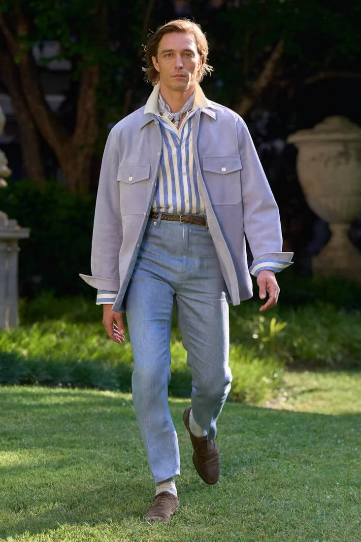
PAUL SMITH
SS26

PAUL SMITH
SS26
Paul Smith charts a course through Paul’s own personal history of travel, with colours, prints and textures conjuring memories from his many voyagesIn an intimate salon-style show at the company’s Milan headquarters, Paul Smith presented a louche, sophisticated vision for the SS26 season through a series of 30 looks. A palette of warm, nostalgic tones like lime green, fuchsia, and coral evoked a fondly remembered summer voyage, but also brought to mind the practice of hand-dyeing which gives fabrics an exceptional depth of colour.
Above all, the palette elicited an impression of heat, with the bright standout colours complemented by an array of sun-bleached earth tones, inspired by a book of Cairo street photography which caught Paul’s attention during the early design phases. The collages incorporated fragments of photographs taken by Paul, his keen eye seeking out those things that others miss. This collage theme was echoed in a double-breasted jacket with applique birds, and a leather blouson with applique flora rendered in suede, offering a textural counterpoint.
“Clothing that holds a modern flair and heritage.”
Herbert Hofmann, Vice President of Creative and Buying at Highsnobility
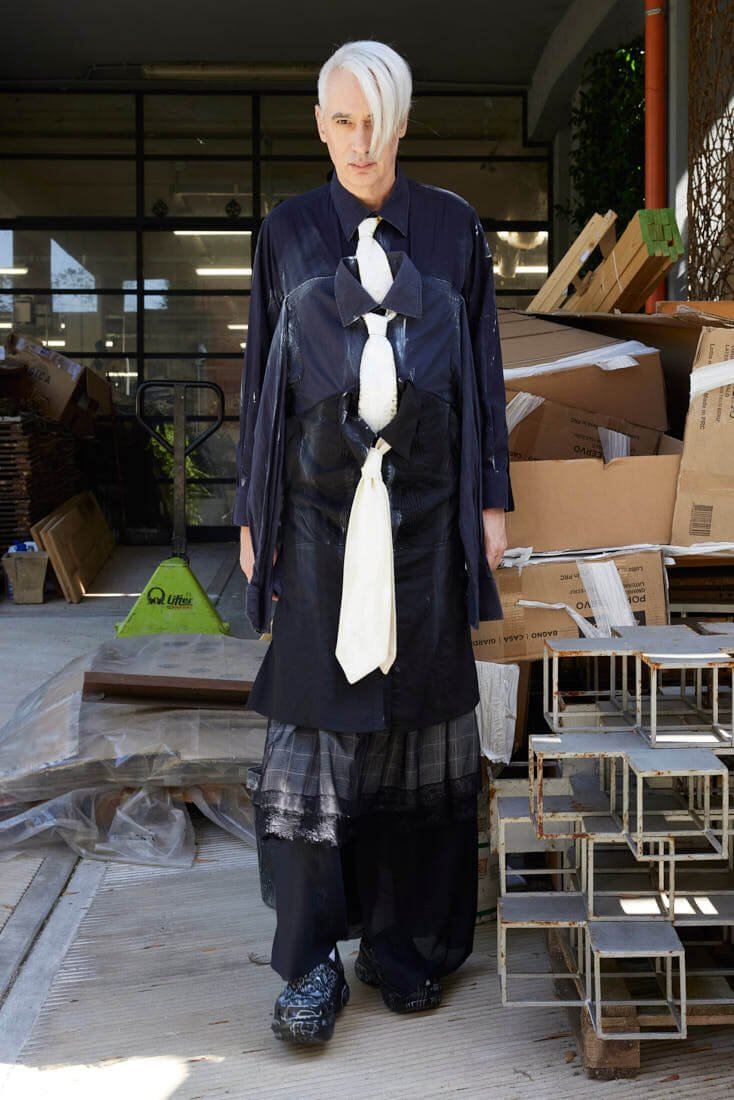
SIMON CRACKER
SS26
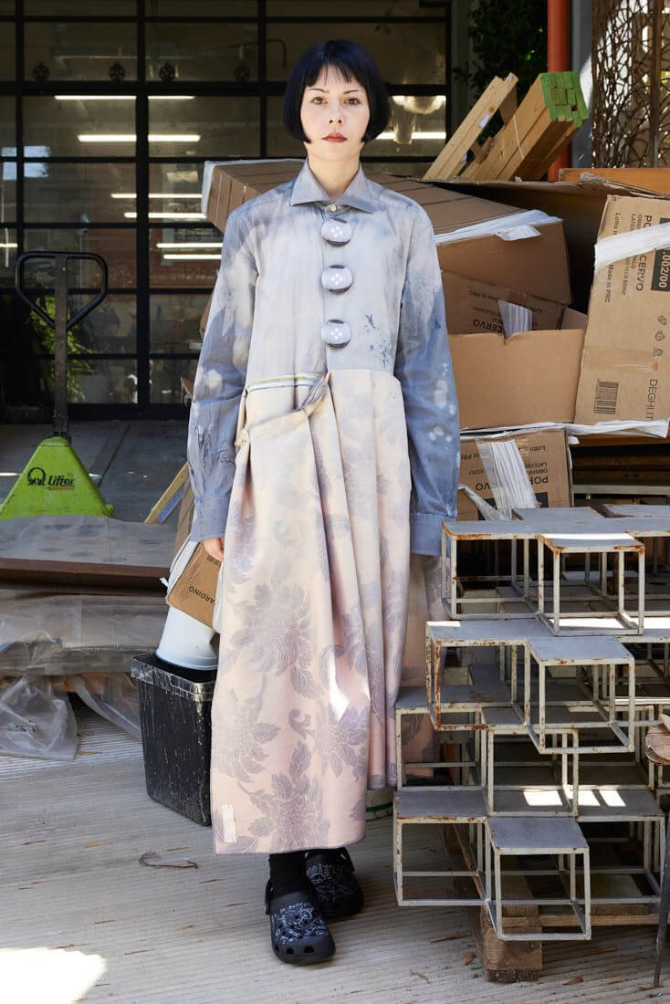
SIMON CRACKER
SS26

SIMON CRACKER
SS26
For Simon Cracker, we live in a world where incompetence reigns supreme, and where the only way forward is to dig deeper. The result is a cleaner, more focused collection from the brand this season.
The colours are exclusively shades of white, rope, ecru and shades of grey and black, obtained by dyeing, painting and bleaching. There are no flashy fabrics, aside from the first Simon Cracker all-over pattern. The basic uniform consists of a square T-shirt and shorts inspired by men's tailoring. Each outfit highlights a single garment and its unique features. Crocs' iconic models complete the uniform, in the same palette but ’crackerised’ one by one with graffiti, patches and customized charms.
“We are bringing the focus back to the clothes, with few distractions,” the said. “The collection revives some of our iconic garments (the Siamese T- shirt, the earthworm jacket, the posture shirt...), with the clear objective of creating unique, upcycled pieces that can be reproduced: the same but always different.”
A different, flamboyant throughline that takes centre stage in the Royal Academy of Fine Arts Antwerp show, which presented the collections of its new guard of creatives that were straddling between craft, poise and optimism. This year’s show had a newfound ease to it, coupled with the eclecticism of the collections that brimmed with technical know-how and tons of playfulness. This year, designers seemed to be navigating two competing urges: experimenting with new shapes while delivering a “meaningful” look. Or, as Highsnobiety’s Vice President of Creative and Buying, Herbert Hofmann, puts it: “Clothing that holds a modern flair and heritage.”
As a member of this year’s jury, Hofmann’s role lies in weighing creativity against commercial viability — seeing whether students have the urge, or the ability, to turn great design into something today’s customer will actually wear.
dunhill
SS26
dunhill
SS26
“I’m keen on what’s new, what’s innovative, and how a designer addresses today’s challenges: sustainability, sourcing, marketing, and creative identity,” he says. “It’s interesting because sometimes you see someone who has the whole package but is quieter than others. We think about how we can push those talents — give them the tools to survive in this crazy market.” In Antwerp, Hofmann sees a balance of modernity and heritage passed down from Simons, Van Noten, and Van Beirendonck protégés.
“You look at the kids on the street and they’re wearing the most amazing outfits. There’s a lot of vintage, and it’s meticulously handpicked and layered. There’s a cosy speciality in the air,” he says. “I always associate Denmark or Sweden with furniture, interiors, and architecture — but here, it’s about fashion. Compared to other major fashion cities, you realize Milan, Paris, and others tend to follow overarching commercial trends. But here, creativity pushes past convention.”
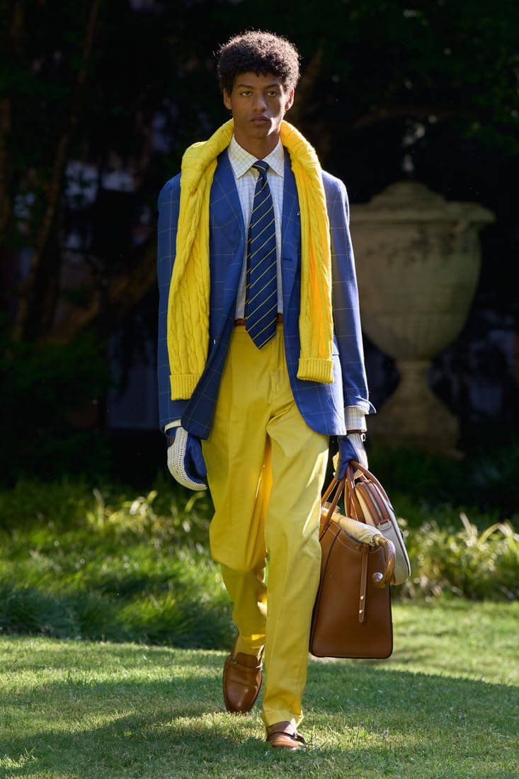
Bally wanted to revisit its sports heritage as it celebrates the release of the new Tennis Collection. Since its inception in 1851, the Swiss brand has always had an affinity with the technical requirements of performance wear, as well as the artisanal expertise to make exercise elegant. In this latest collection, a number of the house’s legendary styles are undergoing a redux, marrying the brand’s history with its evolving visual identity.
The dunhill Spring Summer 2026 season from Creative Director Simon Holloway draws from a distinctly British duality, the rarefied dress codes of English aristocracy and their influence on the louche, cultivated rebellion of British rock icons.
Taking cues from the sartorial expression of the Windsor men - figures that continue to be a central inspiration to the evolving dunhill wardrobe - this formal code is interjected with the effortless attitude of Bryan Ferry and Charlie Watts, the most classically dressed British rock stars, resulting in a collection that transcends the referential. These culturally iconic men inherited societal elegance but wear it with disobedient grace. For Spring Summer 2026 dunhill embodies this tension: the formal undone, the classic made rakish.
In perpetuity, craftsmanship remains central to the practice of design in this storied House. The collection is grounded in a dunhillian legacy of handwork and provenance, with a deep reverence for artisanal fabric mills, traditional craft and only the most excellent materials. The collection moves through the season in chapters: Car coats, driving blazers and motoring trench coats - drawn from the House’s Motorities legacy - are sculpted in butter soft French lambskin, supple suedes, coated Linen or cotton-silk twill in various shades of British drab.
credit all images
(c) Paul Smith, Dunhill, Simon Cracker, Bally SS26