HACOY - Maximilian Rupp on Munich Fashion and Comfort

HACOY - Maximilian Rupp on Munich Fashion and Comfort

.specials

Inside HACOY
the Munich Brand Shaping Comfort with Restraint


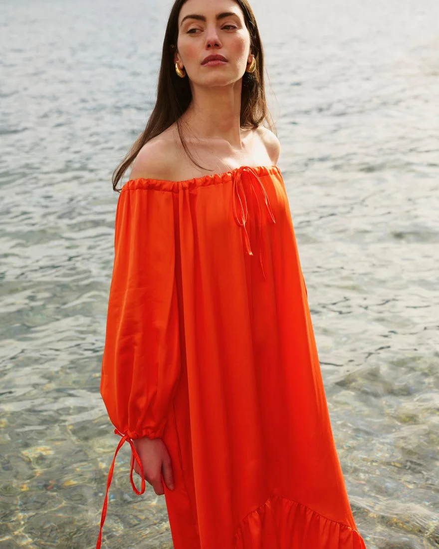
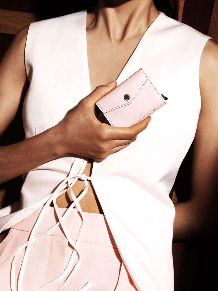
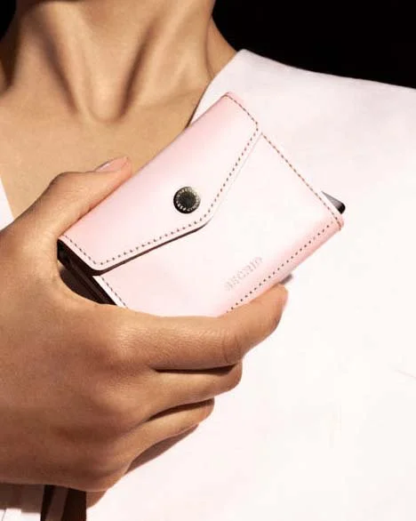
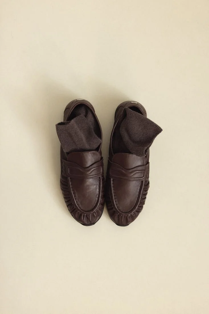
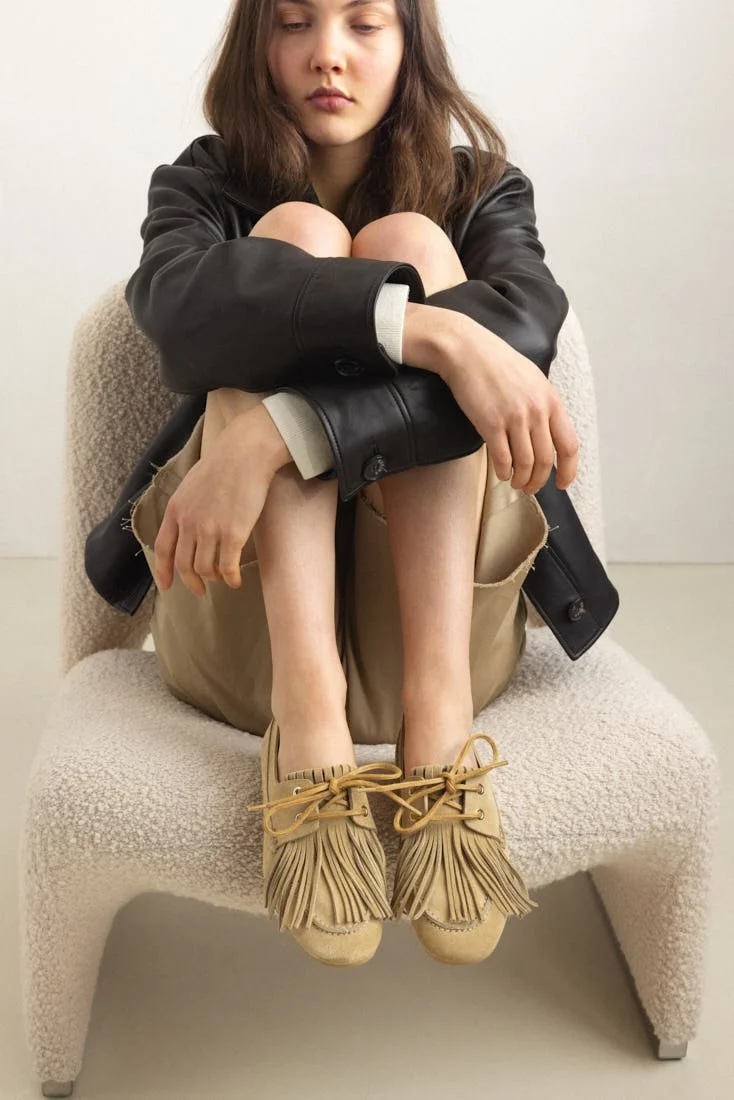
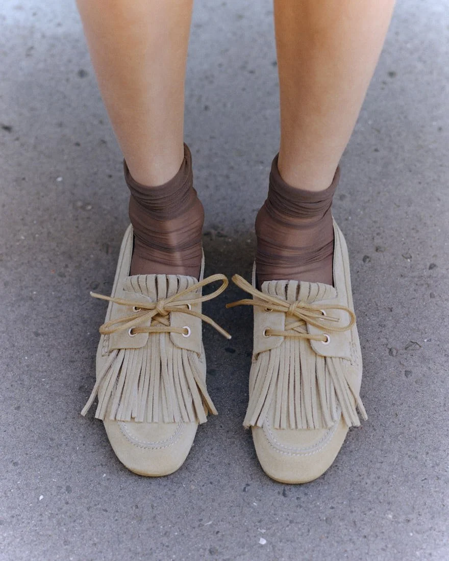
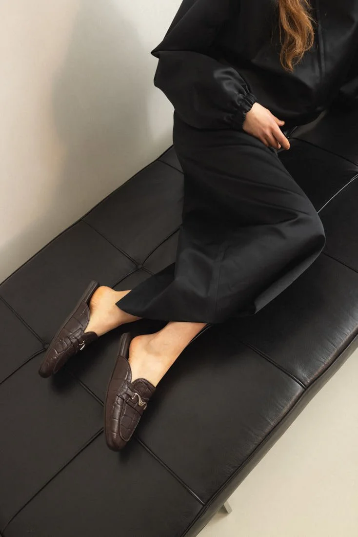
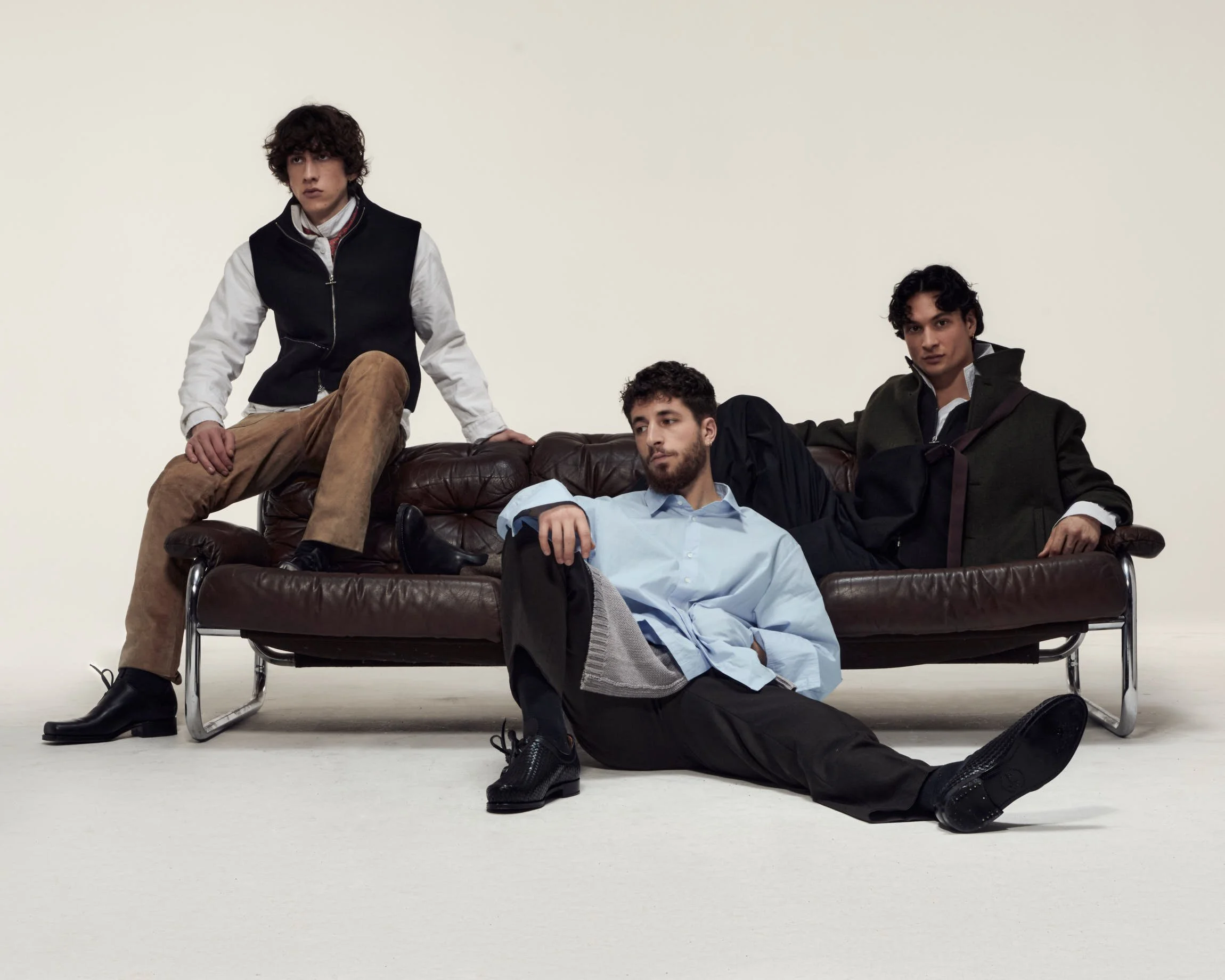
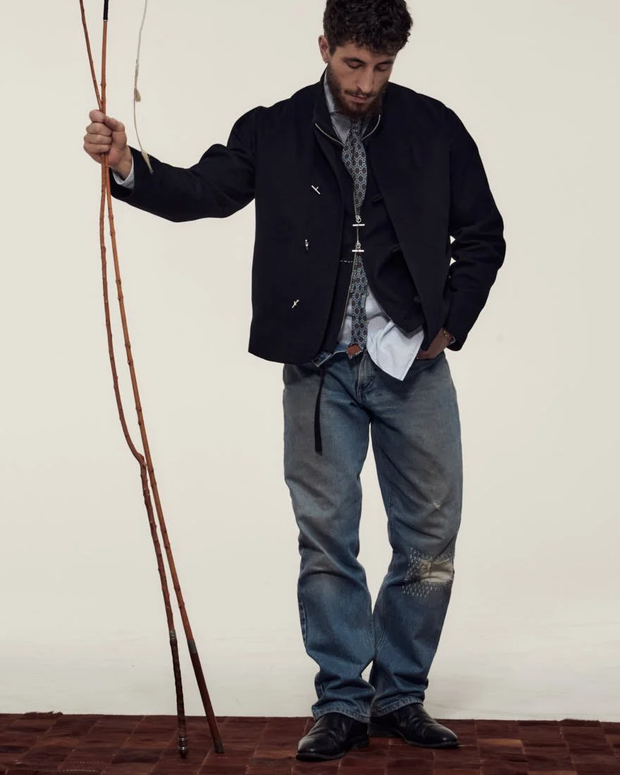
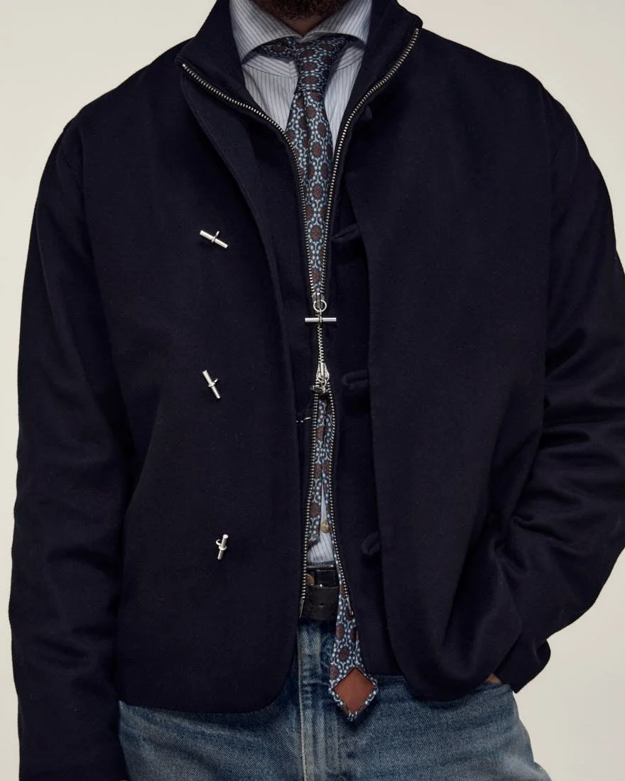
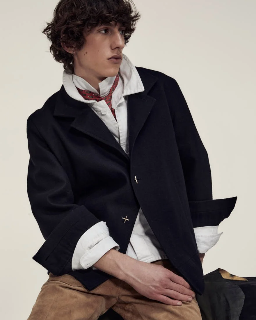
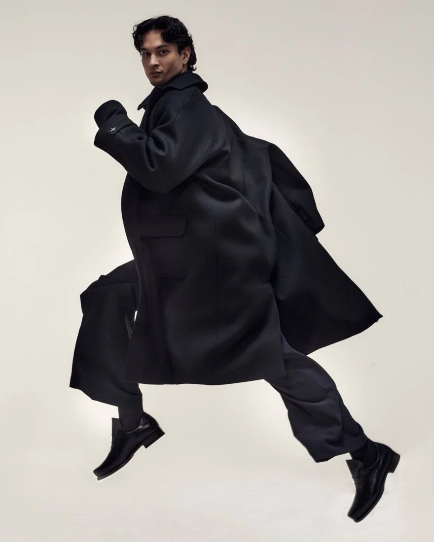
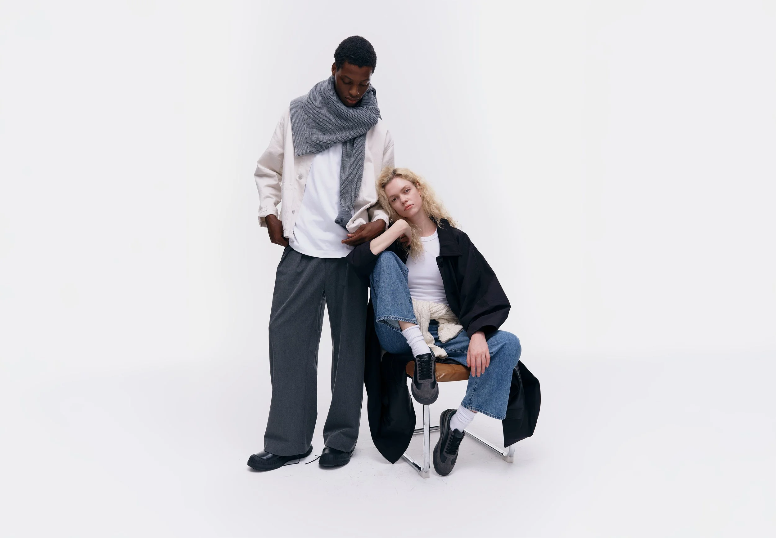
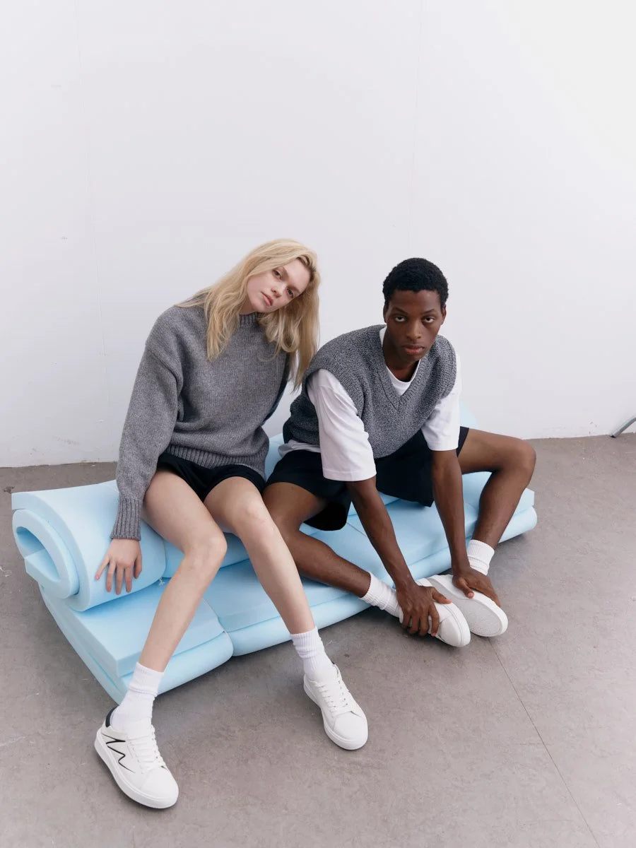
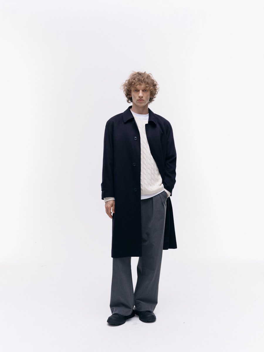
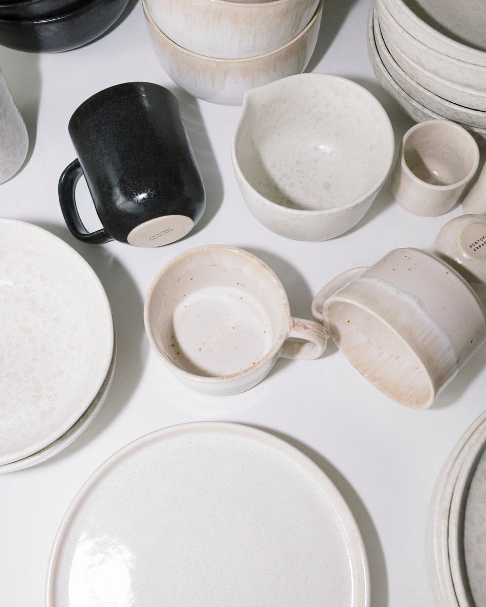
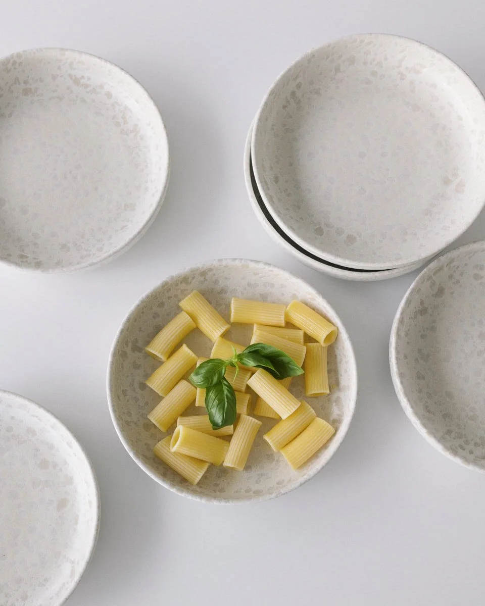
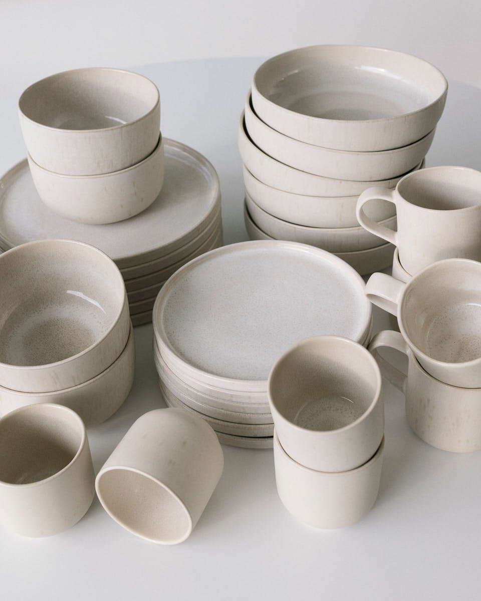
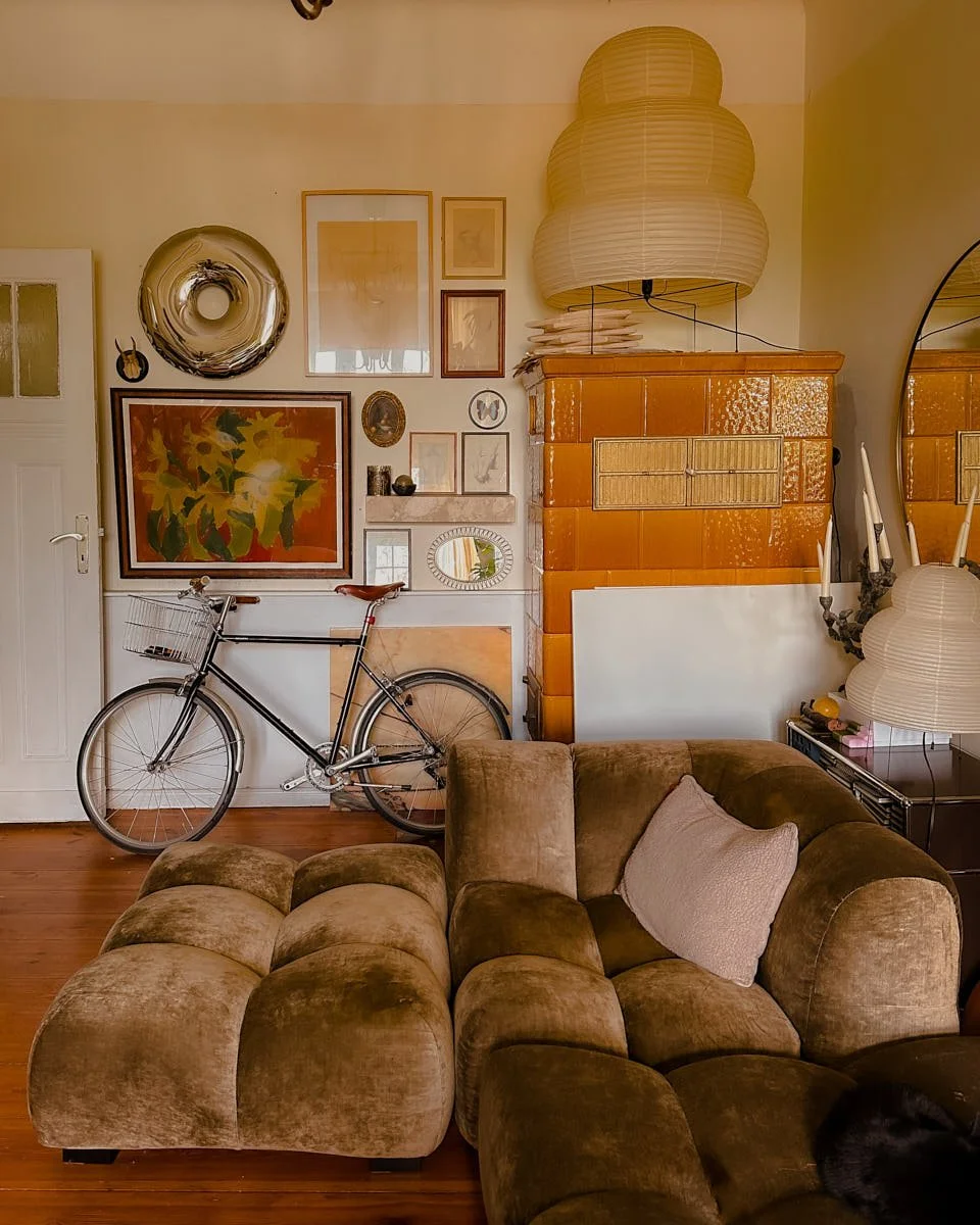
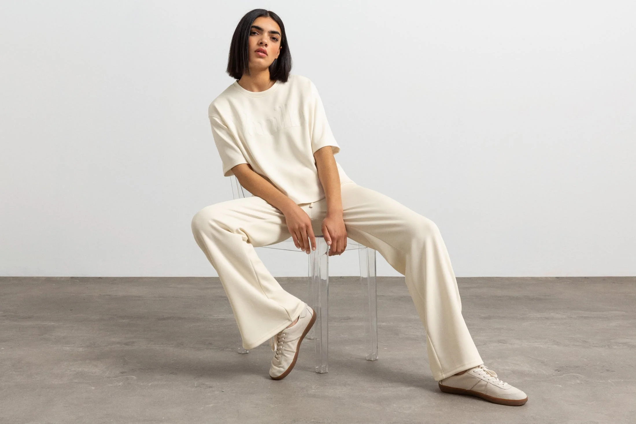
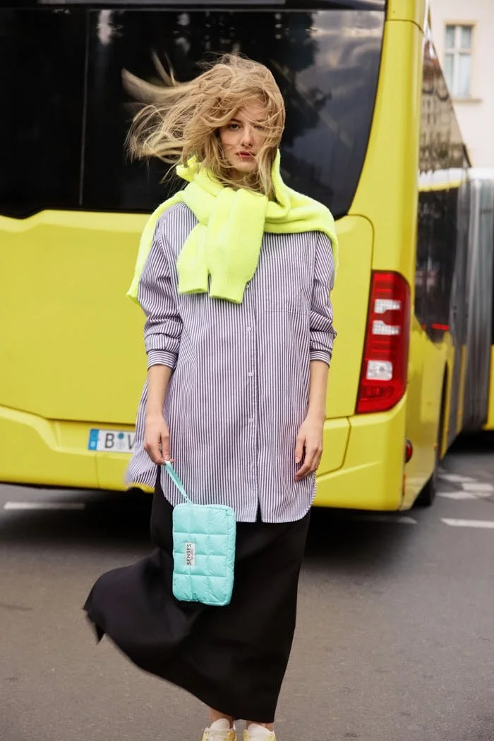
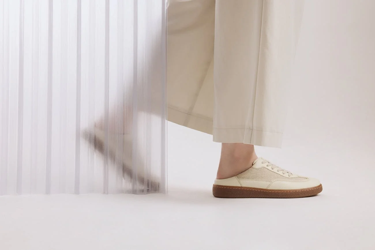
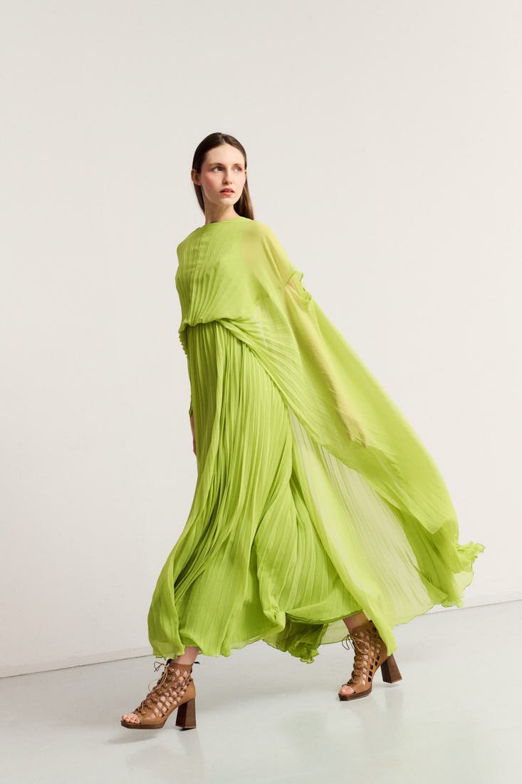
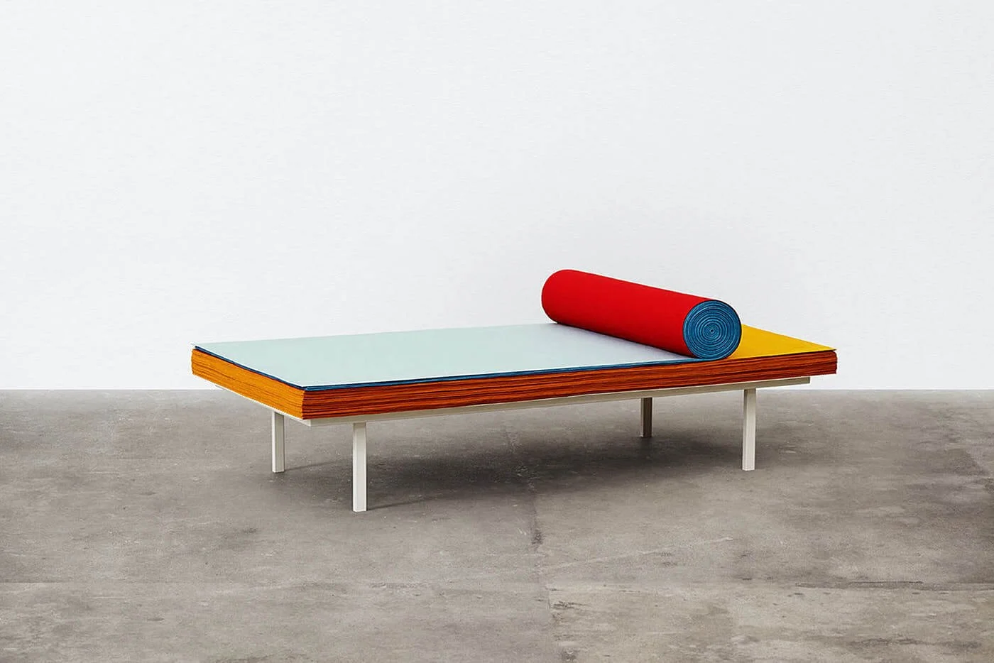
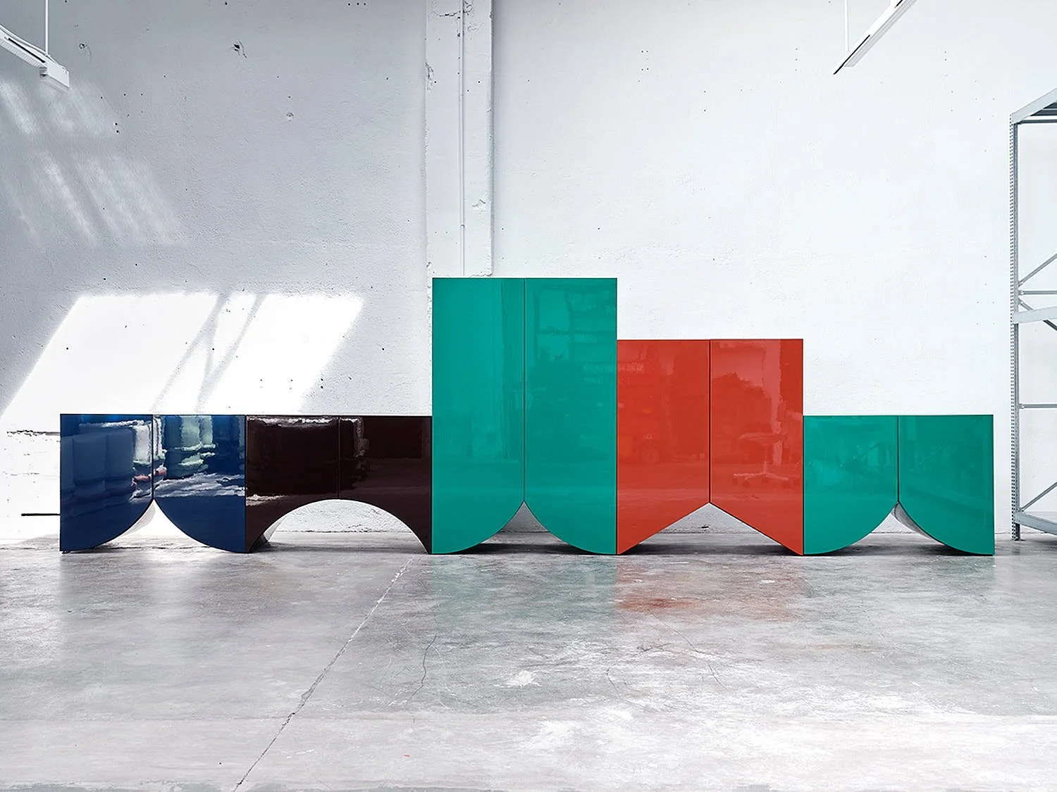
Fashion has learned to keep desire slightly unfinished. A new season, a new cart, a new reason to feel almost complete. HACOY enters that cycle with a quieter proposition, shaped around what founder Maximilian Rupp calls “a sense of enough.” Founded in Munich, with Romana Tricoli leading the design side, the brand looks at clothing through contact, habit and restraint, from silk underwear and a unisex cupro pajama to swimwear and bamboo T-shirts made for the city that first gave the project its pace.


LE MILE Magazine fashion brand from Munich HACOY by Maximilian Rupp
 
LE MILE Magazine fashion brand from Munich HACOY by Maximilian Rupp


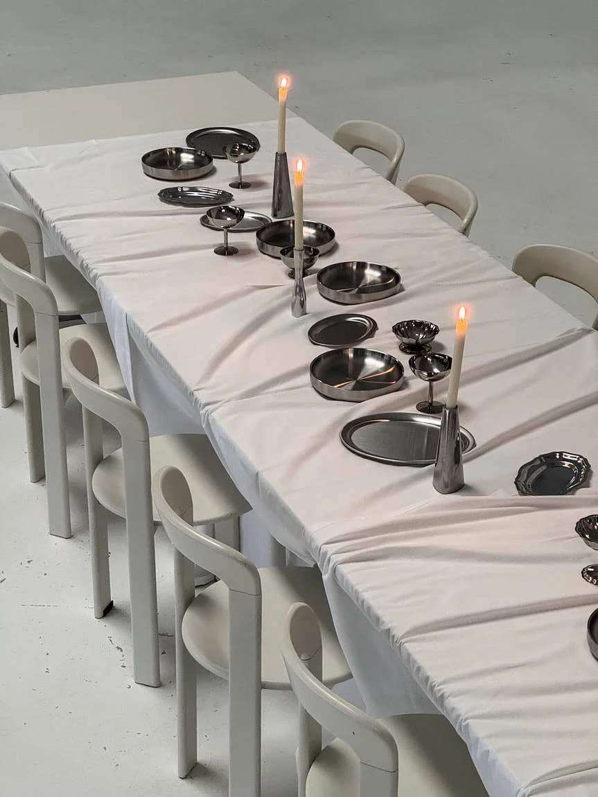
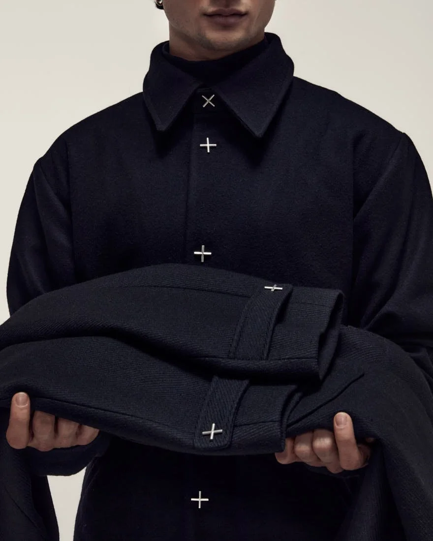
The focus sits close to the body, where a garment has very little space to pretend. A waistband, a seam, a collar, fabric after several hours of wear. These are small decisions, but they determine whether comfort remains an idea or becomes something lived with. HACOY develops its pieces with long-term manufacturing partners in Italy and Lithuania, where material, fit, production realities and responsibility enter the process early, before a garment can become part of the range.

In conversation with LE MILE, Rupp speaks about refusal, everyday desire, material honesty and the discipline required to let a young independent brand grow from one city without outgrowing the restraint it was built on.

 
LE MILE Magazine fashion brand from Munich HACOY by Maximilian Rupp
 
LE MILE Magazine fashion brand from Munich HACOY by Maximilian Rupp


LE MILE
HACOY seems to begin with a simple promise: clothing should make daily life feel less loud, less forced and less disposable. What did you feel was missing in fashion before you started building the brand?

Maximilian Rupp
A sense of enough. Most of the industry is built to keep you slightly dissatisfied, because that is what makes you buy the next thing. I wanted clothes that do the opposite, clothes that you stop thinking about once you own them. What was missing, for me, was restraint. Pieces that don't perform, don't shout, and don't expire in your head after one season.

What has "Better, not more" already made you refuse?

Discounts, for one. We don't do sales, and we've turned down the big seasonal sale events even when the maths looked good, because a brand that is "better, not more" can't also be "40% off." We've passed on collaborations that would have given us reach but not meaning, and on expanding the range just to have more to show. The hardest refusals are the reasonable-sounding ones: another drop, another category, another channel. Most of them I say no to.

Where does comfort usually fail in a garment?

At the points of contact. The waistband, the collar, the seam against the skin, the label that scratches after an hour. Comfort fails when it is treated as something you add at the end, after the look is decided. The body is honest about it. It just takes a few hours to tell you.

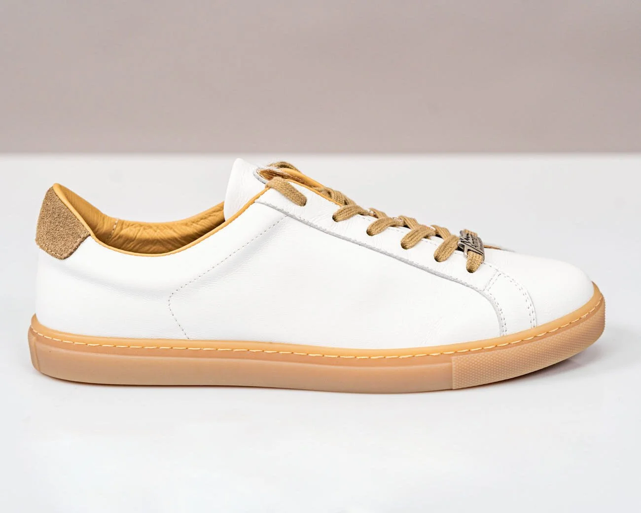
HACOY is currently focusing on silk underwear, a unisex cupro pajama and swimwear, all categories that sit close to the body and private daily routines. Why did this intimate layer of dressing feel like the right place to move into now?

Because if "less loud" is going to mean anything, it has to start where no one is watching. These are the clothes for waking up, resting, being alone. There is nothing to hide behind: no styling, no occasion, no audience. You can't fake quality in a piece that is only ever experienced privately. That felt like the most honest place to be.

Romana Tricoli leads the design side, while you shape the broader system around it. Where do strategy and design have to agree before a garment can move forward?

On whether the piece earns its place. Romana can take an idea further than I can on the design side. My job is to hold the constraints: the material, the price it can honestly carry, whether we can make it the way we say we make things. We have to agree on the why before the what. If a piece is beautiful but we can't produce it responsibly, it doesn't move. If it is responsible but says nothing, same answer. The agreement is almost always about restraint.

You studied business psychology and fashion brand management, which is an unusual combination for a founder working with clothing so closely tied to feeling and routine. What did that attention to human behavior teach you about fashion?

That almost no one buys clothes rationally. People buy a feeling, and a small story about who they are. You can exploit that or you can respect it. I chose to design for the everyday self rather than the aspirational one, the person getting dressed on an ordinary Tuesday, not the imagined version of them. Behavior also taught me that habit beats novelty. The pieces people actually love are the ones they reach for without deciding to.
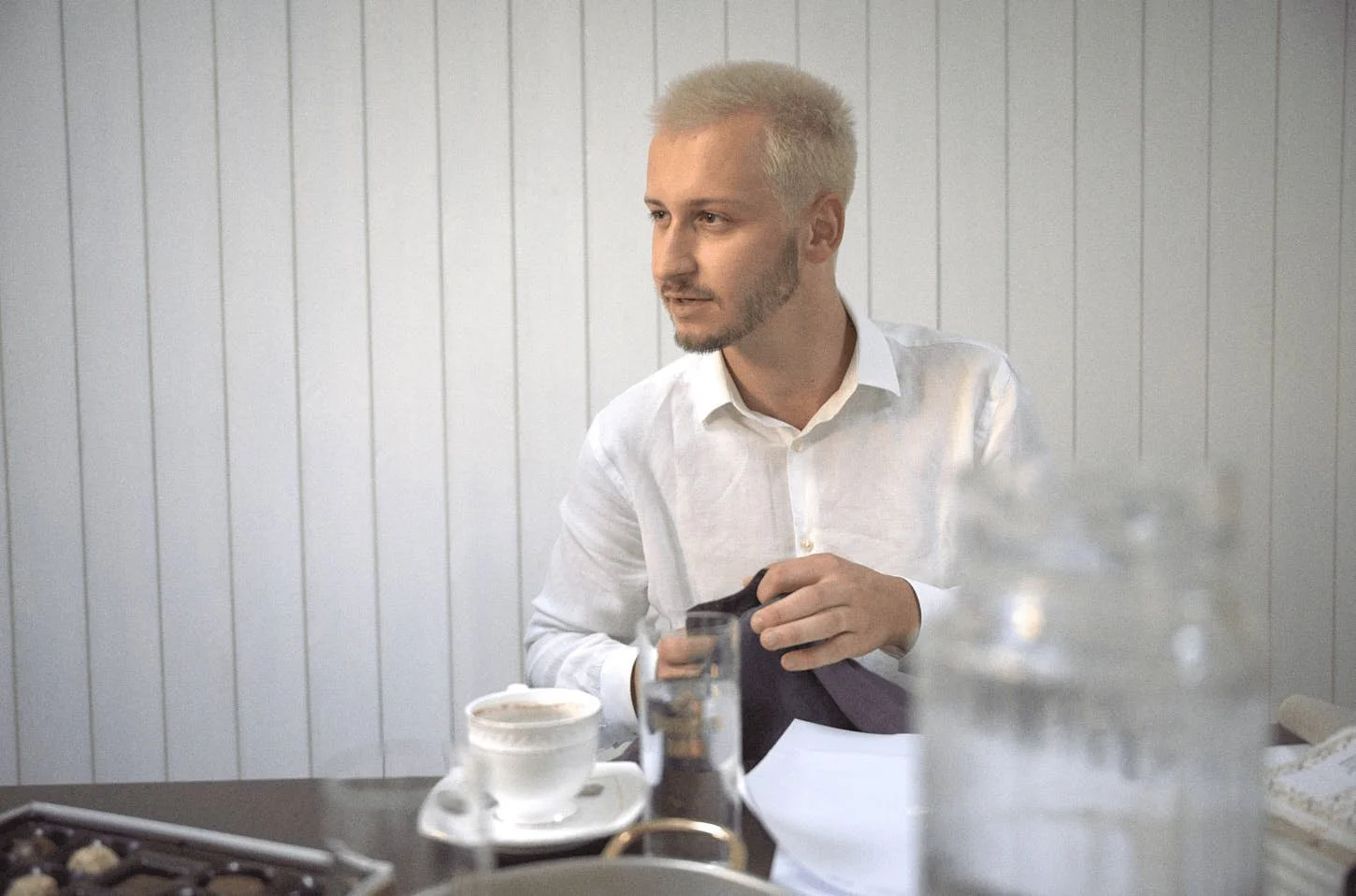
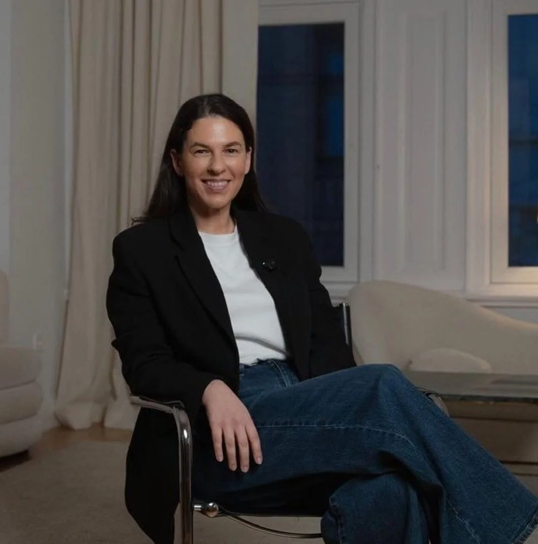
 
 
LE MILE Magazine fashion brand from Munich HACOY by Maximilian Rupp Founder Interview

HACOY
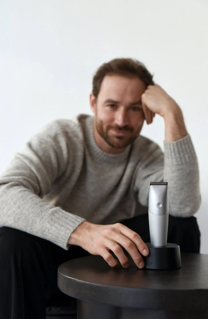
portrait of founder Maximilian Rupp


When does function become more important than material purity?

When purity would fail the person wearing it. A "purer" fiber that pills, shrinks, or falls apart in two years is not the responsible choice just because it sounds clean. The material is a means, not the point. If a considered blend lasts ten years and a single fiber lasts two, the blend is the more sustainable garment. I would rather be honest about that than perform purity.

HACOY works with long-term manufacturing partners in Italy and Lithuania, giving the brand a concrete European production geography. What did these partners change about your original idea of the brand?

They made it slower and more honest. I came in with an idea of the brand. They taught me the reality of making: minimums, lead times, what a fabric will actually do, what is genuinely possible. You can't bluff your way through a workshop. Working with the same people over years turns production from a transaction into a relationship, and that changes what you are willing to put your name on.

"Hyper local, global" begins with one city first, not a global rollout. What becomes clearer when a brand grows from a place instead of from a market plan?

Who it is actually for. The idea is local hubs, city by city, where over time each city produces its own clothing rather than everything flowing out of a single source. Italy is where we hold the standard today, but it is a starting point, not a permanent anchor. The longer goal is production that lives where the people who wear it live. When you grow from a place, you have real people and real context giving you feedback, not an abstract target group on a slide. A market plan tells you where the demand should be. A city tells you who is actually showing up, and what they actually need. The second one is harder to argue with.

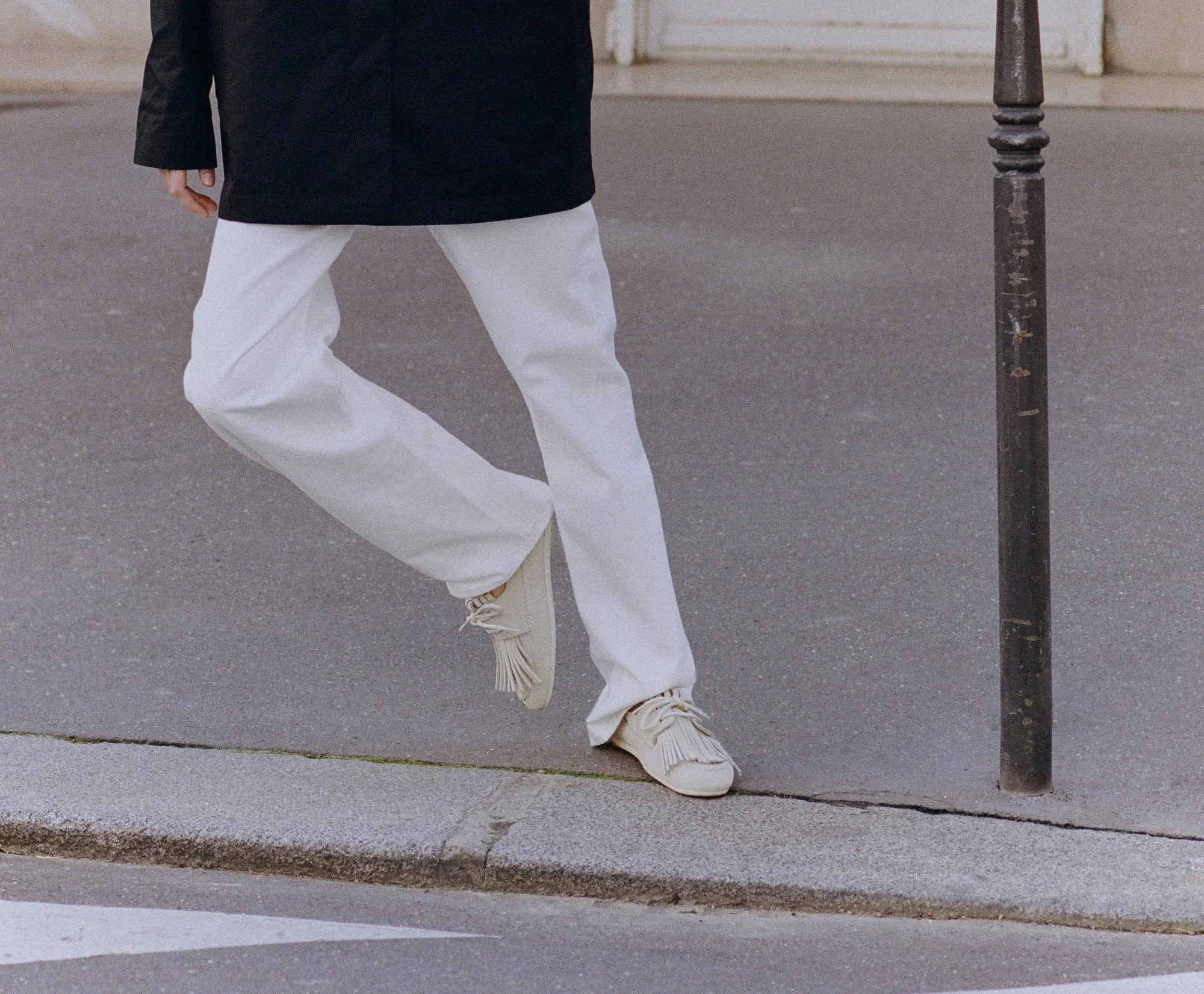
The new bamboo T-shirts are planned as a Munich-only launch, which makes locality part of the product itself. What has to happen for a garment to feel connected to a city without turning into merchandise?

Merchandise is when you print the city's name on a shirt and call it belonging. Connection is when the city actually shaped the thing: where it is made, who tried it first, the fact that it exists at this scale because of this place. It has to come from a real constraint and a real relationship, not a graphic. If you removed the word "Munich" entirely and it still felt of Munich, you have done it right.

Alongside the brand, you work on MAR, your personal painting practice. What kind of space does MAR give you, and what can it hold that would become too private inside a fashion brand?

MAR has no brief and no customer. Nothing has to be useful, coherent, or finished. It can hold doubt and mess, the things that don't resolve, which a brand is not allowed to show. HACOY has to be legible to other people. MAR doesn't have to be legible to anyone, including me. I need both, and I think they protect each other.

You mentioned ADHD and mental health as subjects you care about. Has that influenced how you build a working environment around the brand?

Yes. I've tried to build the brand around how I actually work rather than how I am supposed to. That means fewer, deeper focuses instead of many shallow ones, being honest about capacity, and a structure that bends rather than punishes. I am not interested in a culture that treats a different kind of attention as a flaw to be managed. If anything, the way my mind works is part of why HACOY looks the way it does.

Fashion still depends on real bodies, real fabric and people making decisions together. How do you prevent AI from making an independent brand look larger or smoother than it really is?

By using it for the work, not the front. I run a lot of the brand alone, and AI lets one person do what used to take a team. But the temptation is to use that to look bigger and more polished than we are. I try not to. A startup magazine once decided not to feature us because they assumed we were already a big company. I took it as a compliment, because at most we are three people. It told me the work was landing, but it also reminded me how easily the surface can outrun the truth. So the decisions that matter stay human, the texture stays human, and the brand is allowed to look exactly as small and handmade as it is. The danger is not the tool. It is letting the surface outrun the substance.

If HACOY's first phase is about proving the model in Munich, what would tell you that the brand is ready for another city?

Pull instead of push. Not a single revenue number, but the quieter signs: people coming back, rewearing, telling other people without being asked, a community that holds together when I am not actively feeding it. The day the model runs in Munich without me pushing on it constantly, and there is genuine demand coming from somewhere else, that is the signal. Until then, moving would just be ambition pretending to be readiness.


LE MILE Magazine fashion brand from Munich HACOY by Maximilian Rupp
 
LE MILE Magazine fashion brand from Munich HACOY by Maximilian Rupp


— Explore the Full Collection at www.hacoy.com
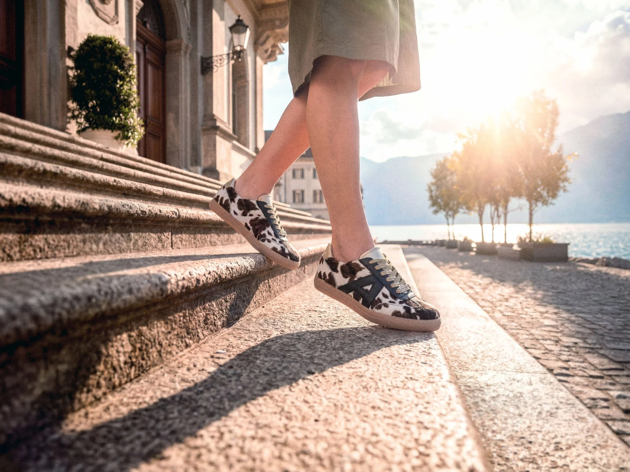
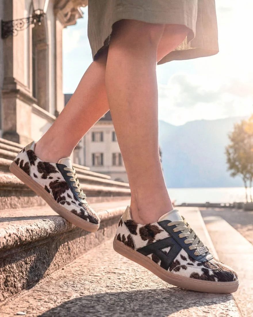
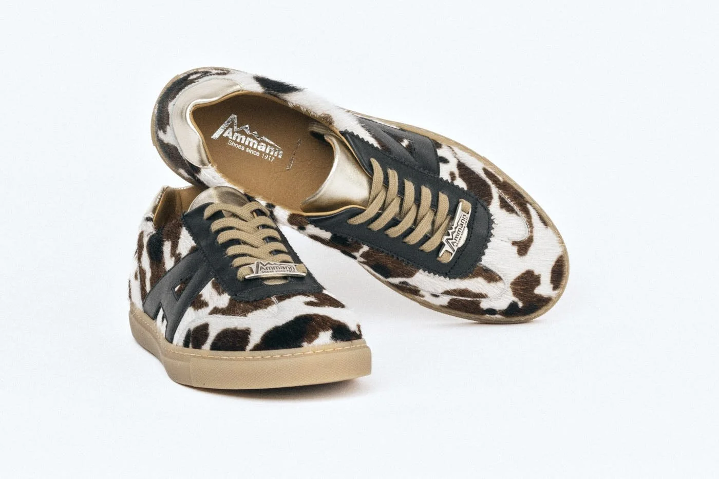
all images HACOY Press

SOOS Atelier - The Art of the Active Table

SOOS Atelier - The Art of the Active Table

.specials

SOOS Atelier and the Art of the Active Table


Amsterdam Tableware for Serving, Sharing and Staying Longer


At SOOS Atelier, the table is understood through movement, with objects carried in, placed within reach, shared, cleared away and remembered. Founded in Amsterdam, the brand approaches tableware through the physical habits that make being at the table feel natural, giving form to the small decisions that shape a room before, during and after a meal. Its objects enter these gestures with little ceremony, allowing food and conversation to remain close to the centre of attention.


LE MILE Magazine Soos Atelier Classic Tray A stainless steel tray for small servings, coffee moments and everyday gestures around the table.

SOOS Atelier, Classic Tray
A stainless steel tray for small servings, coffee moments and everyday gestures around the table.

 
LE MILE Magazine Soos Atelier Shiloh Plates, Shiloh Breakfast Bowl Stainless steel plates and bowls from the Shiloh collection, shaped for shared meals, breakfast settings and daily use.

SOOS Atelier Shiloh Plates, Shiloh Breakfast Bowl

Stainless steel plates and bowls from the Shiloh collection, shaped for shared meals, breakfast settings and daily use.


The stainless steel range gives SOOS Atelier its clearest material line, carrying one visual language across plates, bowls, trays, cups, coupes and cutlery At a time when stainless steel is again gaining visibility in interiors and object design for its reflective surface and industrial clarity, SOOS Atelier brings the material to a more intimate scale. In the Shiloh pieces, steel becomes direct and durable, with a reflective surface that holds light while keeping its practical edge. Trays, plates and bowls stay close to the logic of service, yet their surfaces give even simple arrangements a visible charge. The material makes serving feel deliberate, and it asks to be used and looked after.

That matter-of-fact quality is important because SOOS Atelier’s idea of table culture depends on use. Hosting is treated as a sequence of gestures shaped by what is placed in the centre, what remains within reach and which object makes a simple meal feel considered. The collection belongs to a contemporary appetite for tables that are visually aware and generous, while still allowing the meal to remain the point. The objects hold a setting together while keeping the table open to food, conversation and time.

From there, glass and ceramic shift the table into lighter and more private rhythms. The Square Glasses have a graphic clarity that suits a morning drink as easily as something served later in the day, with straight sides and softened corners that give the hand a precise form to hold. The A.M. Coffee Club pieces draw the table back to the morning, where scale matters more than abundance. White ceramic, blue lettering and compact proportions place them in the quiet rhythm of espresso, the first longer cup of the day, the moment before a room becomes social. In these pieces, SOOS Atelier shows that table culture also begins in solitude, with an object chosen for a habit repeated often enough to matter.

 
LE MILE Magazine SOOS Atelier Disposable Camera Silver A silver analogue camera loaded with Kodak 400 film, designed to be passed around and let an evening collect different perspectives.


SOOS Atelier, Disposable Camera Silver

A silver analogue camera loaded with Kodak 400 film, designed to be passed around and let an evening collect different perspectives.


LE MILE Magazine SOOS Atelier Large Shiloh Tray, Square Glasses A stainless steel tray and straight-sided glasses for drinks, small dishes and everyday serving.

SOOS Atelier, Large Shiloh Tray, Square Glasses

A stainless steel tray and straight-sided glasses for drinks, small dishes and everyday serving.


The Disposable Camera Silver adds a sharper cultural note because it addresses something already present wherever people gather. SOOS Atelier gives that presence a designed body through its silver case, allowing the camera to sit inside the same visual language as the objects around it. Loaded with Kodak 400 film and 27 exposures, it carries a clear function, yet its relevance lies in the way it changes the record of an evening. Passed between guests, it lets a shared moment move through different hands, seats and timings.

SOOS Atelier’s own visual language is carefully composed, with a refined sense of colour, furniture, proportion and surface, while the disposable camera introduces a looser record shaped by flash, blur, uneven framing and partial attention. Through that looseness, the idea of gathering becomes practical. A table shared by several people produces several views of the same moment, and the camera gives that multiplicity a physical form. It makes remembering part of the setting, while leaving the experience open to chance.

Across steel, glass, ceramic and film, SOOS Atelier gives ordinary table habits a more deliberate form while keeping their ease intact. Its pieces make serving, drinking, sitting and remembering feel considered, leaving the table open to the informal pleasure of staying a little longer.

 
LE MILE Magazine SOOS Atelier Stainless Steel Tableware A table setting with stainless steel plates, bowls, trays and serving pieces from the SOOS Atelier collection. Photography by Tess Letort.

SOOS Atelier, Stainless Steel Tableware

A table setting with stainless steel plates, bowls, trays and serving pieces from the SOOS Atelier collection

 
LE MILE Magazine SOOS Atelier Morning Fuel Cup A ceramic cup and saucer for the morning coffee moment, simple in form and made for daily use.

SOOS Atelier, Morning Fuel Cup

A ceramic cup and saucer for the morning coffee moment, simple in form and made for daily use.

LE MILE Magazine SOOS Atelier The A.M. Coffee Club A ceramic coffee family for the morning table, moving from espresso to the first longer cup of the day.

SOOS Atelier, The A.M. Coffee Club

A ceramic coffee family for the morning table, moving from espresso to the first longer cup of the day.


— Explore the full SOOS Atelier collection at www.soosatelier.com

content credits
photographed by Tess Letort, SOOS Atelier

Clothing in Use - The Language of Maara Studio

Clothing in Use - The Language of Maara Studio

.specials

Where Colour Holds
Maara Studio by Izabela Barbaric


written LE MILE


Maara Studio takes shape through a way of working that stays close to the garment itself and to how it is worn. Founded by Izabela Barbaric, the label develops through decisions that remain tied to the piece rather than building a fixed vocabulary.


Maara Studio by Izabela Barbaric LE MILE Magazine

Maara Studio

 
Maara Studio by Izabela Barbaric LE MILE Magazine

Maara Studio


Colour enters the collections with a clarity rooted in presence. It holds the garment in place, allowing it to register immediately while remaining connected to the body wearing it. The effect is direct, with a controlled sense of staging.

A similar precision runs through the way garments are imagined in relation to specific people. Many pieces are connected to women from Barbaric’s own circle, as a way of thinking through posture, gesture and how a piece is carried. This thinking informs proportion, material and colour at a level that remains embedded in the garment itself, without resolving into fixed characters or narratives.

Material and production follow these conditions, with small editions produced through Italian ateliers keeping the process close to the object so adjustments remain traceable and decisions do not disappear in scale. Fabrics such as silk, cotton and linen are selected for how they respond in wear, how they hold shape without fixing it, and how they shift over time. What emerges is a way of approaching femininity that does not need to be defined in advance. It takes shape through use and through how a garment holds together while being worn. In the following conversation, Izabela Barbaric speaks about how this approach developed and how it continues to inform Maara Studio.

 
Maara Studio by Izabela Barbaric LE MILE Magazine

Maara Studio

 
Maara Studio by Izabela Barbaric LE MILE Magazine

Maara Studio

Maara Studio by Izabela Barbaric LE MILE Magazine

Maara Studio


LE MILE
When did your design language reach a point where it needed its own label? Was there a decisive moment, or did that step take shape gradually? And how closely is that founding impulse tied to the assured femininity your work expresses today?

Izabela Barbaric
The desire was there from an early age. As a child, I used to flip through catalogues and magazines and knew I wanted to be part of that world. At first, I took a different path, worked, gained experience, and saw a lot, but something creative was always missing.
During the pandemic, that thought became more concrete. The turning point came in a conversation with a friend who simply asked why I wasn’t doing it. I didn’t have an answer. In that moment, I realised there was no real reason not to, so I started. Confident femininity was never a concept to me, it was always a feeling. For me, it is less about an external image and more about an inner attitude: taking space, being present, and not adapting.
Over time, that feeling became more defined through the process itself, through making decisions, but also through moments of uncertainty. That attitude was always there, but it only became tangible through building my own label.

Looking back at your earlier years — before Maara existed — what did you believe fashion could give you that it perhaps couldn’t at the time? And has that belief changed?

Fashion has always been a way for me to express mood and personality. It is about feeling comfortable, moving freely, and dressing intuitively rather than according to expectations.
That sense of freedom is still at the core of my work today. If anything, it has become even stronger.

Colour plays a central role in your collections. It feels deliberate, almost defiant in its openness. What does that luminosity mean to you beyond its immediate visual impact?

Colour represents joy to me, but it is also a statement. It expresses presence, confidence, and a certain independence from the need to conform. Colour always carries an attitude. At the same time, it is a form of communication. It influences how a look is perceived, the mood it carries, and how present it feels.
Sometimes colour is an intuitive decision, sometimes it is used more consciously to create contrast or a sense of calm. It also helps structure my collections by creating connections or, in some cases, intentional breaks.

Much of contemporary fashion operates through irony or conceptual distance. Against that backdrop, Maara feels direct and sensual. Is that a conscious choice? And what does that directness allow you to express that might otherwise get lost?

Yes. I believe in honesty in expression. Clothing should connect and evoke something without needing explanation. That directness makes it accessible, while still remaining deeply personal.


Maara Studio Portrait of Designer Izabela Barbaric LE MILE Magazine

Maara Studio
portrait of designer and founder Izabela Barbaric

 
Maara Studio by Izabela Barbaric LE MILE Magazine

Maara Studio


Who do you design for? And how does that presence — real or imagined — influence the way a piece takes shape?

I design for individuals. I often have a friend or an important woman in my life in mind, her presence, her way of living, the way she presents herself, how she wears colour, and how she wants to be perceived. Clothing should enhance that personality, not overshadow it. It is about presence, confidence, and a sense of joy.
This idea directly shapes my designs, especially in terms of silhouette and proportion. Colour and material also come from this, because each piece needs to adapt to the person, not the other way around.

When you design, how consciously are you thinking about the body? Is movement something you construct deliberately, or does it emerge intuitively as the piece develops?

The feeling on the body is essential. A piece needs to feel natural and move with the wearer. When that works, everything else follows almost automatically. I think about the body and movement very early in the process. It is not something that comes at the end, it accompanies the design from the beginning. There is always a moment where I test how a piece falls, how it moves, and whether it supports the body or restricts it. Many decisions are made at that point.

Several of your pieces carry the names of women from your own circle. What shifts in your process when a garment is connected to someone you know personally? For you, is friendship more a source of inspiration, a space of resonance — or at times even a form of corrective?

It makes the process more personal. I think about real characters, their energy, their presence, and shared memories that are meaningful to me. Friendship is a strong source of inspiration for me because it strengthens each person in their own identity. That is essential.
At the same time, these relationships create a kind of resonance. They influence how I see my designs, how I develop them further, and sometimes how I question them. It is less about direct feedback and more about a shared understanding that shapes the process.

What does working in small editions allow you to preserve? And when does limitation start to feel like a conscious choice rather than a constraint?

It keeps me close to the product. I can work more consciously, make more precise decisions, and preserve the uniqueness of each piece. This creates something more personal and less interchangeable.

When working with small Italian ateliers, where does quality become non-negotiable for you — in the material, in the cut, in the finishing, or in something less tangible?

Everything.
Quality reveals itself in the details, in the materials, the cut, the craftsmanship, and above all in the fit. That is where I take the time it needs. For me, it also means paying close attention to the construction of a garment, how it is built, how cleanly it is made, and how well it holds its shape over time. That is where the difference really lies.

Croatian roots, Italian production — how present is that duality in your thinking? And where does it surface most clearly in the design itself?

For me, Croatia represents boldness, freedom, and a very vivid understanding of fashion, a way of expressing oneself and embracing life.
Italy, on the other hand, stands for precision, craftsmanship, and uncompromising quality. Both cultures carry a strong female energy, as an attitude, as a presence, as something natural. A woman as the centre, as a driving force, as someone who shapes rather than follows. This duality also becomes visible in the design itself, in the interplay between strong colours and clear silhouettes, between expression and controlled construction. That tension defines my work.


— Explore the Full Collection at www.maara-studio.com
all images seen by Karolina Golis, beauty by Anna Winkel for Maara Studio

Ammann Sneakers - ASCONA BEINWIL Leather Cowhide Construction

Ammann Sneakers - ASCONA BEINWIL Leather Cowhide Construction

.specials

Ammann’s New Sneaker Line 

Flat Silhouettes Shaped by a Century of Shoemaking


The form settles low and controlled, with a sole that introduces a measured lift while keeping the overall proportion compact, allowing the upper to remain close to the foot and uninterrupted in its line, so the shoe reads as a continuous volume rather than a layered construction, its presence defined through balance and alignment instead of added elements.

 
Ammann Shoes Sneaker Urban LE MILE Magazine cow pattern

Ammann
Sneaker Urban

 
Ammann Shoes Sneaker Urban LE MILE Magazine cow pattern

Ammann
Sneaker Urban


Developed from a lineage that began in a small workshop in Oberentfelden and expanded into a manufacturing structure shaped by durability, repetition and large-scale production, including military boots and everyday leather shoes built for sustained wear, the current collection carries forward a way of thinking that prioritises how a shoe performs over time and under use. This history does not surface through direct reference, yet it informs the way proportions are handled, how the sole meets the upper, and how the overall structure avoids unnecessary articulation.


ASCONA and BEINWIL follow this logic through flat, continuous lines and a construction that stays visually closed, with the sole slightly raised and softly rounded to stabilise the form without introducing tension, while the upper remains compact and aligned, allowing the shoe to maintain a consistent stance across different contexts.

 
Ammann Shoes Sneaker Urban LE MILE Magazine cow pattern still

Ammann
Sneaker Urban

 
Ammann Shoes Sneaker Urban LE MILE Magazine cow pattern still

Ammann
Sneaker Urban

Ammann Shoes Sneaker Urban LE MILE Magazine cow pattern still
 
Ammann Shoes Sneaker Urban LE MILE Magazine cow pattern still

Ammann
Sneaker Urban


Across the collection, smooth leathers define the surface through a restrained range of tones, from pale variations to warmer finishes, each responding differently to light and wear, while cowhide introduces natural variation through its pattern, ensuring that individual pairs carry subtle differences without affecting the underlying structure. The material selection stays precise, with each surface supporting the overall form rather than redirecting attention. Seams follow the curvature of the upper closely and remain visually contained, while branding is reduced to minimal interventions that do not interrupt the line of the shoe, and within the lacing, a small cowhide heart is integrated into the tongue, positioned in a way that remains secondary to the construction and only becomes visible upon closer inspection.

Developed in collaboration with specialised manufacturers in Northern Italy, where long-standing relationships shape both material sourcing and fabrication, the production process extends the same level of control beyond a single location, maintaining consistency through shared technical knowledge and established workflows. Within the current landscape of sneaker design, where form is often driven by scale, surface treatment or visible construction, Ammann’s approach remains focused on proportion, material handling and structural clarity, allowing the shoe to hold its position through the way it is built and resolved.


images (c) AMMANN SHOES

DISCOVER MORE: www.ammann1917.ch
Explore ASCONA and BEINWIL sneakers shaped through low silhouettes, smooth leather, cowhide details and precise construction.

Secrid Envelope Wallet - Slim Leather Wallet

Secrid Envelope Wallet - Slim Leather Wallet

.specials

Inside Secrid’s New Envelope
How Fold and Mechanism Define Access


written LE MILE


Since 1995, Secrid has developed pocket-sized accessories shaped through industrial design and a clear approach to construction. Founded by René and Marianne van Geer in the Netherlands, the brand continues to produce locally, with assembly carried out in collaboration with social enterprises. This production model connects material, process and labour within a consistent, regionally anchored system.
The wallet is defined by how it manages access and Secrid’s Envelope approaches this through a construction that begins with a single fold, shaping the object into a compact, continuous volume where structure and closure are resolved in one movement. The geometry emerges directly from how the material bends, creating a form that holds its shape without added framing or reinforcement. Developed and produced in the Netherlands, the object carries a design logic that connects industrial precision with a clear, everyday usability.


Secrid Envelope Pebble Ice Blue LE MILE Magazine

SECRID
Envelope Pebble Ice Blue

 
Secrid Envelope Vintage Cognac LE MILE Magazine

SECRID
Envelope Vintage Cognac


That fold establishes the outer presence, but its function becomes clear once the wallet is handled. The surface carries a slight resistance, the edges remain precise, and the volume stays contained even when filled. The construction holds a fixed proportion, keeping the object stable in the hand and in the pocket. This controlled containment defines how the wallet behaves in everyday use, setting limits that prevent it from accumulating excess.

The interior builds on this constraint by distributing space with exact intention. Cards, coins and small essentials are assigned distinct positions within a layout that remains legible at a glance, including a dedicated compartment that accommodates loose items without disrupting the overall structure. Each compartment is directly accessible, allowing interaction without rearranging the contents. The organisation is embedded in the construction itself, guiding how the wallet is used through its spatial logic.

At the core sits Secrid’s card mechanism, a compact unit that defines the system the wallet is built around. A single press releases the cards in a stepped formation, making selection immediate and controlled while holding up to eight cards within a protected enclosure. The movement is consistent, governed by an internal structure that stores, shields and presents the cards in one sequence. This mechanism establishes a clear rhythm of use through repetition and precision.

 
Secrid Envelope Vintage Cognac and Pebble Butter Yellow LE MILE Magazine

SECRID
Envelope Pebble Butter Yellow & Vintage Cognac

 
Secrid Envelope Vintage Cognac LE MILE Magazine

SECRID
Envelope Vintage Cognac


The interaction between folded exterior and mechanical core determines how the object performs over time. The outer layer absorbs contact and movement, while the internal unit maintains its exact function with each use. Production takes place in the Netherlands, with assembly carried out in specialised social enterprises, embedding the object within a broader manufacturing context that links material, labour and process.

Material selection reinforces this behaviour, with leather that retains enough structure to preserve the folded geometry while remaining responsive to touch and motion. Its surface develops subtle variation through use, registering contact without altering the underlying form. Colour options extend this without changing the construction, allowing the same object to appear more subdued or more pronounced depending on finish.

Within the broader shift toward carrying fewer, more deliberate items, the Envelope narrows its scope through this controlled construction. It defines capacity through form, organises access through mechanism, and stabilises use through material. The wallet becomes a fixed system that holds its shape, its contents and its function in a single, continuous structure.


Secrid Envelope Original Ballete LE MILE Magazine

SECRID
Envelope Original Ballete

 
Secrid Envelope Original Ballete LE MILE Magazine

SECRID
Envelope Original Ballete


Price €79 for the Secrid Envelope
— Explore the full Collection at www.secrid.com

NUBIKK SS26 - Collection Moccasins and Loafers Return to Everyday Wear

NUBIKK SS26 - Collection Moccasins and Loafers Return to Everyday Wear

.specials

Inside NUBIKK’s SS26 Collection
Why Moccasins and Loafers Matter Again


Footwear has been running on autopilot for years, with sneakers absorbing functions that once belonged to other categories until their dominance flattened distinctions to the point where they stopped saying much at all. What is taking shape now is less a new trend than a redistribution of attention. Loafers, moccasins and mules return without recovering their old authority, entering the same everyday space without insisting on occasion, status or hierarchy.

 
NUBIKK SS26 Collection Riley Mio Brown Loafers Women LE MILE Magazine

NUBIKK SS26
Riley Mio Brown Loafers Women

 
NUBIKK SS26 Collection Riley Mio Brown Loafers Women LE MILE Magazine

NUBIKK SS26
Riley Mio Brown Loafers Women


NUBIKK makes that shift easier to read because the brand has never depended on heritage mythology or on the inflated novelty cycle that drives much of the contemporary market. Founded in 2012 in Waalwijk, a town with a long connection to Dutch shoemaking, it has built its identity through a more pragmatic line of thinking, one that begins with wear, material and repeat use, then extends that logic across sneakers, booties, slip-ons and moccasins. Production in Portugal, leather sourcing tied to Leather Working Group suppliers, and a repair-first approach give that positioning more weight than the usual contemporary-brand language ever could, grounding the product in continuity while keeping it visually aligned with a contemporary sense of style.
That matters because NUBIKK is neither trying to rescue the moccasin as a classic nor inflate it into a fashion object. In SS26, the category is handled with less sentiment and more clarity. The point is not revival but usability within a wardrobe where the old division between sneaker, loafer and softer leather shoe has started to erode, while maintaining a level of lightness that shapes both how the shoe feels and how it appears.


Within this group, Riley Mio and Riley Jade hold a tighter, more controlled line, while Joan Macaw and the more open Joan Mule extend the same idea outward, not as separate statements but as variations within a shared position. They remain closely aligned, with surface and detail carrying most of the variation. A smoother leather upper with a restrained strap keeps one version tighter and quieter, while suede opens another through visible seams, lacing or fringe, allowing texture to carry more of the expression. In models such as Joan Macaw and Riley Jade, these shifts become more visible through fringe, stitching and lacing, while Riley Mio and Joan Mule introduce a slightly firmer note through their more defined upper construction and hardware. Elsewhere, embossed finishes and metal hardware sharpen the tone without pulling the shoe out of the same broader field. The point is not that these models blur into one another, but that they stay close enough in attitude to function within the same wardrobe logic.


NUBIKK SS26 Collection Joan Macaw Beige Slip Ons Women LE MILE Magazine

NUBIKK SS26
Joan Macaw Beige Slip Ons Women

 
NUBIKK SS26 Collection Joan Macaw Beige Slip Ons Women LE MILE Magazine

NUBIKK SS26
Joan Macaw Beige Slip Ons Women


That proximity is what makes them timely, as the moccasin is no longer framed as a softer cousin of formal footwear nor as a nostalgic gesture toward leisure. It becomes a direct, adaptable part of daily dressing, able to sit with denim, tailoring or looser silhouettes without asking for a change of register. Even the mule, which pushes the line further through its open heel, does not break the structure. It shows how little closure a shoe now needs in order to feel complete.

This is where NUBIKK becomes more interesting than the average seasonal footwear label. The brand is not operating at the level of runway declaration, and it does not need to. Its strength lies in understanding a middle zone of the market that many brands still mishandle, where shoes carry enough form to register, enough ease to remain in constant use, and enough variation in material and finish to shift mood without forcing a new identity each time, while retaining a lightness that reads as both a functional and visual quality. That balance is harder than it sounds, especially in a category where products still veer too quickly toward either comfort cliché or overdesigned statement.


NUBIKK SS26 Collection Riley Mio Off White Loafers Women LE MILE Magazine

NUBIKK SS26
Riley Mio Off White Loafers Women


Seen from that angle, the collection says something precise about the current state of footwear. Categories remain visible, but their authority has weakened. What matters now is not whether a shoe once belonged to formalwear, leisurewear or sneaker culture. What matters is whether it can keep moving across those territories without friction. NUBIKK does not solve that through spectacle, but through a steady recalibration of forms that were already there, waiting for a different use.

 
NUBIKK SS26 Collection Riley Jade Bordeaux Loafers Women LE MILE Magazine

NUBIKK SS26
Riley Jade Bordeaux Loafers Women

 
NUBIKK SS26 Collection Joan Mule Brown Slippers Women LE MILE Magazine

NUBIKK SS26
Joan Mule Brown Slippers Women


images (c) NUBIKK

DISCOVER NUBIKK: www.nubikk.com
Explore moccasins, loafers and mules shaped through lightweight construction, material clarity and everyday adaptability.

HAKA beja - Material-Driven Approach to Contemporary Menswear

HAKA beja - Material-Driven Approach to Contemporary Menswear

.specials

A Jacket, a Shirt, a Coat — Nothing More, Nothing Less
HAKA beja and a Material-Driven Approach to Contemporary Menswear


At HAKA beja, each jacket remains tied to the availability of its fabric, and that condition already says a great deal about how the work is made. In a fashion system organised around calendars, images and recurring releases, clothing usually enters circulation with its timing already decided. Material follows the idea, quantity follows the plan, and the garment arrives as part of a larger visual proposition, while HAKA beja operates from a different starting point. Here, availability sets the terms, fabric determines direction, and a piece reaches release only once its form, construction and proportion have settled over time. What results carries a quiet clarity that feels increasingly rare in contemporary menswear, as these are clothes whose value does not depend on novelty at the moment they appear but on whether they remain convincing once they are worn, handled and returned to.

 
HAKA beja by designer Benjamin Seeßle 2026 Fashion Brand photo by Leo Köhler LE MILE Magazine
 
 
HAKA beja by designer Benjamin Seeßle 2026 Fashion Brand photo by Leo Köhler LE MILE Magazine
 

That orientation did not emerge from a conventional fashion trajectory. Textiles were present early on through family connections to the industry, and Benjamin Seeßle had originally intended to train as a tailor for menswear. During a dual degree in fashion management, he spent his practical phases at a long-established retailer in Lower Bavaria whose history lay in trouser production. The people around him understood fabric, construction and quality with real precision. At the same time, he found himself unable to connect to either standard retail fashion or the codes of high fashion, which led him to begin making his own pieces from leftover cloth within that environment. Those first samples were developed as a private practice, shaped by an interest in traditional menswear and by a desire for clothing that could retain simplicity without becoming generic.

That sense of simplicity remains central to the brand and is easy to misread, as HAKA beja does not chase extravagance and does not rely on conceptual overload to produce significance around the object. Seeßle describes the outcome with almost disarming directness as simply a jacket, a shirt, a coat, a phrasing that shifts attention away from inflated authorship and back toward the garment itself. These pieces are designed with precision, but they do not perform design as spectacle, and their authority comes from material, cut, hardware and use.


The structure of the brand follows the same logic. There are no classical seasonal collections, no complete SS or FW proposals assembled for a date on the calendar, no artificial limitation staged as scarcity, as HAKA beja instead works in individual products developed independently of a fixed release structure. Overproduced luxury fabrics are sourced first and used until they are gone, which establishes the central condition under which each piece is developed. Availability does not enter at the end as a practical restriction but acts at the beginning and shapes what can come into being at all. Quantity is therefore limited by actual supply, and each piece remains bound to the specific fabric from which it was developed, so that once that material is gone, the exact constellation of material, cut and finish cannot simply be repeated.


HAKA beja by designer Benjamin Seeßle 2026 Fashion Brand photo by Leo Köhler LE MILE Magazine
 
HAKA beja by designer Benjamin Seeßle 2026 Fashion Brand photo by Leo Köhler LE MILE Magazine


This results in a different temporality, as garments are not created to complete a line-up or to satisfy the expectation of seasonal renewal, but develop over months through vision, modelling, tailoring and adjustment until they hold together. Influences enter from far beyond fashion in any narrow sense, with references ranging from film, personal environment and hunting to craft, gardening, everyday labour and food culture. The language of classic menswear and the Alpine region remains visible throughout, though never in the form of costume or citation, appearing instead as discipline in silhouette, restraint in proportion and a functional clarity that leaves room for variation.

Food culture is especially important here, and it gives the brand one of its most useful images. Seeßle speaks of the laid table with friends or family as a guiding idea behind HAKA beja. The image works because it is less metaphor than method. A good meal prepared for others depends on the quality of ingredients, on manual work, on time and on care in presentation, while it also establishes a difference between consumption and appreciation. The host selects well, prepares carefully and plates with attention, creating a situation in which everyone present responds accordingly, as pace changes, perception sharpens and behaviour follows. Within that setting, clothing enters the same field of respect, where one dresses properly for such an occasion to acknowledge the people around the table and the effort that has gone into what is being shared.


HAKA beja by designer Benjamin Seeßle 2026 Fashion Brand photo by Leo Köhler LE MILE Magazine

photographer LEO KÖHLER / stylist NATALIA WIERZBICKA / assistant DOMINIK EHRENGRUBER / hair + make up EVA HERBOHN / studio OAT MILK STUDIOS / models PAOLO FIORE, ADRIAN GABOR VITUS VON ZOLYOMI, JANIS BITARAF


From that perspective, HAKA beja becomes easier to understand, as the garments do not ask to be read through fashion images first but belong to a larger idea of conduct in which material quality, craft and presentation shape how an object is received and how one behaves in relation to it. This is also why the brand’s simplicity feels substantial rather than reductive. It is grounded in selection and preparation, where good natural ingredients, manual work and careful presentation form the basis of thinking and making. The analogy to cooking remains direct and extends from product development to the way a finished piece enters life.

The process begins with material, as only natural fibres are used, chosen for durability, tactile presence and the way they record wear over time, while wool, cotton and silver form the basis of the work. The fabrics often come from overproduced stock originally made for major luxury houses, sourced through European suppliers such as Nona Source in France. Sampling takes place in Germany, silver components are produced through jewellery foundries and goldsmiths in southern Germany, and construction is handled by tailoring partners in Italy and neighbouring European contexts. The phrase Made in Europe is often used loosely in contemporary branding, but here it refers to a production chain that remains concrete, localised and traceable.


What distinguishes HAKA beja is that this material logic does not announce itself through overt virtue signalling, as the garments do not read as proofs of concept for sustainability discourse but stand on their own as resolved objects. Dense wool fabrics with a firm hand allow jackets and outer layers to hold shape with striking assurance, while proportions are handled with intelligence, often through shorter lengths that shift visual weight upward and subtly alter the movement of the body. Shirts, ties and tailored references persist, while workwear and Alpine dress introduce a different register of utility and familiarity, so that the result sits in a precise zone of tension once described as roughness and elegance, remaining materially legible.

 
HAKA beja by designer Benjamin Seeßle 2026 Fashion Brand photo by Leo Köhler LE MILE Magazine
 
HAKA beja by designer Benjamin Seeßle 2026 Fashion Brand photo by Leo Köhler LE MILE Magazine


This tension becomes particularly visible in the silver elements, where fine cross-shaped fastenings in 925 silver appear on several jackets with exact placement, functioning as closure and structural point at once. The act of opening and fastening carries a slight resistance, making wear a more deliberate interaction, while each element retains its own material character and remains visibly marked. The relationship between textile and metal stays legible instead of dissolving into styling effect, and Seeßle’s preference for silver over gold, expressed with notable directness, reflects a clear distinction in perception, where silver reads as genuinely valuable without becoming loud. Even the naming system refuses unnecessary narrative inflation. Terms such as Korpus, Rumpf, Kittel or Sack do not construct mythology around the product but simply identify types. A jacket remains a jacket, a vest remains a vest, and variation takes place through cut, material and handling, which keeps attention on labour and execution rather than on storytelling frameworks imposed from the outside.

What emerges from all this is a practice with a rare degree of internal consistency, in which material, time and use remain closely aligned throughout. The pieces do not rely on collection logic, on theatrical image production or on the designer’s self-mythology to establish relevance, but instead shift the focus toward a more demanding question of whether a garment can remain persuasive through construction, touch, proportion and repeated wear. At HAKA beja, clothing does not gain value by appearing, but proves itself through use over time, as garments are worn, returned to and recognised for the consistency of their material, construction and form.


images (c) HAKA beja

DISCOVER HAKA beja: haka-beja.de
Explore Made in Europe garments released in small series, with a focus on raw natural materials, craftsmanship and contemporary design.

HIDDEN WHITE - The Recalibration of luxury Footwear

HIDDEN WHITE - The Recalibration of luxury Footwear

.specials

HIDDEN WHITE and the Recalibration of luxury Footwear
A London Brand focused on Material, Durability and Value


Any footwear label working with a reduced visual language faces a fundamental condition from the outset, since the absence of dominant branding places the full burden of identity on construction, proportion, material and finish. HIDDEN WHITE operates precisely within that constraint, building recognition directly through the object, where material, structure and proportion define authorship in a way that does not rely on amplification.

 
HIDDEN WHITE Footwear Brand LE MILE Magazine Dylan White Black Leather Trainers

HIDDEN WHITE
Dylan White Black Leather Trainers


HIDDEN WHITE Footwear Brand LE MILE Magazine Dylan Black Leather Trainers

HIDDEN WHITE
Dylan Black Leather Trainers


Founded in London in 2024, the brand is structured around a clearly defined conceptual frame, yet its relevance is determined by how consistently that frame is translated into product. White functions here as a tool for surface precision and visual clarity, while the notion of the hidden introduces a second layer that directs attention toward embedded elements. This relationship is resolved through construction. Stitch lines follow the contour of the foot with clear intent, panel transitions remain controlled, and the connection between upper and sole is handled in a way that keeps the form continuous and visually stable.

The Morse code translation of H and W serves as the most specific identifier within this system. Its application is integrated into the structure of the shoe through embossing, linear detailing or subtle graphic placements that remain part of the construction. Repeated across models, this code forms a quiet but consistent signature that can be recognised without relying on overt branding.


Across the collection, this approach takes shape through a range of silhouettes that extend beyond a single core product. Trainers such as Dylan and Dara establish the foundation through clean leather uppers, measured proportions and restrained graphic intervention. Asure introduces a more pronounced toe construction and a sharper outline, shifting the visual weight forward, while certain versions move further into a more expressive register through material contrast and surface treatment. Asher translates the language into an oxford structure supported by a heavier sole unit, and Aura carries it into boots. Taken together, the collection operates as a system, though not a uniform one, with quieter models sitting alongside more assertive interpretations that test how far the underlying design logic can be extended.


HIDDEN WHITE Footwear Brand LE MILE Magazine Asure Black Leather Trainers

HIDDEN WHITE
Asure Black Leather Trainers

 
HIDDEN WHITE Footwear Brand LE MILE Magazine Asher Gunmetal Patent Leather Oxford Shoes

HIDDEN WHITE
Asher Gunmetal Patent Leather Oxford Shoes


The context in which HIDDEN WHITE operates is already densely populated. Minimal leather sneakers, reduced branding and controlled palettes have become a shared language across a wide range of premium labels over the past decade. Under these conditions, restraint alone no longer produces distinction. What becomes relevant is whether a brand can develop a recognisable internal structure, one that remains identifiable through proportion, construction and repeated design decisions, not through external markers. HIDDEN WHITE builds that distinction through a combination of coded detailing, clearly weighted silhouettes and a material-led approach that holds together across different product categories, giving the collection a level of internal definition that remains legible even as individual models shift in tone, and making it increasingly difficult to read the brand as interchangeable within this segment.

This extension across categories reflects a broader development within contemporary footwear, where the distinction between casual and formal continues to dissolve and categories increasingly overlap. HIDDEN WHITE addresses this through a shared construction logic, allowing elements to move across trainers, more formal silhouettes and boots without appearing displaced.


HIDDEN WHITE Footwear Brand LE MILE Magazine Asure Grey Leather Trainers

HIDDEN WHITE
Asure Grey Leather Trainers


Material decisions reinforce that structure at a functional level. Full-grain leather, structured linings and solid rubber sole constructions define how the shoes respond to movement and pressure. The surfaces maintain clarity while adapting through wear, and the internal construction supports extended use through a balance of cushioning and stability. This is further supported by a comfort-focused insole system that introduces a more technical layer to the product, shaping how the shoe performs over longer periods of wear. The product is built to hold its form over time and gradually adjust to the foot through repeated use.

At the same time, HIDDEN WHITE sits within a broader recalibration of how value is defined in footwear. Material quality, durability and long-term usability are gaining weight in a market where visual status signals carry less relevance than they once did. This shift is reinforced by increasing scrutiny around production standards and product lifespan, placing greater emphasis on how things are made and how long they last. In that context, a focus on full-grain leather, structured construction and wear over time moves beyond aesthetic positioning and becomes part of a wider conversation about what constitutes a valuable product today. Positioned between legacy luxury and more accessible design-led brands, HIDDEN WHITE reflects a segment that combines material quality with a more attainable entry point.


This physical definition remains central to how the shoes are perceived. The soles carry a certain mass, the materials retain density, and the overall construction prioritises substance. That decision shapes appearance and experience, giving the shoes a grounded presence and a more direct, supportive feel in wear. The visual language follows the same logic, with a restrained palette that still allows the shoes to maintain a clear presence through proportion, toe shape and panel definition. Individual elements are positioned with precision, allowing variation without disrupting the overall reading of the collection.

 
HIDDEN WHITE Footwear Brand LE MILE Magazine Dara Different Trainers

HIDDEN WHITE
Dara Different Trainers

HIDDEN WHITE Footwear Brand LE MILE Magazine Dara Different Trainers

HIDDEN WHITE
Dara Different Trainers

 
HIDDEN WHITE Footwear Brand LE MILE Magazine Asher Burgundy Leather Oxford Shoes

HIDDEN WHITE
Asher Burgundy Leather Oxford Shoes


The strongest moments in the collection appear where proportion, construction and material align with clarity. Models such as Dylan and Dara show how this balance can hold in its most reduced form, while Asure and selected Asher variations demonstrate how the same logic can be extended into more pronounced silhouettes without losing definition.

HIDDEN WHITE’s strength lies in its ability to maintain that balance across a growing range of products. The brand does not depend on a single defining model, but builds its identity through a consistent set of decisions that remain visible across different categories, which gives the collection stability while leaving enough room for development, positioning HIDDEN WHITE as a label that is not searching for direction, but actively shaping it.


images (c) HIDDEN WHITE

DISCOVER HIDDEN WHITE: hiddenwhite.com
Explore leather sneakers and footwear focused on construction, durability and material quality.

Portofino Ceramica - The Structure of Contemporary Tableware

Portofino Ceramica - The Structure of Contemporary Tableware

.specials

Where Objects take their Place
Portofino Ceramica and the Structure of Contemporary Tableware


Ceramic objects rarely stand alone as they enter use immediately, shaping how food is placed, held, and perceived, and defining situations through weight, proportion, and surface. At Portofino Ceramica, that condition informs the work from the beginning.

 
Tablewear by Portofino Ceramica LE MILE Magazine Coffee Bento Cups

Portofino Ceramica
Bento Cups

 
Tablewear by Portofino Ceramica LE MILE Magazine black Bento Diner Plates

Portofino Ceramica
Bento Diner Plates

Portofino Ceramica
Elsa & Bento Tablewear


The brand traces back to a family business founded around thirty years ago, originally centred on the trade of Italian ceramics. Now led in second generation by Phil and Zoi, the company continues its family structure while gradually redefining its design direction. Production moved to Portugal as the European ceramic landscape evolved, placing the work within a production context shaped by technical precision and long-standing ceramic know-how. What defines the process is gradual refinement, with forms adjusted over time and decisions building on what already exists.

Design takes shape through close exchange with the producers, as ideas originate within the brand and develop further through technical knowledge and an understanding of clay that shapes proportion, feasibility, and finish. Form does not arrive fully resolved but stabilises between intention and material behaviour, shaped by both.


This dynamic continues directly in production, where material behaviour determines each stage. The initial forms are cut from clay plates and shaped by hand, giving each piece its slightly irregular contour. Stoneware is then refined and finished by hand, dried to stabilise its structure, then fired at high temperatures to establish durability. In some cases, drying takes place under natural conditions before firing. Glazes are applied manually and reach their final state only in the second firing, where surface, tone, and texture settle. Subtle variations remain visible in colour and reflection, with the overall character remaining consistent.

 
LE MILE Magazine Portofino Ceramica Alvo Vase

Portofino Ceramica
Alvo Vase


Tablewear by Portofino Ceramica LE MILE Magazine Rio Vase

Portofino Ceramica
Rio Vase


These differences give the collection variation within a coherent whole, reflecting the nature of hand-applied processes and raw material behaviour. They become perceptible in handling and light, allowing objects to exist together without becoming identical. In the Elsa series, this approach translates into a precise, tactile form. The matte exterior absorbs light and stabilises the object visually, while the reactive glaze inside introduces depth and variation. Its qualities are most evident in use, in the way heat is retained, the surface responds, and the object settles in the hand.

Bento shifts the emphasis towards surface interaction, where matte and glossy glazes meet within each piece and shift with movement and light. Reflections change, edges soften or sharpen, and the surface remains active while retaining its restraint. The palette of beige and black reinforces this direction.


Tablewear by Portofino Ceramica LE MILE Magazine Bento jug

Portofino Ceramica
Bento Jug


On the table, the pieces relate through proportion and spacing, with plates, bowls, and vessels aligning without hierarchy and allowing arrangements to emerge from context. They remain adaptable, moving between everyday use and more composed settings without adjustment.
This flexibility is sustained by a material structure designed for continuity in use, as high firing temperatures ensure durability and resistance to regular handling, including dishwashing, while weight, edge definition, and surface remain perceptible, allowing the objects to continue registering physically in use.

The same thinking extends to sourcing, packaging, and logistics. Manufacturing in Portugal concentrates specialised knowledge and keeps material sourcing regional, while packaging and distribution in Germany maintain control over handling and reduce plastic use, with a focus on durability, responsible production, and reduced material waste. They form part of the same overall approach.


A different emphasis appears in the vases, where use becomes less central and silhouette takes on greater presence. In pieces such as Rio, Alegra, or Alvo, vertical proportions and more pronounced forms define space more directly, allowing material and surface to be read without mediation.


Tablewear by Portofino Ceramica LE MILE Magazine Dining Bento Bowl

Portofino Ceramica
Bento Bowl

 
Tablewear by Portofino Ceramica LE MILE Magazine Dining Tablewear Elsa

Portofino Ceramica
Elsa Tablewear


Across the collection, refinement remains continuous, with forms reduced until they hold, surfaces calibrated until they stabilise in light and use, and variation contained within a narrow range.

The collection settles into everyday contexts through repetition and continued handling, carrying a clear identity through proportion and material presence. Its coherence lies in how pieces relate in use, through scale, spacing, and surface, forming a system that can be extended over time. In practice, the system stays open, shaped by how it is arranged, adapted, and lived with over time.


images (c) Portofino Ceramica seen by Aimilia Theofilopoulos

DISCOVER PORTOFINO CERAMICA: portofino-ceramica.com
Explore contemporary tableware, stoneware ceramics, and handmade collections including plates, bowls and vases.

Sweef Modular Sofas - Scandinavian Design for the Modern Living Room

Sweef Modular Sofas - Scandinavian Design for the Modern Living Room

.specials

Why Modular Sofas Are Redefining the Living Room
— A Look at Sweef


In many interiors, the sofa occupies the largest wall or the most obvious corner. Yet its presence shapes the entire room, setting the space in motion and determining where the eye settles, how a conversation is staged, and how the body lands at the end of the day.


Sweef Modular Sofa LE MILE Magazine Kamelen Hos Foretag

Sweef
Modular Sofa Kamelen

 
Sweef Modular Sofa LE MILE Magazine Hajen

Sweef
Modular Sofa Hajen

Sweef Modular Sofa LE MILE Magazine Dromedaren red

Sweef
Modular Sofa Dromedaren


Few objects carry so much spatial consequence while appearing so familiar. This quiet spatial authority explains why the sofa has become one of the most telling objects in contemporary interior design, functioning less as an accessory of domestic life and increasingly as a form of soft architecture.

This shift is especially visible in the renewed interest in modular seating. As homes become less fixed in their routines and more layered in their use, the sofa is increasingly expected to do more than remain in place. It has to absorb change, adapt to new spatial conditions and continue to make sense across different phases of living. The most compelling systems therefore combine comfort with a design clarity that allows them to structure a room with confidence.


Sweef approaches the home from exactly this territory, with the sofa at the centre of its thinking. Founded in 2011, the Swedish brand emerged through e-commerce and developed around the idea that customers should be able to build a piece around their own sense of comfort, proportion and material preference instead of choosing from a narrow set of fixed outcomes. Much of the collection is made to order, with extensive fabric and colour options shaping the final expression of each piece.

 
Sweef Modular Sofa LE MILE Magazine Dromedaren cow

Sweef
Modular Sofa Dromedaren

 
Sweef Modular Sofa LE MILE Magazine Dromedaren cow

Sweef
Modular Sofa Dromedaren


One of the clearest examples is Valen, a sofa whose appeal lies in its deep seat, low horizontal emphasis and generous, almost compressed softness. It reads immediately as a piece designed around staying rather than perching. The proportions are substantial without becoming heavy, and the silhouette remains calm even when the upholstery shifts the mood from neutral linen to saturated velvet. Colour plays a decisive role here, as a sofa upholstered in deep green velvet creates a very different spatial gravity than the same piece in pale linen or textured bouclé. Within contemporary interiors, upholstery increasingly carries the visual weight of a room, giving colour and texture a more defining role in the overall composition.

Where Valen establishes the core language, Mammuten expands it into a fuller spatial proposition. Presented by Sweef as a modular sofa series, it strengthens the idea of the sofa as an evolving landscape within the home. That is where Sweef becomes especially relevant within the current interior conversation. Modular furniture is being reconsidered as a long-term domestic framework capable of moving with its owners, absorbing changing habits and maintaining continuity while the surrounding life shifts. Sweef’s modular presentation of pieces like Mammuten and Dromedaren speaks directly to that logic.

That focus on modularity does not define the full scope of Sweef’s collection. Alongside its configurable systems, the brand develops more fixed sofa formats, sofa beds and a broader interior offering that extends its approach to comfort and material into different domestic situations. The recently introduced Björnen 2.0 sits within this expanded context as a sofa bed that carries the same attention to proportion and surface into a more transitional use. It reads as a piece that moves between states without disrupting the room, maintaining a consistent presence whether in its closed or extended form.


Sweef Modular Sofa LE MILE Magazine Dromedaren brown living room

Sweef
Modular Sofa Dromedaren


Material plays a central role in how this logic is perceived and in how the object enters the room. Sweef’s universe is built around velvets, linen blends, bouclé-like textures and a notably broad palette of colours, allowing fabrics to act as spatial markers within the room instead of functioning merely as upholstery. Contemporary interiors are increasingly described as layered environments in which different materials, surfaces and tones build atmosphere through depth and tactility. In such spaces the sofa often becomes the strongest textile element in the room, anchoring the composition visually and atmospherically.

This renewed attention to material also intersects with a broader shift in how furniture is valued. In contemporary interiors, quality and longevity increasingly function as indicators of luxury, encouraging homeowners to select pieces that justify their presence over time. Sweef’s made-to-order production, emphasis on durable upholstery materials and repair-oriented service logic position the sofa as a long-term object designed to evolve with its owners across changing living situations.


Sweef’s showrooms give this philosophy a spatial dimension and allow the furniture to be experienced beyond digital imagery. Locations in Stockholm, Oslo and Berlin present the sofas within fully realised interior settings where scale, proportion and tactility become immediately legible. The newest of these spaces opened in Berlin-Kreuzberg on Prinzessinnenstraße 14 and introduces the collection to the German market within a setting that makes Sweef’s Scandinavian language of comfort, material and proportion physically legible.

 
Sweef Modular Sofa LE MILE Magazine Mammuten

Sweef
Modular Sofa Mammuten

 
Sweef Modular Sofa LE MILE Magazine Mammuten

Sweef
Modular Sofa Mammuten


Within these showrooms, the relationship between sofa and space becomes clearer. Walking around a modular piece reveals how its proportions define circulation through the room. Sitting down exposes the depth of the seat and the structure of the cushions. Fabrics shift character depending on light and distance, and configurations that once appeared online begin to read as spatial structures.

Seen from this perspective, Sweef resonates with a broader return to interiors that value adaptability, material character and emotional permanence. The best sofas offer comfort while establishing order and atmosphere within the room. They anchor the interior and provide a stable centre of gravity for everyday life. Sweef understands this well. The contemporary sofa is no longer only where living happens. It increasingly becomes the structure that allows living to take shape at all.


images (c) Sweef

DISCOVER SWEEF MODULAR SOFAS: sweef.de
Explore Sweef’s modular sofa collections, materials and colour configurations.

SENSES .THE LABEL - Spring/Summer 2026 Collection

SENSES .THE LABEL - Spring/Summer 2026 Collection

.specials

SENSES .THE LABEL 

Why Colour becomes the defining Structure of the Collection


written SARAH ARENDTS


In many current womenswear collections, colour rarely appears all at once. Often it appears as a tonal shift that subtly alters the mood of otherwise familiar silhouettes. 
In the Spring Summer 2026 collection by SENSES .THE LABEL this dynamic becomes visible through a series of carefully placed colour accents within a stable wardrobe vocabulary. One of the clearest appears in the drop Vanilla Sky, where butter yellow enters through textured knitwear and relaxed layering pieces. Set against a palette of soft neutrals and fluid tailoring, the tone warms the collection without disturbing its calm composition.


SENSES The Label Vanilla Sky LE MILE Magazine

SENSES .THE LABEL
Vanilla Sky Drop

 
SENSES The Label Vanilla Sky LE MILE Magazine

SENSES .THE LABEL
Vanilla Sky Drop


The Spring Summer season is organised through six drops released gradually over time. Vanilla Sky, Neon Nectar, Riva Mare, Tropical Edit, Gym and Cin Cin introduce shifts in colour, pattern and material while remaining anchored in the same design language. Feminine silhouettes, streamlined shapes and casual structures define garments that move easily through everyday life.

Each drop subtly recalibrates the visual atmosphere of the wardrobe as the season progresses. Cin Cin introduces a vivid orange that becomes the collection’s most direct colour accent, while Riva Mare adds maritime striping in white and Spicy Red whose graphic rhythm brings structure to otherwise fluid silhouettes. Tropical Edit expands the palette with saturated blues and lighter summer prints, Neon Nectar deepens the chromatic range, and Gym leans further into the collection’s sport-inflected dimension. Butter yellow in Vanilla Sky remains the softest tonal intervention within this evolving palette.


Across these variations the underlying construction remains consistent. Wide trousers, soft tailoring and lightweight knitwear establish pieces that transition easily across different moments of daily life. Many pieces rely on relaxed proportions and clean cuts, allowing fabric, colour and silhouette to carry the visual identity of the wardrobe.

 
SENSES The Label Neon Nectar LE MILE Magazine
 

SENSES .THE LABEL — Explore the full Spring/Summer 2026 collection at www.sensesthelabel.com


SENSES The Label Neon Nectar LE MILE Magazine

SENSES .THE LABEL
Neon Nectar Drop


Knitwear plays a particularly important role within this structure, with lightweight pullovers, cardigans and fine-gauge layers appearing throughout several drops as flexible elements within the seasonal wardrobe. Positioned between structure and softness, knitwear becomes an ideal surface for colour within the collection’s tonal system. Shades such as butter yellow or aqua can appear clearly without overwhelming the silhouette itself.

The drop structure reinforces this gradual approach. Instead of presenting the season as a single visual statement, the collection evolves through smaller tonal adjustments across the different chapters. Each drop introduces a new colour impulse or graphic element while leaving the broader wardrobe language intact.

Within contemporary womenswear this modular approach has gained relevance as wardrobes increasingly favour garments that circulate easily across different contexts of everyday life. SENSES .THE LABEL adopts this structure with particular clarity, organising the season through a sequence of focused colour interventions. Collections built through smaller releases introduce colour, pattern and material in clearly defined moments throughout the season. Each drop concentrates these elements within a specific phase of the collection, allowing the wardrobe to develop through successive shifts in colour and material.

 
SENSES The Label Senses LE MILE Magazine

SENSES .THE LABEL
Neon Nectar Drop

 
SENSES The Label Riva Mare LE MILE Magazine

SENSES .THE LABEL
Riva Mare Drop

 
SENSES The Label Cin Cin LE MILE Magazine

SENSES .THE LABEL
Cin Cin Drop


SENSES .THE LABEL uses this rhythm to position colour as a guiding element of the season. Aqua, orange, butter yellow, Spicy Red and deep blue appear as distinct accents before receding into the collection’s quieter tonal field. The wardrobe evolves through a sequence of tonal adjustments that unfold gradually across the season. Each shift introduces a subtle change in atmosphere as the underlying silhouette language remains stable.

A measured rhythm runs through the collection as calm base tones establish orientation and precisely placed colour accents guide the movement of the season. Relaxed silhouettes remain consistent throughout the wardrobe as colour gradually reshapes the atmosphere of familiar forms.

FOUR SEASONS Hotel Toronto - The Room That Writes Itself

FOUR SEASONS Hotel Toronto - The Room That Writes Itself

FOUR SEASONS HOTEL TORONTO
*The Room That Writes Itself


written ALBAN E. SMAJLI


The tower rises in Yorkville like a polished blade, sharp in outline, glazed in light, everything precise and unapologetic, the Four Seasons Hotel Toronto stretches itself upward with the kind of calm authority that requires no announcement, the streets below move fast, boutiques glitter, galleries invite, and yet the building carries its own temperature, a cooler air, an architectural pause in the rhythm of the city.


Toronto Four Seasons Hotel LE MILE Magazine Hotel Review Lobby

Lobby Area
Toronto Four Seasons Hotel

 
Toronto Four Seasons Hotel LE MILE Magazine Hotel Review Cuisine

Breakfast at Café Boulud
Toronto Four Seasons Hotel

 
Toronto Four Seasons Hotel LE MILE Magazine Hotel Review Restaurant

Dine at d|bar by Chef Daniel Boulud
Toronto Four Seasons Hotel


Inside, the air folds differently, there is a thick softness that begins with stone, slips into oak, settles in marble, silk, walnut, a quiet orchestration of textures that play against each other like instruments in a restrained orchestra, a whisper more velvet than sound, the so-called White Lotus Effect, interiors choreographed to soothe the eye and anchor the body, endless hallways that feel deliberate, artworks that rest in corners without trying to speak too loudly, sofas that curve like sculpture, light that diffuses itself across brushed brass until it feels liquid.

The dining floor performs in its own register, Café Boulud glows in brass and shadow, mirrors stretch out like backdrops, plates arrive like rehearsed gestures, duck that melts, desserts that gleam, every course an act on a stage where the kitchen breathes through open fire and the wine list reads like a collection of obsessions bound in leather, and then the night turns into dbar, where live music carries the floorboards into something looser, where a glass of something amber warms in the hand and a voice arcs across the crowd until the evening settles into its own rhythm.


Hospitality here becomes choreography, the kind of movement where no one is ever visible, and yet everything is touched, the room arranges itself every day in gestures that feel more intimate than any greeting, a long iMac cable tied with a branded leather buckle as if the machine were a guest in itself, a ring discovered inside a silk pouch embroidered with the Four Seasons mark, a handwritten note set quietly on a desk with lines that reach the guest without requiring a reply, small acts that fold into each other until the entire stay reads like a letter in multiple chapters, unsigned, unfinished, endlessly warm.


Toronto Four Seasons Hotel LE MILE Magazine Hotel Review Suite

Suite
Toronto Four Seasons Hotel


Every morning the room carried new signals, a flower leaning near porcelain cups, a towel folded into something with a quiet smile, a book placed open at the page left behind, an invisible companion that observes without intrusion, service as an atmosphere rather than a figure, gestures so subtle they almost vanish, yet accumulate into memory, every detail another brushstroke in a larger canvas of care.

The neighborhood outside lives its own script, Yorkville stacked with galleries and fashion windows, museums within walking reach, streets lined with shaded terraces, all of it easy, all of it available, and the hotel at the center becomes an anchor and a stage, architecture that belongs to the city while sustaining its own intimacy.

The stay lingers because of its accumulation, a layering of architecture, design, food, sound, and those daily acts of hospitality that move in silence, a hotel that extends beyond the idea of lodging and enters the territory of ritual, where the city flows outside and the room itself holds its own gravity, a space where the guest feels carried, folded, remembered in every gesture, without ever meeting the hand that created it.


Toronto Four Seasons Hotel LE MILE Magazine Hotel Review Indoor Pool

Indoor Pool
Toronto Four Seasons Hotel


And after return the Four Seasons glass water bottle travelled with us, heavy in the bag, transparent and stubborn, now standing in the kitchen with the authority of an object that carries Toronto mornings and silk pouches and handwritten notes, it carries the silence of room service and the sound of jazz rising from dbar, it carries the weight of a city folded into glass, and every time the sun cuts through it we smile, because the bottle insists on memory the way the hotel insists on detail, endlessly, gracefully, without pause.


discover more Four Seasons Toronto
all images (c) Four Seasons Hotels Limited

Anna Schäfer Bachtadze - Concept Couture

Anna Schäfer Bachtadze - Concept Couture

.specials

Anna Schäfer Bachtadze
Defines a Slower Couture Rhythm Between Berlin and Paris


written SARA DOUEDARI


Anna Schäfer Bachtadze creates couture with a quiet kind of conviction. Between Berlin and Paris, she has shaped a practice that values time, sensitivity and the intimate dialogue between garment and woman. Her designs do not chase attention — they unfold gently, revealing their strength through craftsmanship, comfort and care. In this conversation, she reflects on transformation, longevity and the beauty of choosing a slower, more conscious path in fashion.


Bachtadze LE MILE Magazine Anna Schäfer Bachtadze Haute Couture

BACHTADZE
seen by Anna Schaefer Bachtadze

 
Bachtadze LE MILE Magazine Anna Schäfer Bachtadze Haute Couture

BACHTADZE
seen by Anna Schaefer Bachtadze


Born in 1980 in Tbilisi, Georgia, Anna grew up in a deeply artistic environment that shaped her early understanding of aesthetics and discipline. Ballet was her first great love; although she did not pursue it professionally, the weightlessness of stage costumes and the emotional intensity of performance continue to influence her work. Fine lace, fluid silhouettes and a sense of movement remain signatures of her design language.

 
Bachtadze LE MILE Magazine Anna Schäfer Bachtadze Haute Couture

BACHTADZE
seen by Anna Schaefer Bachtadze

 
Bachtadze LE MILE Magazine Anna Schäfer Bachtadze Haute Couture

BACHTADZE
seen by Elizaveta Belyaeva


After moving to Berlin at the age of fifteen — where she acquired the nickname “Bibi” — she later studied fashion design at HTW Berlin, graduating magna cum laude. Professional experience in management and marketing at international luxury houses such as Louis Vuitton and Céline provided her with the strategic foundation to establish her own label in 2009.

Originally operating within the traditional fashion calendar, she made a decisive shift in 2019, stepping away from wholesale and overproduction to reposition her brand as Concept Couture. Today, she works exclusively made-to-order, creating modular eveningwear designed to transform and endure. For Anna Schäfer Bachtadze, couture is not about seasons or spectacle — it is about responsibility, precision and pieces meant to accompany a woman for years, even generations.

 
Bachtadze LE MILE Magazine Anna Schäfer Bachtadze Haute Couture Designer portrait

Anna Schäfer Bachtadze, founder + creative director
seen by Elizaveta Belyaeva

 
Bachtadze LE MILE Magazine Anna Schäfer Bachtadze Haute Couture

BACHTADZE
seen by Anna Schaefer Bachtadze


Sara Douedari
Are you a romantic or a realist when it comes to fashion?

Anna Schäfer Bachtadze
It depends on my mood. I don’t like to define myself within rigid categories. In terms of aesthetics, I feel closer to a mystic than to a romantic — I am drawn to atmosphere, intuition, and subtle emotion. Yet when it comes to construction and wearability, I am very pragmatic. I design gowns that feel effortless on the body, so a woman can fully inhabit the experience of wearing them.


What was the exact moment you decided: I refuse to produce fashion that doesn’t last?

It wasn’t a single moment — but rather a process. When you run a small brand with a direct connection to your clients, there is no space for compromise or for failure in the form of a bad product. You cannot hide behind marketing. Your clients experience your work up close — they judge you by your quality. They don’t buy a logo; they buy your expertise. And loyalty only comes through real satisfaction.

Fashion has always been my life, not a trend or a strategy. If I was building something that would define my path, it had to have longevity. I didn’t create this brand for recognition or visibility. I created it because it was the only language that felt true to me.

Saying no to overproduction sounds powerful - but what did it cost you?


In fact, nothing. Quite the opposite. When I was operating within the traditional fashion system — producing up to six collections a year simply to fill the calendar — that was the most stressful period of my career. High risks, high investments, constant pressure to sell.

Stepping away from overproduction didn’t cost me financially or creatively. It only cost me my ego — and that was a very healthy exchange.


When you say „Made to Transform“, is it the garment that transforms - or the women wearing it?

Both.

The garment is engineered to allow transformation. Each dress is built from several modular elements that can be combined in different ways, allowing a woman to shift her look — from black tie to cocktail — with ease.

But “Made to Transform” also refers to the awareness of the client. Stepping out of the traditional fashion system was a necessary evolution for me. Yet transformation is never one-sided. It is a mutual story between the creator and the consumer.

To move beyond habitual consumption patterns requires a certain level of consciousness. True transformation happens when both sides are ready to evolve

Craft takes time. The market demands speed. Where do you draw the line - and have you been tempted to cross it?

I don’t design in response to market pressure — I design in response to my clients. If a woman comes to me with an urgent and meaningful occasion, we will do everything possible, even work through the night if necessary. But urgency must remain the exception, not the norm.

I will never again push my team into constant stress simply to compete within a system that has lost its sense of proportion. Craft requires time, precision, and respect — both for the garment and for the people who create it.
That is where I draw the line.
I also made a structural decision: I stopped working with wholesale. I now sell directly or online. This allowed me to step out of the pressure of buying seasons and production calendars dictated by the market. After Covid, selling luxury online became normal — even expected. So this transition felt organic, almost inevitable.

Between Berlin and Paris - who understands your work faster?

No one understands my work quickly. My dresses don’t scream like Instagram fashion. They reveal themselves when you try them on — when you feel the construction, the comfort. That takes time.

But Paris has a long-standing culture of couture and craftsmanship. There is a certain sensitivity here — an understanding that subtlety can be powerful.

Ten years form now, when one of your garments is still in someone closet - what will that prove?

In fact, many of my clients already own dresses that are ten years old or more — and they still wear them, or even pass them on to their daughters.

What does that prove? That true style exists beyond trends and seasons. And that I have done my work well.


Sustainable Luxury Footwear by AGAZI

Sustainable Luxury Footwear by AGAZI

.specials

AGAZI - Sharpens Footwear with Redefined Design Intelligence

Plant-Based Innovation and European Workshop Production Redefine Contemporary Footwear


written LE MILE


Luxury houses invoke craftsmanship while expanding production across global markets, and sustainability is framed as urgent even as most brands remain embedded in accelerated supply chains. Contemporary footwear operates within this visible tension, balancing heritage narratives with industrial scale and ethical ambition with logistical reality. Design, material responsibility and manufacturing logic frequently coexist without fully converging. Founded in 2023 in Poland, AGAZI does not position itself as manifesto or corrective intervention. It advances a quieter alignment in which design, material responsibility and workshop production operate within the same structural framework.


AGAZI Mule Haze Shoes Poland made LE MILE Magazine

AGAZI
Mule Haze


The alignment becomes evident before it is explained, as a sharp red pump elongates the foot without exaggeration and a cut-out heel structured through latticework reveals skin in measured intervals, its geometry deliberate and controlled. The silhouettes feel composed, shaped by proportion and restraint rather than seasonal impulse. Visually, the collection aligns with contemporary runway imagery while maintaining its own internal clarity, inviting assessment through line, surface and balance first.

This matters because the high heel remains one of fashion’s most exacting objects, it exposes hesitation in construction, magnifies imbalance and leaves little room for material compromise. In this context, responsibility cannot remain theoretical. The IVO line sharpens the classic pump through disciplined colour blocking and clean edges. DANCE YOUR WAY introduces negative space without disrupting internal precision, allowing the heel to move, flex and be tested in motion. Durability, craftsmanship and comfort under pressure become intertwined standards. Techniques such as Strobel construction and certification for sensitive feet reinforce a commitment to longevity that extends beyond appearance. Within a fashion culture long oriented toward image, comfort increasingly signals seriousness, as the intention shifts toward refining how the heel performs rather than tempering its authority.


In Łuków, eastern Poland, a family-owned workshop with more than thirty years of experience forms the operational core of AGAZI, where performance remains inseparable from place. Now led by the founder’s son, the factory has introduced systems that reduce material waste and tighten the relationship between design intent and resource use. More than ninety percent of the workforce are women, shaping a locally rooted company structure marked by social awareness. At a moment when progress in fashion is often equated with geographic expansion and layered supply chains, maintaining a contained production model becomes a deliberate position. Growth is pursued through refinement and selective positioning. Oversight remains immediate, decisions travel shorter distances, and European manufacturing functions as an operational condition informing each stage of development.

 
AGAZI IVO MIDI Red Poland made LE MILE Magazine

AGAZI
IVO MIDI Red

STEP INTO PLANT-BASED FOOTWEAR
agazi.eu
Vegan shoes handcrafted in Poland from certified plant-based leather alternatives.


AGAZI High Heels IVO Green Pink Poland made LE MILE Magazine

AGAZI
IVO Green Pink


Material innovation appears without spectacle, as plant-based alternatives such as apple leather derived from juice industry waste, grape leather sourced from wine production residues, bamboo-based components and natural cork, paired with sugar cane soles, are integrated directly into the construction process. Over the past decade these materials have moved from experimentation to credible industrial application. The decisive question concerns their capacity to sustain uncompromising quality in practice. At AGAZI, their use remains controlled, with surfaces kept precise, finishes refined and colour saturation deliberate. Sustainability operates as a foundational condition of production, while aesthetic expression retains its autonomy.

The resulting collection resists seasonal volatility through measured proportions and restrained embellishment. Structural play remains disciplined, preserving formal clarity. The shoes appear conceived to settle into a wardrobe and accompany daily life over time, allowing durability to function simultaneously as material property and stylistic stance. Longevity concerns not only the endurance of a sole but the continued relevance of a silhouette.

 
AGAZI LOUISE Matte Brown Poland made LE MILE Magazine

AGAZI
LOUISE Matte Brown

 
AGAZI High Heels Dance Your Way Toffi LE MILE Magazine

AGAZI
Dance Your Way Toffi

 
AGAZI High Heels Dance Your Way Toffi LE MILE Magazine

AGAZI
Dance Your Way Toffi


This coherence extends into the Second Life programme, through which worn pairs can be returned, cleaned, repaired and redirected in collaboration with local foundations. Responsibility extends beyond the moment of purchase and informs how products are conceived from the outset. Material choice, construction method and lifecycle form a continuous design consideration across the lifespan of each pair.

AGAZI positions itself within European luxury through a measured, structurally grounded approach, acknowledging the realities of an industry defined by scale. Its strength lies in coherence. By aligning thoughtful design, uncompromising quality, material accountability and a contained European production framework, the brand articulates a model that feels internally resolved. Within the contemporary fashion landscape, such resolution carries weight. As a European label with a clearly articulated ethical orientation and a design language shaped by precision and aesthetic sensitivity, AGAZI commands attention not through volume but through structural clarity and refined design intelligence.


credits for images:
IVO black&caramel, IVO green&pink, IVO jeans, IVO #2, DANCE YOUR WAY (black & toffi), MULE HAZE, NOMAD MOON, NOMAD SUN
photographer Mateusz Grzelak
stylist kasiamioduska kasiamioduska + Filip Janiak
beauty Kasia Olkowska
set design Dagmara Kazimiera Stępień


CARMEN, IVO midi red, LOUISE (black & matte brown)
photographer Julia Niedospiał

That’s Engineering in Men’s Grooming
 with Brooklyn Soap Company

That’s Engineering in Men’s Grooming
 with Brooklyn Soap Company

.specials

That’s Engineering in Men’s Grooming
Brooklyn Soap Company extends its Grooming System with the Brooklyn Blade Pro


written MARK ASHKINS


Brooklyn Soap Company introduces the Brooklyn Blade Pro as the most technically defined device in its grooming range to date. Positioned alongside the Brooklyn Blade trimmer, the Brooklyn Shaver for foil shaving and the Brooklyn Body Blade for waterproof body grooming, the Pro advances the brand’s shaping phase through material density, mechanical precision and service-oriented construction.


Brooklyn Soap Company
Brooklyn Blade Pro


Over the past decade, men’s grooming has settled into a disciplined routine shaped by precision and repetition. Beard length, neckline definition and calibrated fades are maintained with an attention that treats the bathroom mirror as a recurring checkpoint. In this environment, devices gain significance because consistency over time defines the result as clearly as the initial cut. Construction and mechanical integrity therefore move to the centre of evaluation. Weight, balance and torque influence handling during trimming, while material stability determines how cleanly contours can be drawn and how reliably a chosen length can be reproduced across weeks of use.

The Brooklyn Blade Pro is built around a full metal housing sealed for waterproof operation. Inside, a brushless professional motor delivers sustained torque engineered to reduce mechanical wear over time. The precision blade is specified at 0.35 millimetres, enabling controlled edge definition and tighter line work. Runtime is listed at up to three hours per charge, supported by an exchangeable battery system designed for extended lifecycle use. Nine magnetic attachment combs ranging from 2 to 20 millimetres create a stable interface between blade and beard, reducing micro movement during trimming and supporting uniform length control.


These specifications position the Pro within an engineering-led understanding of grooming. A rigid metal body stabilises grip during detail work. Magnetic guards help maintain consistent pressure along the skin. Sustained motor performance supports even cutting from the first pass to the last, embedding accuracy in the mechanics of the tool itself.

 
Brooklyn Soap Company Brooklyn Blade Pro product full LE MILE Magazine male model shaving with trimmer

Part of Brooklyn Soap Company’s expanding grooming system — explore the Brooklyn Blade Pro at www.bklynsoap.com


Brooklyn Soap Company Brooklyn Blade Pro product full LE MILE Magazine trimmer detail

Brooklyn Soap Company
Brooklyn Blade Pro


The release also reflects the structural development of Brooklyn Soap Company as a brand. Founded on beard and shaving formulations, the company gradually articulated a phased grooming system structured around cleansing, shaping and conditioning. Care products such as Beard Shampoo, Beard Oil in variants including Classic and Cedarwood, face and beard cream and aftershave treatments establish the supportive layer around form and skin balance. The trimmer defines shape; the surrounding formulations maintain texture and comfort once that shape is set.

Across its cosmetic portfolio, the brand references formulations developed with natural ingredients and produced without microplastics or silicones under a Made in Germany designation. In hardware, the emphasis on durable metal construction and replaceable components extends this framework from cosmetic composition to industrial design. Longevity emerges as a shared principle across both liquid and mechanical categories.

 
Brooklyn Soap Company Brooklyn Blade Pro product full LE MILE Magazine

Brooklyn Soap Company
Brooklyn Blade Pro

 
Brooklyn Soap Company Brooklyn Blade Pro product full LE MILE Magazine

Brooklyn Soap Company
Brooklyn Blade Pro

 
Brooklyn Soap Company Brooklyn Blade Pro product full LE MILE Magazine

Brooklyn Soap Company
Brooklyn Blade Pro


Within the contemporary men’s care sector, evaluation criteria increasingly centre on specification and service life. Motor type, battery concept and housing material influence purchasing decisions as strongly as scent or surface finish. Against this backdrop, the Brooklyn Blade Pro operates as a structural reinforcement within the grooming system, strengthening the shaping phase through material solidity and mechanical stability. Engineering becomes the defining language of daily beard maintenance.

Family Resort Moar Gut - A Family Stay

Family Resort Moar Gut - A Family Stay

Between Meadow and Mountain
A Family Stay at Moar Gut


written LE MILE


Arriving at Moar Gut in Großarl feels like entering a place that revolves around families in a very practical way. The road narrows as the valley opens, mountains rising on either side, and then the buildings appear: timber façades, wide balconies, and pathways connecting the different houses across the ten-hectare area. The entire property is car free, which changes the atmosphere immediately. Children move freely between lawns and courtyards, parents walk without distraction, and best of all, the pace settles immediately.


Moar Gut Family Resort GROSSARL Yoga mother and daughter photo Moar Gut LE MILE Magazine

Moar Gut Family Resort
Yoga

 
Moar Gut Family Resort GROSSARL suite chimney photo Albrecht Schnabel LE MILE Magazine

Moar Gut Family Resort
Suite with Chimney / seen by Albrecht Schnabel

 
MOAR GUT Family Resort LE MILE Magazine Suite

Moar Gut Family Resort
Suite


We arrived with two young children and the usual logistics that come with travelling as a family. Within minutes of check-in, things began to feel lighter. The resort is still family-run by the Kendlbacher family, who transformed what began as a farm in the 1960s into a five-star family nature resort over decades. That background is present in the way the team moves through the space, very attentive, direct, genuinely welcoming. Families are clearly understood here, down to the very smallest detail.
Our suite, one of 46 spread across three interconnected buildings, offered generous space and a clear layout. Wood defines the interior, paired with linen, natural stone, and wide windows opening onto the surrounding landscape. Each suite includes a separate children’s room, which changes the dynamic of a stay with young kids entirely. Evenings become manageable, mornings calmer, and everyone has space to retreat.


Food quickly shaped the rhythm of our days, as the resort operates on a full gourmet board basis, allowing meals to structure the experience without requiring constant planning. Breakfast unfolds generously, lunch is fresh and light, afternoons bring cakes and small creations, and evenings present six courses for adults. The children move between their own buffet and our table, choosing dishes that are adapted to their tastes while maintaining quality and freshness.

 
Moar Gut Family Resort GROSSARL spiral staircase photo Albrecht Schnabel LE MILE Magazine

Moar Gut Family Resort
Spiral Staircase / seen by Albrecht Schnabel

 
Moar Gut Family Resort GROSSARL Outdoor photo Albrecht Schnabel LE MILE Magazine

Moar Gut Family Resort
Outdoor View / seen by Albrecht Schnabel


Much of what is served comes from the resort’s own bio farm, regional producers, and even its own hunting grounds, and ingredients feel clear and precise. Plates arrive carefully arranged, colours balanced, textures considered. There is visible attention in every course, and the kitchen works with confidence. Wine is treated with equal care; Thomas Kendlbacher, a trained sommelier, curates and advises personally. By this, dinner becomes an experience that belongs equally to parents.

While adults linger at the table, the children are usually still active. The Natur-Kinderhof welcomes babies from 30 days old and offers structured childcare throughout the day. Around 1,000 square metres are dedicated to children, designed with wood, wool, and natural materials. There are climbing areas, ateliers, a theatre room, a cinema space, workshops with real tools, and a gaming area for older kids. Our children entered this world with ease and returned with stories of baking, painting, and rehearsing performances.

Outside, the bio farm extends the experience, and horses, cows with calves, alpacas, goats, and a donkey named Benjamin live on the property. Each family can take on a temporary animal sponsorship, including introductions and feeding. Our children are still too young for longer riding sessions, so the pony ride quickly became their highlight, small hands gripping the saddle with full concentration as they circled the paddock. The presence of Icelandic horses and a professional riding hall adds another layer to the connection between children and animals on site.

 
Moar Gut Family Resort GROSSARL Spa photo Moar Gut LE MILE Magazine

Moar Gut Family Resort
Spa

 
Moar Gut Family Resort GROSSARL relaxation room photo Moar Gut LE MILE Magazine

Moar Gut Family Resort
Relaxation Room


There is a dedicated Baby Spa offering floating, yoga, and massage sessions guided by trained staff. Infants drift in pure mountain spring water under careful supervision. At the same time, adults have access to a 25-metre outdoor infinity pool, an adults-only sauna world, and quiet relaxation areas. Pools are maintained with drinking-water quality, and sustainability is integrated into daily operations.

The architecture supports the entire concept, because the buildings are connected underground, preserving a village structure above ground. Renovations have been guided by solar energy thinking, local craftsmanship, and natural materials.


During our stay, mornings often began with a walk along the Panoramaweg, afternoons included time at the indoor pool, and evenings ended with long dinners while the children were still absorbed in activities. The surrounding Großarltal offers over 250 kilometres of marked hiking trails and access to Austria’s largest national park region, yet much of what we needed was already present within the resort itself.

What defines Moar Gut is the coherence of everything working together. Babies, toddlers, school-aged children, parents, and grandparents share the same environment with ease. The rhythm feels practiced and sincere. For families with young children, finding a place that combines design quality, culinary depth, professional childcare, and emotional warmth is rare. But at Moar Gut, it feels resolved and so we left with children already asking when we would return, and with the certainty that we will.


discover more Family Resort Moar Gut
header image (c) Matthias Warter

nhow Roma - A Roman Stay, From the First Evening On

nhow Roma - A Roman Stay, From the First Evening On

A Roman Stay, From the First Evening On
*
nhow Roma


written ALBAN E. SMAJLI


Rome reveals itself gradually, especially in the late afternoon, when the light begins to fade and the city shifts into evening. The drive along Corso d’Italia passes apartment buildings with warm windows already lit, cafés pulling in chairs and lowering shutters, traffic moving steadily through the dimming street. The trees of Villa Borghese stand dark against the sky, stretching along the edge of the road. The car slows, luggage is lifted from the trunk, and within a few steps nhow Roma stands directly ahead, its façade illuminated against the evening traffic, marking the beginning of the stay.


nhow Roma Le Mile Magazine Hotel Review Rome

Lobby and Reception Entrance
(c) Minor Hotels


nhow Roma Le Mile Magazine Hotel Review Rome

Lobby and Reception Sculptural Art
(c) Minor Hotels

 
nhow Roma Le Mile Magazine Hotel Review Rome

Suite, Lounge Area
(c) Minor Hotels


Inside, the lobby is already active, guests checking in, suitcases rolling across the floor, staff moving between desk and entrance. On the walls, classical figures appear in bold reinterpretations, their forms integrated into columns and surfaces that continue along the corridors. Fragments of sculpture and graphic details surface near the lifts and along the way to the rooms, appearing again on different floors in new arrangements. We arrive later than expected, so check-in moves quickly, a key card handed over, brief directions given. In the room, the suitcase is placed by the door just as the phone rings. A small welcome gathering is taking place in one of the hotel’s private suites, spaces set up for intimate get-togethers with their own bar and bartender. The suitcase remains unopened as I head back into the corridor and join the group, the first evening in Rome beginning before the room has even been settled.


By the next morning, the breakfast room fills gradually, guests arriving at different times, carrying coffee and small plates of fruit, pastries, and eggs to their tables. Some are still quiet, others already in conversation about the plans for the day.
At one point, a small group of guests begins to sing together, forming an a cappella harmony that spreads across the space. Heads turn, a few people smile, some join in for a line or two, and after a few minutes the singing fades, leaving the room to return to its steady pattern of breakfast and conversation.


nhow Roma Le Mile Magazine Hotel Review Rome

Room Premium
(c) Minor Hotels


From the hotel entrance, Villa Borghese can be reached within minutes. The path leads past trees and open gravel walkways toward the Galleria Borghese, whose façade appears between the greenery. Inside, painted ceilings and marble sculptures fill the rooms, visitors moving steadily from one gallery to the next. After some time in the museum and the surrounding park, the walk back toward Corso d’Italia follows the same route, the hotel entrance appearing again at the edge of the street.

In the afternoon, we set off in an electric Fiat 500, driving through Rome with the roof open and the engine barely audible. The car moves easily through traffic, passing monuments, residential streets, and small cafés tucked into corners that are easy to miss on foot. The driver talks continuously, pointing out buildings, sharing anecdotes, explaining details that slip by quickly if no one names them. With Facile Tours, the tour lasts around three hours, and by the time we return, many parts of the city have already been seen in sequence, connected through streets, stories, and conversation.

Later, back at the hotel, the lift becomes its own small stage. Inside, a built-in karaoke station invites guests to pick a song while the cabin moves between floors. People laugh, sing a few lines, forget the lyrics, and start again as the numbers above the door light up one by one. The doors open, conversations resume in the hallway, and the evening continues upstairs. Dinner takes us to different places over the course of the stay. At Rosina - Cucina di Casa, the room is arranged like a narrow Roman street, with laundry lines overhead and closely set tables. Plates arrive in large portions, pasta, meat, and vegetables served in quantities that assume no one leaves hungry. When some dishes return half full, the staff laughs and says an Italian mother would insist on finishing everything.


nhow Roma Le Mile Magazine Hotel Review Rome

Restaurant LUDO
(c) Minor Hotels


On another evening, we remain at the hotel for dinner at LUDO, nhow Roma’s own restaurant, which is scheduled to open officially in mid-February 2026. The restaurant is already operating in a preview setting, and during dinner the waiter explains the concept behind it: once fully launched, the space will host live music and DJs, turning it into a place where guests come to dine, drink, and spend the evening together. The menu combines Italian and international dishes, from pasta to grilled meats and lighter plates, setting the foundation for a restaurant designed to stay active well beyond dinner hours.

Another night leads into the city to The Appuntamento. The interior is clearly structured, with strong colours, defined shapes, and distinctive tableware chosen to match each course. The design approach connects naturally to the aesthetic direction of nhow Roma, where bold forms and visible details shape the atmosphere throughout the building.


Over several days, the hotel becomes more familiar through repetition. Murals catch attention in passing, reflections shift as daylight moves through the lobby and corridors, and conversations with the staff continue from one day to the next. During one of those conversations, the building’s background comes up: it was constructed between 1968 and 1971 on the grounds of a former Vatican convent. The renovation kept the original structure intact, updating the façade with large solar panels that are clearly visible from the street. Standing again on Corso d’Italia, the earlier framework becomes easier to notice within the current design.

On the final morning, Rome begins as it did on the first, with traffic along Corso d’Italia and early light settling across the façades. The Spanish Steps are still only a short walk away, reachable within fifteen minutes through streets that have already become familiar over the past days. There is time for one more coffee, one more slow walk through Villa Borghese, one more look back at the hotel entrance before stepping into the city again. What remains are the days themselves, marked by rooms returned to at night, streets crossed in the afternoon, and tables shared in the evening.


discover more nhow Roma
all images (c) Minor Hotels

Vila Vita Parc Algarve - Art, Village Life & Luxury by the Sea

Vila Vita Parc Algarve - Art, Village Life & Luxury by the Sea

The Art of Village Life
Why Vila Vita Parc is Portugal’s Most Stylish Community


written LAURA DUNKELMANN


Forget the concept of a "resort" for a moment. The word often suggests lobbies, room numbers, and anonymity. Vila Vita Parc, perched on the dramatic rocky coast of the Algarve, plays in a different league. It isn’t a hotel block—it is a village. But not just any village; it is arguably Europe’s most curated, aesthetic, and relaxed microcosm. It is the "Luxury Edition" of Portuguese country life.


Vila Vita Parc Portugal vila terrace LE MILE Magazine

Vila Vita Parc
Terrace

 
Vila Vita Parc Oasis LE MILE Magazine

Vila Vita Parc
Oasis

 
Vila Vita Parc SUITE LE MILE Magazine

Vila Vita Parc
Suite


Checking in here means becoming part of a temporary community. You don’t just stay; you reside in an organically grown ecosystem. The architecture proudly cites the region’s Moorish heritage: blinding white walls, terracotta roofs, and the Algarve’s signature ornate chimneys. You stroll across authentic Calçada Portuguesa (cobblestones), past intimate piazzas and splashing fountains. It has everything a functioning municipality needs—from the local wine merchant (a spectacular cellar deep underground) to the "village baker" (world-class pâtisserie). You nod to neighbors on the winding paths. You belong.

However, what distinguishes Vila Vita Parc from a mere luxury retreat is its soul—and that soul is artistic. The immense tropical gardens that weave through the estate are not just scenery; they form an open-air museum. Everywhere, amidst palms, hibiscus, and the deep blue of the Atlantic, art emerges.


It is a constant journey of discovery: contemporary masterpieces, such as the striking works by Arne Quinze, stand in dialogue with the wild nature of the cliffs. The art here isn't locked behind glass cases; it is part of daily life. It stands beside the pool, watches over the path to the spa, or hides in the lush greenery. This curated approach gives the resort an intellectual depth rarely found in the Algarve.


Vila Vita Parc sunset LE MILE Magazine

Vila Vita Parc
Sunset at Beach


True luxury today implies responsibility, and this village takes care of its surroundings. With its own farm, Herdade dos Grous, ensuring a genuine farm-to-table experience, and a dedicated desalination plant to preserve local water resources, the resort operates in deep harmony with nature. This commitment extends to the local fauna as well, through active partnerships with conservation groups like RIAS to rehabilitate wildlife and protect the ocean’s biodiversity.

Despite the two Michelin stars at the "Ocean" restaurant and the flawless service, nothing feels stiff here. This is due to its deep roots in Portuguese culture. Traditional Azulejos (colorful tiles) add splashes of color and history throughout. The hospitality is warm, almost familial—typical of a village community that is proud of its home.

 
Arne Quinze green lupine final Vila Vita Portugal LE MILE Magazine

Vila Vita Parc
Green lupine by Arne Quinze

 
Arne Quinze fountain lupine final Vila Vita Portugal LE MILE Magazine

Vila Vita Parc
Fountain lupine by Arne Quinze


Vila Vita Parc manages the feat of offering world-class luxury while feeling as authentic as a walk through an old fishing hamlet. It is a place for aesthetes who want to experience, not just consume. At the end of your stay, you don’t feel like you’re checking out of a hotel, but rather moving away from a beloved neighborhood. And in your mind, you’re already planning your return to this artful village by the sea.


Muller Van Severen - Inside the Belgian Design Duo

Muller Van Severen - Inside the Belgian Design Duo

How Muller Van Severen Built One of Today’s Most Influential Furniture Studios


Fien Muller and Hannes Van Severen began working together in 2011, bringing two independent artistic backgrounds into a shared studio. Fien trained as a photographer, developing a precise understanding of composition, surface, and colour, while Hannes studied sculpture and focused on spatial structure and the behaviour of materials in three dimensions. The partnership formed through ongoing conversations about objects and through a gradual interest in how furniture could serve as a direct extension of their artistic processes.

 
LE MILE Magazine furniture design by Muller Van Severen images round aluminium tubes bench

ALLTUBES Bench by Muller Van Severen, part of the ALLTUBES series
(c) Muller Van Severen

 
LE MILE Magazine Belgian artists Fien Muller and Hannes Van Severen Muller ALLTUBES cabinet high

ALLTUBES Cabinet High + Chair 2 by Muller Van Severen
(c) Muller Van Severen

 
LE MILE Magazine furniture design by Muller Van Severen images round aluminium tubes detail of storage

Detail of the ALLTUBES Wall Cabinet L by Muller Van Severen
(c) Muller Van Severen


The development of each piece begins with material examination and simple construction tests. Metal rods are bent or joined to explore tension, leather is suspended to understand curvature, and polyethylene sheets are evaluated for their stability and chromatic presence. Decisions emerge from these practical studies rather than from conceptual narratives. Lines, joints, and surfaces remain visible because every part of the object reflects the steps that shaped it. This approach creates furniture that carries the clarity of studio experimentation without decorative additions or concealed elements.

Colour selection follows the same principle of directness. Polyethylene retains the industrial tones originally used for classification in food-processing environments; metals age at their natural pace; leather develops patina through use. These properties guide the design process and influence the proportions and combinations of materials. Instead of treating colour as a secondary layer, the duo integrates it at the earliest phase of development, allowing it to act as a structural element within the work.


Diversity within their oeuvre arises from the range of functional questions they address. Seating pieces examine how minimal surfaces can maintain comfort through tension alone. Tables often incorporate lighting, creating merged objects that organise spatial arrangements through a single construction. Shelving systems explore vertical extension and load distribution, while carpets translate the duo’s sense of balance into textile form. Variations come from the specific technical requirements of each task, not from shifts in style. The relationship between Fien and Hannes remains central to the evolution of their work. Drawings, scale models, and continuous dialogue form the basis of their process, with both artists contributing to each stage until a coherent solution emerges. The studio functions as a place for daily testing and refinement, and this environment shapes the calm, straightforward presence found in their finished pieces.


LE MILE Magazine furniture design by Muller Van Severen images day bed creative and colorful

Daybed designed by Muller Van Severen for Kvadrat’s “Divina: Every Color Is Divine” exhibition, 2014
(c) Muller Van Severen

 
LE MILE Magazine furniture design by Muller Van Severen portrait image of Belgian artists Fien Muller and Hannes Van Severen

Hannes Van Severen + Fien Muller
Muller Van Severen


A recent development in their practice is the opening of a dedicated showroom near Ghent, accessible by appointment. This space allows architects, collectors, and design professionals to encounter the work in a precise and controlled setting. The showroom presents their furniture in a scale and context aligned with its intended use, giving visitors the opportunity to study materials, proportions, and constructions directly. This addition extends the studio’s reach without altering its foundational methods, and it offers a clear view of the ongoing investigations that anchor their work.


LE MILE Magazine Sculptural cabinet from Muller Van Severen’s Bridges collection for BD

Bridges cabinet series by Muller Van Severen for BD Barcelona
(c) Muller Van Severen


Collaborations with production partners, including long-term work with valerie_objects, extend their designs into international contexts while preserving the essential principles of the studio. Manufacturers follow material guidelines that reflect the duo’s priorities: clearly defined geometries, unaltered surfaces, and structural transparency. These partnerships allow the work to circulate more widely without shifting the foundation of the practice.


Muller Van Severen continues to build a body of furniture that reflects an uninterrupted engagement with material behaviour, proportion, and the practical demands of construction. Every object contributes to an ongoing exploration of how form and function can be approached with artistic precision, and the resulting work introduces a steady presence to interiors through disciplined use of colour, material, and structure.


LE MILE Magazine furniture design by Muller Van Severen images two-seater with lamp light

Duo Seat + Lamp by Muller Van Severen, presented at Design Brussels in 2011
(c) Muller Van Severen

 
LE MILE Magazine LE MILE magazine Belgian artists Fien Muller and Hannes Van Severen Muller Van Severen lacquer cotton pillow sofa

Pillow Sofa designed by Muller Van Severen, created with KASSL Editions and reimagined by BD Barcelona
(c) Muller Van Severen


header image credit

Crossed Double Seat (2012), designed by Muller Van Severen for the Future Primitives series at Biennale Interieur
(c) Muller Van Severen

Gian Paolo Fantoni - Handcrafted from Pieve di Cento

Gian Paolo Fantoni - Handcrafted from Pieve di Cento

.specials

Gian Paolo Fantoni
A Studio Shaped by Story and Craft


Gian Paolo Fantoni presents a steady approach to jewelry shaped by personal history and a clear commitment to craft. The brand was founded by Giorgia, who built the project as an extension of her own story and as a continuation of the memory of her father, whose name she chose for the studio.


What began as a private passion grew into a working environment that she shares with her husband, Samuel, who joined the studio in 2019 and became part of the daily rhythm of its production and research. The workshop sits in Pieve di Cento, a small town in the province of Bologna, where every piece is conceived, designed, and finished by hand.


Gian Paolo Fantoni Jewels LE MILE Magazine
 
 
Gian Paolo Fantoni Jewels LE MILE Magazine
 
Gian Paolo Fantoni Jewels LE MILE Magazine
 

The studio moves within a steady routine in which materials are chosen with precision and each idea develops through patient handcrafting. Giorgia approaches jewelry as a form of memory, which shapes the direction of the collection and the way each piece is conceived. Custom engravings or selected elements allow the wearer to embed personal details into the design.

The necklaces form an essential part of the brand’s practice and they combine Japanese glass beads, natural stones, and brass elements plated in gold or silver. The arrangement follows a clear structure that arises from the materials themselves. Engraved components can be added to carry names or brief messages. The earrings extend this language through the same materials and proportions, maintaining continuity across the pieces produced in the workshop.


Bracelets have played a defining role since the early years of the brand. The engraved versions center on a small plate designed to hold a short word or mantra. The form remains straightforward, giving space to the intention behind the engraving and to the tactile presence of the piece. The visual material produced by the studio supports this approach. The jewelry is shown in natural settings that reveal texture, scale, and finish. The images highlight the handmade character of the work and present the pieces in settings that reflect the atmosphere of the workshop. The focus stays on proportion, material, and the quiet rhythm of the objects.

 
Gian Paolo Fantoni Jewels LE MILE Magazine
 
Gian Paolo Fantoni Jewels LE MILE Magazine
 

The story behind the studio remains central to its identity, Giorgia founded the brand in 2016 in response to her long-standing passion for jewelry and her wish to turn it into a meaningful livelihood. Naming the brand after her father anchors the project in a moment of personal continuity. The growth of the studio, supported by Samuel’s presence and the trust of its early audience, has remained steady and intentional. The workshop’s scale allows each piece to pass through the hands of its makers with attention and consistency, reflecting the studio’s commitment to detail and calm craftsmanship.


Gian Paolo Fantoni follows a practice grounded in material care and steady craftsmanship. The workshop in Pieve di Cento operates within a calm structure in which each piece is built from clear decisions about form, texture, and proportion. The process remains consistent, selecting materials, shaping components by hand, and refining details until the piece aligns with the studio’s standards. This approach defines the identity of the brand and sets the rhythm of its work.


Gian Paolo Fantoni
www.gpfgioielli.it

based in Pieve di Cento, Italy
handcrafted jewelry designed and made in the brand’s own workshop

focus on customizable pieces with engravings, natural stones, and Japanese glass beads
jewelry handmade since 2016

all information based on brand presentation