
WHY VALENTINO CRUISE 2027 FEELS LIKE A PRIVATE ARCHIVE
written SARAH ARENDTS
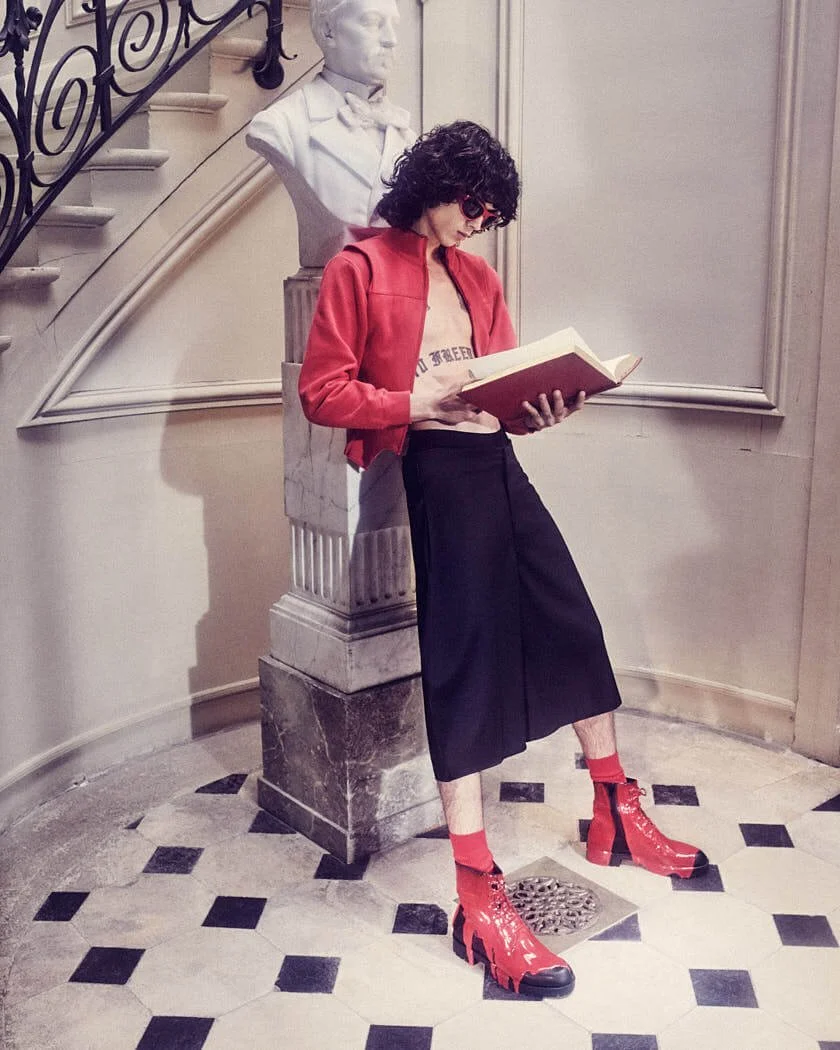
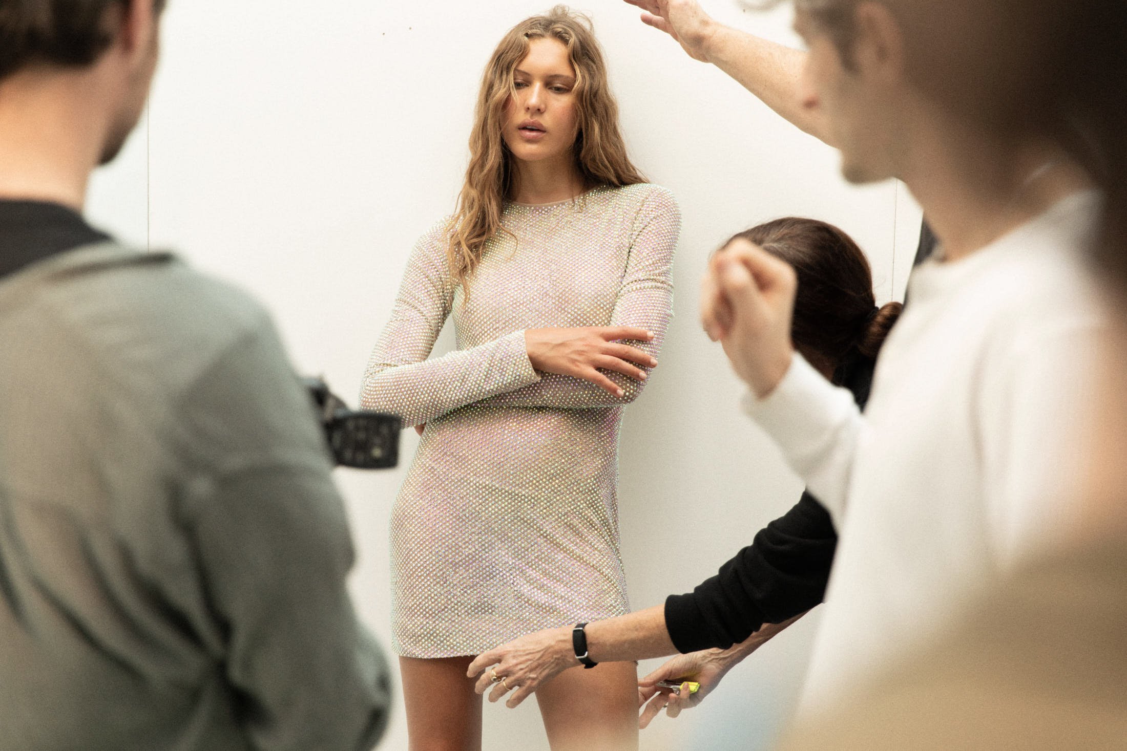
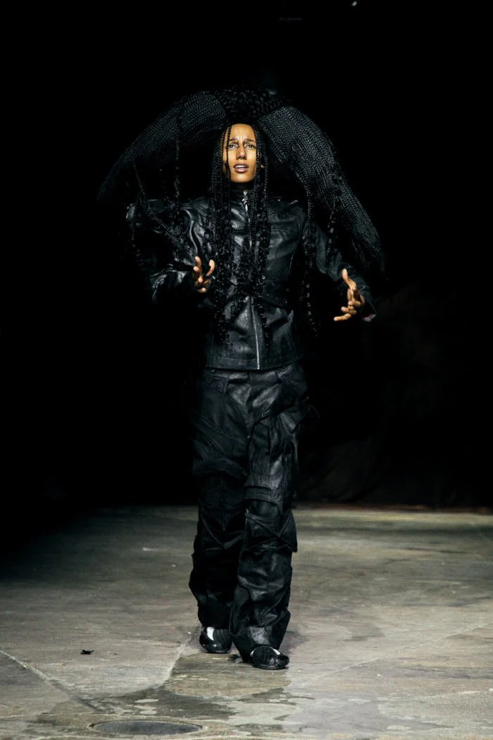
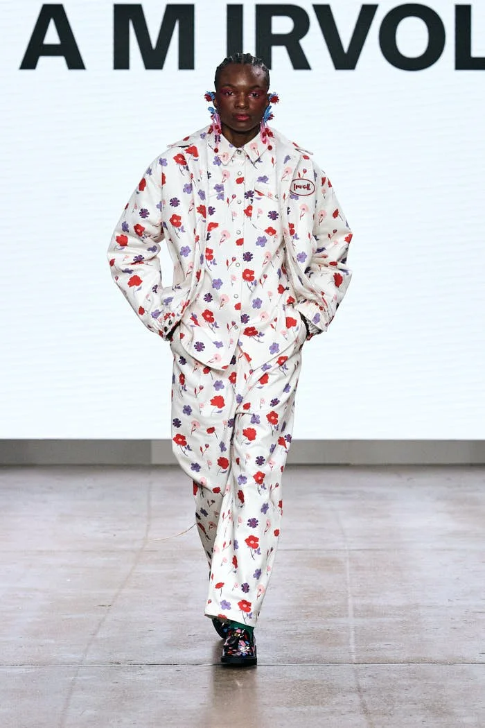
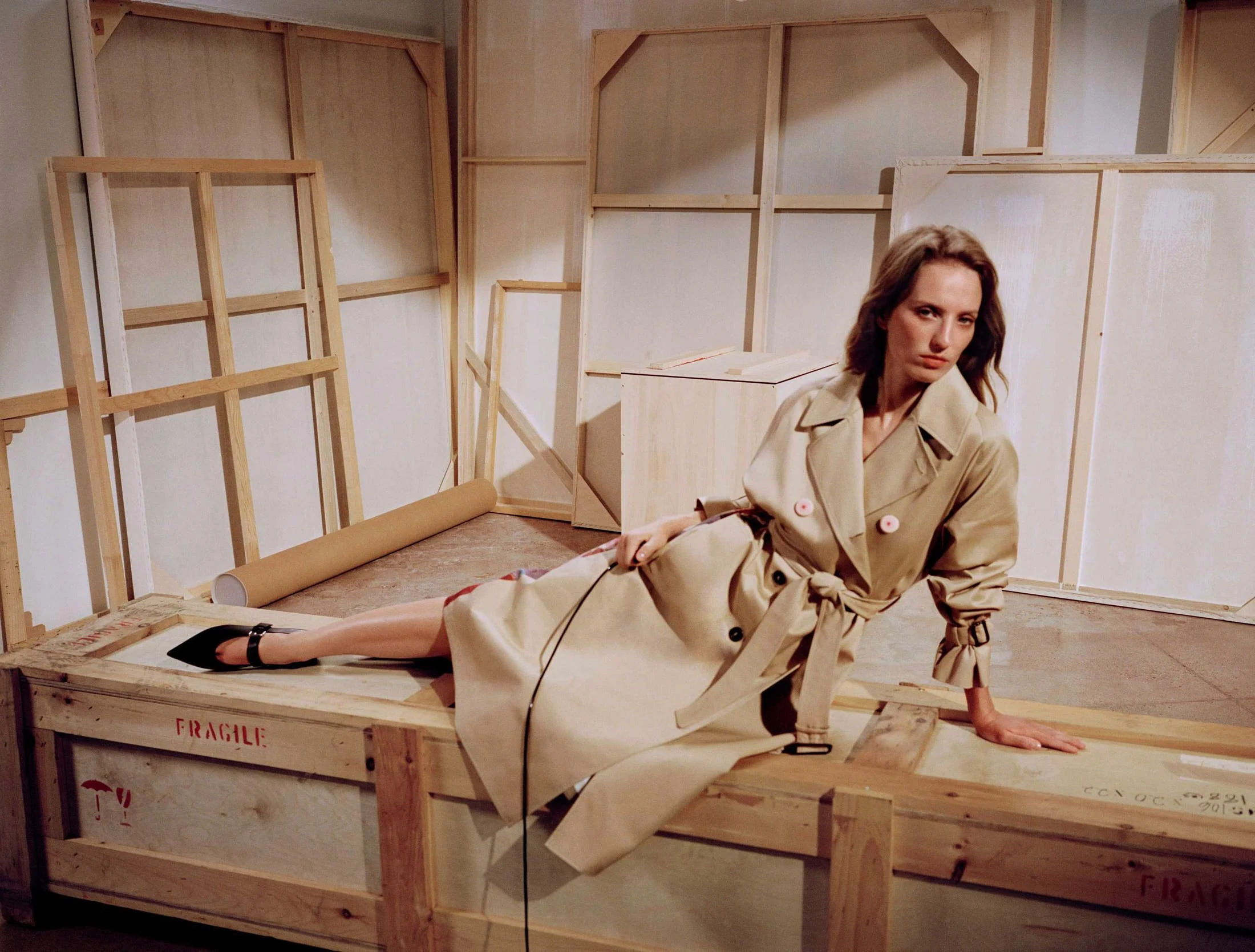
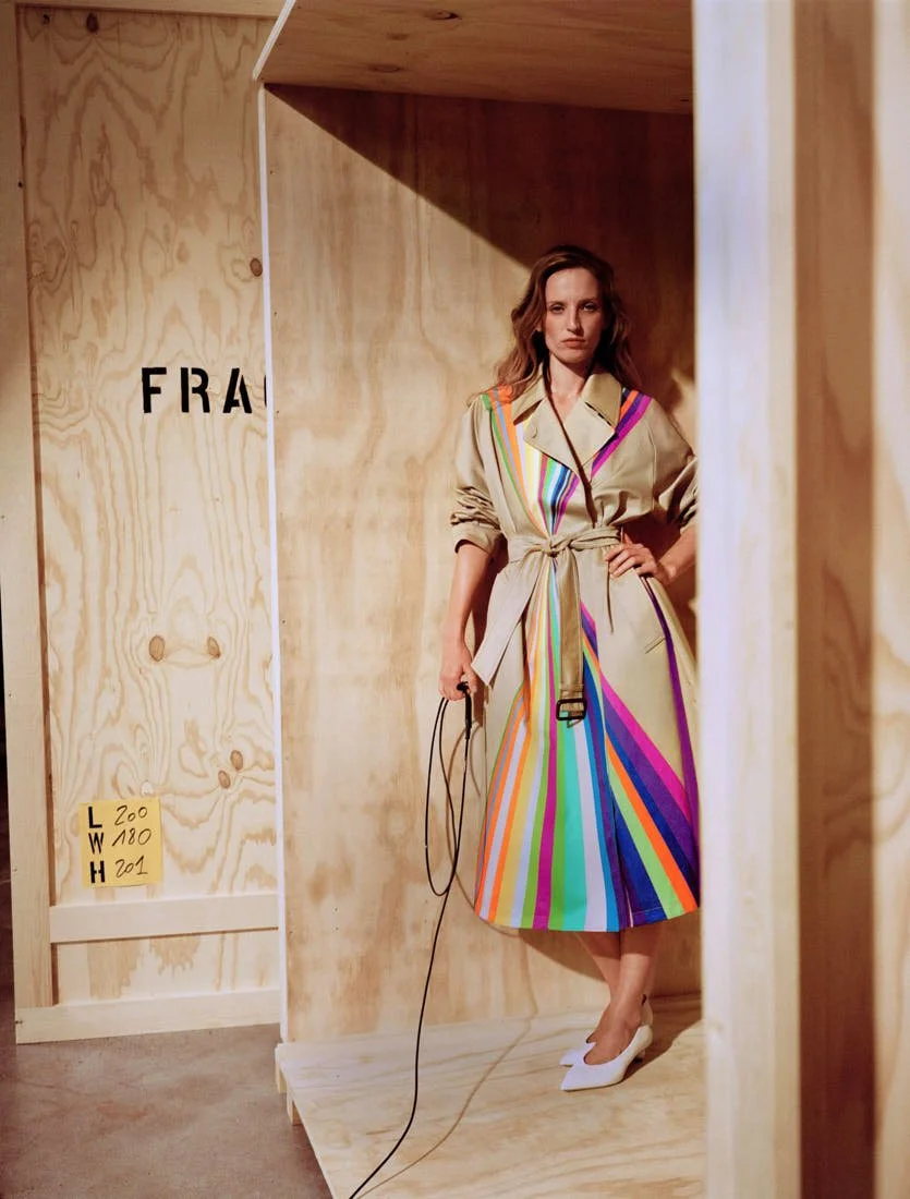
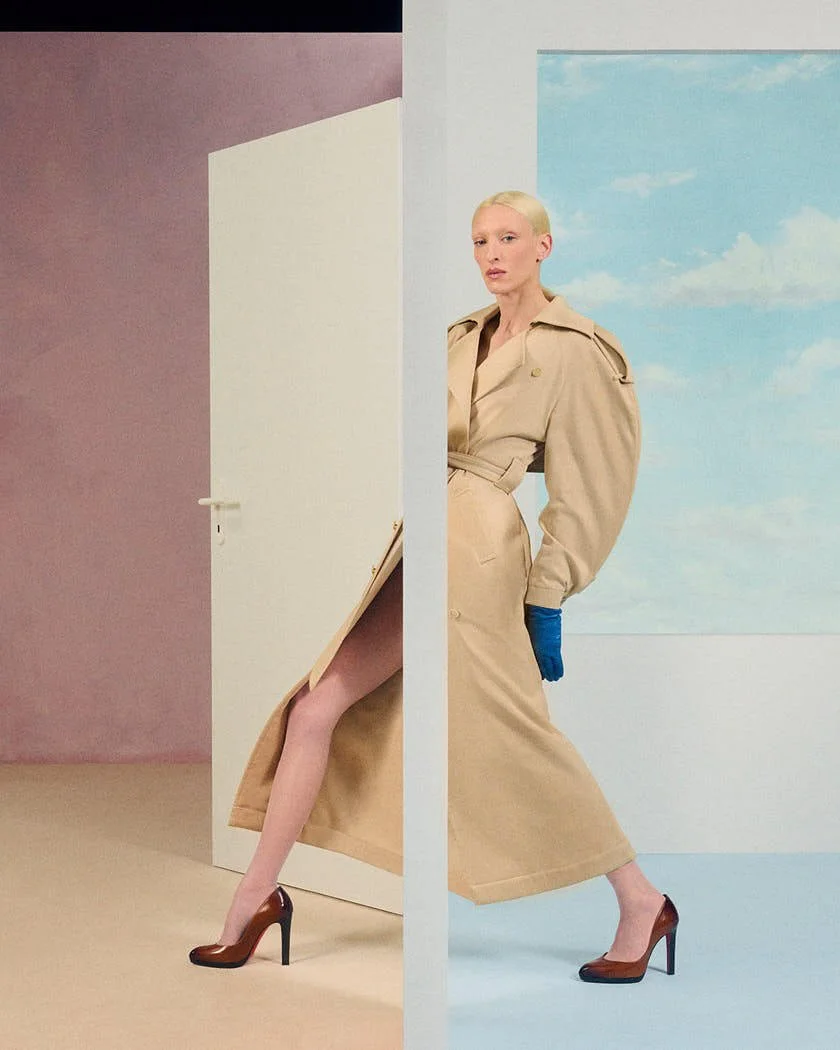
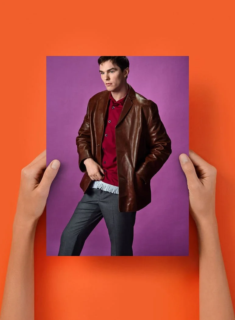
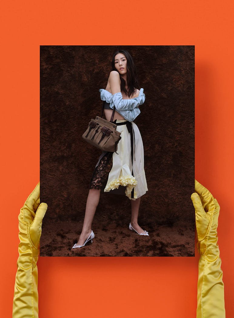
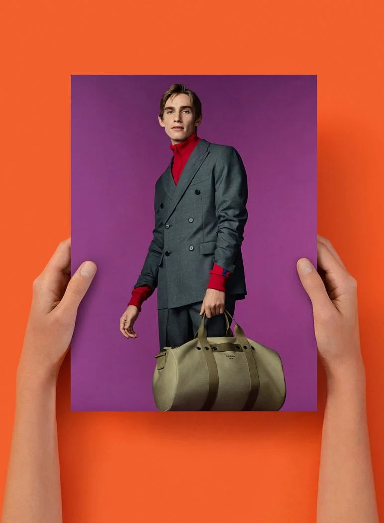
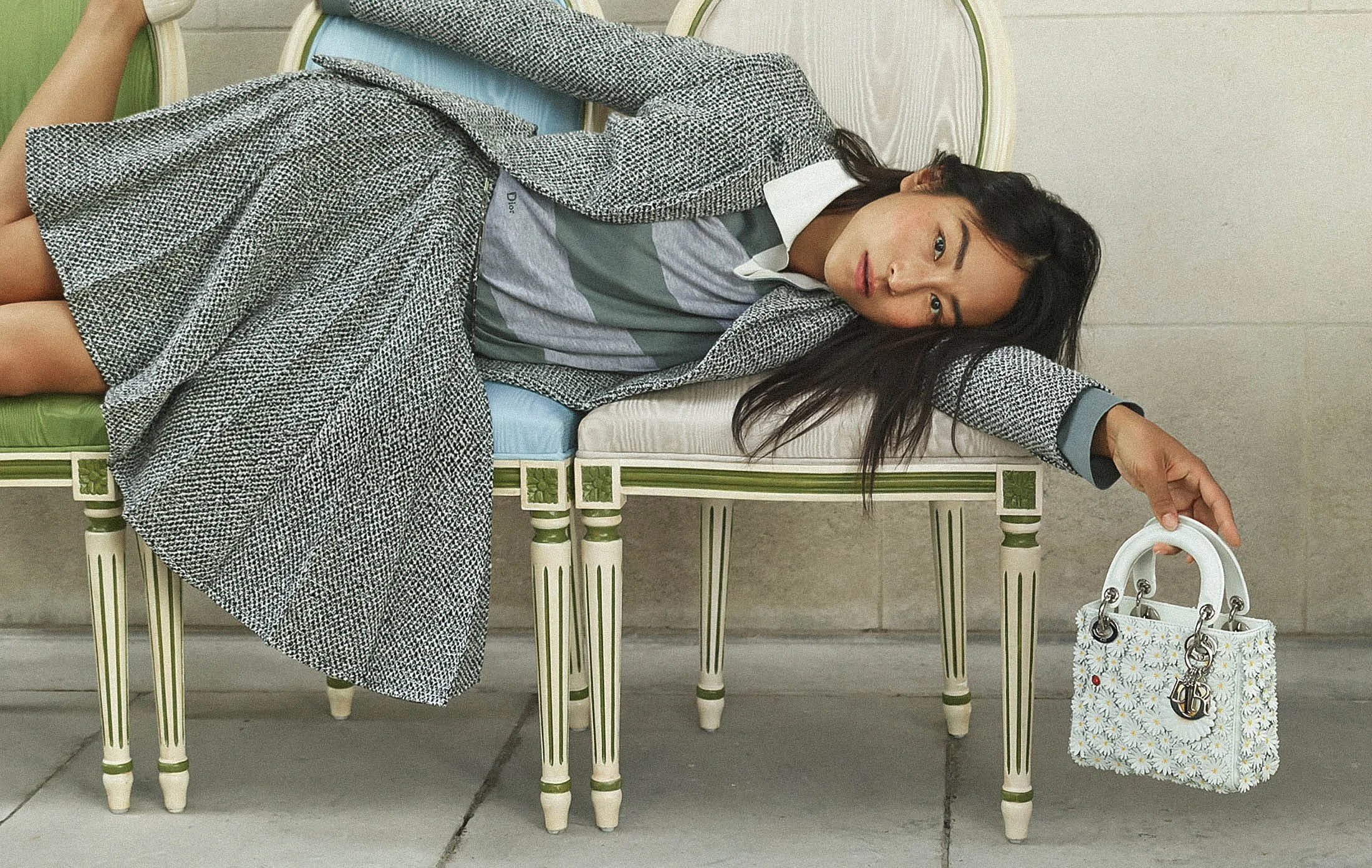
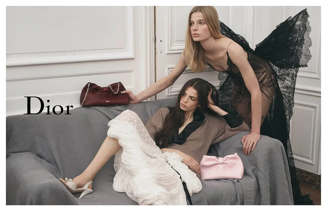
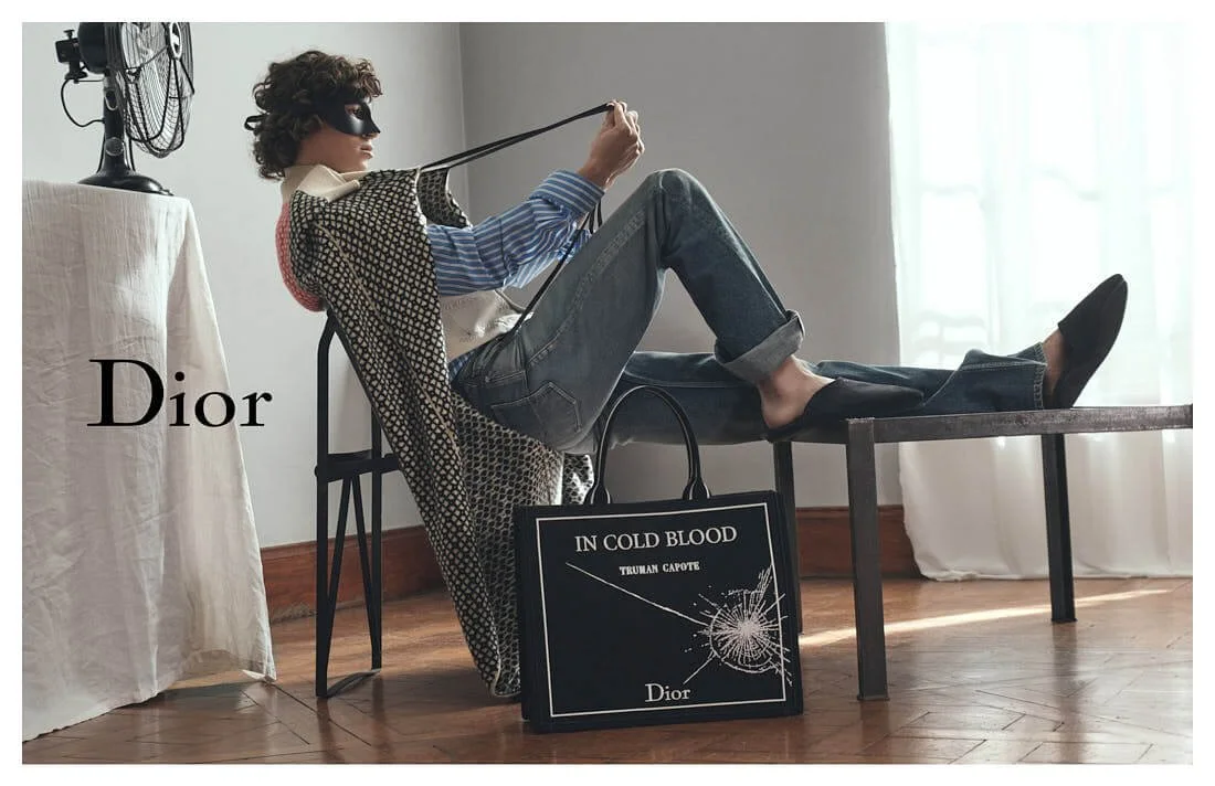
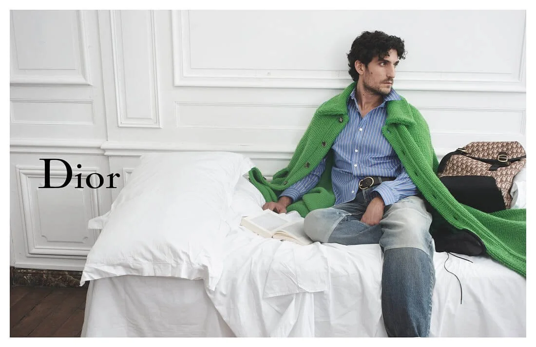
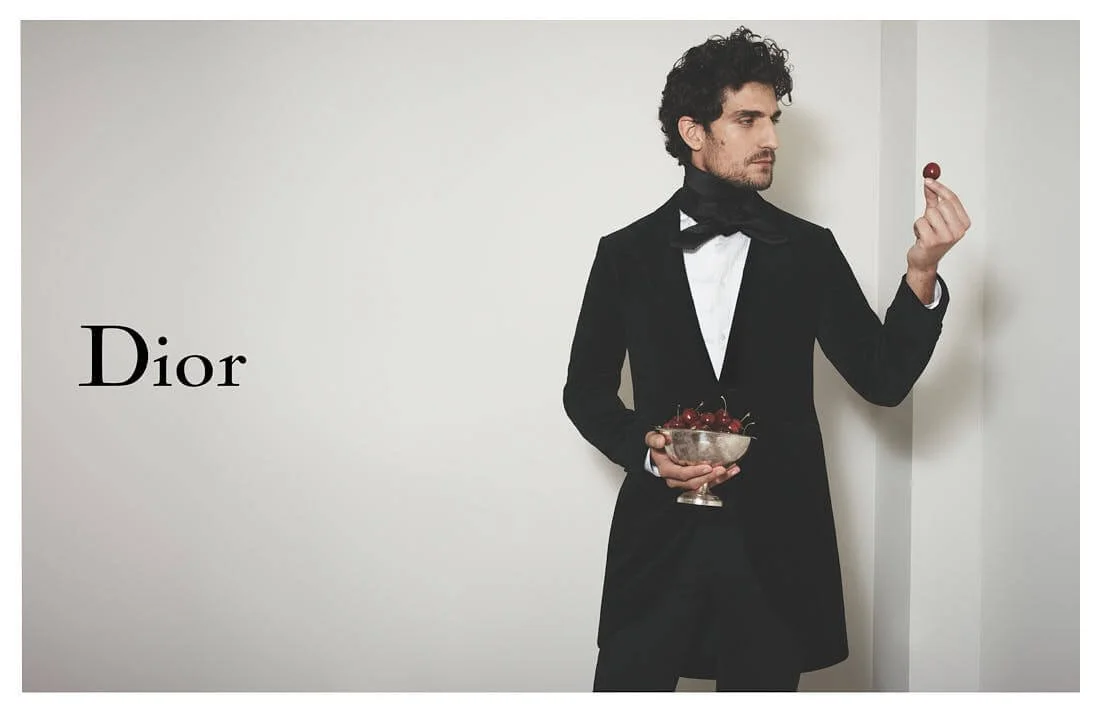
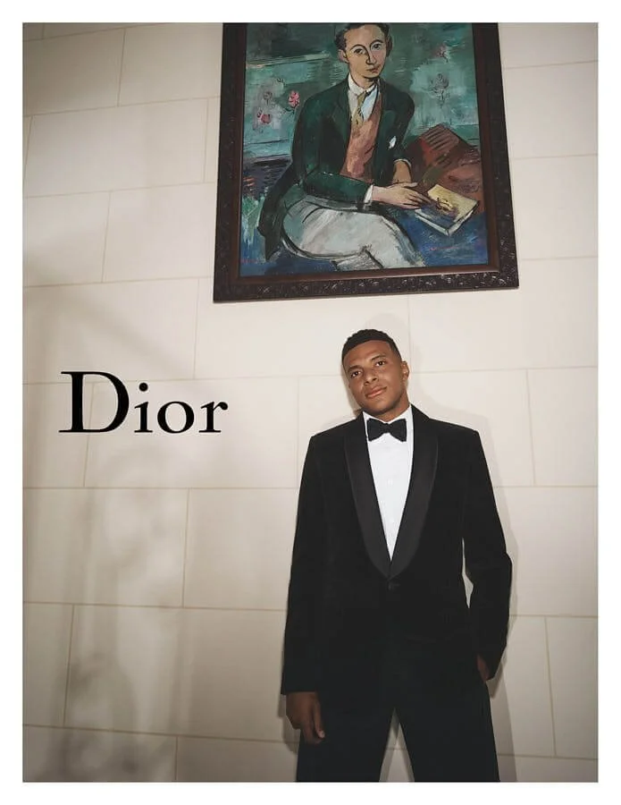
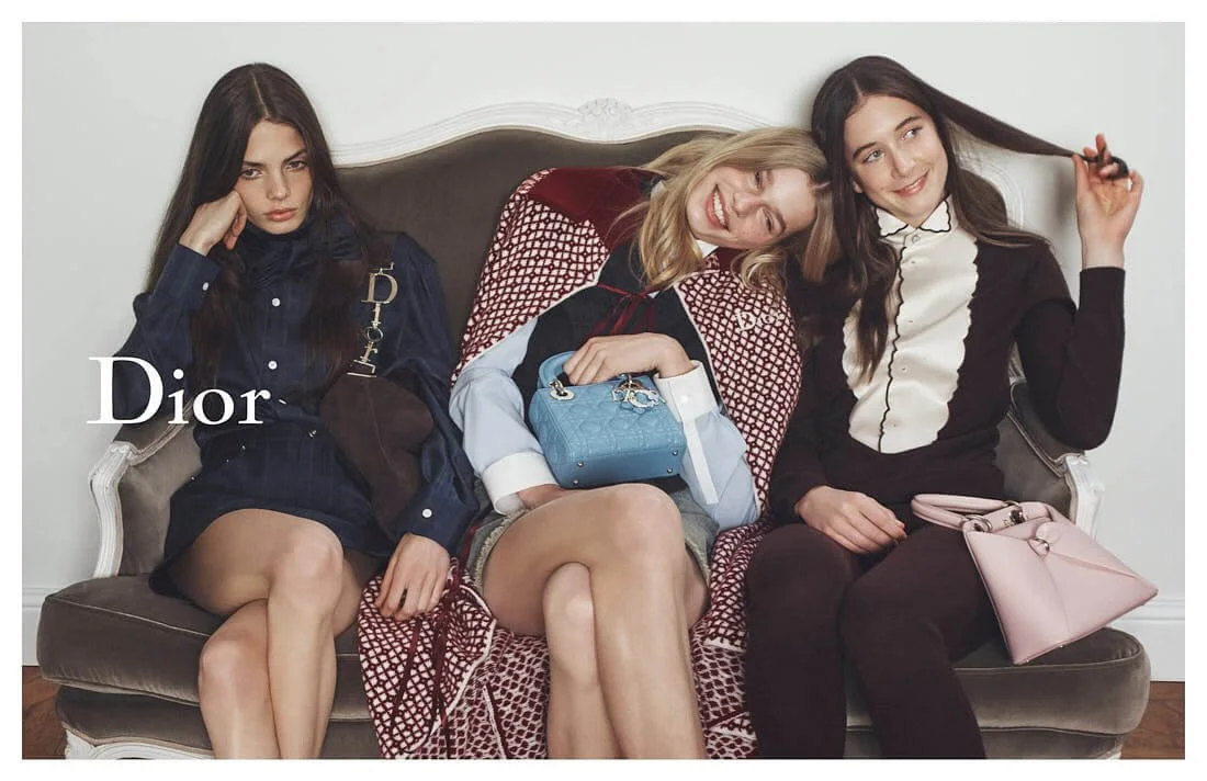
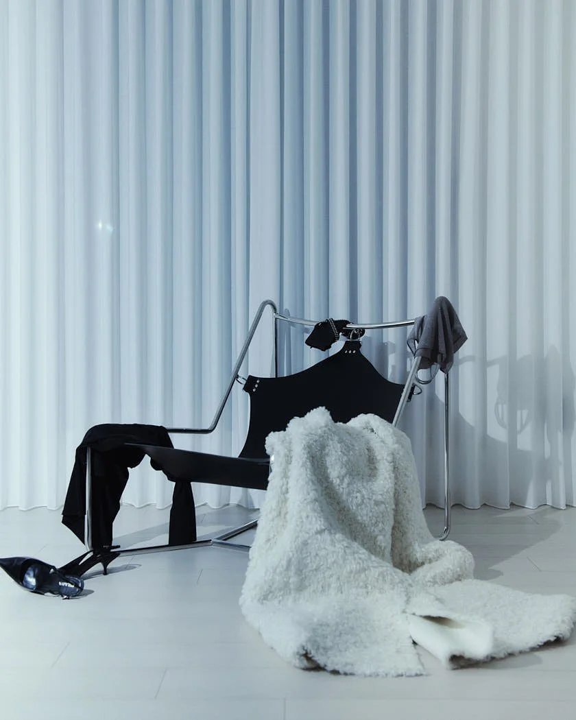
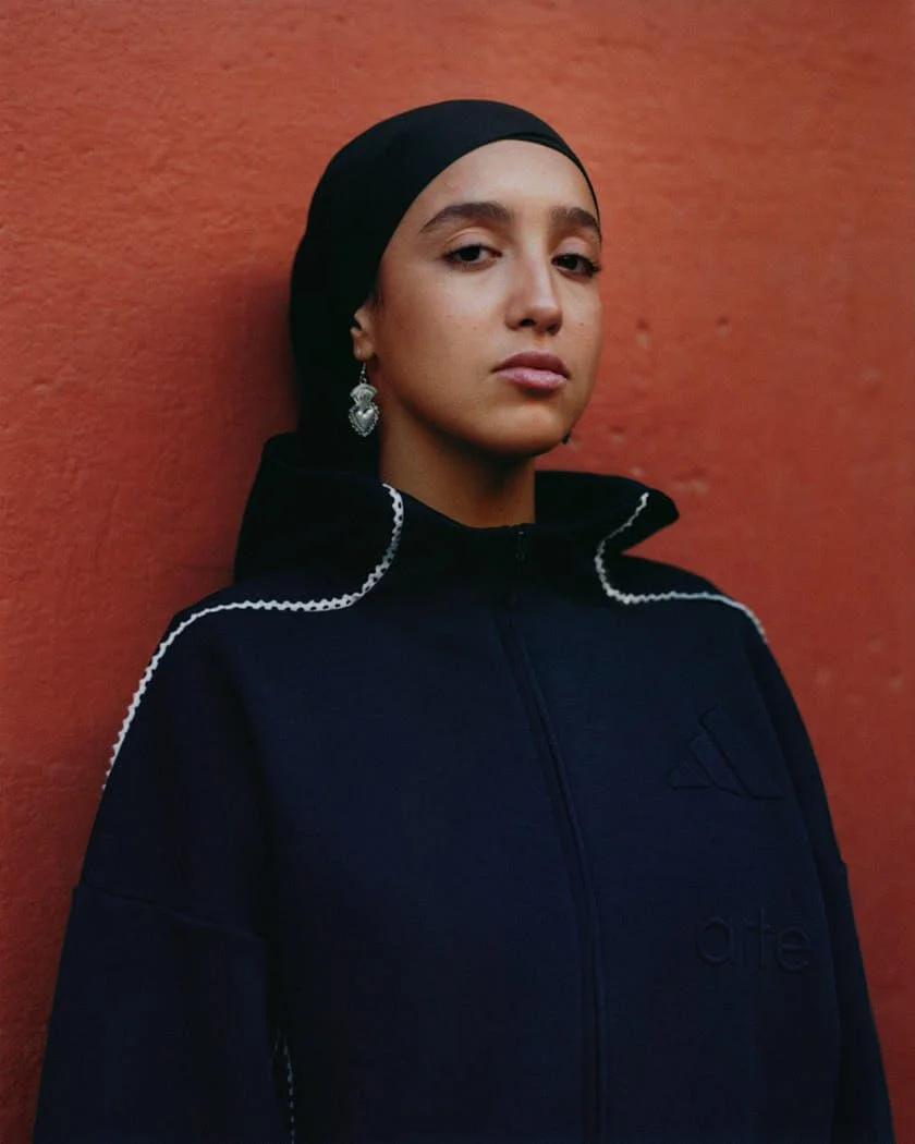
Valentino Cruise 2027 treats clothes as evidence of private life. In Liv Liberg’s campaign at Villa Gaia Gandini in Milan, Alessandro Michele’s collection sits among rooms that already feel occupied by memory, with coats, prints, shoes and bags carrying the pressure of people who have dressed for themselves before anyone looked.

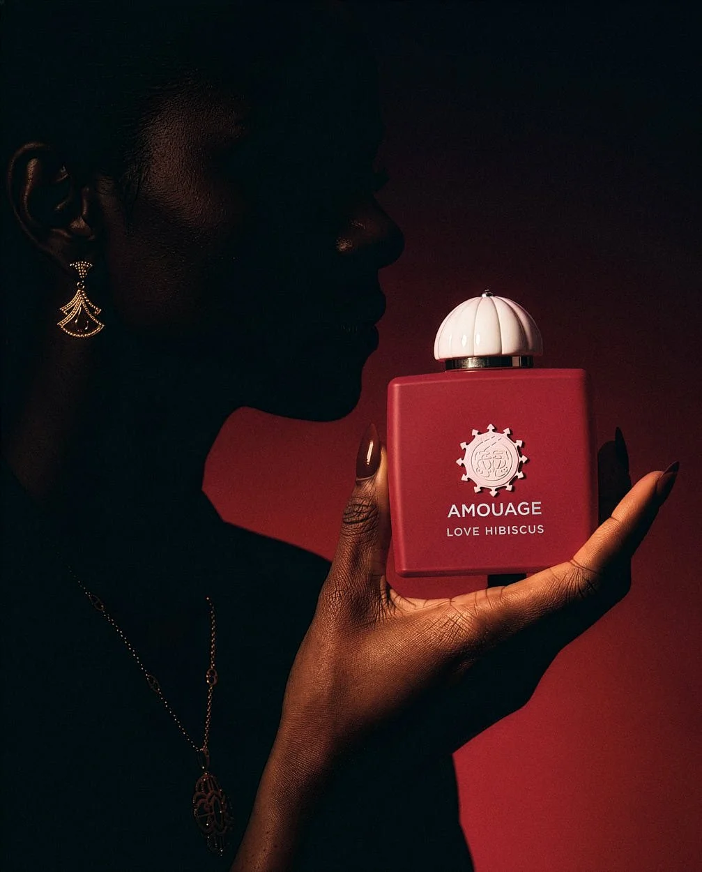
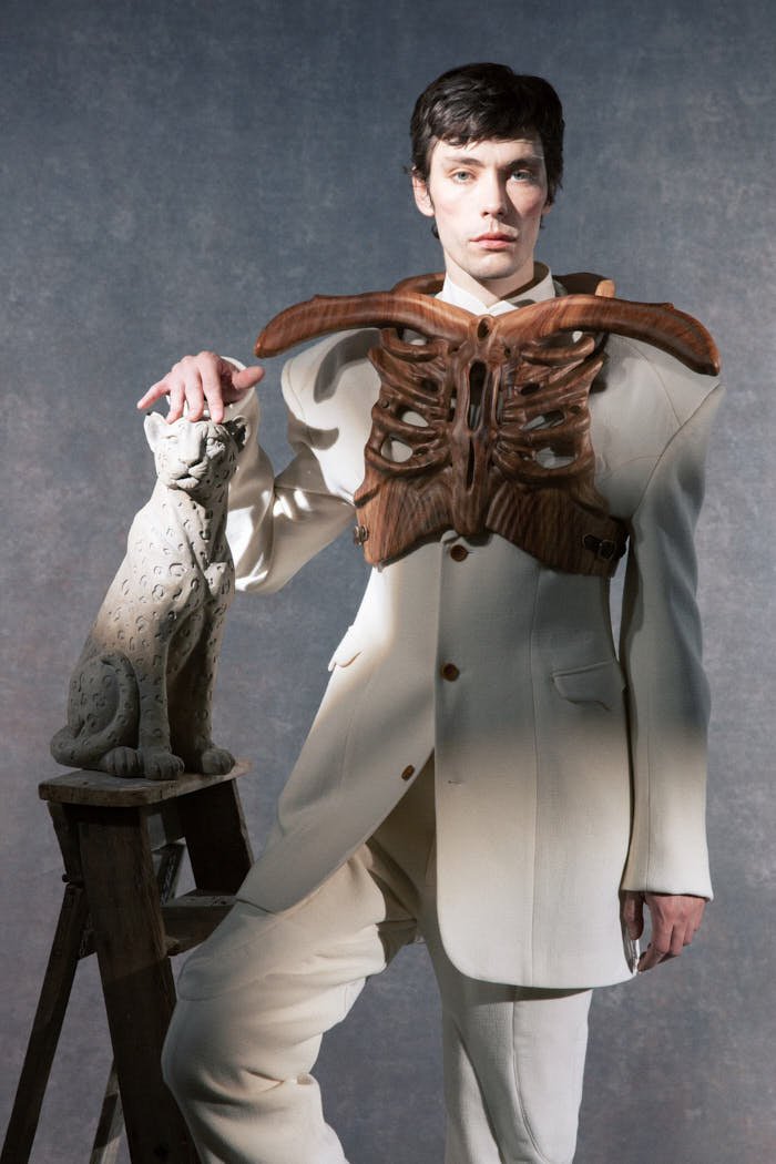
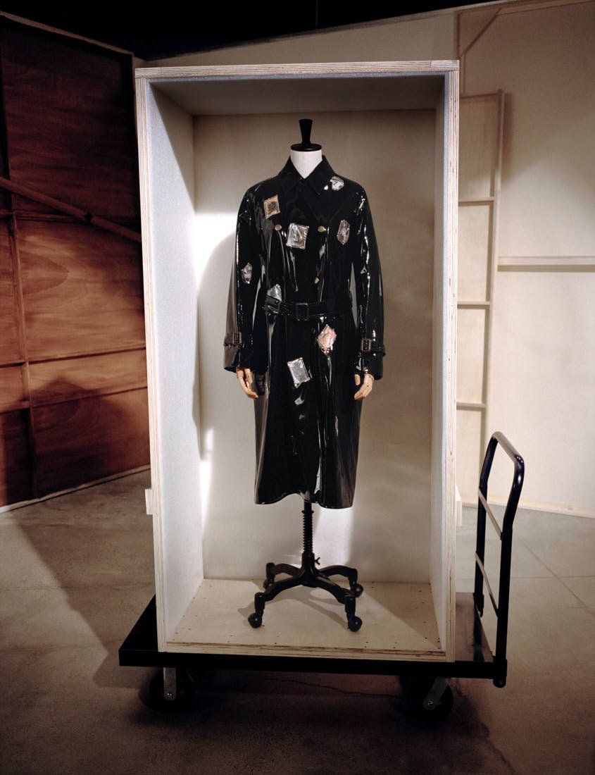
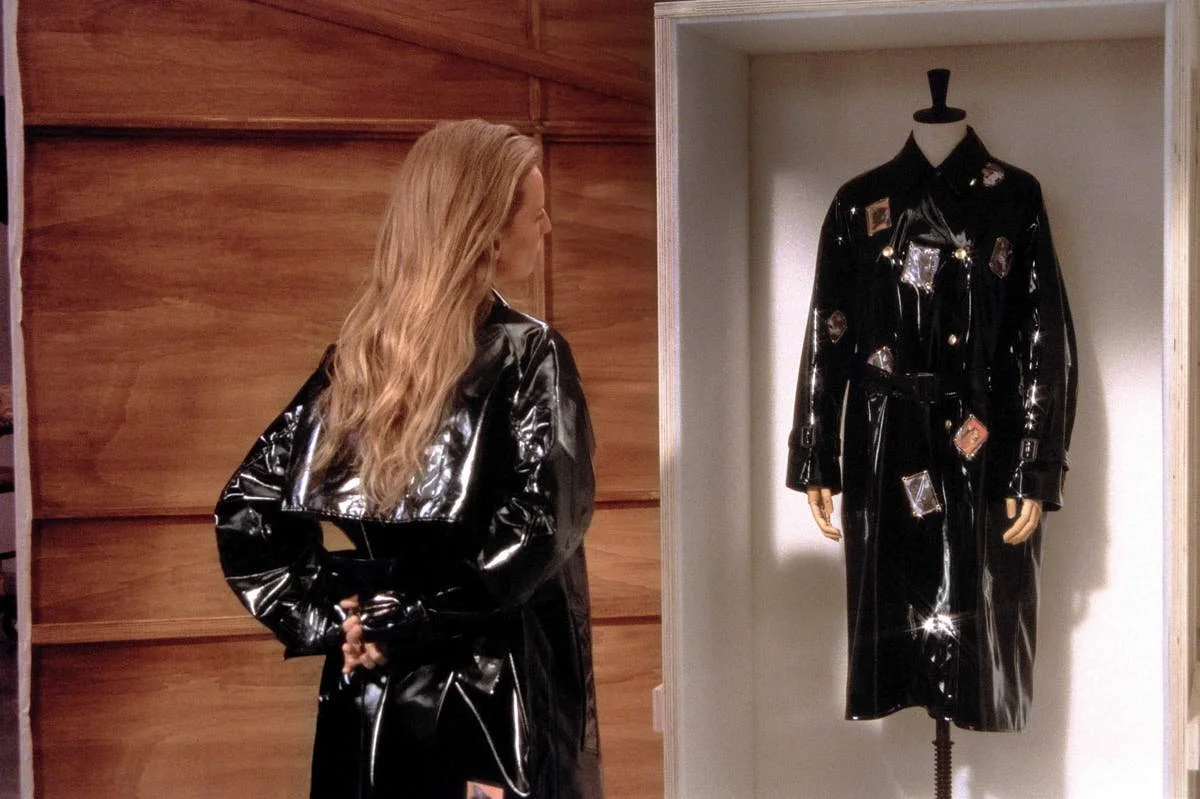
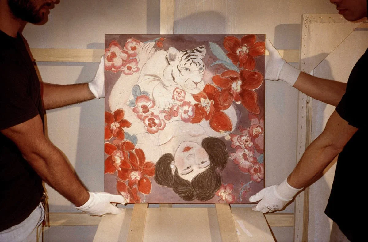
VALENTINO / Cruise 2027 Collection

VALENTINO / Cruise 2027 Collection
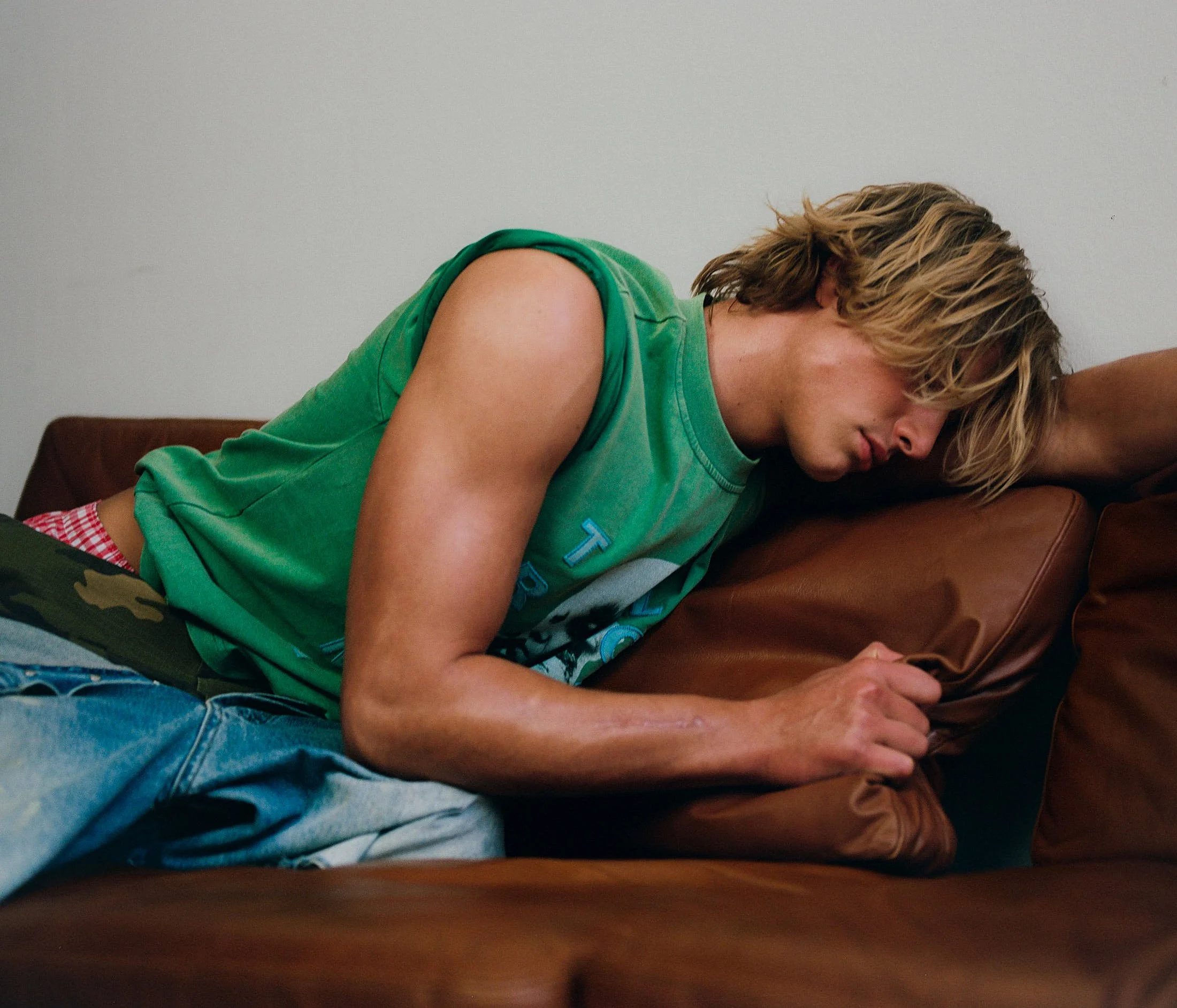
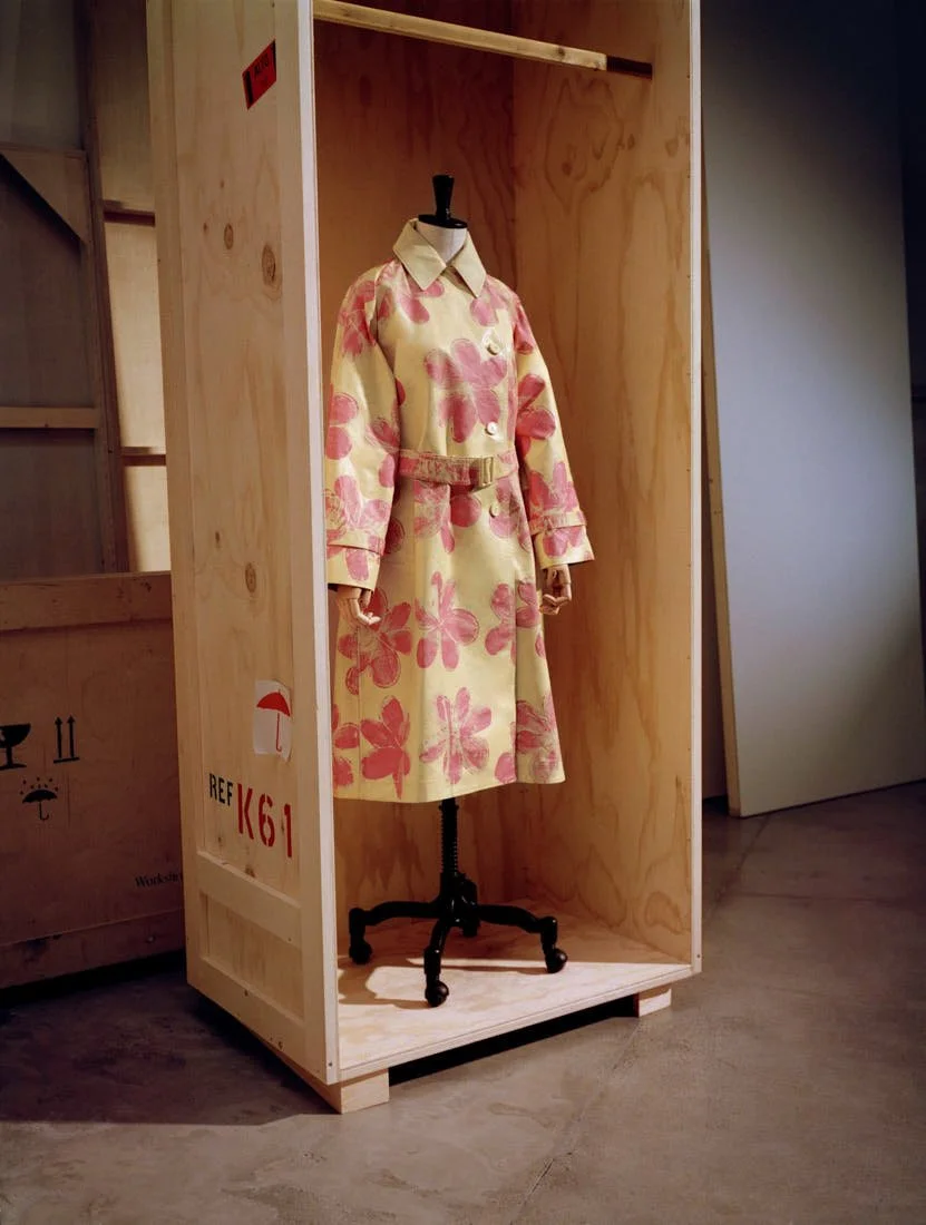
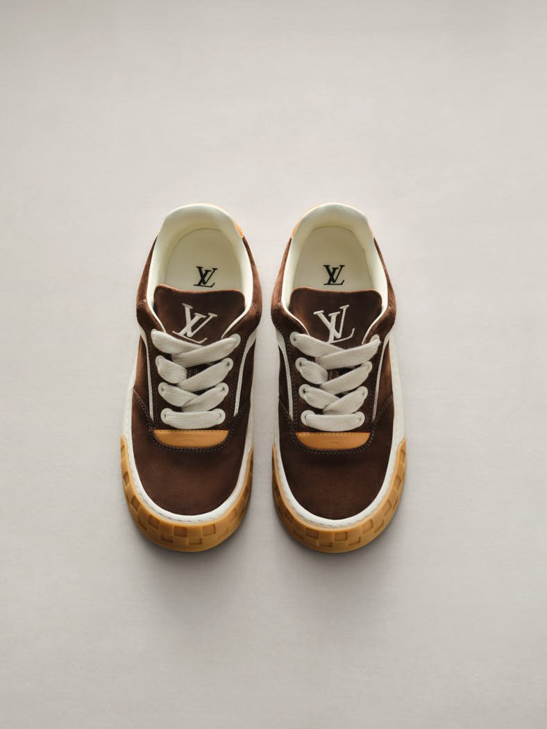
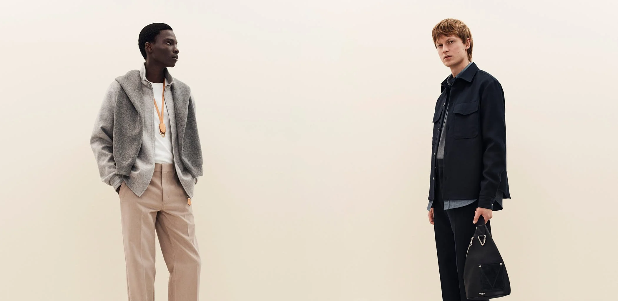
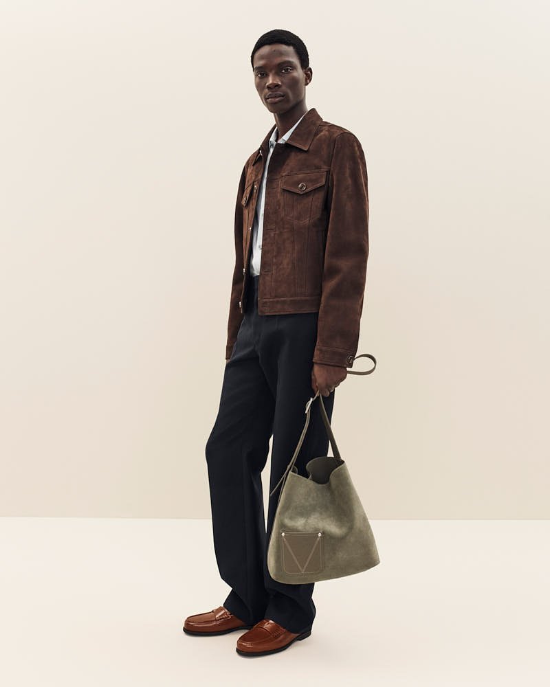
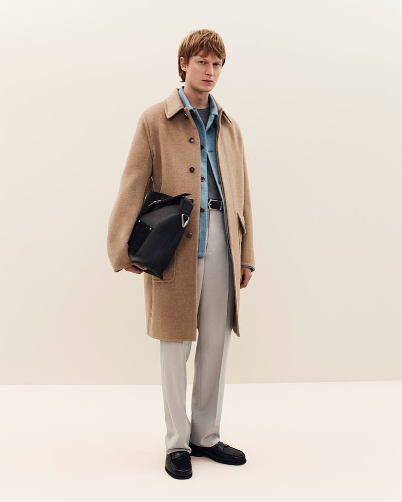
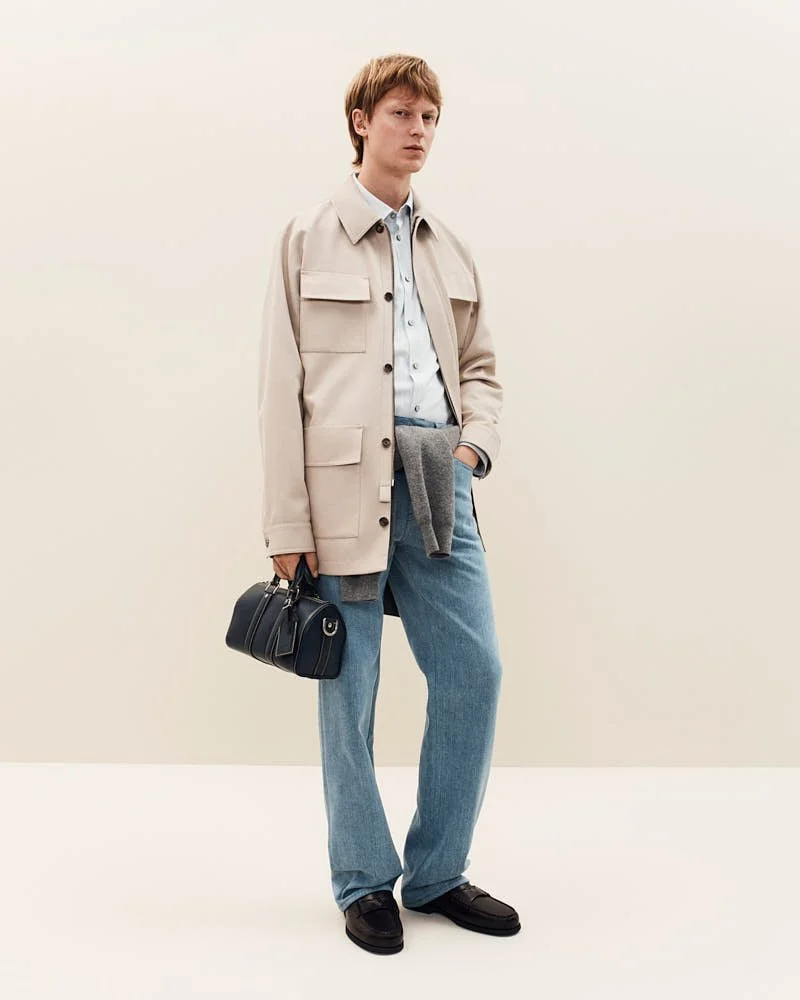
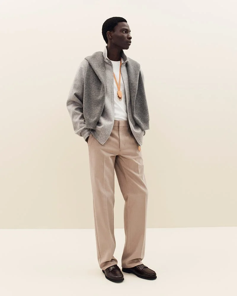
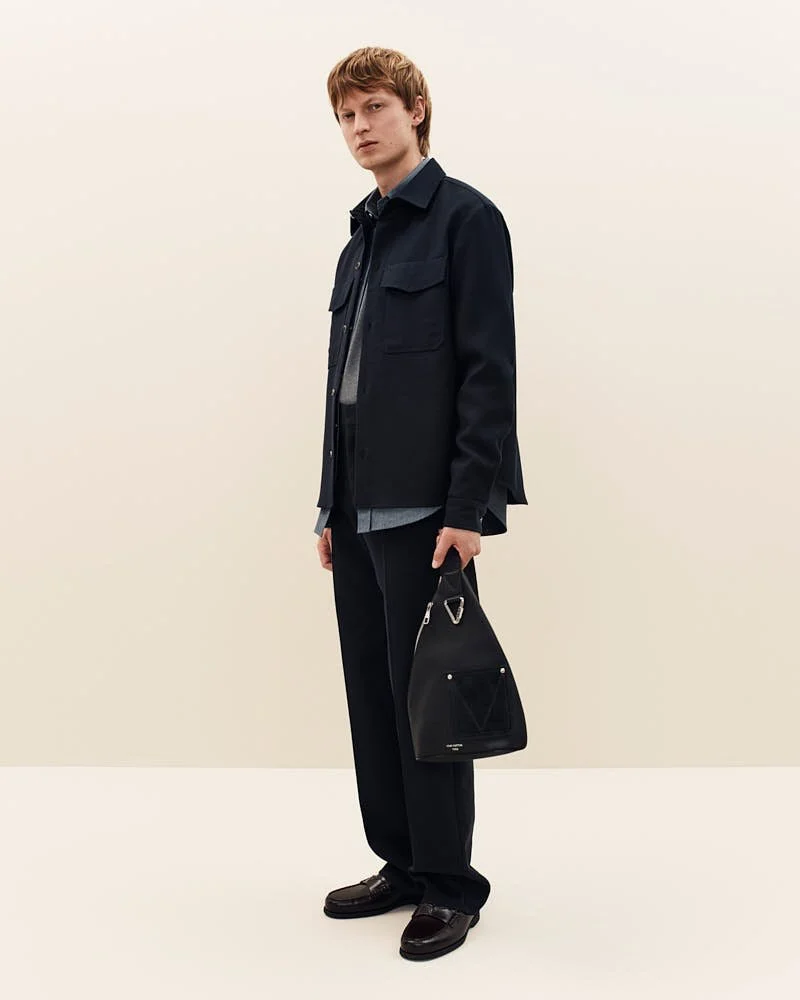
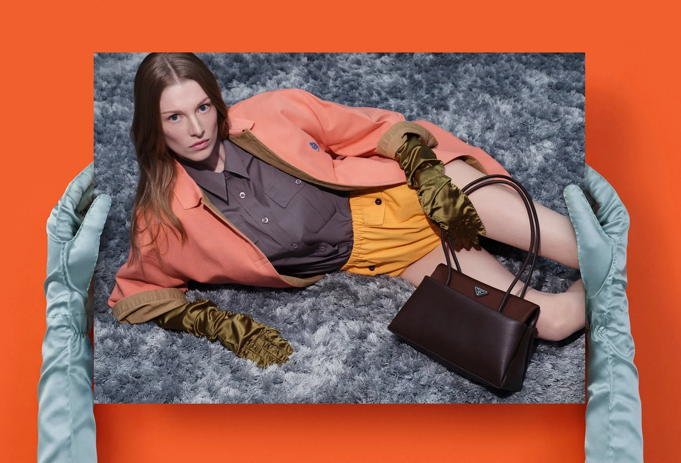
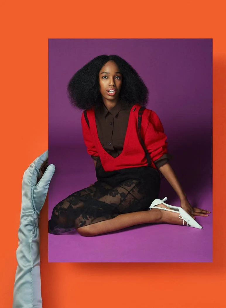
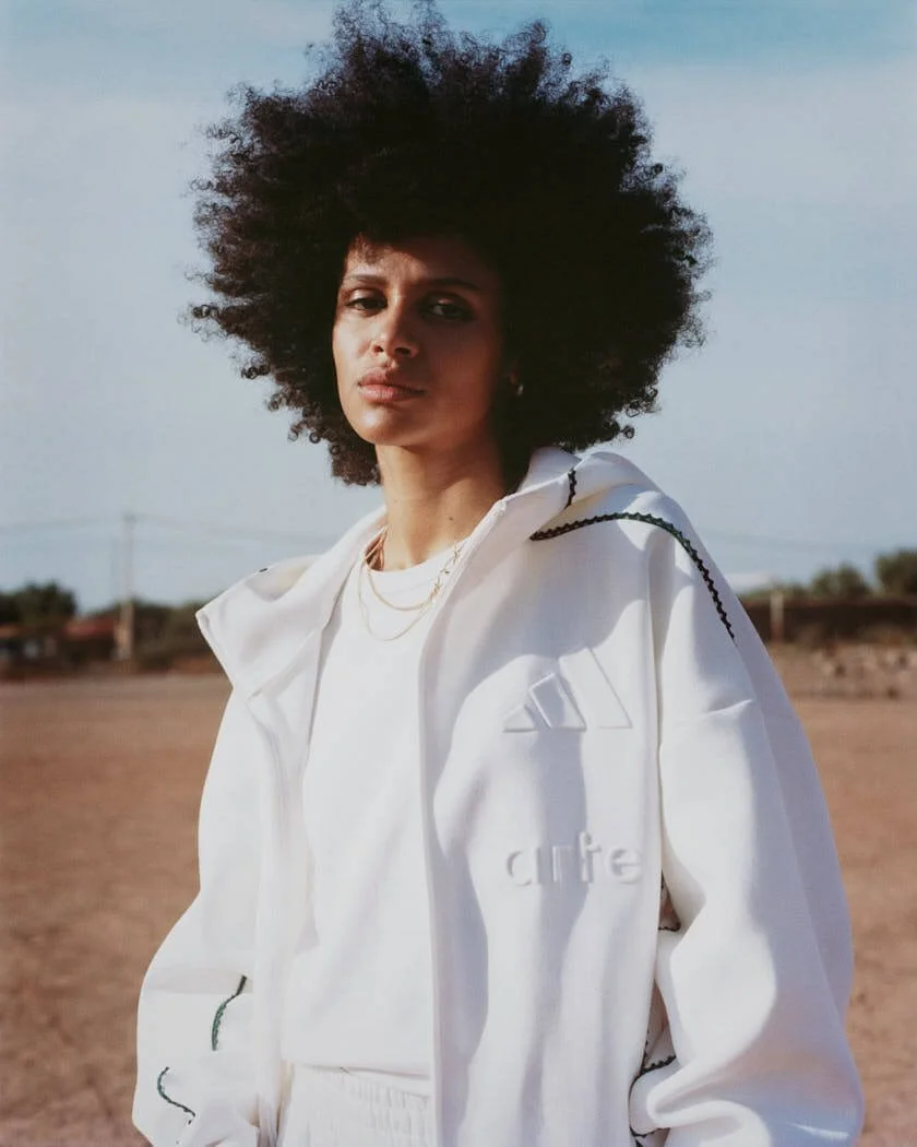
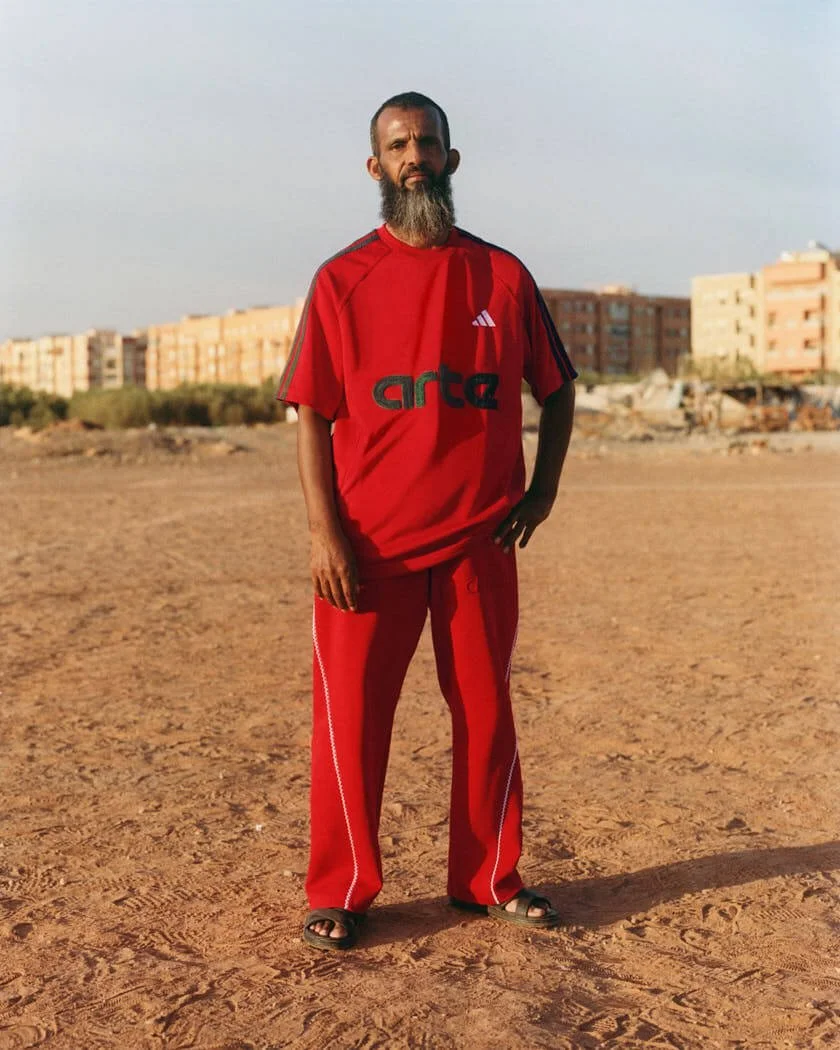
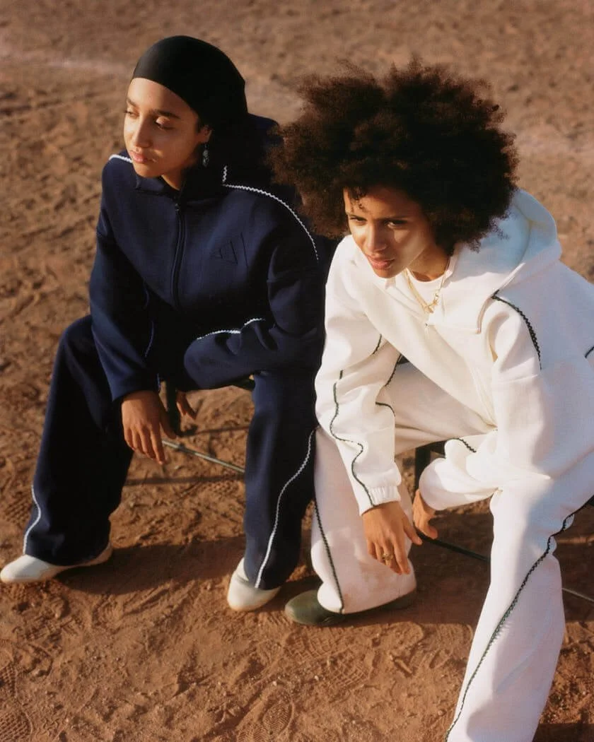
The collection places women’s and men’s wardrobes inside the same emotional register. A floral print has the confidence of something found in a family photograph. A coat sits on the body with deliberate weight. Tailoring softens around the figure, while decorative surfaces give each look a sense of attachment. Michele is interested in the way garments become personal before they become public, the way a sleeve, a collar or a pair of shoes can suggest a life already in motion.
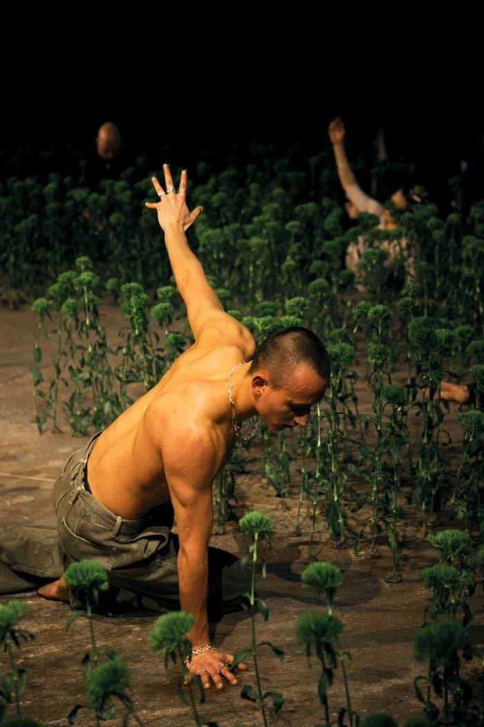
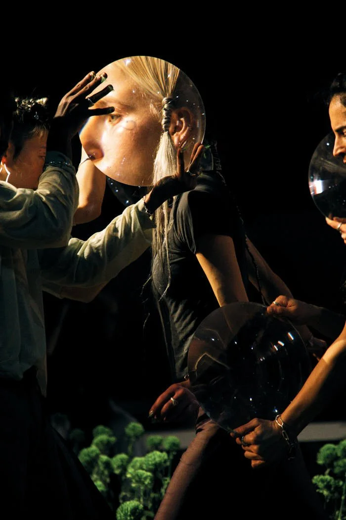
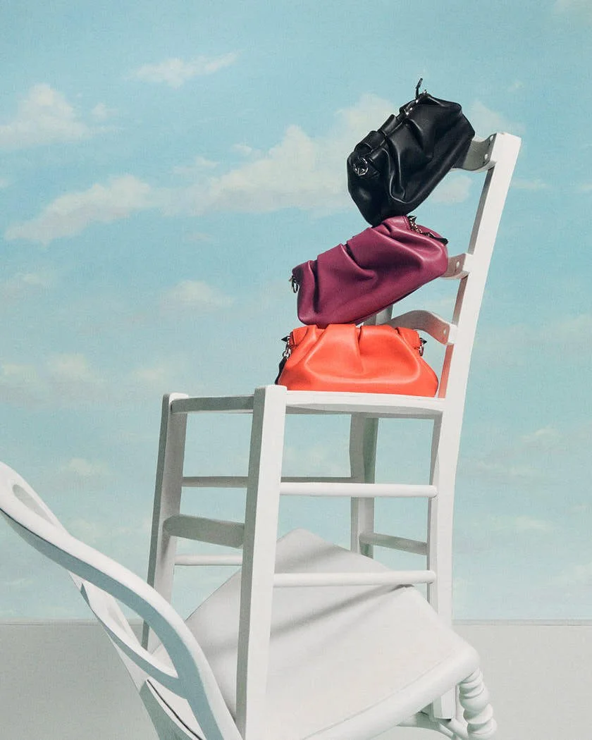
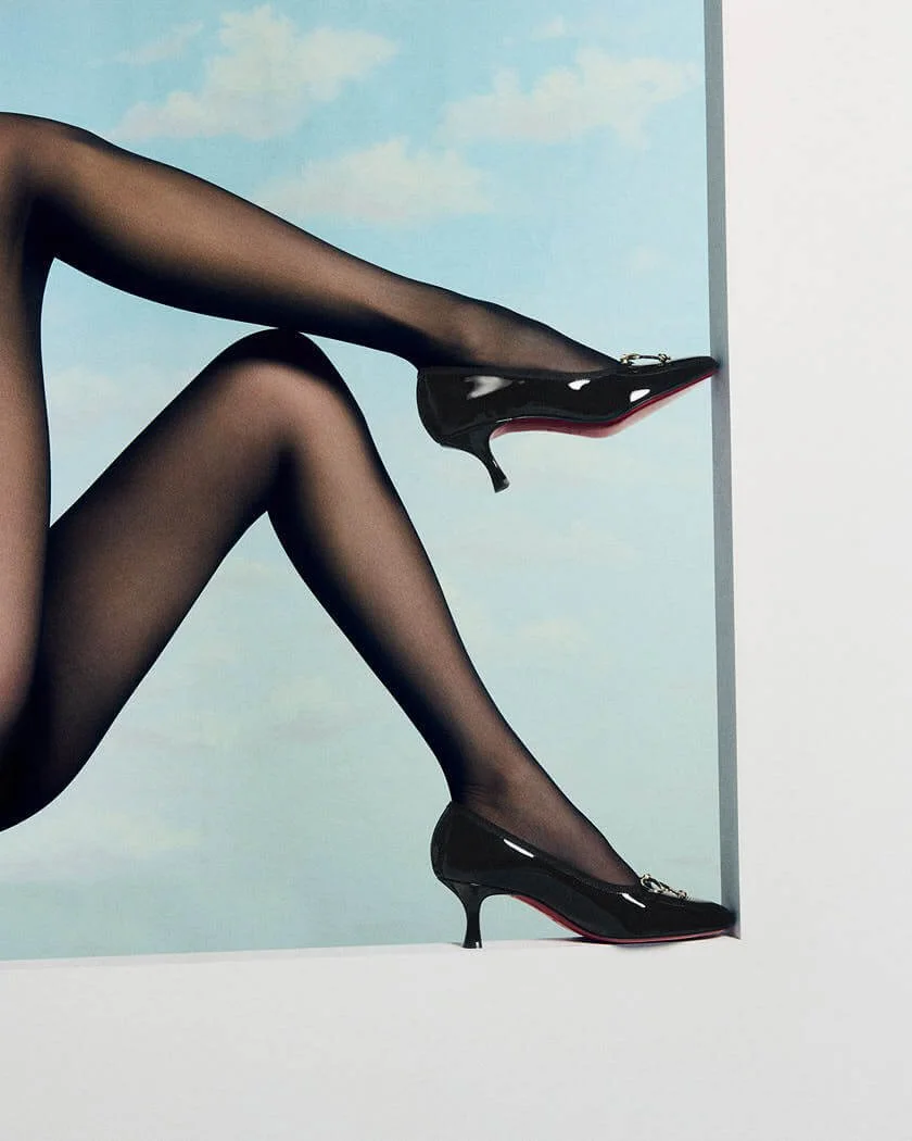
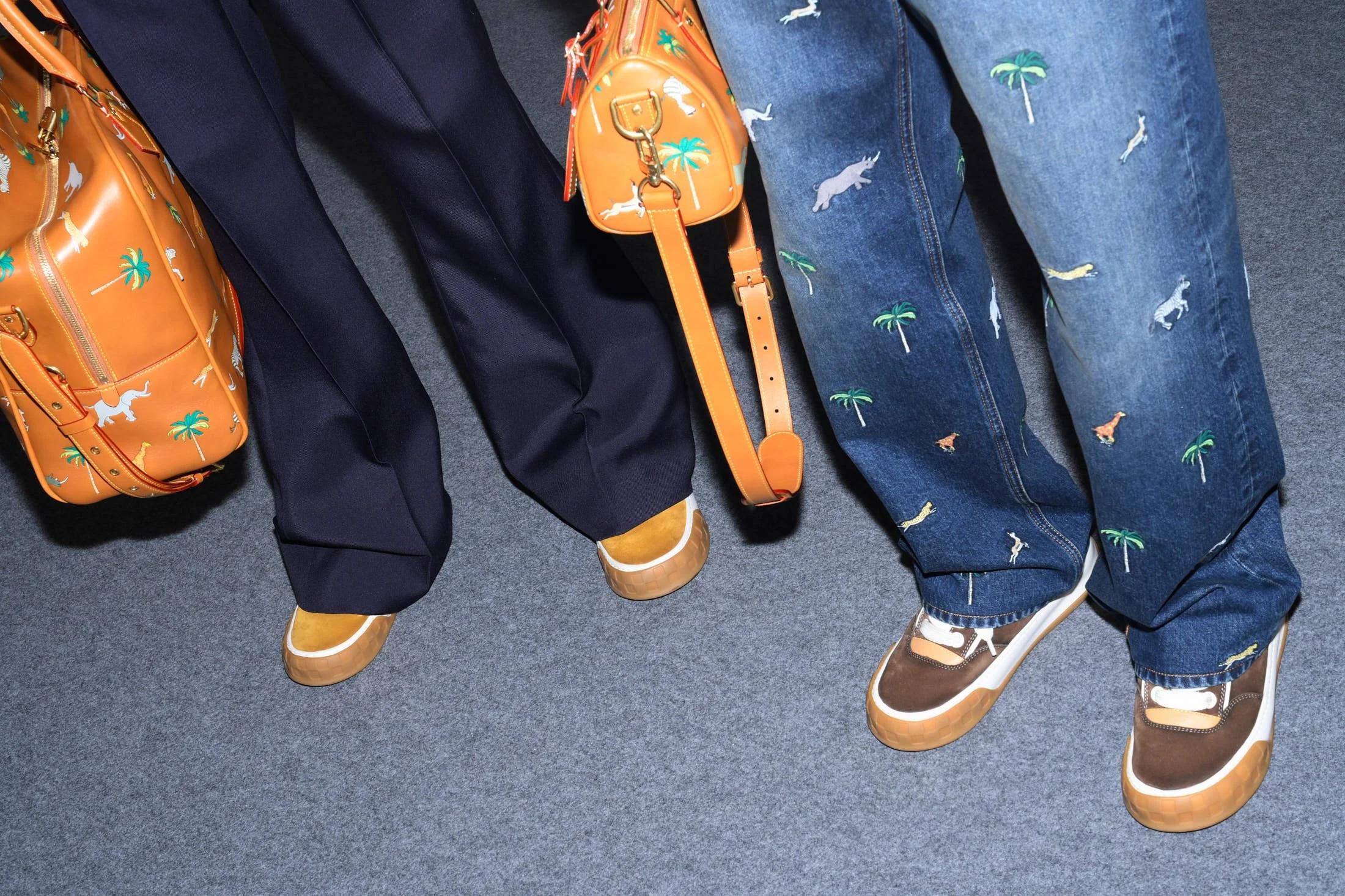
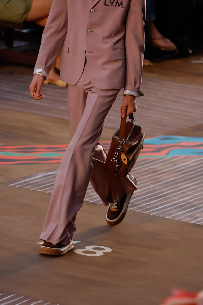
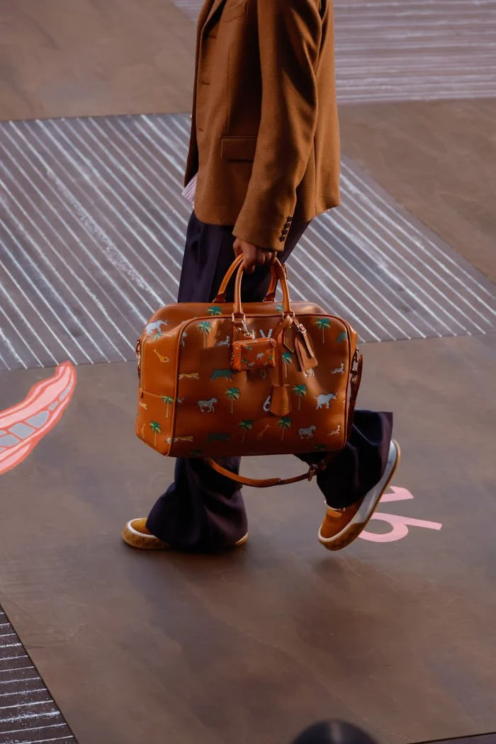
Cruise often belongs to travel, yet here the idea of movement feels closer to interior life. The collection creates characters through clothing that seems chosen with private logic. There is elegance, but it comes through possession rather than polish. A bag is held like something needed, shoes alter posture, prints bring memory into the image, and ornament becomes part of behaviour.

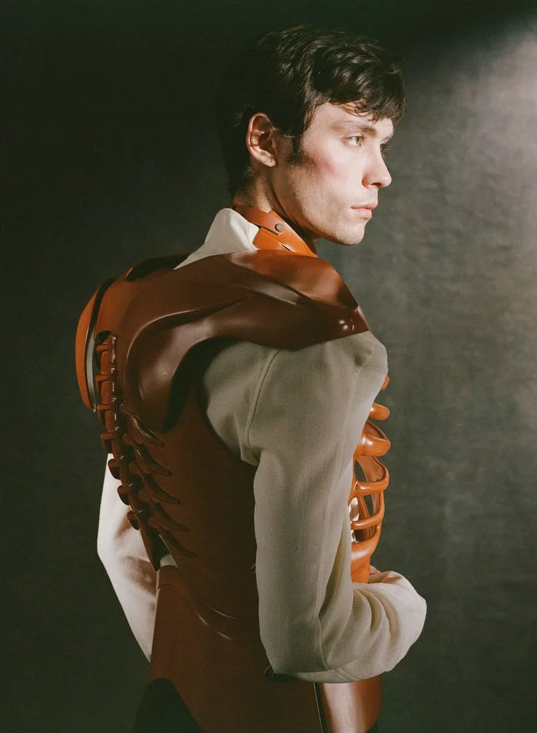
VALENTINO / Cruise 2027 Collection

VALENTINO / Cruise 2027 Collection
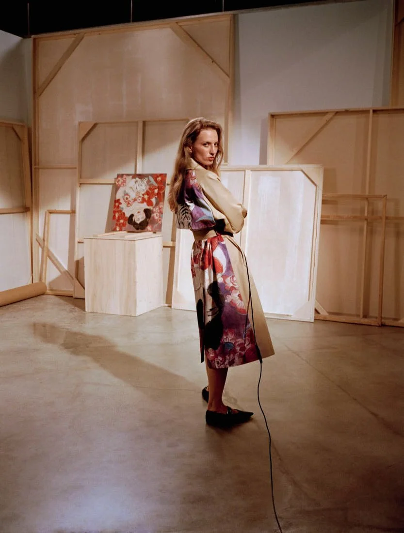
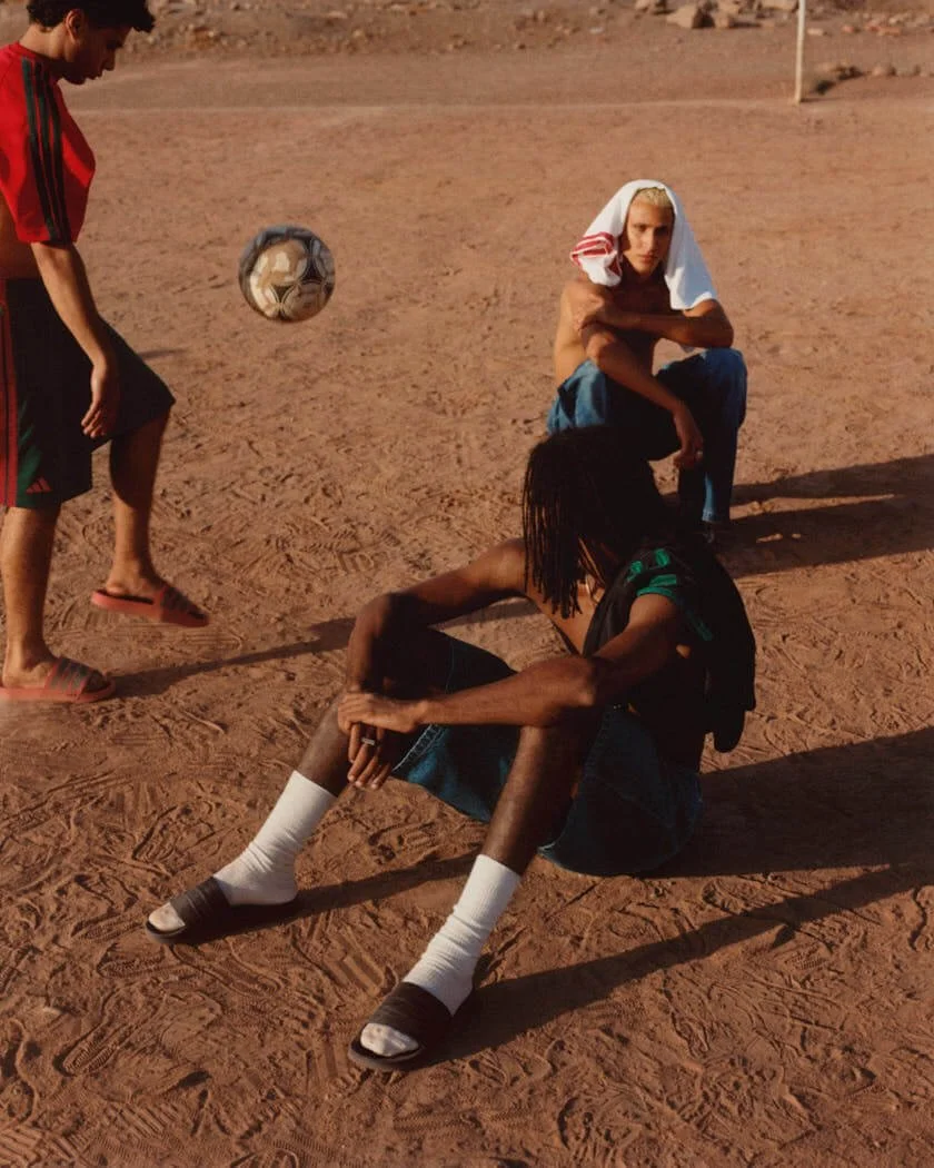
Liv Liberg’s photographs sharpen that reading: shot at Villa Gaia Gandini in Milan, the campaign places George Anderson, Valery Sergeva, Yar Aguer, Gaetan Bianchi, Dario Tonin and Khadim Diouff inside a setting filled with domestic gravity. The villa gives the collection a lived frame. Walls, mirrors and furniture hold their own presence, making the clothes feel observed by the rooms as much as by the camera. Liberg’s images carry a controlled intimacy and the models appear caught during a pause, close to speech or just after it. Their gestures keep the campaign away from pure display. A hand rests near a bag and a body turns slightly into the room.
This is where Michele’s Valentino feels most precise, because his work for the Maison has often dealt with memory, excess and character, but Cruise 2027 gives those ideas a more domestic pressure. The clothes do not ask to be decoded as symbols. They work through wear, through mood, through the friction between private taste and public image.

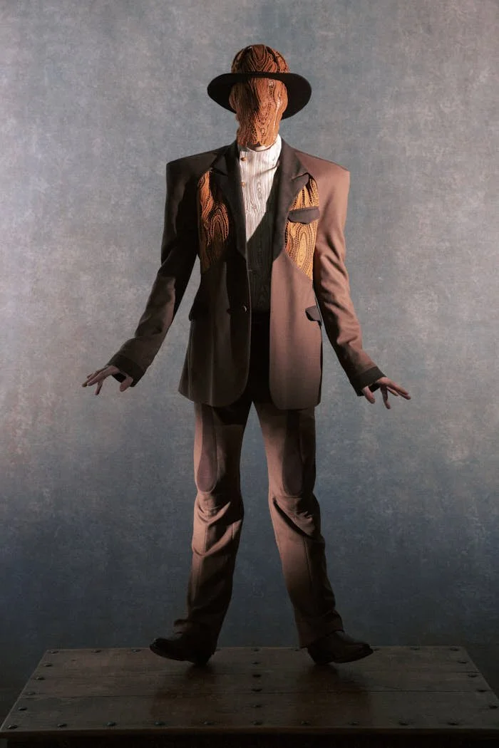
VALENTINO / Cruise 2027 Collection

VALENTINO / Cruise 2027 Collection

VALENTINO / Cruise 2027 Collection

VALENTINO / Cruise 2027 Collection
The campaign uses Milan as a house, a stage of possession, a place where fashion enters rooms already charged with time. Valentino Cruise 2027 gains its force from that tension: clothes carrying the trace of someone’s life, photographed in a space that seems to remember its own.

VALENTINO / Cruise 2027 Collection
all images Courtesy of Valentino
creative director ALESSANDRO MICHELE
photographer LIV LIBERG
hair stylist PAOLO SOFFIATTI
make-up artist JOEL BABICCI
manicurist ROBERTA RODI
models GEORGE ANDERSON, VALERY SERGEVA, YAR AGUER, GAETAN BIANCHI, DARIO TONIN, KHADIM DIOUFF
location VILLA GAIA GANDINI, ROBECCO SUL NAVIGLIO, MILAN, ITALY