Viewing entries tagged
product design

SECRID and the Things We Carry - The Contemporary Wallet Reconsidered

SECRID and the Things We Carry - The Contemporary Wallet Reconsidered

.specials

SECRID and the Things We Carry


LE MILE


Before leaving the house, there is still that familiar inventory of what needs to come along. Phone, keys, wallet. The sequence has survived remarkably well, even as the objects behind it have changed. Payment cards, train tickets and boarding passes have moved onto screens, receipts increasingly arrive by email, and cash has become optional in many situations. The wallet remains, though its definition has loosened considerably.


SECRID has been following these changes for much of its history. Founders René van Geer and Marianne van Sasse van Ysselt began considering the consequences of electronic payment in the 1990s, long before the smartphone gathered so many everyday functions into one device. The Cardprotector that followed in 2009 remains at the centre of the Dutch company today. Its aluminium case holds a small stack of cards, while a lever at the base pushes them upwards in a staggered arrangement for access. Seventeen years of development have left that basic gesture recognisable, while the object around it has become increasingly varied.
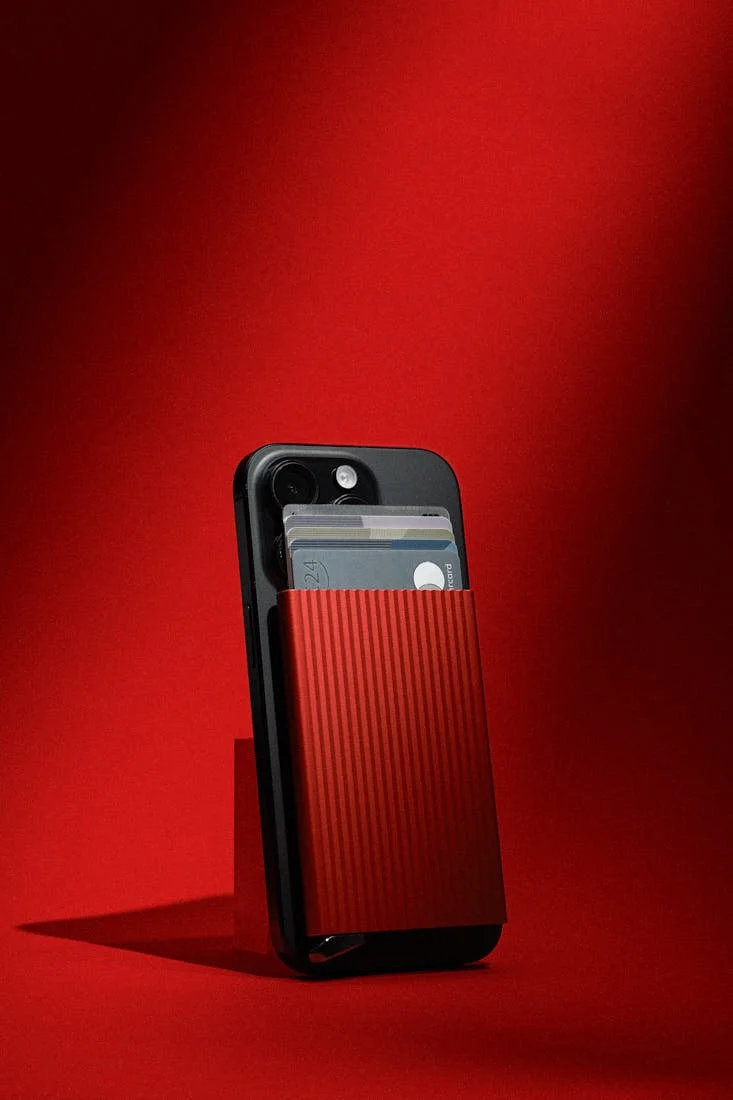
 
 
SECRID Premium Cardprotector+ Fluted for MagSafe in red attached to a black smartphone with several cards visible above the fluted aluminium case, photographed against a red background for LE MILE Magazine.

SECRID
Premium Cardprotector+ Fluted for MagSafe - red
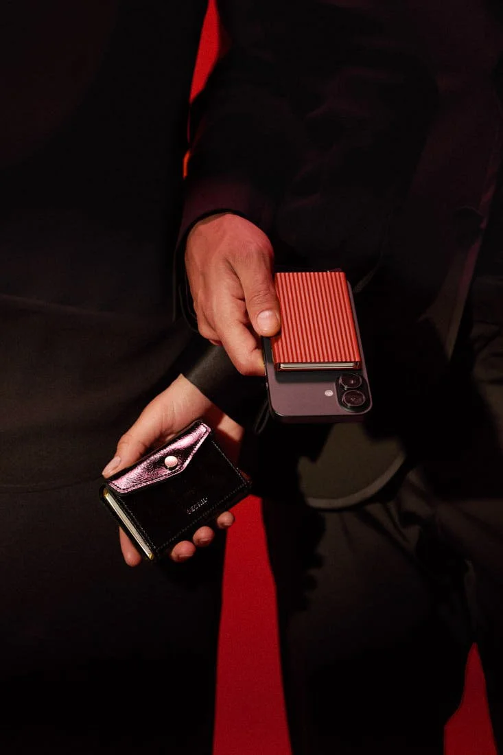
SECRID Premium Envelope Wallet+ Naplak in black and Premium Cardprotector+ Fluted for MagSafe in red, held together with a smartphone against a dark red and black setting, LE MILE Magazine.

SECRID
Premium Envelope Wallet+ Naplak - black
Premium Cardprotector+ Fluted for MagSafe - red


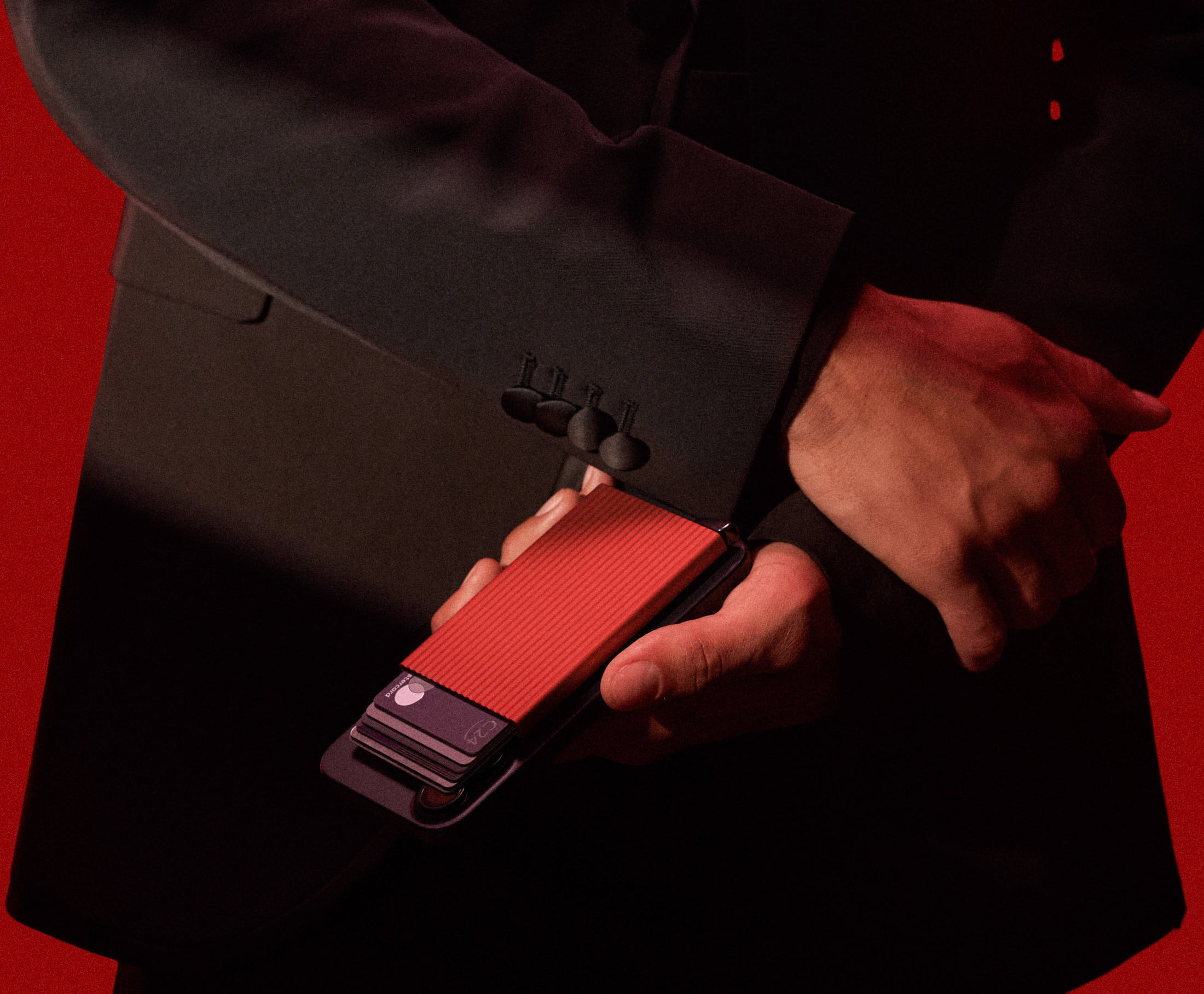
With the Premium Cardprotector+ Fluted for MagSafe, the idea moves directly onto the smartphone. A magnetic connection holds the Cardprotector to the back of a compatible phone and allows it to be detached when needed. The Plus mechanism accommodates metal cards alongside conventional ones, while vertical grooves across the aluminium front give the Fluted edition additional grip. Electronic payment helped prompt SECRID's early reconsideration of the conventional wallet; three decades later, the resulting idea has arrived on the back of a device that has itself assumed many of the wallet's former functions.

Its position there also changes the way the Cardprotector is seen. An object previously retrieved from a pocket or bag now becomes part of something already in the hand, exposing its surface and colour throughout the day. Offered in several colourways, the Premium Cardprotector+ Fluted for MagSafe can remain discreet or become a visible accent, with the Red version bringing particular presence to the ridged aluminium and polished metal lever. Choosing one begins to resemble the decisions made around other personal accessories, where function establishes the object and colour determines how comfortably, or deliberately, it enters a look.

This territory is less new to SECRID than the industrial appearance of its original Cardprotector might suggest. Van Geer comes from industrial and product design, while Van Sasse van Ysselt's background is in fashion, and leather entered the development of the Cardprotector relatively early. Once the aluminium mechanism was combined with leather, the compact card system also entered the familiar territory of the traditional wallet. Over time, that relationship between mechanism and material has become broad enough to accommodate different proportions, leather treatments, colours and ways of carrying the same underlying system.
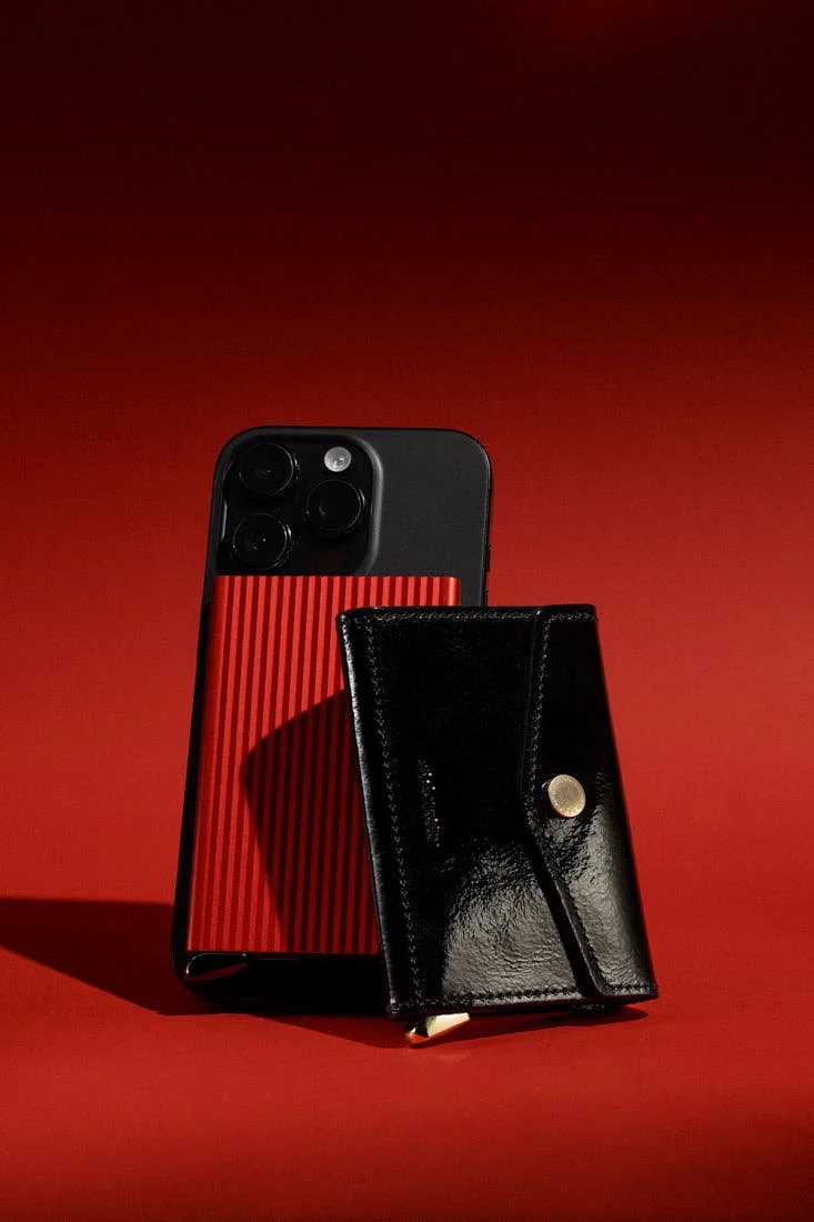
 
SECRID Premium Cardprotector+ Fluted for MagSafe in red attached to a smartphone alongside the Premium Envelope Wallet+ Naplak in black with glossy leather and gold-tone detail, LE MILE Magazine.

SECRID
Premium Cardprotector+ Fluted for MagSafe - red
Premium Envelope Wallet+ Naplak - black
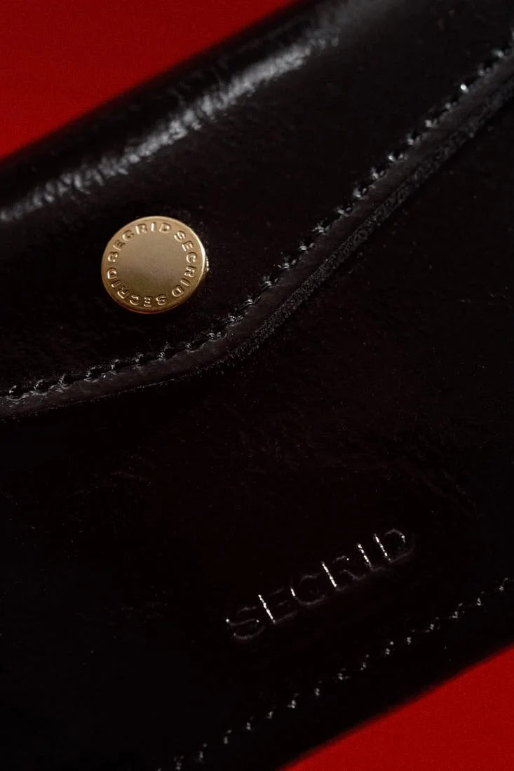
 
Close-up of the SECRID Premium Envelope Wallet+ Naplak in black, showing the glossy leather surface, stitching, embossed SECRID logo and gold-tone fastening detail, LE MILE Magazine.

SECRID
Premium Envelope Wallet+ Naplak - black


The Premium Envelope Wallet+ Naplak makes this particularly clear. Its Cardprotector+ sits within a folded leather construction with additional room for coins and small personal belongings, giving the wallet a different presence in the hand and a more natural relationship with the wider language of leather accessories. Naplak contributes something specific here. The semi-gloss Naplak leather in Black and Plum, paired with gold coloured components, introduces a material sensibility associated with fashion and leather goods without obscuring the functional structure underneath.

A wallet occupies an unusual position in a wardrobe because it is rarely worn in the conventional sense, yet it accompanies clothing with an intimacy shared by relatively few objects. It moves between hand, pocket, bag and table, collecting traces of use while repeatedly entering view. SECRID's expanding attention to finishes, leather treatments and colour acknowledges this role. The choice between aluminium and leather, a restrained colour and a vivid one, or the compact Cardprotector and the fuller Envelope affects little about the basic purpose of carrying cards. It changes considerably how the object participates in someone's daily appearance.

This is also where the two products become more interesting together. The Premium Cardprotector+ Fluted for MagSafe gives SECRID's compact aluminium architecture a newly exposed position beside the phone. The Envelope Wallet+ Naplak allows the same core mechanism to inhabit a more expressive leather form with room for the miscellaneous things that still accumulate through a day. A metal key, loose change or a ring temporarily removed from a finger hardly belongs to a grand argument about analogue life. They simply exist, and good objects tend to become convincing when they account for such ordinary realities.

The persistence of the Cardprotector at the centre of both products says something about SECRID's approach to development as well. Its original mechanism has remained recognisable while locking systems, surfaces, materials and applications have continued to evolve. Current Premium+ versions can hold metal cards, MagSafe has created another way of carrying the Cardprotector, and leather allows the same architecture to move into forms increasingly legible as fashion accessories. Production and assembly in the Netherlands, including through social enterprises, sit alongside an established repair infrastructure, giving this gradual development a practical dimension. An object used every day has time to reveal where it can be improved.
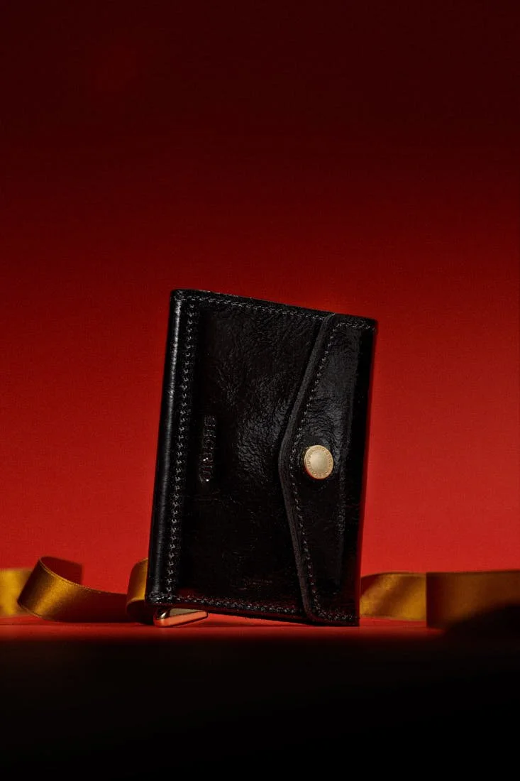
 
 
SECRID Premium Envelope Wallet+ Naplak in black with glossy leather, stitched envelope construction and gold-tone fastening, photographed against a deep red background for LE MILE Magazine.

SECRID
Premium Envelope Wallet+ Naplak - black
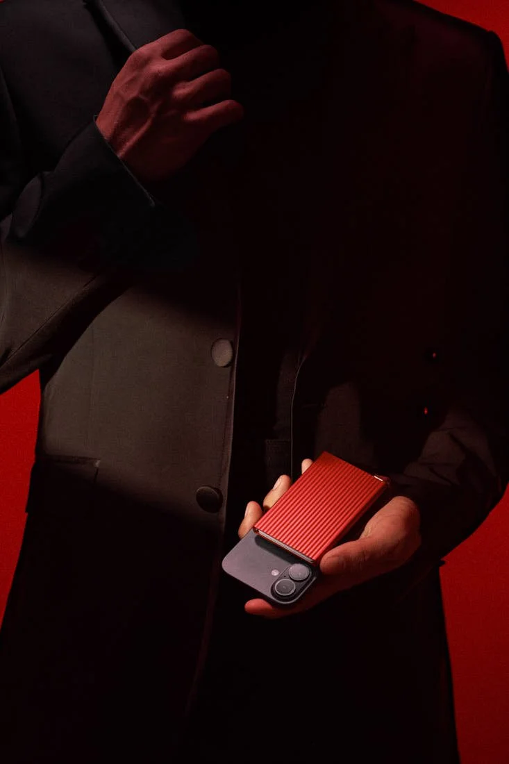
 
SECRID Premium Cardprotector+ Fluted for MagSafe in red attached to a black smartphone and held in hand, showing its ridged aluminium surface and compact profile, LE MILE Magazine.

SECRID
Premium Cardprotector+ Fluted for MagSafe - red


Seen from here, the contemporary wallet becomes a surprisingly broad design proposition. It can sit almost flush against a smartphone or take the form of a semi-gloss Naplak accessory in Black or Plum; it can be selected for the efficiency of its mechanism and still carry the aesthetic weight of something chosen to accompany a wardrobe. SECRID's strength lies in allowing those possibilities to develop around a recognisable core. What began with a question about carrying cards has grown into a wider consideration of how the small objects closest to us should function, feel and look.


images (c) SECRID

DISCOVER MORE: www.secrid.com
Explore SECRID’s contemporary wallets, from compact cardholders and MagSafe designs to leather styles made for everyday carry.
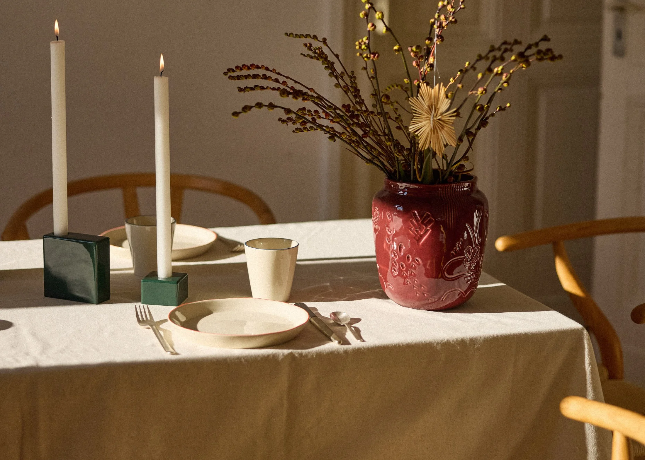
How Aberta Opens Up onomao’s Design Language

How Aberta Opens Up onomao’s Design Language

.specials

Aberta and the Expanding Language of onomao


LE MILE


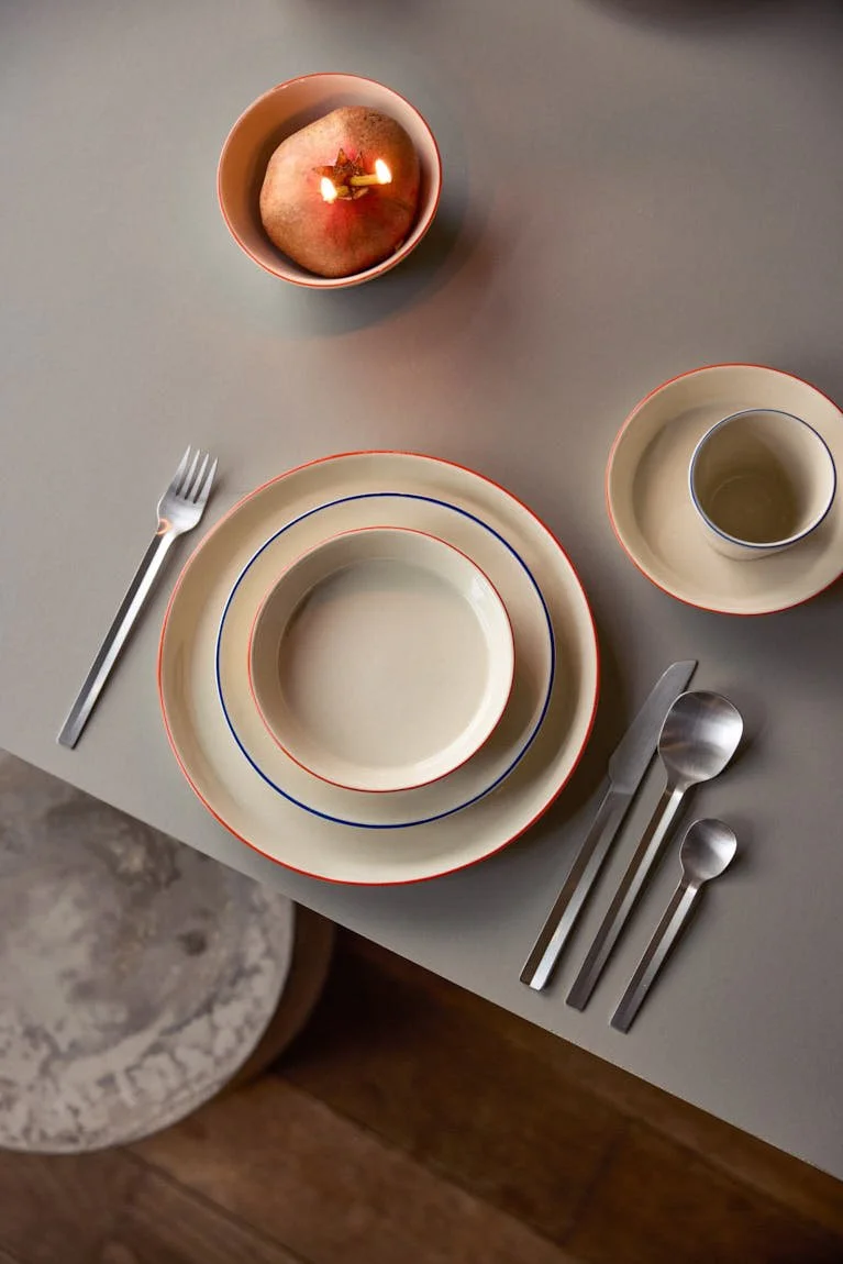
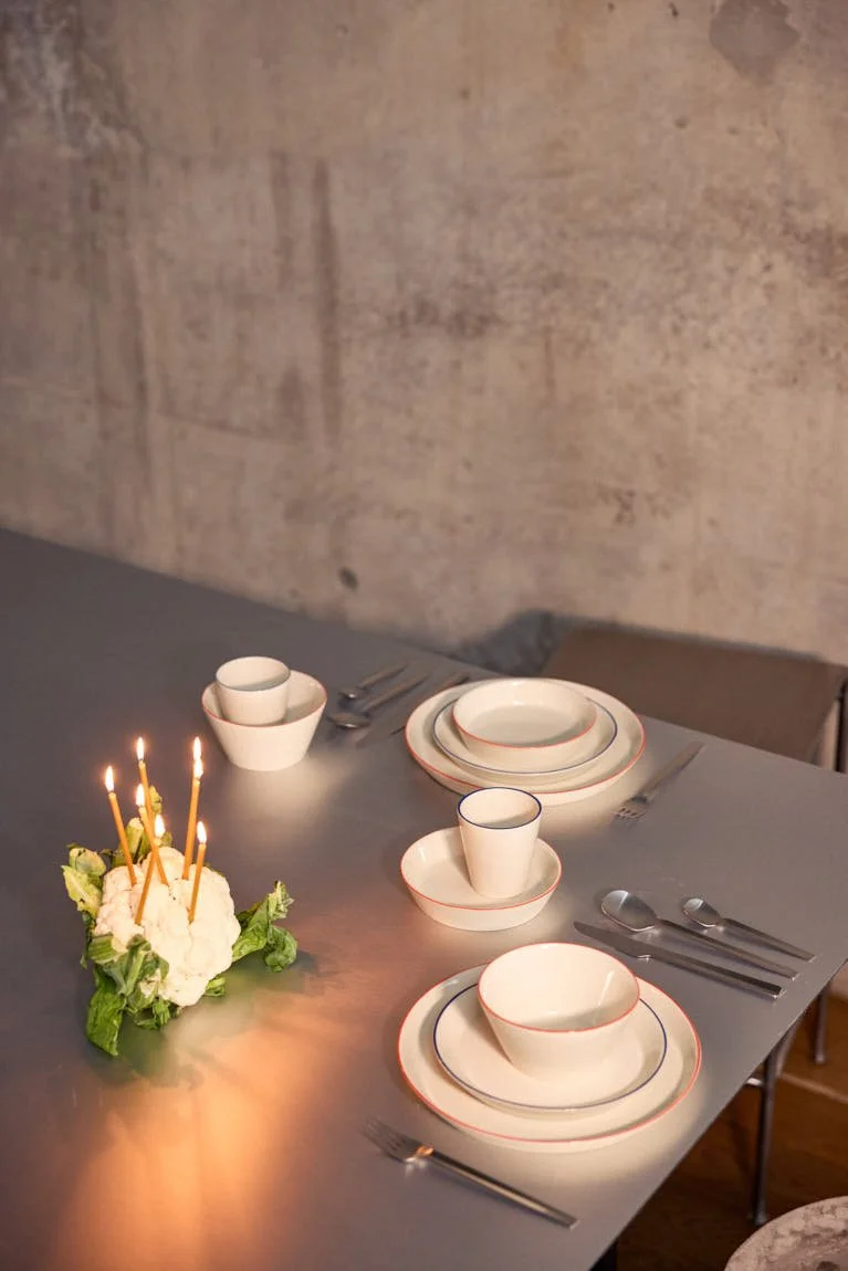
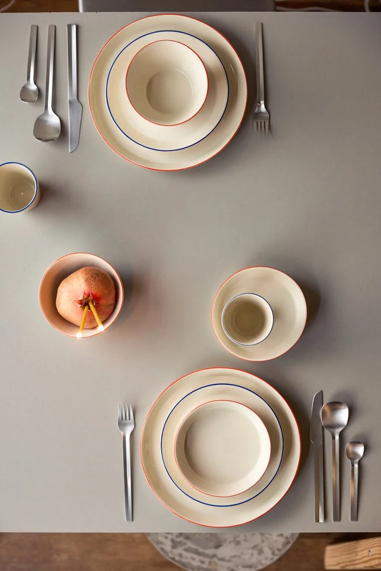
Among onomao’s four tableware collections, Aberta is perhaps the clearest exercise in proportion. Developed as a stoneware collection for everyday use, its plates, bowls, cups and jug share a conical geometry that opens gently upwards, giving the collection its name, Portuguese for “open”. The proportions change considerably from one object to the next, while a fine hand-painted line in blue or orange finishes each piece at the rim and gives the family another point of recognition.

 
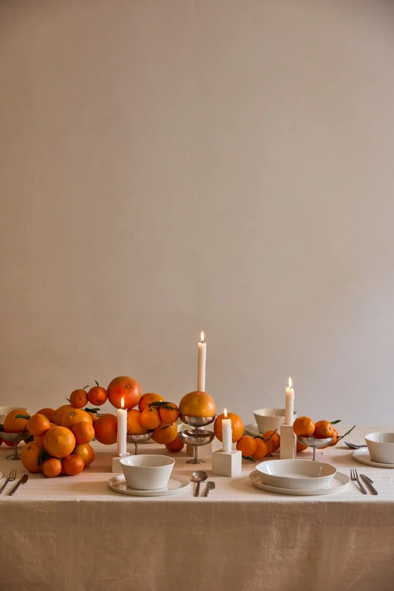
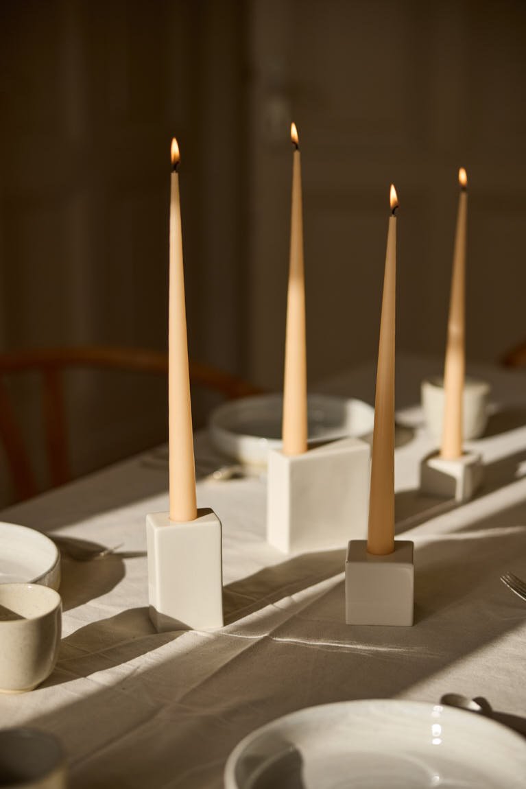
onomao Traditionell collection in Natural White with white GMK x onomao candle holders, arranged as a warm table setting for LE MILE Magazine.

onomao
Traditional collection - natural white
candle holder 4 BLOCKS (
GMK x onomao) - white

 
onomao Aberta collection with layered stoneware plates, bowl and cup featuring hand-painted blue and orange rims, photographed for LE MILE Magazine.

onomao
Aberta collection

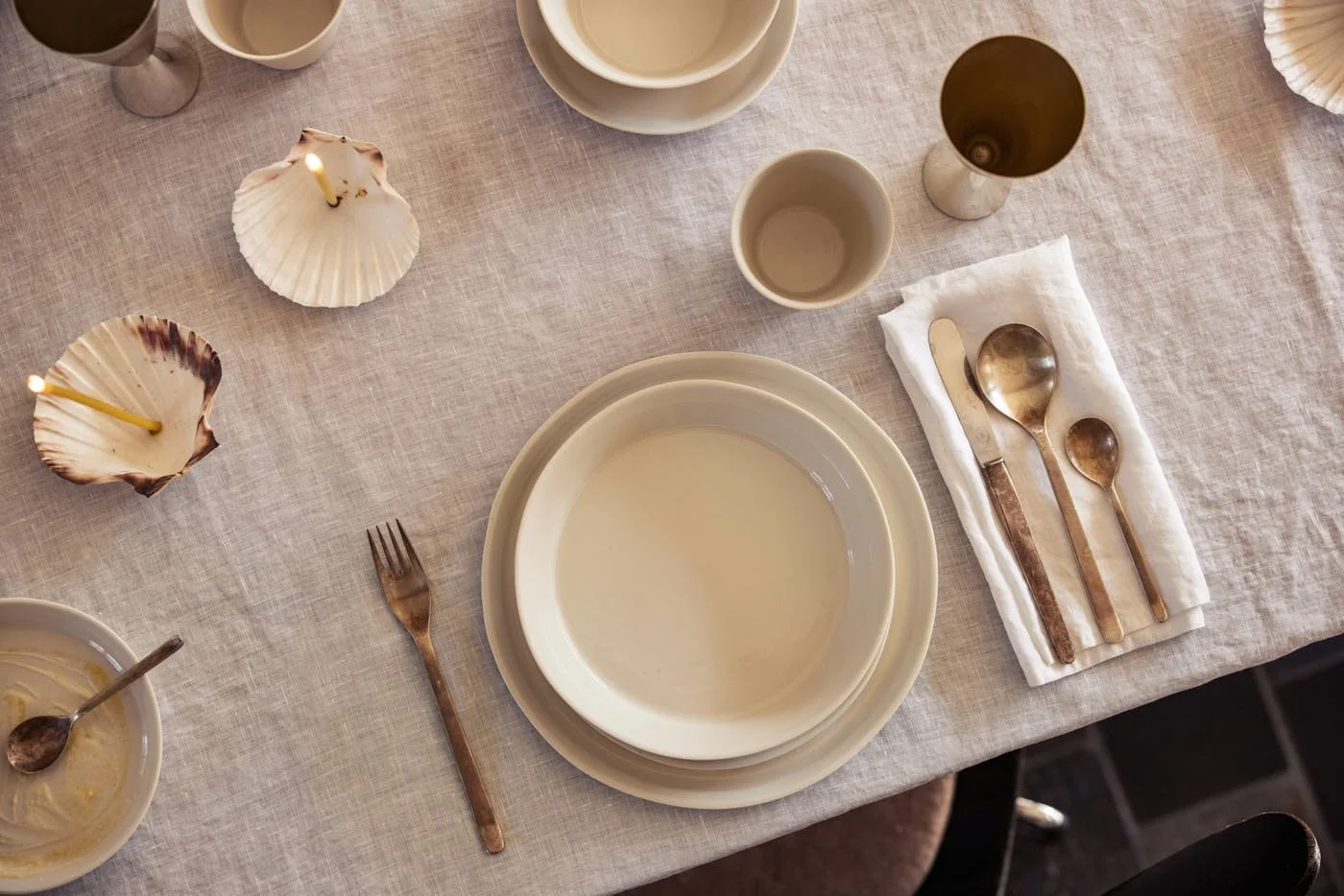
onomao Traditionell collection in Sand with stacked ceramic tableware in natural tones, LE MILE Magazine.

onomao
Traditional collection - sand


The underlying form proves surprisingly adaptable. A plate spreads the geometry low and wide, a bowl gives it depth, a cup pulls it further upright. The relationship remains visible, while each piece keeps its own proportion. Stoneware gives the shapes physical substance, while the painted edge sharpens their contour and adds a subtle point of emphasis. Small differences in shape, colour and texture remain part of the handmade production.

There is nowhere for a weak proportion to hide in a collection this spare. A relatively small shift in height or width can alter the character of a vessel, and Aberta depends on those adjustments being convincing from object to object. Its coherence comes from repeating a formal principle while allowing the purpose of each piece to modify it.


In clay, that clarity becomes harder to control. Ceramic production introduces its own variables through drying, firing and glazing, while the hand-painted border introduces another degree of variation. onomao has developed its ceramics through samples and direct exchanges with Portuguese manufacturers since its early years, with forms and glazes adjusted as prototypes move between design idea and workshop. Arthur Wystrychowski has described visits during which changes could be discussed with the makers and tested directly.

 
onomao Aberta collection arranged as an everyday table setting with hand-painted orange and blue details on stoneware, LE MILE Magazine.

onomao
Aberta collection

 
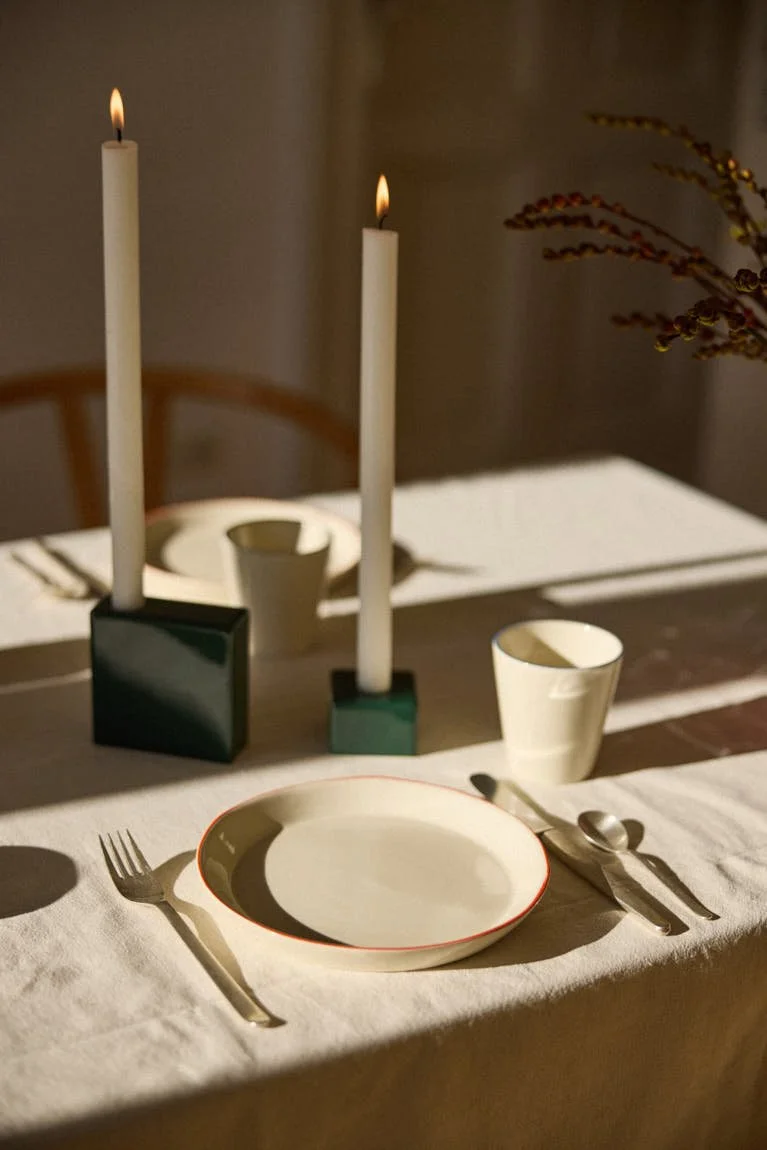
onomao Aberta collection with orange-rimmed stoneware tableware and green candle holders from GMK x onomao, LE MILE Magazine.

onomao
Aberta collection
candle holder 4 BLOCKS (
GMK x onomao) - green


Introduced as onomao’s third ceramic collection, Aberta was also the first the company produced in Alcobaça in central Portugal. The family manufactory was founded in 1988 and has particular experience in hand painting. That makes the narrow coloured border part of an established production skill within the workshop itself.

The relationship between designing and learning how things are made has followed onomao from the beginning. Brothers Arthur and Felix Wystrychowski founded the company in Cologne in 2018 after both had developed close personal connections to Portugal. Arthur studied landscape architecture in Berlin, while Felix lived in Portugal for several years, trained as a chef and later became a graphic designer. Their training came from adjacent fields, and their early collections developed through an exchange of ideas, samples and revisions with the manufacturers who would eventually produce them.


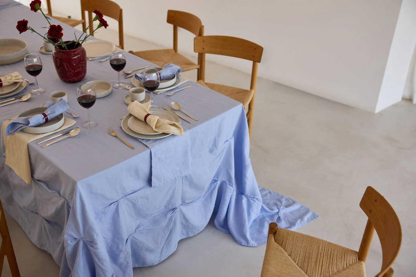
onomao Traditionell collection in Sand with Vase II by Enguerrand Poncelin x onomao and table linen by erlich textil x onomao, LE MILE Magazine.

onomao
Traditional collection - sand
vase II (Enguerrand Poncelin x onomao) - fig
tablecloth draped
& cloth napkins (erlich textil x onomao)


That curiosity eventually became hands-on when onomao installed its own pottery studio inside the Cologne office, allowing the team to work directly with clay and test new designs at the wheel. The office occupies a former bakery, and the space once used for its oven now contains a ceramic kiln. Understanding a production method changes the questions a designer can ask of it, and Arthur has spoken explicitly about knowing the possibilities and limitations of ceramic production when developing new objects.

Today the tableware catalogue moves through distinctly different silhouettes. Traditionell works with more robust forms and numerous glazes; Klassik introduces softer, organic profiles set on a small base; Pura shifts into thin-walled porcelain. Aberta occupies its own position among them, defined by its opening contours and the graphic precision of its painted rim.


Collaborations have widened that vocabulary further. With fellow Cologne label erlich textil, onomao extended the table into cotton-linen tablecloths and napkins, taking an existing relationship between the brands into another material category. Casa Lawa changes the temperature again. The Sicilian guesthouse and creative project founded by Lukas Lewandowski brings a background spanning hospitality, food and design into a more expressive ceramic collaboration, still produced through Portuguese workshops.

 
onomao Pura collection in White with white GMK x onomao candle holders in a long table setting, LE MILE Magazine.

onomao
Pura collection - white
candle holder 4 BLOCKS (
GMK x onomao) - white

 
onomao Aberta collection tableware with conical stoneware plates, bowls and cups finished with hand-painted blue and orange rims, LE MILE Magazine.

onomao
Aberta collection


The common ground lies in a design process shaped by material knowledge, close work with makers and attention to use. Outlines, colours and surfaces are free to change. Atelier onomao extends that approach through projects with outside artists and designers.

Aberta holds a particularly clear position within this broader field. Its conical premise moves easily between different functions, while colour has been assigned a precise place within the design. The collection has character, yet no single gesture has been asked to carry all of it.

 
onomao Pura collection in White with porcelain plates, bowls and cups arranged on a linen table setting, LE MILE Magazine.

onomao
Pura collection - white


Tableware is handled, washed, stacked and returned to the cupboard until its presence becomes part of routine. By then, novelty has disappeared. What matters is how naturally a cup sits in the hand, how convincingly a bowl holds its proportions, and how readily different pieces find their place together. Aberta is particularly persuasive at that stage, when design has stopped introducing itself and simply has to keep working.


images (c) onomao

DISCOVER MORE: www.onomao.com
Explore onomao’s world of contemporary tableware, handmade ceramics and considered objects for everyday living.