Viewing entries tagged
photo artist

VERONIKA GEORGIEVA *On Paper Surgery, Deconstruction and Memory

VERONIKA GEORGIEVA *On Paper Surgery, Deconstruction and Memory

Ctrl + X
IT’S ABOUT THE CUT, THE WOUND AND THE IMAGE


interview + written HANNAH ROSE PRENDERGAST


Destruction isn’t more natural. Just easier.

Deconstruction, on the other hand, is Veronika Georgieva’s native language.

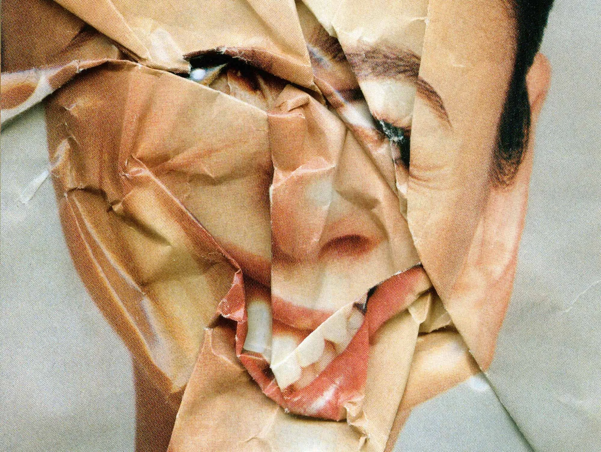
With her trusty scissors, she frees photographs, slides, and film from an eternity of official events. This version feels truer to how it actually happened.

Paper Surgery is a delicate operation to restore the soul; it’s also an SS 2010 ad campaign for Comme des Garçons.

Pulled from her own archive and that of complete strangers, the source material stings the same. The rest is just recovery.

No need to name the wound or explain the cut—the light will get to it. If not, a fashion magazine will.
 
Paper Surgery Series. image courtesy of Veronika Georgieva

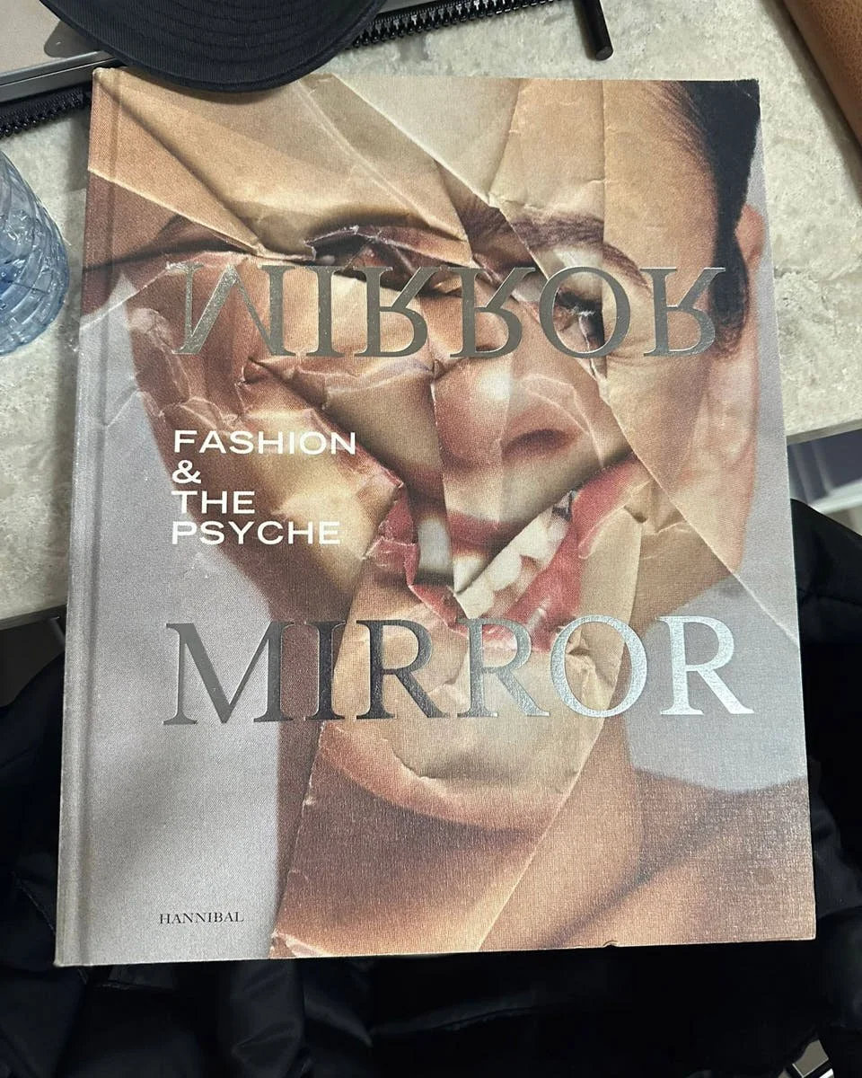
Paper Surgery Series, Hannibal
Image courtesy of Veronika Georgieva
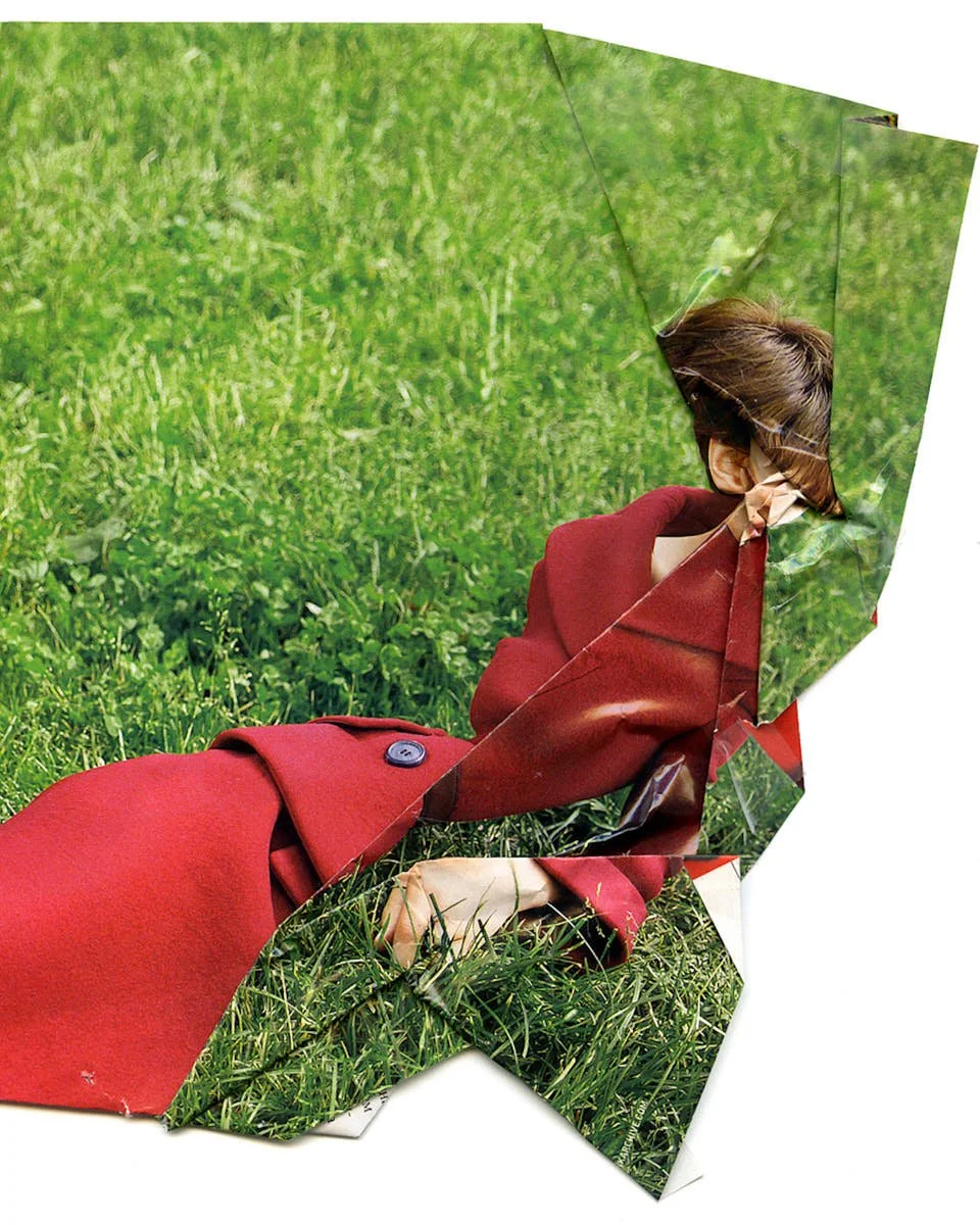
 
I Loved You For So Long. from Paper Surgery Series. image courtesy of Veronika Georgieva

I Loved You For So Long. from Paper Surgery Series.
Image courtesy of Veronika Georgieva


Hannah Rose Prendergast
What’s lost when you try to replicate Paper Surgery digitally in Photoshop?

Veronika Georgieva
The imperfections in my work aren’t just visual; they’re conceptual. They challenge ideas of control. The accidental tears and unpredictable folds from physically manipulating paper are essential to the series. When you try to replicate this digitally, even with the most skilled attempts, the result feels too precise. It loses the raw touch that defines this aesthetic. And I’m just not interested in doing that. I love accidents too much.

All my works exist on the threshold between control and surprise, even for myself. Otherwise, I’d be bored by my own creativity. There’s good boredom and bad boredom—like good and bad cholesterol. I need the material to surprise me. I’m deeply annoyed when there’s no excitement of the unknown, no “accidental mistake.” I need a physical dialogue with the material, with its resistance, to feel that I’m an artist alive.


Why does deconstruction feel so natural to your creative process?

There’s absolutely no rule. But it’s important to distinguish between destruction and deconstruction. Destroying isn’t more natural—just easier. Deconstruction is harder because it’s analytical. Its goal is creation: building something new. I’d like to think creation is ultimately more natural for humans than destruction. At least, I want to believe that, even though recent years seem determined to prove the opposite.Deconstruction may look like destruction to anyone unwilling to engage with the process. People often ask, “Why did you ruin this dress?” or “Why cut up those photographs?” But I adore deconstruction. My methods break habitual perceptions of ordinary things, sometimes pushing them to the point of unrecognizability.

What are the risks of starting with a political message?

The risk isn’t politics in art, it’s politics as art’s predetermined script. The strength of art lies in interpretation. When it begins with a fixed political premise, it can end up privileging the artist’s authority over the viewer’s freedom to engage. A didactic mural about climate change, for instance, might dictate a single correct reading. But a more ambiguous work, like Anselm Kiefer’s scorched landscapes, leaves space for multiple, active interpretations.

True subversion doesn’t force the world to understand—it lets people feel and outspeak. Overtly political art can be easily co-opted. When power meets dissent, it often inoculates itself by sanitizing and selling it back. Think of Banksy’s anti-capitalist murals, auctioned off for millions. Starting with politics risks turning art into a gesture absorbed by the market as “radical chic.”

How does photography influence our collective memory and perception of truth?

Truth? What truth? Personal and collective memories are both unreliable. Photography has joined the club, thanks to Photoshop and AI. Even eyewitnesses can’t be trusted. Just look at the Rashomon effect, where the same event is recalled in contradictory ways by different people. Memories depend on identity and interests. Take the myth of George Washington cutting down the cherry tree—'I cannot tell a lie'—a story invented after his death to portray him as virtuous. Isn’t it symbolic? A story about honesty that's itself a lie.

Is there an image that becomes stronger by resisting capture?

Absolutely. Like gods or monsters left unseen in horror films, the viewer’s imagination always eclipses the reveal. But this principle extends beyond horror. Any image grows stronger by resisting fixation. The moment you try to pin it down, in a photograph, a painting, even in words, it loses its spectral charge. That’s why Resnais never showed the traumatic event in Last Year at Marienbad, and why Borges described the Aleph as “a point in space that contains all other points.” The most potent visions remain unfinished, demanding the mind’s collaboration to exist at all.

This is exactly why the hidden folds in Paper Surgery, or the dark voids built from layered slides, matter more than what’s visible. Meaning crumples into layers, interpretation becomes a dance between surface and depth. The unseen isn’t absence—it’s the image’s engine.
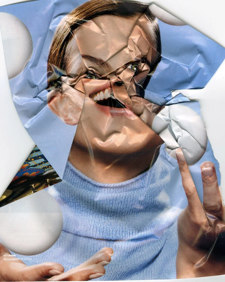
 
 
page 9 from Paper Surgery Series. image courtesy of Veronika Georgieva

Page 9 from Paper Surgery Series.
Image courtesy of Veronika Georgieva


Do you see more character in fashion magazines today?

I don’t think so. It’s just a new grammar of control. To ask whether faces have “more character” implies we’ve agreed on what character is. Unpredictability? The marks of lived experience? Fashion magazines today reflect a cultural hunger for authenticity but deliver it as a product. Modern retouching tools simulate character (a freckle left intact, a wrinkle allowed to stay), but it’s a calculated rebellion—a corporate nod to realness.

Compare that to Corinne Day’s raw Polaroids of Kate Moss in the ’90s, where the awkwardness was unplanned—and therefore revolutionary. Today’s “flaws” are often focus-grouped: an illusion of imperfection.

How do you embrace conflict or tension in your work?

I’m currently working on a video installation for a ballet performance centered on barocco, a theme that deeply resonates with me. Barocco isn’t just a historical period; it’s a state of mind. It emerges when old systems fail—when something bursts beyond its frames, rupturing space, scale, and meaning. The ballet will unfold on an unconventional stage: a circular platform rotating around a massive metal cylinder. The venue, a former bread factory, offers almost no space for traditional scenery. The dancers appear like butterflies pinned to the cylinder, with no room to fly.
My idea is to deconstruct the cylinder with multi-channel video projections, puncturing it with virtual trompe l’œil corridors, expanding it through illusion. These corridors will stretch into receding depths, pulling viewers inward.

For inspiration, I revisited Last Year at Marienbad, those haunting black-and-white corridors shot in a German Rococo castle, that endless hall of mirrors. For weeks now, I’ve been losing myself in those imagined passageways. I want to go there, to see that place. Though I know reality could never match the film. Some inspiring places are better left unvisited, preserved only in the mind.

In a world where authorship is fragmented, what still truly belongs to the artist?

The process. The moment. The thrill. Love and death.
Everything belongs to the artist.
The decision to designate it as art.
The vulnerability of offering it to the world, knowing it will be rewritten, reclaimed, or erased.
The act of bravery belongs to the artist.
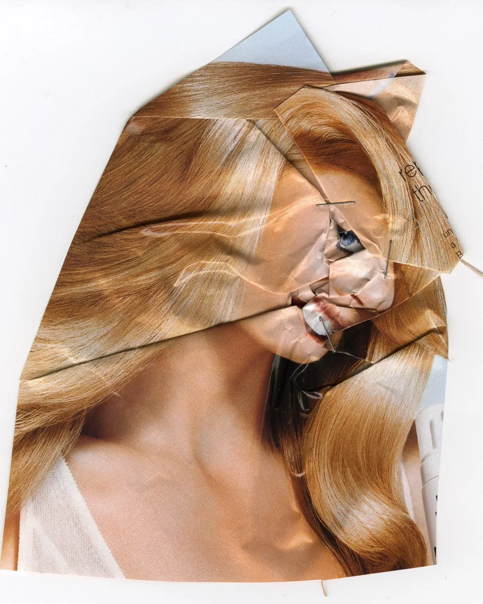
 
Page 57 from Paper Surgery Series. image courtesy of Veronika Georgieva

Page 57 from Paper Surgery Series.
Image courtesy of Veronika Georgieva
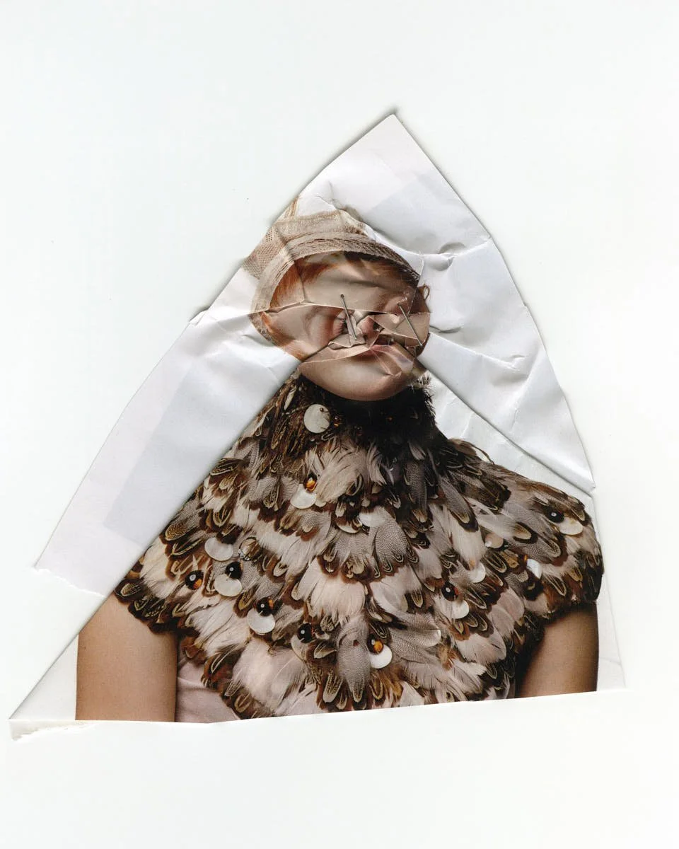
 
Page 55 from Paper Surgery Series. image courtesy of Veronika Georgieva

Page 55 from Paper Surgery Series.
Image courtesy of Veronika Georgieva


What image will you always return to?

Martin Kippenberger’s self-portrait. He stands with a crudely made sign around his neck, something you might expect to see on a lost child, a drunk, or an Alzheimer’s patient. Instead of a name or instructions, he scrawls: “Please, don’t send me home.” To me, it encapsulates the artist’s eternal paradox: the simultaneous search for home and flight from it—the dull comforts of the familiar. It’s desire rooted in impossibility: a lost paradise, forever out of reach, yet perpetually pursued.

A chaotic journey without a map.
The purpose of purposelessness.
Unfiltered traces of a personal destiny.
Moments of raw emotional gesture.
The coveted “mistakes.”
That time before morning arrives with its regrets and clean-ups.
The choice-free, guilt-free, unfiltered ride.

Can an image that wounds also offer healing?

I don’t know about healing, but I can tell you about the wound. In Camera Lucida, the French philosopher Roland Barthes introduces punctum—a term I adore. Punctum is an accidental detail in a photograph that “pricks” or “bruises” the viewer, creating a deeply personal, often painful resonance. As Barthes writes: “The punctum is a sting, speck, cut, little hole—it is also a cast of the dice. It wounds” me.

That’s why it remains elusive: punctum doesn’t reside in the image itself but in the collision between image and life. Barthes describes how a photograph of his mother evoked profound sorrow in him, though to others, it was just an ordinary snapshot. Punctum can’t be planned or manufactured; it arises spontaneously, unique to each observer, tethering emotion to image.

I suppose if you understand why an image reopens a wound, healing follows naturally. It lies in refusing to let pain stagnate. Like champagne, best drunk once opened, or it sours into vinegar and poisons you. As Rumi wrote: “The wound is the place where the Light enters you.”

Is there something you’ve cut that you wish you hadn’t?

Scissors are a girl’s best friend. They’ve never betrayed me. Not yet. Everything I’ve cut—and I’ve cut a lot—I’ve never regretted. When I was a young girl growing up in the Soviet Union, stores had limited clothing, and what they did have was usually ugly. But I always wanted to be stylish, so I learned to sew. I sewed everything, fromraincoats to pants, shorts to dresses, even a summer suit for my mom. I once designed and sewed an entire fashion collection.

With my architecture degree, paper models and cutting were already part of my routine. But after becoming a mother twice over, I only had time to cut. By then, I was living in New York City, surrounded by secondhand stores filled with more clothes than I’d ever dreamed of. To create unique designs that fit my figure, I cut endlessly.

Once, my dear friend Renata was shocked to learn where I’d gotten such a lovely belt. I’d started by cutting up a whole dress, but ended up trimming it down until only the belt remained—perfect for my vision.

When should you go offline?

I can tell you when not to go online: when you’re bored. Boredom is the mother of creativity—those who get bored turn to something new, something unique. It’s a huge problem, especially for kids today, who are never bored. They can fill every second with social media, immersed in the lives of others, forgetting their own. To create, you need a vacuum. Being online offers everything except a vacuum.

In his essay In Praise of Boredom, one of my favorite poets, Joseph Brodsky, frames boredom as a portal to self-awareness and existential clarity: “When hit by boredom, let yourself be crushed by it; submerge, hit bottom. In general, with things unpleasant, the rule is: the sooner you hit bottom, the faster you surface. The idea here … is to exact a full look at the worst. The reason boredom deserves such scrutiny is that it represents pure, undiluted time in all its repetitive, redundant, monotonous splendor.”

The notion of time is important for the artist. And when you’re online, time flies. The sad thing is, it flies unnoticed.
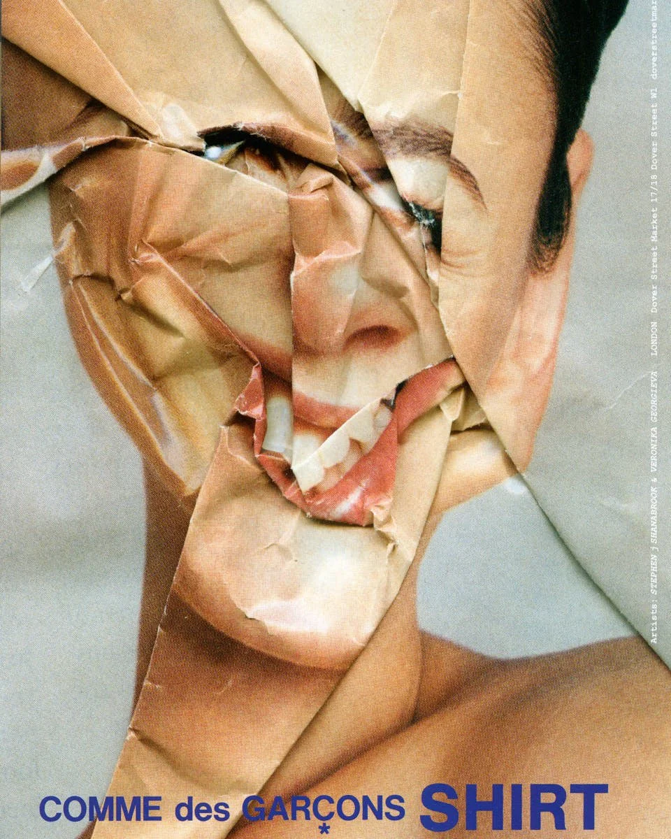
 
 
Comme des Garçons campaign. collaboration with Stephen j Shanabrook. image courtesy of the artists & CdG

Comme des Garçons campaign. collaboration with Stephen j Shanabrook
Image courtesy of the artists & CdG


Lines of Sight, Layers of Sound *The Total Language of Wolfgang Tillmans

Lines of Sight, Layers of Sound *The Total Language of Wolfgang Tillmans

Lines of Sight, Layers of Sound
*The Total Language of Wolfgang Tillmans


written Amanda Mortenson


A library breathes differently when an artist takes over. Pages stay still, but the light shifts. The Centre Pompidou hands over 6,000 m² to Wolfgang Tillmans, and the result is neither retrospective nor installation, but something in between—an unfolding.


Rien ne nous y préparait – Tout nous y préparait. The title of the exhibition stretches like a refrain, unresolved and cyclical. From June 13 to September 22, 2025, the Public Information Library (Bpi) becomes the surface of this phrase. And Tillmans, in his full fluency, draws a language across it—photographic, sonic, sculptural, political.

 
Moon in Earthlight, 2015 Courtesy Galerie Buchholz, Galerie Chantal Crousel, Paris, Maureen Paley, London, David Zwirner, New York

Moon in Earthlight, 2015

Courtesy Galerie Buchholz, Galerie Chantal Crousel, Paris, Maureen Paley, London, David Zwirner, New York

 
Echo Beach, 2017 Courtesy Galerie Buchholz, Galerie Chantal Crousel, Paris, Maureen Paley, London, David Zwirner, New York

Echo Beach, 2017

Courtesy Galerie Buchholz, Galerie Chantal Crousel, Paris, Maureen Paley, London, David Zwirner, New York


The exhibition arrives at a rare juncture. The Pompidou prepares to close for major renovation, and this final show is summation and offering. In a space usually devoted to silent reading and public access, Tillmans constructs a new form of visibility—one that includes what is seen and how.
The selection spans four decades of practice. Photographs are placed without chronology. Stillness meets print meets rhythm. The work is assembled with and against the building’s original structure, transforming the library into an environment that breathes with energy and tension. Archival material sits beside new compositions. Laser light pulses. Loudspeakers relay sound works. A sense of immersion replaces the convention of looking.


This is about an artist choosing a place with high foot traffic, open structures, and constant flux—and turning it into a medium.

What emerges is an exhibition as summary and space. The Bpi becomes a working model for how images live among us. The ceilings, walls, carpets, and shelves are absorbed into the visual syntax. Tillmans’ “Truth Study Center” unfolds across tables. Posters, zines, and publications are stacked with intention. HIV education materials rest beside press photographs, club ephemera beside celestial charts.

Tillmans brings all media. Music plays a constant role. His sonic compositions occupy the same register as his images—cut, repeated, looped. Film works are arranged in rooms that stay open to the larger pulse of the building. There’s only the ambient flow of ideas moving through form.


Wolfgang Tillmans à la Bpi, janvier 2025 © Centre Pompidou LE MILE Magazine

Wolfgang Tillmans à la Bpi, janvier 2025
(c) Centre Pompidou


At the core of this gesture is a belief in space as knowledge. The Bpi, a place of shared information and open presence, aligns with the artist’s long-standing interest in visibility, collectivity, and also intimacy. His work has always layered personal and public registers: bodies, cities, protests, pages, light. Here, those layers reach architectural scale.

CELINE enters the frame not through clothing or installation, but through Accès Libre par CELINE, a rare gesture of sponsorship that expands access. Four days of open admission stretch across the exhibition’s life—offering time, and plenty of it, to wander, stay, return. This collaboration moves with clarity. CELINE enters the art space through gesture. The house aligns with the architecture of presence and steps forward with precision. As a partner, the house marks its first-ever project with the Centre Pompidou. The exhibition unfolds under the creative direction of Michael Rider, who took on the role of artistic director in January 2025.


Tillmans returns to Paris with a wide-spanning institutional presence. Photographs travel across tables, suspend from ceilings, glow through projection. They live among books and browsers, headsets and desks. Artwork and infrastructure move as one, folding into a shared spatial rhythm.

The architecture of the Bpi becomes part of the work. In close collaboration with scenographer Jasmin Oezcebi, the exhibition develops its own spatial logic. Library furniture shifts position. Walls open new lines. Light acts as a tool for memory.

Every visual element follows a larger score. Materials speak together. The viewer moves through atmosphere, guided by rhythm and tone. The Pompidou moves toward transition. Tillmans shapes a moment with weight. The building gathers light. Images echo. Colors shift. Layouts change. Each element stays present.

Banner Image
(c) The State We’re In, A, 2015
Courtesy Galerie Buchholz, Galerie Chantal Crousel, Paris, Maureen Paley, London, David Zwirner, New York


its only love give it away, 2005 Courtesy Galerie Buchholz, Galerie Chantal Crousel, Paris, Maureen Paley, London, David Zwirner, New York LE MILE Magazine

its only love give it away, 2005

Courtesy Galerie Buchholz, Galerie Chantal Crousel, Paris, Maureen Paley, London, David Zwirner, New York


LAVAZZA 2025 *by Omar Victor Diop

LAVAZZA 2025 *by Omar Victor Diop

LAVAZZA 2025 Calendar
*Celebrating 130 Years of Blending


written Alban E. Smajli


The Lavazza 2025 calendar is a living work. Its pages carry a rhythm, shaped by 130 years of blending.


It moves through color, energy, and form, holding stories that stretch across time. Omar Victor Diop creates four acts, each unfolding with precision and intention. The frames capture motion, moments, and layers that reflect connection.

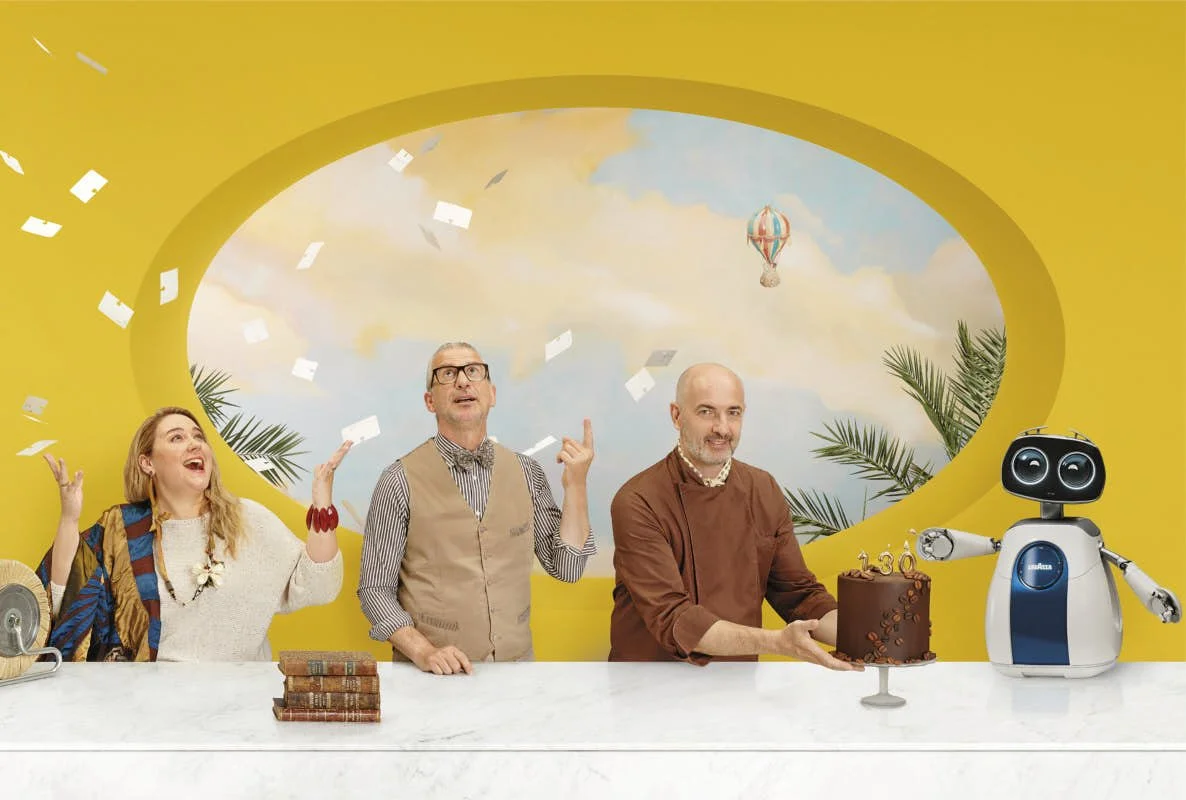
Blending Cultures begins in winter. Blues fill the space, drawing focus to Whoopi Goldberg. Her presence forms the axis, surrounded by gestures and movements that echo outward. The frame holds lives, histories, and expressions, each one adding weight to the composition. Spring emerges in Blending Times. Jannik Sinner steps forward, his energy defining the tone. Arne Anker stands within the frame, his stance precise, his presence calm. Props and textures align with the figures, extending the narrative into the space they occupy. The image holds movement, grounded in craft and care.


LAVAZZA Calendar 2025 Omar Victor Diop Vienna Event LE MILE Magazine Whoopi Goldberg

(c) Omar Victor Diop
LAVAZZA Calendar 2025, February


“A day, a week, a month, a year – for me, it’s always Lavazza!”

Whoopi Goldberg


Summer shifts into Blending Roots. Omar Victor Diop steps into the frame, central to the story. The tones deepen into green, reflecting origins and connections. The composition expands, pulling threads of identity and place into focus.

Autumn closes with Blending Minds. Julia Nordhaus enters the frame, her energy focused and deliberate. Ochre tones fill the space, creating a sense of thought and creation. The composition feels open, inviting reflection and engagement. Every detail contributes to the narrative, holding its place within the whole.

The calendar moves through these acts, carrying the philosophy of blending into its imagery. The bar counter repeats across frames, forming a thread of exchange and connection. Props, shadows, and textures create depth, adding layers to the story. The energy of blending continues in every element, carrying the vision forward.

Blending began in 1895. Luigi Lavazza worked among sacks of coffee beans, each carrying whispers of the land it came from. Aromas clashed, mixed, and settled into something unified. The act grew into an idea, shaping how Lavazza created and connected with the world. Every blend carried stories, people, and places.


Francesca Lavazza - Vorstandsmitglied der Lavazza Group LAVAZZA Calendar 2025 Omar Victor Diop Vienna Event LE MILE Magazine


“The end result is much more than the sum of individual parts: the result is the Lavazza Group, a family of over 5,500 people, celebrating its 130th anniversary—a long, pioneering journey oriented toward responsibility for people and the environment.”

Francesca Lavazza
Member of the Board of the Lavazza Group


The 2025 calendar transforms this philosophy into visual form. Omar Victor Diop’s lens captures blending as an act of energy, movement, and stillness. Each tableau unfolds with precision, drawing the viewer into its layers. Blending Cultures reveals the winter blues. Whoopi Goldberg holds the center. Around her, figures interact, each one carrying its own weight within the scene. The composition speaks to exchange and the coexistence of traditions.

Spring emerges in Blending Times. Tennis-star Jannik Sinner and Arne Anker take the lead. Sinner brings a sense of vitality, while Anker reflects the artistry of craft. The rhythm of the scene resonates through objects and gestures. Blending Roots shifts into green, where Diop steps into the frame. His stance anchors the image in the concept of shared origins.

In Blending Minds, Julia Nordhaus of Lavazza Germany becomes the focal point. The ochre tones of autumn surround her, carrying the energy of collaboration and the pursuit of ideas. Her gaze suggests a vision forward, rooted in creativity and innovation.

Blending defines each frame. It appears in the arrangement of subjects, in the textures, and in the spaces where people and objects converge. The recurring bar counter emphasizes gathering and exchange, while the costumes and props bring layers of context and meaning into focus. Every element contributes to the overall narrative.


read more: Let´s Blend! Calender 2025!


(c) Omar Victor Diop
LAVAZZA Calendar 2025, August

 
LAVAZZA Calendar 2025 Omar Victor Diop Vienna Event LE MILE Magazine Portrait Artist

(c) Omar Victor Diop
Artist portrait


“I depicted the concept of blend through the use of color—universal yet deeply personal. My intent was to create a multifaceted fresco that united identities, origins, and skills in a unique symposium.”

Omar Victor Diop


scroll the calendar


Arne Anker brought his perspective as Lavazza’s Ambassador of Indulgence for Germany. His Berlin restaurant, BRIKZ, reflects the blending ethos through its evolving menu. Coffeetails, a centerpiece of his work, reimagine coffee as a living ingredient, constantly adapted to new contexts.

Anker’s approach embodies the spirit of blending, creating moments that move beyond the static and into the experiential. Francesca Lavazza spoke of the calendar as a reflection of shared values. Her words grounded the project in the brand’s ongoing mission to connect people and ideas. Julia Nordhaus, whose presence in Blending Minds highlights Lavazza’s commitment to forward-thinking innovation, underscored the importance of collaboration within and beyond the company.


The 2025 calendar extends Lavazza’s heritage into new dimensions, transforms blending into a framework for thinking, one that bridges art, culture, and identity. Its unveiling in Vienna emphasized this movement, reinforcing Lavazza’s role as a catalyst for connection and creativity. The project shows how blending, born in coffee, continues to shape the way the brand engages with the world.


A Brewed Vision shared with Lavazza

(c) Omar Victor Diop for LAVAZZA
2024