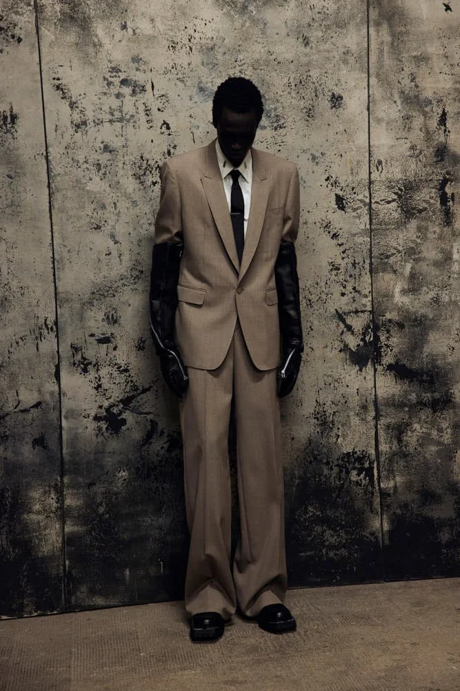
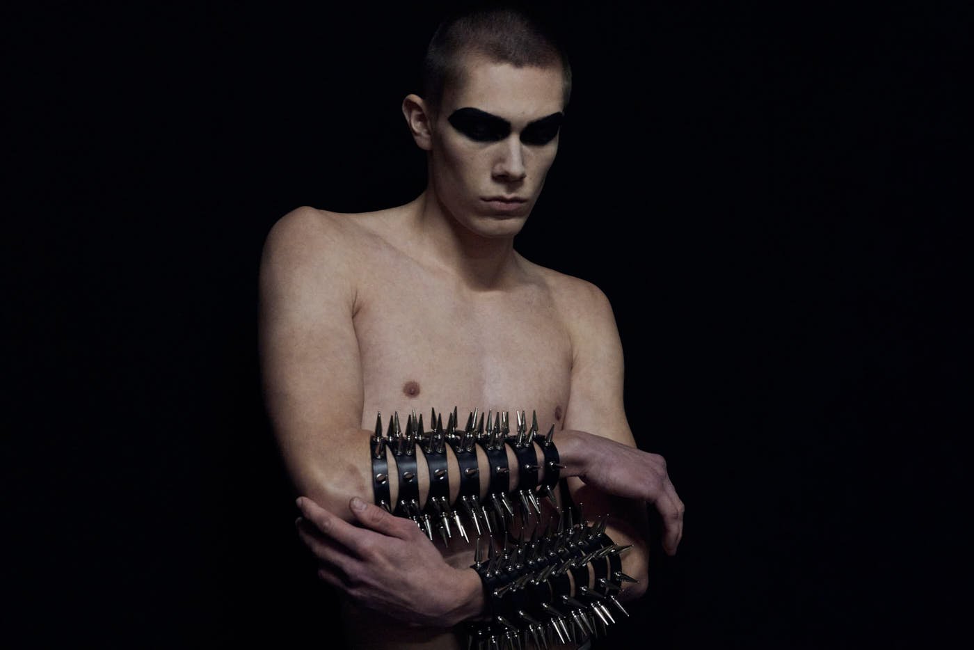
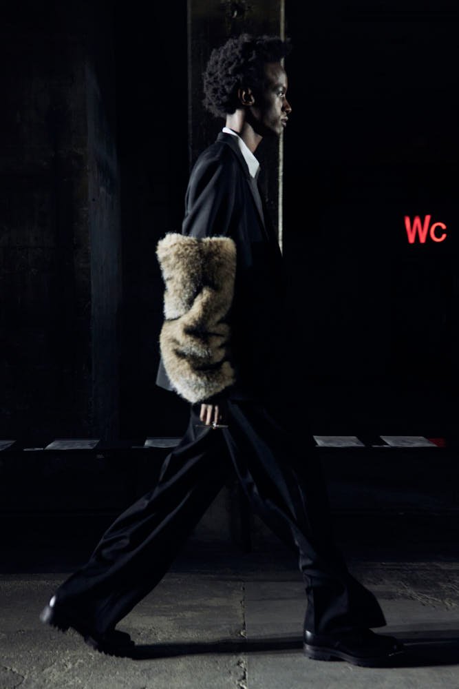
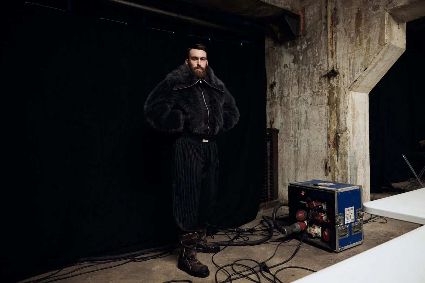
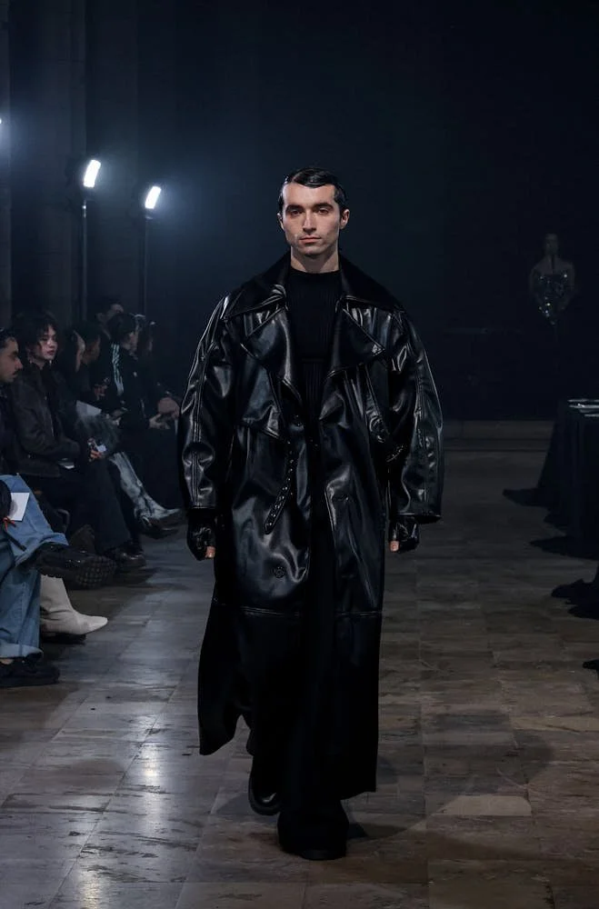
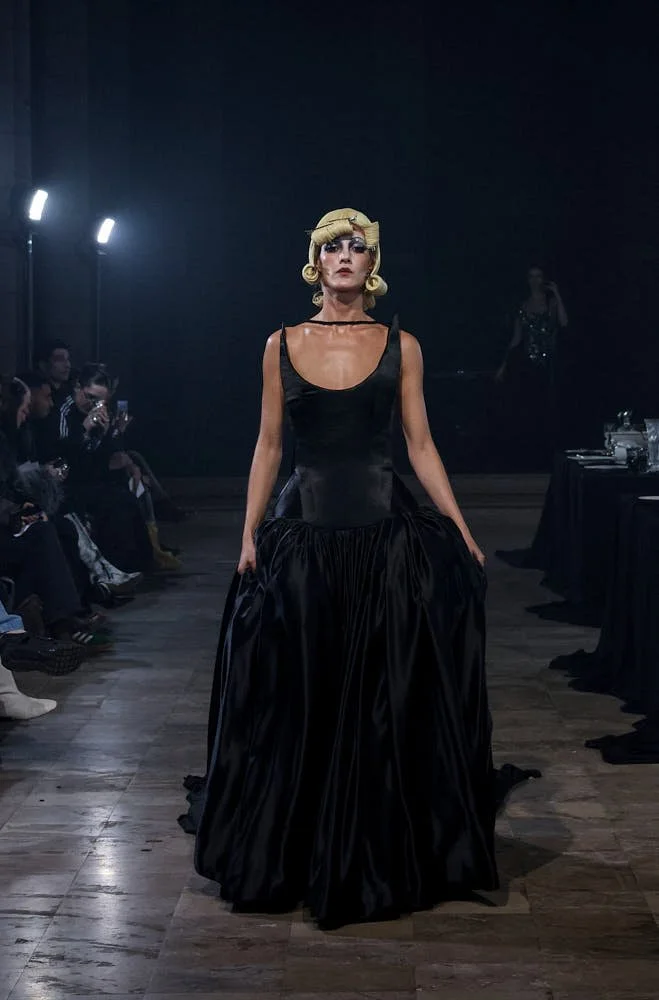
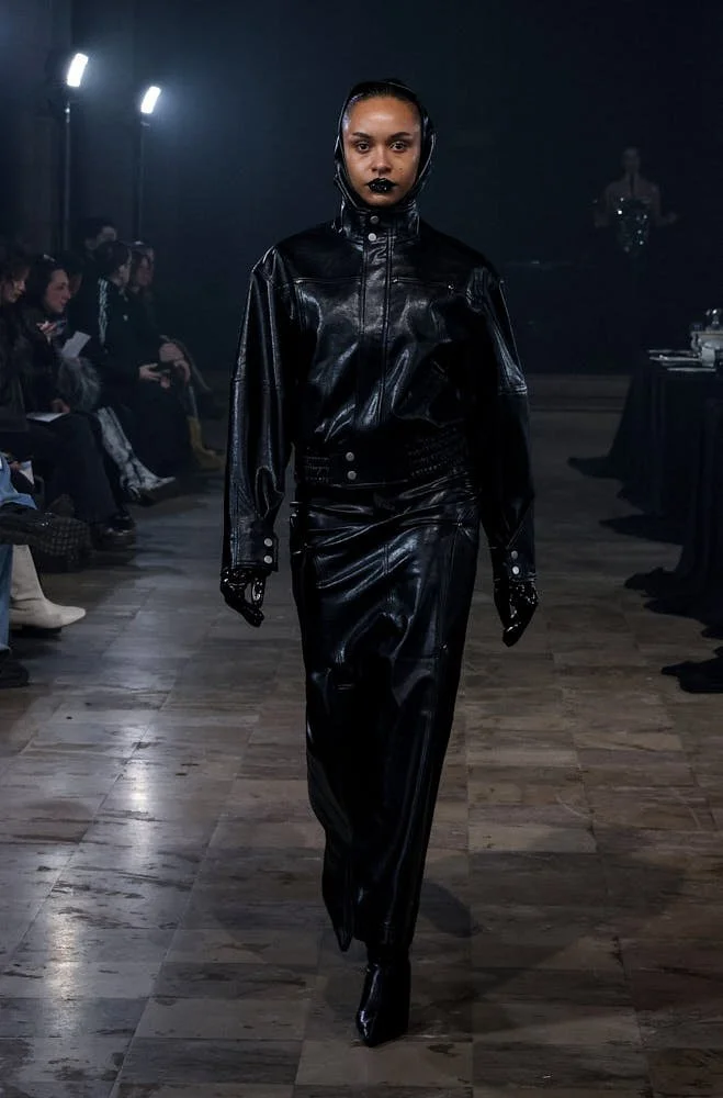
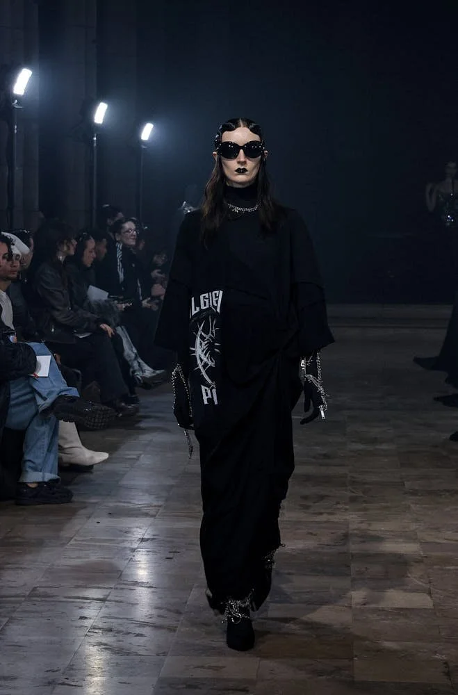
DSSLR - A Line Drawn in Motion

DSSLR - A Line Drawn in Motion

DSSLR
*Christoph A. Dassler Returns to the Court


written MONICA DE LUNA


There is a quiet intensity to the way Christoph A. Dassler speaks about design. A sense of continuity runs through his words — a rhythm that connects history with vision, precision with pulse. From Herzogenaurach, the cradle of German sportswear, Dassler steps forward with a new name: DSSLR. It reads like an abbreviation of legacy itself — clean, concise, timeless.


Launched in August 2025, DSSLR by Christoph A. Dassler arrives as a sport and lifestyle brand defined by clarity and conviction. It enters the world with a tennis collection built for the demands of movement, elegance, and responsibility. Each piece aligns with the spirit of today — a moment where performance, sustainability, and creative design form one continuous gesture.

 
LE-MILE-Magazine-DSSLR-Tennis-Collection-On-Court-Women-off-white

DSSLR On Court Women / off white

 
LE-MILE-Magazine-DSSLR-Tennis-Collection-On-Court Tennis-Women-Men

DSSLR On Court Women + Men


We are convinced that high standards and low environmental impact can go hand in hand,” says Christoph A. Dassler. The statement carries a sense of commitment, a belief shaped through decades of family innovation and a personal return to his origins. “For me, it was a goal matured over decades to return to the world of sports and fashion,” he adds. DSSLR becomes the realization of that journey — a modern system of values, woven through fabric, form, and philosophy.

At the core lies a dedication to materials. Up to 95 percent of each garment consists of recycled fibers and organic cotton sourced from Portugal. The fabrics move with the body, cooling, protecting, breathing, and maintaining a sense of purity through construction. The On-Court line expresses design intelligence that frames athletic performance as aesthetic experience. UV protection, odor control, and targeted sweat-zone ventilation define a new level of refinement.


The silhouettes are architectural in their intent — cut to mirror the lines of play, engineered for the body’s dynamic rhythm. Each detail is the result of collaboration between Dassler and a team of designers who have shaped collections for global sport houses. Together, they sculpt pieces that feel disciplined yet effortless, merging function, design, and sustainability into a single visual and tactile language.

Beyond the court, the Off-Court line extends the same integrity into daily life. The designs reveal an understanding of form that feels both global and individual — defined by material quality, surface clarity, and details that speak through structure rather than decoration. Every seam, every tonal shift carries intention. It is fashion that continues the movement.


LE-MILE-Magazine-DSSLR-Tennis-Collection-DSSLR-Founder-Christoph-A.-Dassler

DSSLR Founder / Christoph A. Dassler


We are convinced that high standards and low environmental impact can go hand in hand.

Christoph A. Dassler


Within the structure of DSSLR lies a deeper narrative, the brand builds an ecosystem where creativity, economy, and collaboration coexist within a framework of values. Dassler describes it as a culture — one that honors craftsmanship while inviting new ideas to thrive. It is an inclusive vision shaped by heritage yet oriented toward the future of sport and design.

As CEO and founder, Christoph A. Dassler channels the spirit of his lineage without nostalgia. His grandfather Rudolf Dassler once defined an era of innovation; Sassler continues that momentum by transforming the definition of quality itself. In DSSLR, quality becomes moral, aesthetic, and material all at once. It speaks to a generation seeking transparency in how things are made and what they stand for.


Every element of production follows this logic. The brand’s partners and suppliers hold environmental certifications; every collaboration aligns with the brand’s sustainability standards. “Behind every product stands a partnership with an industry-leading design and production team,” Dassler explains. His tone suggests pride and precision — an awareness that true innovation exists within the details.

The launch of DSSLR feels contemporary and timeless, it celebrates a discipline where sportswear meets couture precision and where sustainability becomes a natural constant. It arrives from a place where heritage fuels creativity — where each garment becomes a tool of movement, a symbol of modern responsibility.

 
LE-MILE-Magazine-DSSLR-Tennis-Collection-On-Court-Women-Tennis-sky-captain-blue

DSSLR On Court Women / sky captain blue

 
LE-MILE-Magazine-DSSLR-Tennis-Collection-On-Court-Men-off-white

DSSLR On Court Men / off white


Through DSSLR, Christoph A. Dassler has built a language that speaks to the new era of sport-fashion — one defined by excellence, integrity, and clarity of purpose. The collection carries an understated strength — a balance of performance and presence. It represents a future where clothing is created with awareness, where every fiber participates in a larger dialogue between body, design, and the world around it.


discover more www.dsslr.de
all visuals (c) DSSLR

André x ELHO - Capsule Collection 2025

André x ELHO - Capsule Collection 2025

André x ELHO
*André Tags the Mountain


written MONICA DE LUNA


André in Lisbon, spray can in hand, the smell of paint in cold air, no studio, no clean desk, just ten ice-pink bombers waiting like empty walls. He says, “Today I’m painting live on 10 jackets. I hope I don’t mess them up, we only have those 10 pink jackets available! They will become unique art pieces.”


Jackets as canvas, fabric as skin, performance stitched and already humming with neon memory. ELHO hands him carte blanche. He doesn’t rehearse, he sprays directly, instinct over plan. Mr. A appears, one wink, one wide eye, loops curling, pink field grinning back.

 
ANDRÉ SARAIVA ELHO FW25 26 Unique art jackets LE MILE Magazine

André x ELHO FW25/26
Unique art cap

 
ANDRÉ SARAIVA ELHO FW25 26 Unique art jackets LE MILE Magazine

André x ELHO FW25/26
Unique art jackets


A capsule, October 2, André x ELHO. Limited, numbered, but not frozen. Phantom performance bomber, hoodies, long sleeves, tees, beanies, the collection carrying André’s world, graffiti lines wrapped in insulation, warmth inside the grin. He says, “Clothes should make you feel good and happy, and serve as protection from the grey outside world.” Protection and mischief in the same seam.

ELHO’s history runs under it, a ghost from 1948, slopes of Germany, Switzerland, neon seasons that lived until 1993, buried, dug up again by Donald Schneider with Claudia beside him. Donald once pulling strings at Vogue Paris, once launching collaborations that cracked fashion open. Now ELHO as “Freestyle,” jackets as silhouettes, down puffers with recycled feathers, Primaloft Bio, Sorona skins, boomerang zippers slicing pockets like hidden doors. He says to André, take it, tag it, burn pink into snow.


André remembers Sweden. “I’ve always liked skiing. I grew up in Sweden, and in winter skiing was just a way to get from A to B. I’m not a champion skier, but every time I go up a mountain and ski down a slope, it reminds me of the fun days of my childhood.” Childhood in tracks of snow, movement as necessity, now returning as art.

The new ELHO calls itself high-tech, fresh, ready for minus twenty, but André looks at it and sees a wall. Pink field, black grin, sprayed live. “In graffiti, freestyle means you don’t follow the strict rules of an alphabet or the straight lines of a letter. You just follow your instinct and let it guide you into making an abstract painting.” Jackets become freestyle and snow becomes a surface.


Donald Schneider
Creative Director at ELHO Streetwear / seen by Henrik Nielsen


ELHO Freestyle to become the #1 innovative outdoor style brand for the next generation.

Donald Schneider


Inside the collection the colors glow—ice pink, scarlet red, neon purple, neon green, black, military green. The Astro down puffer holds 90% recycled down, 10% feathers. The Nova and Phantom shell layers breathe, waterproof, cape twist, patches for self-expression. Jet pants, fleece sets, parachute cuts, names like Hill, Satellite, Cure, Fire. André’s capsule slides among them, painted, tagged, turned into a limited run of objects (acutal art pieces to wear) carrying his alter ego. He laughs, “There’s a lot of Mr. A everywhere, both big and small.”

To wear it is to enter his wink. He says, “Just wear the jacket and make it your own.” A simple command, nothing dressed in explanation. Pink with black, neon grin, a slope or a street, it doesn’t matter. Style comes from outsiders, misfits, people daring to be different. “I love when people are a bit different from the mainstream. I’ve always been fascinated by outsiders and misfits. I like when people dare to be different.”


André speaks of hotels too, Amour, Grand Amour, Le Baron, spaces of smell, sound, touch, people brushing into each other. “Creating places where people can come together, thinking about the sound, the smell, and how people interact, is part of my art.” Jackets and nightclubs, walls and hotels, always surfaces, always extensions. A hotel in the mountains, uniforms in ELHO, a ski team in pink, medals under a grin. He imagines it without hesitation. Love runs through it. “Love is what keeps me going.” Not a slogan, more like a rhythm under every spray, every loop of paint. Even in the Alps, even on a neon slope, love keeps him. He wants surprise, humor, small disruptions. He wants Mr. A everywhere, always winking, always smiling. He says, “I try to go through life with a wink and a smile, like my alter ego Mr. A.”

The André x ELHO collection stands in that place. No need for nostalgia, no need for comparison. Just jackets, pink, painted, sprayed live, turned into unique art pieces, worn with jeans, boots, skis strapped, mountains dropping. “I love the neon pink winter jacket with the black Mr. A on the back. It combines my two favorite things: Mr. A and pink.”

 
ELHO FW25 ELHOXANDRÉ SARAVIA FELIX KRÜGER 2 LE MILE Magazine

André x ELHO FW25/26
lookbook / seen Felix Krüger

 
Phantom André x ELHO Jacket black LE MILE Magazine

André x ELHO FW25/26
lookbook


And maybe next, a hotel on a mountain, maybe a ski team, maybe another canvas. For now, ten pink bombers hold his spray, hoodies hum with his grin, ELHO carries the capsule into winter season 2025/2026. The slopes are ready, the streets too. He says, “I’ve always seen my art as something that belongs to everyone, that everyone can interpret and make their own.” The capsule is exactly that. Yours, his, pink, sprayed, warm, grinning. Enjoy!


ELHO_FW25 26 Campaign photographed by Tobias Wirth LE MILE Magazine

ELHO FW25/26 Campaign / seen by Tobias Wirth


discover more www.ELHOfreestyle.com
all visuals (c) ELHO Freestyle

GOT BAG Moon Bag Ruffle

GOT BAG Moon Bag Ruffle

GOATS GOT BAG Campaign
*A Herd Becomes a Headline


written AMANDA MORTENSON


Some campaigns arrive through strategy decks. But others fall from the sky. GOT BAG’s latest story started with a shepherd in Albania who typed four letters into Google. G-O-A-T B-A-G. A delivery went out, a herd received its new gear, and soon an email returned with photos of goats on the beach. Each animal carried a GOT BAG as if this was the natural order of things. The team packed cameras and went to see it firsthand. Their result is the brands new campaign called “GOATS GOT BAG.”


watch
Mockumentary


The images feel like postcards from an unexpected runway. A black goat under the coastal sun wears a pale Moon Bag with complete ease. A taupe bag appears against limestone and tumbling lemons. A shepherd named Sherif, dressed in wool and holding a staff, lifts a hot coral Ruffle like an official badge of style. The herd moves together along a stone wall and Mediterranean light is washing the scene. The film that accompanies the visuals carries the same energy. Sherif speaks about his herd, the way he names them after his children, the way he sees them as family. He smiles, and the herd steps into fashion history.

GOT BAG’s identity has always circled around material, impact, and design. Since 2018, the label has worked under the line “From Trash to Treasure.” Their process starts with discarded matter such as ocean plastic, fishing nets, industrial scraps. Through recycling and refinement, this matter becomes yarn, then fabric, then a surface with style. From that surface, shapes arrive. Backpacks for commuters, shoppers for markets, rolltops for travel, crossbodies for urban rhythm, puffer bags for play. Each design carries a signature of clean lines, strong details, a feel for volume and curve.


LE MILE Magazine GOT BAG Moon Bag Ruffle

GOT BAG Wavy Puffer Moon Bag in oyster

 
LE MILE Magazine GOT BAG Moon Bag Ruffle goat wearing bag

GOT BAG Cloud Moon Bag in soft shell


The campaign shows this spectrum in action. On the goats you spot the Puffer Moon Bag in black, oyster, scallop. You see the Moon Bag Ruffle in hot coral, cobalt, soft shell. You recognize the way GOT BAG expands a family of products into a larger landscape. They form a catalogue that grows season by season, always linked to the same ethos of reuse and redesign.

What stands out is the tone, because “GOATS GOT BAG” is playful, clever, and confident. The visuals have humor, the mockumentary leans into irony, and the whole story carries a wink. At the same time, it signals reach. Fashion audiences see it, lifestyle audiences see it, and global followers share it. The herd becomes a symbol of how far a label can travel when it mixes creativity with a clear core.


Sherif appears in the campaign as a central figure, he lives with his herd by the Albanian coast, cares for them with devotion, and shares their daily rhythm. His story unfolds in the visuals and the film, where shepherd and herd move together through landscape and frame. His goats wear the bags, he tells his story, and the brand steps into new territory. The shepherd and the label stand side by side, each adding weight to the other.

Behind the campaign sits a company that has grown with purpose. GOT BAG operates as a B Corp™, meeting global standards for social and ecological responsibility. Their foundation in Indonesia collects plastic waste from rivers and coastal areas, builds waste systems with local communities, and channels material into new cycles. The impact is measurable, at the same time, the brand designs products that people want to carry. A backpack on a bike lane in Berlin, a crossbody on a weekend flight, and a Moon Bag carried by a goat along the coast.


LE MILE Magazine GOT BAG Moon Bag Ruffle man standing with orange bag

Sherif wears GOT BAG Cloud Shoulder Bag in hot coral


“GOATS GOT BAG” frames all of this with lightness. The images travel easily and the story sticks. A herd with bags moves across a landscape and suddenly a global audience pays attention. GOT BAG steps into 2025 with a narrative that feels surreal and direct. A shepherd, a herd, and a set of bags that embody design with responsibility. GOT BAG has always spoken through product and this new campaign speaks through image. Together they shape a brand that holds its line, carries its mission, and expands its world. From beaches in Albania to sidewalks in Tokyo, the bags move. They hold objects, they hold meaning, and now they hold a place in one of the most original campaigns of the year.


LE MILE Magazine GOT BAG Moon Bag Ruffle goats wearing bags from got bag

GOATS GOT BAG Campaign

 
LE MILE Magazine GOT BAG Moon Bag Ruffle

GOATS GOT BAG Campaign


discover the brand www.got-bag.com

Rheinfrank Antique Jewellery

Rheinfrank Antique Jewellery

Antique Jewellery
*Timeless Rings, Now in Munich & Berlin


written SARAH ARENDTS


Rheinfrank Antique Jewellery opens paths into the world of vintage engagement rings. The brand crafts pieces rooted in history, gemstones, and timeless design.


Each ring comprises heritage, artistic detail, and symbolic power. Rheinfrank draws you into a space where love becomes visible in silver, gold, and platinum settings. Rheinfrank Antique Jewellery operates from two physical showrooms: one in Berlin Mitte and a newly opened space in Munich. The Munich showroom invites meetings by appointment, showcasing the same passion and selection found in Berlin. In each location, rings sit under soft light, gemstones radiate hues, and every setting tells a story written in craftsmanship.


Every piece in the Rheinfrank collection holds meaning. Diamonds shine with eternal promise. Sapphires carry calm and depth. Rubies pulse with warmth and bold passion. Emeralds reveal lush green glimmers. Colored gemstones such as aquamarine, peridot, and tourmaline deliver subtle charm. Art Deco styles shape many rings with geometry, symmetry, and detailed filigree. Every facet, every cut, and every setting expresses devotion through design.

Rheinfrank sources rings that preserve eras. Victorian engravings, Edwardian details, jewelry from early 20th century Art Nouveau—all pieces with provenance. Jewelry discoverable online, and in showrooms where hands can trace the filigree, eyes can follow reflections in gem surfaces. Each ring is restored with care. Settings checked, stones secured, and patinas preserved where they enrich the story.

Expert guidance awaits every visitor. The team facilitates selection with attention to fit, personality, gemstone quality, and design style. Consultation sessions in Munich and Berlin offer evaluation of rings, explanation of gemstone clarity, cut, color, and setting styles. Ring sizes adapted. Repairs and restorations handled with precision. Every engagement ring feels chosen, not merely bought.


Rheinfrank Antique Jewellery’s showroom in Munich opens new doors for those seeking vintage rings closer to home. The Munich showroom mirrors the care, the inventory, and the detail of Berlin’s original space. Each showroom presents signature pieces and rare finds. Some rings travel between locations to offer highlighting moments. Clients in Munich find access to large-scale catalogues, old-world stone settings, and personal service. Berlin remains anchor, Munich expands presence, both rooted in genuine antique jewellery culture.

Gemstones form the heart of every ring. Brilliant cut, rose cut, cushion, old mine cuts: diverse shapes that echo history. Gold, rose gold, platinum settings crafted to highlight each gem. Settings hand-polished. Fine details like engraving, milgrain edges, bezel settings all care for authenticity. Materials selected for their original quality and durability. Rings resist time.

Rheinfrank Antique Jewellery pushes craftsmanship forward. Restoration workshops ensure longevity. Each ring repaired to honor original design. Cleaned with methods that preserve character. Gemstones tightened without losing hallmarks. Every ring remains heirloom-worthy.


Rheinfrank stands for vintage engagement rings, gemstones, expert craftsmanship, and physical presence in Germany. Berlin and Munich offer choice and experience. Whether drawn by Art Deco geometry, Victorian engraving, nature motifs in Art Nouveau, or the quiet elegance of an old cut diamond—each piece offers voice to a love story.

Visit Rheinfrank Antique Jewellery in Berlin Mitte or the new Munich showroom to see, feel, and choose rings that carry light, fire, and timeless devotion. Reach out for appointments. Let history become part of your promise.


Seoul’s New Perfume Vanguard

Seoul’s New Perfume Vanguard

SEOUL’S SCENT SCENE
*Inside Korea’s Rising Scent Scene


written LAURA DUNKELMANN


New notes. Untold stories. Visionary visuals. The world’s most restless perfume concepts are now rising from Seoul. To reduce them all to K-pop gloss would be a mistake: these young brands play in different registers – some eccentric, some tender, some unapologetically avant-garde. Always authentic. Always alive. A scent compilation of the city’s new vanguard.


On a small hill, tucked between housing blocks and the Leeum Museum, a thick red upside-down “U” pulses with bass – and base notes. Step through and you’re inside Borntostandout’s flagship, part gallery, part funhouse, part provocation. In one corridor: paintings, porcelain, sculpture. In another: mirrored walls, from whose ceilings hang matte-white flacons like ghostly fruit. The mood is loud, the gestures are bold. With creations like Fig Porn and Dirty Rice founder Jun Lim, once an investment banker, insists on friction. “Inspiration comes from the everyday. Sometimes from something as banal as old chewing gum,” he says. The vibe? More bar-night than boutique. Perfume as an attitude, not flattering accessory. It works – even the branded bags have become covetable objects. Founded in 2022, Borntostandout is already backed by L’Oréal and available in niche perfumeries globally.

 
LE MILE Magazine SEOUL SCENT SCENE by Laura Dunkelmann BORNTOSTANDOUT HANNAM FLAGSHIP HANNAM

Borntostandout, Hannam Flagship Store

 
LE MILE Magazine SEOUL SCENT SCENE by Laura Dunkelmann_BORNTOSTANOUT EXTRAIT EXTRÊME_BLACK GUAVA

Borntostandout
Black Guava


A short walk from Borntostandout down the hill, a different frequency: the dreamlike Pesade, with its hazy unisex blend Blue Eyeshadow and the London-inflected SW19, complete with gelato bar serving flavors that echo the scents, are nestled between internationally known names in the era most dense with scent stores. Few metres further, there’s minimalist Nonfiction, whose in-store-only Odorama Cities channels Korean herbs into an olfactory postcard. And then the city’s scent icon: Tamburins.

Its best seller Chamo is everywhere. A code, a secret handshake. Seoul’s answer to what Santal 33 once was in New York: understated but unmistakable, raw yet soft, a cult in the air. To leave Seoul without a Tamburins bag is almost impossible. Hand cream, balm, eau de parfum – they’re souvenirs as much as scents. Founded in 2017, part of the Gentle Monster universe, Tamburins now runs multiple flagships and pop-ups, Haus Nowhere being the latest dependance. But perfume is only half the story: retail is theatre. Abstract electronic art-pop plays, K-pop stars front the campaigns. In summer, Silent Beach filled a warehouse with sand, performance art, and a limited-edition vinyl tied to the scent. Perfume as gesamtkunstwerk.

From a Western gaze, such staging feels almost alien. And yet, despite the radical packaging and spectacle, most Korean brands still collaborate with French perfumers. The labels may read Made in Korea, but the tradition lingers in the base notes.

 
LE MILE Magazine SEOUL SCENT SCENE by Laura Dunkelmann_Tamburins_Store

Tamburins Store Seoul, new space at the recently opened Haus Nowhere


Not so at Sarangheyo. Here, founder Sung composes with Korean collaborators only. His collection is a memoir in molecules – journeys, encounters, stories refracted through a Korean lens. There’s nothing trendy here, the brand is a reflection of class and timlessness. His studio, hidden in a 1960s office block and far away from any shiny shopping area, it feels like an echo chamber of that heritage: oils he uses to experiment with, glass vials, a vintage hi-fi he implemented into the showrooms soundsystem, humming soft jazz. “My perfumes are a link to my origin,” he explains while putting on his iconic canvas apron. Clients can visit the space for intimate consultations as well. After years at LVMH, Sung left and launched Sarangheyo in 2020. “Everything I do now feels authentic,” he says, showing a traditional korean hanko ink pad – the smell of which inspired his next launch. Once conceived as men’s scents, his range now floats unisex: sweet-bitter contrasts in Chocolatic Nchnt; fragile florals in Flower, inspired by a painter living deep in the Seorak forest, where pine and musk drift together like mist.


LE MILE Magazine SEOUL SCENT SCENE by Laura Dunkelmann_Saranghaeyo_KOR_SRHY

Saranghaeyo
91. CHOCOLATIC NCHNT

 
LE MILE Magazine SEOUL SCENT SCENE by Laura Dunkelmann_Saranghaeyo_KakaoTalk

Saranghaeyo
Founder Sung in his showroom 


Also, Sisiology, founded by Nicole Park – a third-generation insider of South Korea’s beauty world – turns away from spectacle and toward the analogue. The language of the 2022 found brand is quieter, circling around moments of emotion and connection, like photographs held in scent. The perfumes feel like intimate captures, soft as memory. Nicole herself reflects that sensibility: her store sits inside a futuristic building whose architecture, from afar, resembles the silhouette of a face. Inside, the atmosphere is hushed. When she sprays Overflown onto delicately illustrated blotters, she doesn’t ask which notes I detect, but which emotions surface. With this clean, floral, luminous fragrance, a sense of enthusiasm and comfort rises — less a perfume, more a feeling suspended in air.


In contrast, CGS presents the avant-garde in its purest form. The 2025 perfume debut of avant-garde photographer Gi Seok Cho. The most niche of all – and the most otherworldly. A secret showroom above his studio in Gangnam. Appointment only. “How did you find this place?” asks the man at the door. Inside, you step into a surreal topography: photographic collages, sculpture fragments, brutalist concrete pierced by circular shafts of light. Flacons displayed like trophies from a parallel planet. On the rooftop, a massive white statue – fallen angel, street fighter, both. The perfumes themselves? Softer than the world they inhabit. Bad Dreams, one of the three perfumes, with its smoke of tobacco and cinnamon, is strangely tender against visuals of thorned hands and butterfly-winged heads.

 
LE MILE Magazine SEOUL SCENT SCENE by Laura Dunkelmann Sisology Overtlowing Eau de Parfum

Sisology
Overtlowing


Creativity. Authenticity. Otherness. That is the essence. And while these houses could be imagined in Paris, in London, in Tokyo – it makes absolute sense that they flourish here, now, in Seoul. A young city, in a country actively forging its identity, investing fiercely in its culture.
Through sound. Through scent. Through everything in between.

 
LE MILE Magazine SEOUL SCENT SCENE by Laura Dunkelmann_Sisology

Sisology
Photoenthusiast and Sisology founder Nicole Park


LE MILE Magazine SEOUL SCENT SCENE CGS sculpture at the showrooms rooftop terrace  by Laura Dunkelmann CGS avant-garde photographer Gi Seok Ch

CGS sculpture at the showrooms rooftop terrace 
seen by Cho Gi-Seok

 
LE MILE Magazine SEOUL SCENT SCENE by Laura Dunkelmann_CGS LOVE AND HATE_HANDY CUT

CGS
Love and Hate

Brioni - Les Extraits Collection

Brioni - Les Extraits Collection

BRIONI Les Extraits
*Bottled Obsessions, Hammered Glass


written AMANDA MORTENSON


Brioni insists on elegance as if it were oxygen. The house has been tailoring Rome’s whisper of power since 1945, and now it has chosen to let that whisper linger on skin, in air, in the memory of whoever dared to stand too close.


Les Extraits de Parfum is not a collection in the ordinary sense, more a disciplined experiment conducted in glass and essence, four variations on purity staged like chapters of a book that doesn’t explain itself.

Iris Exquis is iris stripped of politeness, set against lavender, suede, and a shadow of black tea that behaves like a sly accomplice. Encens Minéral glows with incense that refuses to play temple, green edges cut with pepper, a molecule named Mystikal humming like neon behind a curtain. Labdanum Brut moves in velvet, rose liquored up, musk that knows the language of skin better than its owner, a suggestion of vanillin running through it like a signature you can’t quite forge. Papyrus Éternel wears its black tea like a dinner jacket still warm from last night, papyrus rising like smoke, cardamom and vetiver drafted in to remind everyone that refinement also knows how to smolder.


LE MILE Magazine Brioni Les Extraits Iris Exquis 2025

Brioni
Les Extraits Collection / Iris Exquis


The bottles are less containers than geological events, heavy, octagonal, faceted like minerals that decided they preferred couture to caves. A block of glass beaten with hammer-texture until it catches light like a restless pool, ready to sit on a shelf as if permanence were still possible. They are too solid for vanity, too sculptural for bathroom clutter, designed to exist as much as to hold.

Brioni calls the project a symphony of purity and elegance, but it feels more like a private performance never intended for applause, four compositions sealed in silence until released by the warmth of skin. The perfumes breathe in their own tempo, neither asking nor offering permission. They simply are, and that is the luxury.

The house still speaks of sustainability, though here it arrives without the megaphone of trend. Vegan, cruelty-free, responsibly sourced, recyclable—words that have been stripped of their PR costume and pressed back into service as part of the tailoring. Nothing about Les Extraits performs morality; it wears it, like a lining you only notice when you run your hand inside.

Brioni has always operated as if style were less an act than a condition, and Les Extraits extends that condition into air. A suit might command presence, but a scent occupies absence. It lingers where the body has moved on, in the folds of an evening, in the silence after the door closes. Four fragrances, four monuments, four ways of saying the same thing: elegance leaves evidence. Enjoy yourself!

Available from 1 November in Brioni boutiques and select stores, each 80 ml flacon of Les Extraits de Parfum is offered at EUR 290.


LE MILE Magazine Brioni Les Extraits Iris Exquis 2025 bottle design

Brioni
Les Extraits Collection / Iris Exquis


DANIEL w. FLETCHER SS26

DANIEL w. FLETCHER SS26

.new campaign
The Thistle’s Whisper
*Spring’s Reckoning with Daniel w. Fletcher


written ALBAN E. SMAJLI


There’s a certain wetness to the Scottish Highlands that announces itself only when trousers surrender completely to the elements, the kind that hovers between rain and fog, an atmosphere born from nature’s own reluctance to hurry, pausing in the air, pressing against skin, gliding over shoulders, a presence Daniel w. Fletcher welcomes wholeheartedly for SS26—a collection conceived far from city grids and studio walls, placed deep in a landscape where thistles claim the horizon and sheep pay attention only to the subtle shift in grass and sky, unmoved by the artificial logic of seasons or palettes.

Hand-painted thistles bloom in reckless, botanical abandon, with each flower growing out from shirt sleeves and collars, each garment transforming into a half-wild meadow, an unmanageable flora arranged for the kind of person who ventures into the landscape and becomes indistinguishable from its restless green. Heather finds its way from hillside to fabric, moving across bodies, seeping into skin, with Fletcher’s colours bleeding mauves and mosses and that elusive purple-grey reserved for Sunday afternoons when the air feels heavy with promise and the sky rehearses for the next storm.


Tailoring enters, never content with restraint or ordinary smoothness—long-line jackets shape the silhouette, Edwardian waists emerge for the gentry and the bold, with military details carving sharp intervals in the softness, toggles and buttons murmuring stories of distant uniforms, each element inventing a wardrobe for escapists in waiting. Double-breasted and single-breasted jackets offer endless invitations, in a territory where rules drift across sheep tracks and lichen. Trousers billow, scarves wrap and spiral, silk chasing wind, lambswool berets balancing on heads, each one poised with the quiet confidence of a secret shared in a hushed room.

 
LE MILE Magazine Daniel w. Fletcher SPRING SUMMER 26 lemilestudios

Daniel w. Fletcher
SPRING SUMMER 26 Campaign

 
LE MILE Magazine Daniel w. Fletcher SPRING SUMMER 26 lemilestudios

Daniel w. Fletcher
SPRING SUMMER 26 Campaign


And the formality orchestrates its own quiet spectacle. Ballroom-wear emerges, tuxedos primed for a ceilidh high above the heather, crystal buttonholes glimmer through the mist, organza shirts breathe, drifting with their own internal weather. An urge arises to waltz, or simply to move with intention, carrying each garment across moorland and parquet, each piece calling for nerve, imagination, a willingness to lead it toward uncharted places.

DANIEL w. FLETCHER fills the scene with winks and sidelong gestures—stripes swell with volume, stepping boldly into the foreground, shorts carve themselves close to the edge, displaying knees as new protagonists. Corsets lace up, commanding presence and precision, every tie mapping out new lines for the body’s story. Faux fur overcoats settle across shoulders, weighty and resolute, built for winters that extend as long as one pleases. Each element declares its own prominence, every piece carrying the romance of tradition while responding to the pulse and rhythm of the world outside nostalgia’s reach.


LE MILE Magazine Daniel w. Fletcher SPRING SUMMER 26 lemilestudios

Daniel w. Fletcher
SPRING SUMMER 26 Campaign


Fabien Kruszelnicki’s photography seals the collection in filmic mist, Ruben McDowall flickers between silhouette and apparition, the Highlands rising as protagonist, the model inhabiting the landscape and the lambswool, styling shifting toward the realm of myth. Drama floods the images, comedy bubbles beneath—berets propose riddles, organza murmurs replies, thistles linger with prickly patience, always first to greet a visitor.

The collection drifts toward unsettled ground, finding comfort along the periphery, taffeta trousers sweeping up the grass, faux fur surrendering itself to the force of the wind. Resilience glimmers alongside lightness, each look blends the regal with the ridiculous, composing a wardrobe for those who flirt with romance and savor irony, an assembly of garments that welcomes the world, offers its hand, and releases a trace of heather and irreverence into the air. Art direction by James West, grooming by Sophie Jane Anderson, yet the narrative unfolds with greatest clarity out in the weather, cast across skin, carried forward on bodies in motion.


LE MILE Magazine Daniel w. Fletcher SPRING SUMMER 26 lemilestudios

Daniel w. Fletcher
SPRING SUMMER 26 Campaign

LE MILE Magazine Daniel w. Fletcher SPRING SUMMER 26 lemilestudios

Daniel w. Fletcher
SPRING SUMMER 26 Campaign

 
LE MILE Magazine Daniel w. Fletcher SPRING SUMMER 26 lemilestudios

Daniel w. Fletcher
SPRING SUMMER 26 Campaign

.selected *JS . THONET

.selected *JS . THONET

.selected
REDEFINING AN ICON
JS . THONET – A Personal Interpretation by Jil Sander


written Amanda Mortenson


Certain names shape the way we see objects. Thonet, with its pioneering tubular steel furniture, and Jil Sander, with her legendary approach to purity and precision in fashion, have each left a lasting mark on the culture of modern design.


Now, these two forces meet in JS . THONET – A PERSONAL INTERPRETATION BY JIL SANDER, a collaboration that sees the acclaimed designer translate her unmistakable visual language into the world of furniture. Jil Sander, globally celebrated for her minimalist aesthetic and unwavering pursuit of quality, has stepped for the first time into the sphere of furniture design, selecting the iconic Thonet S 64 P as her canvas.


LE MILE Magazine Thonet S 64 P A PERSONAL INTERPRETATION BY JIL SANDER lemilestudios green chair detail back leather

S 64 P Serious 03 graphite green - Detail
MARCEL BREUER* 1929 / 1930
Edited personally by Jil Sander, 2025

 
LE MILE Magazine Thonet S 64 P A PERSONAL INTERPRETATION BY JIL SANDER lemilestudios green chair

S 64 P Serious 03 graphite green
MARCEL BREUER* 1929 / 1930
Edited personally by Jil Sander, 2025


Originally conceived by Marcel Breuer in 1929/30 (artistic copyright: Mart Stam), the S 64 was already a symbol of Bauhaus innovation, pairing steel with wood and the graphic lightness of Viennese canework.

Sander’s interpretation, created for the Signature Collection JS . THONET – A PERSONAL INTERPRETATION BY JIL SANDER, does not seek to disrupt the past, but rather to renew it—amplifying what makes the classic truly timeless.


Two design lines define her approach. SERIOUS and NORDIC. In the SERIOUS edition, the S 64 P takes on a new presence with a titanium-like gloss on the frame, high-gloss lacquered wood details, and seat and backrest options in four nuanced shades of leather or a deeply stained Viennese canework named DARK MELANGE. Sander draws inspiration from the lacquer of Steinway grand pianos, the soft leather upholstery of vintage English automobiles, and the understated sheen of matte nickelsilver found in architecture. The result is a chair that feels meticulously crafted and unmistakably contemporary—a new level of sophistication for a Bauhaus classic.

The NORDIC version offers a lighter touch, with gentle woods and calm surfaces that evoke the clarity and balance of Northern European design. Both lines express Sander’s core philosophy; reduction without compromise, elegance in every gesture, and material quality that is felt before it is seen.

 
LE MILE Magazine Thonet S 64 P A PERSONAL INTERPRETATION BY JIL SANDER lemilestudios green chair detail back steel tube furniture design

S 64 P Serious 03 graphite green
MARCEL BREUER* 1929 / 1930
Edited personally by Jil Sander, 2025

LE MILE Magazine Thonet S 64 P A PERSONAL INTERPRETATION BY JIL SANDER lemilestudios green chair detail back steel tube furniture design

S 64 P Serious 03 graphite green
MARCEL BREUER* 1929 / 1930
Edited personally by Jil Sander, 2025

LE MILE Magazine Thonet S 64 P A PERSONAL INTERPRETATION BY JIL SANDER lemilestudios green chair detail back steel tube furniture design

S 64 P Serious 03 graphite green
MARCEL BREUER* 1929 / 1930
Edited personally by Jil Sander, 2025


This vision extends to the complementary B 97 side table, another Thonet classic reinterpreted by JS . THONET – A PERSONAL INTERPRETATION BY JIL SANDER. Originally designed in 1933, the B 97’s newly adapted construction includes an open side, allowing the tables to be pulled over sofa, armchair, or bed, or nested efficiently when not in use. The table tops are finished to match the chairs, available in high-gloss lacquer in four shades or in Nero Marquina marble, providing continuity and a sense of holistic design. Every piece in the JS . THONET collection is discreetly engraved with Sander’s facsimile signature—a subtle mark of authenticity and creative exchange. This is a meeting of legacies, each detail testifying to Sander’s conviction that true luxury lies in restraint and attention.


JS . THONET – A PERSONAL INTERPRETATION BY JIL SANDER is a study in transformation. The S 64 P, through Sander’s eyes, becomes something at once deeply familiar and refreshingly new: a piece of living history, distilled and elevated for a contemporary audience. It stands as a quiet but powerful invitation to rethink the classics—through a deep and reverent dialogue with the past.


discover more www.thonet.de
content produced lemilestudios

BDK Paris - IMPADIA

BDK Paris - IMPADIA

IMPADIA by BDK Parfums
*Rose Parade, Paris Bottled, Ego Included


written Monica de Luna


There are mornings in Paris when the light arrives late, hungover and still dressed for last night’s vernissage, spilling rosé and orange across rooftops as if trying to distract the city from whatever existential crisis it’s currently plotting.


BDK Parfums, always one step ahead and never underdressed, walks into this glowing mess and presents IMPADIA—one hundred milliliters of pure Parisian theatre, rehearsed, bottled, and capped like a miniature monument, ready to colonize wrists from Saint-Honoré to the last seat at Café de Flore.

 
LE MILE Magazine bdk Parfums IMPADIA rose new scent

(c) BDK Paris


Jordi Fernández, the nose with the hands of a botanist and the heart of a poet, assembles Bulgarian and Turkish roses, plucked at the peak of drama, flown in like VIP guests to a garden party where the guest list includes mandarin, bergamot, a pear who claims to have summered in the Marais, and vanilla who refuses to sit still. The result is a floral spectacle that does not whisper, does not hide behind a curtain, does not RSVP—simply arrives, luminous and overdressed, dripping with honeyed sunlight and edible secrets.

David Benedek, founder, ringmaster, and possibly Paris’s most enthusiastic fan, claims every sunrise as a personal gift and every sunset as a brand collaboration. He wanders the Palais-Royal and the Tuileries, collecting light as others collect receipts, then promptly instructs the world’s perfumers to bottle the entire scene. The bottle glows, the cap preens, the city sighs—IMPADIA enters the chat, leaving every garden in Paris checking its own scent profile in a pocket mirror.


LE MILE Magazine bdk Parfums IMPADIA rose emotion roses flying


A spritz of IMPADIA promises transformation; stone turns silk, pigeons turn art critics, lovers discover poetic purpose, and every passing stranger grows suddenly convinced you own the deeds to at least one Haussmann apartment. Rose, in this scenario, is queen, president, and maître d’, commanding attention with every breath, assembling fruit, blossom, praline, and wood as accessories. Each note is a handshake, a double-take, a well-timed shoulder pad in the crowded metro of olfactory ambition. Paris, with its manic energy and inability to ever be subtle, demands a perfume that lives as loudly. IMPADIA obliges, stepping out every day as if the city invented golden hour, layering sunlight over skin, rewriting the myth of the French garden in every atomized plume. Each bottle is a ticket to the performance, and every wearer a cameo in this endless, rose-colored parade. Experience yourself!


LE MILE Magazine bdk Parfums IMPADIA rose bottle design

(c) BDK Paris

LE MILE Magazine bdk Parfums IMPADIA rose new bottle

(c) BDK Paris


(c) BDK Paris


HEIGS - Beurre

HEIGS - Beurre

HEIGS
*Beurre Was Here Before You Noticed


written GINEVRA VALENTE


Some bags enter quietly and settle quickly, and others arrive too loudly to be believable; Beurre, from HEIGS, does neither and both simultaneously, occupying space with the ease of something that had an appointment, then forgot about it entirely and appeared anyway, not bothering with apologies, because leather has better things to do.


HEIGS calls the leather calfskin, full grain, uncorrected, words that carry meaning only until touched, after which language feels slightly beside the point, since texture does all the talking anyway, saying something precise about discretion without caring if it’s overheard, and allowing the grain to gather impressions quietly as the weeks slip by and nobody notices. Beurre remains Swiss in conception and French in assembly, two facts delivered with subtlety usually reserved for more questionable claims, suggesting a production process hidden somewhere in the kind of quiet European atelier where coffee breaks stretch indefinitely and stitching happens as if each line were the first ever sewn and the last worth doing.

 
LE MILE Magazine HEIGS Beurre Bag detail shot
 
 
LE MILE Magazine HEIGS Beurre Bag
LE MILE Magazine HEIGS Beurre Bag model holding bag
 

The clasp holds Heidi and the lion, an emblem placed quietly inside, a detail included thoughtfully, precisely positioned where the hand finds it naturally, offering a subtle reassurance rather than explanation, a private recognition intended exclusively for whoever chooses to carry it.
The bag holds its presence quietly, never needing to raise its voice to enter the conversation, assured enough to wait for occasions to form naturally around it, confident that purpose emerges without being predicted.


The shape remains clear, quietly leaving space for whatever might accompany it, confident enough to allow purpose to emerge naturally, trusting that its presence alone provides all the context required. Beurre moves through rooms with quiet assurance, settling naturally beside everything already present, suggesting gently that adjustments are unnecessary, since good design anticipates life without needing acknowledgment. It's leather intended for living, softly prepared to age, comfortably ready to darken, unconcerned yet always aware of its own worth.


LE MILE Magazine HEIGS Beurre Bag model playing on floor with hand and bag

Melissa x Diesel Collab

Melissa x Diesel Collab

.new collab
MELISSA x DIESEL
*Rubber Gods and Other Delusions of Elegance


written AMANDA MORTENSON


Rubber melts memory faster than heat, and in the Melissa-Diesel union, the memory gets rewritten in translucent layers and factory-spun fantasies, where every sole becomes an altar and every arch a design thesis.


The launch breathes with that quiet insistence that only comes from brands long familiar with the performance of excess, the kind of intimacy that happens when a shoe imagines itself both object and spectacle, more monolith than accessory.

The Quantum Thong arrives soft and symmetrical, carrying a shape that recalls diagrams from a manual no one asked to read but everyone wants to own. Pink slides in like bubblegum after midnight, black stands like a nightclub wall you lean against out of rhythm, transparent red and blue offer the promise of temperature shifts that begin at the ankle. Platforms follow, geometric volumes with the attitude of architecture during a full moon and sandals lifted like invitations or warnings.
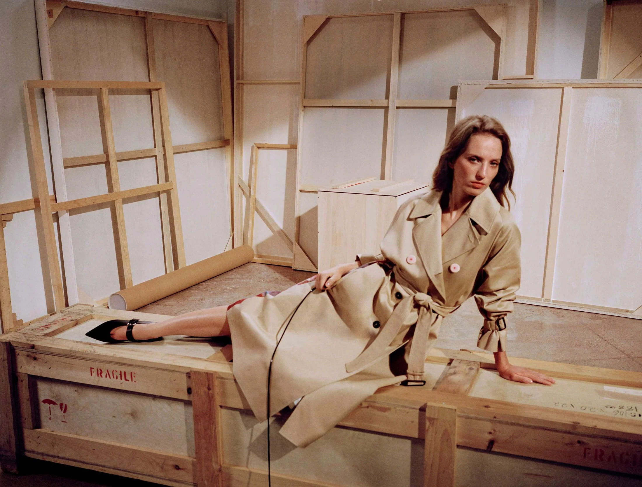
 
 
rubber sandals LE MILE Magazine MELISSA x DIESEL lemilestudios

MELISSA x DIESEL
Campaign

 
rubber shoes LE MILE Magazine MELISSA x DIESEL lemilestudios

MELISSA x DIESEL
Campaign


Sneaker X completes the trinity with the assurance of something bred inside a sealed studio with fluorescent silence and biometric locks, where gender loses its meaning and all that remains is a shell for movement, polished and aerodynamic. Every size appears, every color holds its own name, and nothing left to adjust. The Diesel D expands across each silhouette like a glyph from an urban folklore, a kind of sigil for the new believers of street couture and synthetic spirituality. The D doesn’t explain itself, it rather rotates, stretches, embeds, and accepts the surface as gospel and the foot as oracle.

Shoppers gather through portals coded to feel clean and frictionless, digital altars where Melissa and Diesel light scented fires made of pixelated gradients and mock-sincerity. Stores function as museums that forgot to lock the vitrines. Feet enter without asking and photography follows with no alarms.

 
rubber sandals LE MILE Magazine MELISSA x DIESEL lemilestudios

MELISSA x DIESEL
Campaign


The collaboration folds time and flattens the idea of occasion. Morning, evening, somewhere between the club and the convenience store—each moment welcomes a shoe that behaves like sculpture and speaks in capital letters. Melissa carries its decades like an heirloom dipped in gloss, marching through past alliances with architects and provocateurs, never missing a step even when the runway disappears. Diesel, still fluent in the dialect of denim rebellion and factory-born pride, supplies the posture and the push, a language understood without translation.

The launch floats in like it missed the memo but still gets photographed from every angle. Color-coded, algorithm-approved, properly translucent in places where mystery performs best. The calendar says July 15th, the internet stretches and the shelves absorb it. Just plastic shaped like an idea someone once sketched on a napkin at a very loud dinner. Melissa leans in, Diesel flexes. So while the shoes wait, the feet arrive.


rubber black shoe LE MILE Magazine MELISSA x DIESEL lemilestudios

MELISSA x DIESEL
Campaign

 
woman wearing red rubber shoe LE MILE Magazine MELISSA x DIESEL lemilestudios

MELISSA x DIESEL
Campaign

Endless Joy x Gung Ama

Endless Joy x Gung Ama

ENDLESS JOY
*The Priest, the Chef, and the Camera in the Jungle


written ADRIAN COLTER


There’s a certain way light touches skin in Bali that makes everything look like a ceremony, even when it’s just someone eating rice alone at 11am with one leg curled under the other and a small dog under the table, staring as if it knows something you don't.


This kind of place speaks through silence and sweat and cotton that sticks to the middle of your back in a way that makes you aware of your own pulse. So when Endless Joy decides to tell a story here, one that floats somewhere within fashion and folklore and something they’ve agreed to call Taksu, it becomes clear they offer more than garments inspired by the island. They’re wrapping up a worldview in fabric and tossing it over your shoulders like a wet blessing.


Endless Joy SS25 Gung Ama campaign shot in Bali published in LE MILE Magazine Digital

Endless Joy, SS25
seen GUNG AMA

 
Endless Joy SS25 Gung Ama campaign shot in Bali published in LE MILE Magazine Digital

Endless Joy, SS25
seen GUNG AMA


You have to imagine it as a séance conducted by two expats with a really good sense of color and a surprisingly respectful understanding of animist spirituality. Enter Gung Ama, the photographer with a camera that breathes, and a way of standing still that draws people into speaking more truthfully, even in silence. He works with an Afghan box camera, a device built around chemistry and intention and waiting. No assistants, no light rigs, no LCD screens blinking into feedback loops. Just the kind of waiting that makes time expand and eyes look away, then back again, when they realise they’re being seen.

Together, they’ve chosen five Balinese creatives, though “creatives” floats slightly too sterile for what these people do. There’s a priest, quiet in title but expansive in presence; a chef whose food carries the weight of earth and apology; a dancer moving through space with the assurance of someone who has listened to trees; a visual artist with turmeric beneath the nails and memory in the knuckles; and a musician whose instruments continue breathing between each note. Each of them captured mid-being, a state Gung Ama enters with that box of his and that way he listens without nodding. Endless Joy continues to exist in that space shaped by the poetic and the mythological, guided by a density of print that gathers meaning with each layer and a looseness of certainty that allows form to remain open, a kind of slow unfolding that settles through gesture and holds within intention, and here, in the moss-laden air of Ubud, that unfolding reaches a saturation point, the clothing not placed upon the environment but absorbed by it, absorbed into it, held within its breath and dampness and murmur, the fabric gathering story as residue, carrying the cadence of something spoken inward, and once touched, once held, the vibration begins almost imperceptibly, somewhere beneath the surface of language, somewhere between texture and heat. The collaboration expands without circling memory, drawing on the presence of the box camera, the grain of black-and-white film, the full weight of an analogue process that seek to meet, and what comes through is not recollection or reference but contact, direct and immediate, already living, already rooted, already woven into the space between palm frond and ankle bracelet, between the accumulation of sweat and the sound of oil meeting iron in the first breath of morning.

 
Endless Joy SS25 Gung Ama campaign shot in Bali published in LE MILE Magazine Digital

Endless Joy, SS25
seen GUNG AMA

Endless Joy SS25 Gung Ama campaign shot in Bali published in LE MILE Magazine Digital

Endless Joy, SS25
seen GUNG AMA

 
Endless Joy SS25 Gung Ama campaign shot in Bali published in LE MILE Magazine Digital

Endless Joy, SS25
seen GUNG AMA


Taksu holds its ground beyond description, evading the frame of search engines and definitions, remaining instead in the charged pause before thought, in the interval that hums just before articulation, transmitting itself through sensation, a force that rises through the hands and exits through the act, made visible only in what it produces, as pulse, as field, as presence that lingers in the eyes, in the breath, in the stillness of those portrayed. The people here carry it completely, through the sheer fact of being, and the garments shaped around them hold that same frequency, neither reflecting nor responding but residing within it, holding it as they move, as they are worn, as they accompany the body through space with an attuned stillness that remains.

Temu Space, where all this unfolded, holds presence in everything it touches, with trees gathering stillness at the edge of movement, stones settled into quiet alignment, and air thick with sound and heat, as the space draws the work inward and lets it grow through rhythm, through repetition, through a making that expands without beginning or end. Intention settles early and shapes the atmosphere through quiet accumulation, as each gesture returns to the last with memory already held in the motion. Endless Joy moves within this field, responding to what surrounds it, and what takes form carries the same density, thread and pigment moving with weight and quiet insistence, folding into the air, holding its place.


Within a visual culture marked by repetition and gestures that circulate with speed, there is a shift here toward authorship that builds from the inside, shaped by the people who hold the language of the place through action, through practice, through the way rhythm moves through the body and the way sound settles into ground. What forms here follows that rhythm, held in depth, and the field continues to vibrate with what has been made as extension. The clothing arrives through this same process, carrying silk, carrying illustration, carrying the line of the portraits, with the surface moving in layers and the depth sitting just underneath, asking for wear, duration, presence, and for the continuation of something that has already begun. The work holds memory, holds gesture, holds temperature, and circulates as a field that stays near the body and moves with it.

Fashion here opens space, reshaping how the body moves and memory holds, as time folds into fabric drawn with intention. Something older moves through each piece—steady, unhurried, fully formed—and once worn, the garment speaks through presence, holding the trace, carrying atmosphere, returning the story into the world.

Berlin Fashion Week SS26 *Highlights

Berlin Fashion Week SS26 *Highlights


BERLIN, BABY!
*13 Berlin SS26 Moments That Rewired Fashion’s DNA (and Our Nervous Systems)


written SARAH ARENDTS
documented NICOLAI SAUER

Berlin throws itself headfirst, limbs flailing, into the spring/summer 2026 abyss and claws its way back with glitter-streaked cheekbones, melted mesh, and stories to tell from behind veils of sweat and synthetic nostalgia. Restraint stays buried under cobblestones.


Thirteen houses, collectives, renegades, and reverents surfaced from the city’s creative swamps to orchestrate one long slow gasp of textile rebellion, post-dystopian tenderness, and neurotic elegance. This week held no boundaries, it performed itself as an exorcism in daylight.


LE MILE Magazine Berlin Fashion Week SS26 shot by Nicolai Sauer brand Clara Colette Miramon white courset

CLARA COLETTE MIRAMON
SS26

 
LE MILE Magazine Berlin Fashion Week SS26 shot by Nicolai Sauer brand Clara Colette Miramon

CLARA COLETTE MIRAMON
SS26


Tulle trailed like it had somewhere better to be, catching on the carpet rolled out in front of the Volksbühne, which stood there massive and unbothered, probably thinking about its next revolution or cigarette, while CLARA COLETTE MIRAMON turned the whole street into a makeshift ward where care wasn’t whispered, it was strutted, dragged, flung over shoulders like it weighed nothing and everything at once.

Hospital beds leaned into Pilates machines like an inside joke about wellness, uniforms cut from memory walked alongside jackets that looked like they’d been trained in restraint. Sequins clung where tenderness had been. It all moved like aftermath, like someone tried to tidy up a feeling and gave up halfway through. And when the short wedding dress showed up with a real scoliosis brace tucked underneath, no one gasped because everyone already knew, this was what happens when you hold it in for too long and decide to let it wear you instead.

Gender-melt rituals expanding in neoprene priesthoods, metallics slick with sweat theology, garments summoned from the intersection of sacred longing and queer futurism. IMITATION OF LIFE, GMBH’s SS26 collection, unfolded as an autobiographical opera, where every silhouette became a protest and a prayer, shaped by bodies negotiating desire, diaspora, or devotion. Layered mesh and synthetic gloss coated skin like ex-votos, while deep-cut tailoring paid homage to faith communities, the kind that cradle and the kind that exile. There was no clean line between theology and sensuality, no clear boundary between mourning and joy—only garments vibrating with ancestral heat, with techno as liturgy and muscle memory as myth.

 
LE MILE Magazine Berlin Fashion Week SS26 shot by Nicolai Sauer brand GMBH

GMBH
SS26

 
LE MILE Magazine Berlin Fashion Week SS26 shot by Nicolai Sauer brand GMBH

GMBH
SS26

LE MILE Magazine Berlin Fashion Week SS26 shot by Nicolai Sauer brand GMBH

GMBH
SS26

 
LE MILE Magazine Berlin Fashion Week SS26 shot by Nicolai Sauer brand GMBH

GMBH
SS26

LE MILE Magazine Berlin Fashion Week SS26 shot by Nicolai Sauer brand GMBH

GMBH
SS26


LAURA GERTE’s SS26 collection, LOOPED & BOUND, moved like a spiral collapsing into itself without conclusion, without hierarchy, just perpetual orbit. The designer’s vision crawled through movement and memory, with upcycled silks twisted into unstable elegance, techno-lingerie suspended in friction and delay, each element vibrating beneath the distorted pulse of a soundscape by RIFTS. Fashion slipped sideways, became gesture, became echo, became the choreography of mesh folding into another gesture, and then another, endlessly. Gerte designed with repetition as ritual, layering rhythm over rhythm until the silhouettes moved with the logic of instinct, tracing patterns in the air like choreography inherited from future bodies.


A whisper steeped in starch, pressed into precision and then unraveled by a quiet kind of defiance that trades volume for voltage. IDEN’s language unfolds in shell-like layers, protective yet porous, where embellishment slips from memory and off-white ferments into something less polite, more possessed. Drapery loops like an invocation conjured to summon breath across space, pulling tension through pleats and folds that gather meaning without anchoring themselves in touch. Garments hover within a field of elsewhere, calibrated to radiate beyond gesture, atmosphere thick with the trace of bodies they neither await nor dismiss.

 
LE MILE Magazine Berlin Fashion Week SS26 shot by Nicolai Sauer brand Laura Gerte

LAURA GERTE
SS26

LE MILE Magazine Berlin Fashion Week SS26 shot by Nicolai Sauer brand Laura Gerte

LAURA GERTE
SS26

 
LE MILE Magazine Berlin Fashion Week SS26 shot by Nicolai Sauer brand IDEN

IDEN
SS26


JULIAN ZIGERLI slid into SS26 like a kid who just discovered the soft side of chaos and decided to wrap himself in it head to toe. Raver therapy disguised as suiting, cuddlewear torn into layers that giggle and sting in equal measure. Airbrushed tuxedos floated through rooms like serotonin hallucinations, plush renderings of memories misfiled under joy and juvenile revolt.

A palette that threw tantrums and love letters with the same gesture, textures with emotional volatility dialed up to maximum volume. Zigerli designed as if vulnerability wore platform sneakers and glittered under club lights at noon, as if print therapy were a real treatment plan and Berlin the only qualified practitioner.


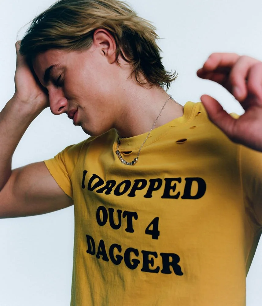
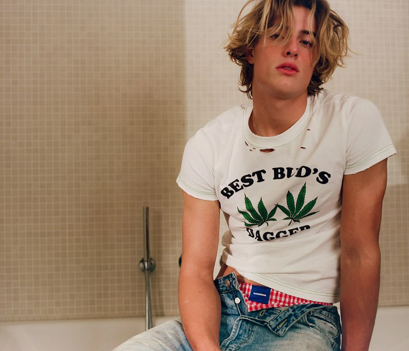
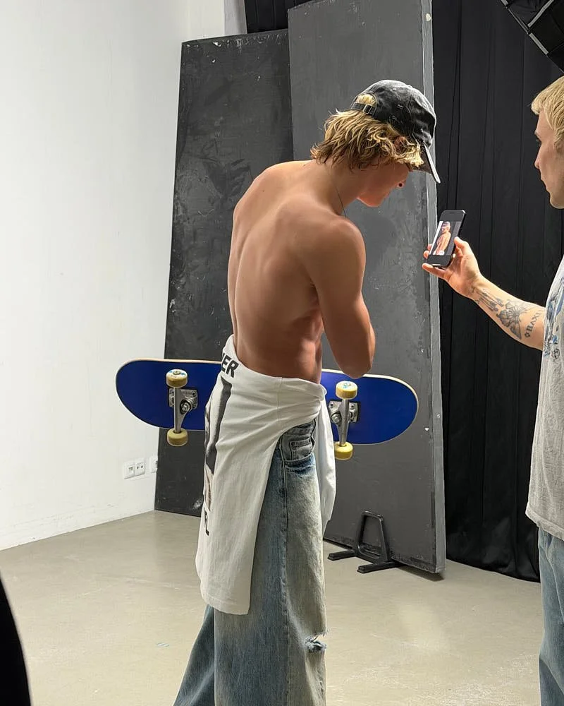
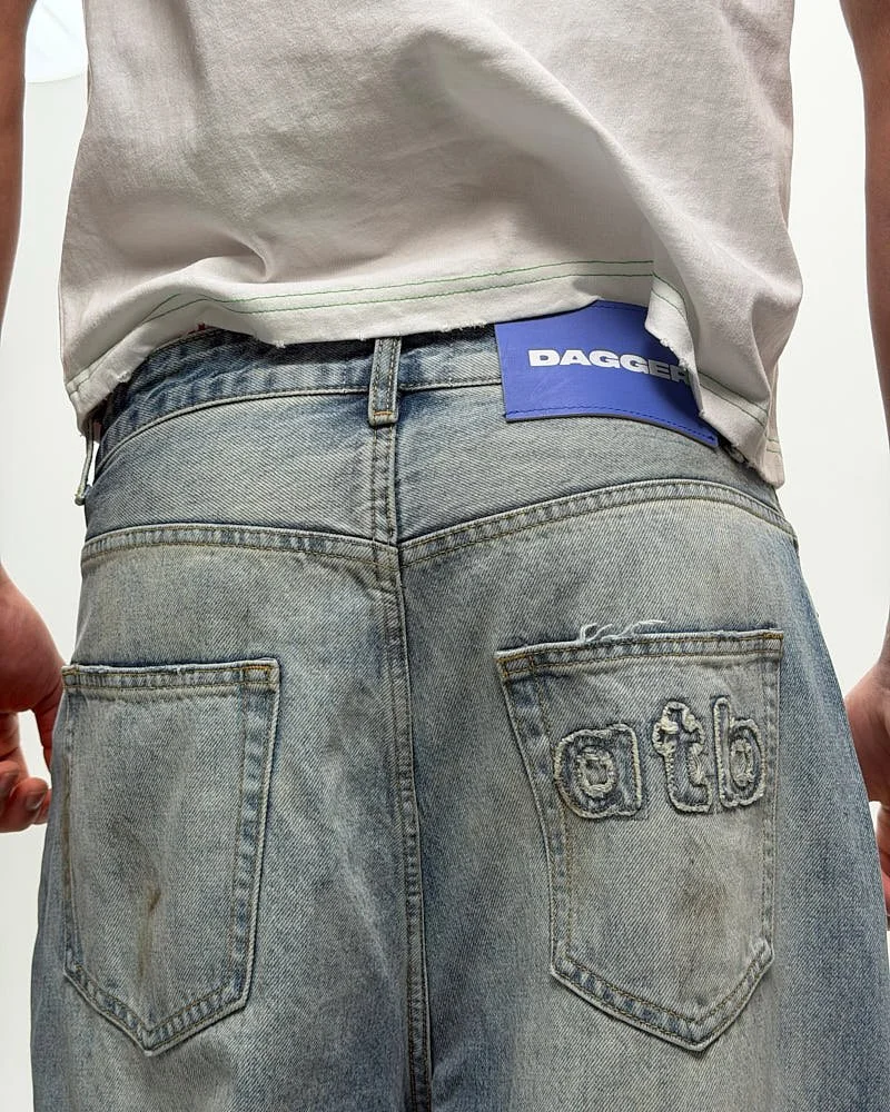
If denim could sweat under pressure, this is where it would happen—spiraling through DAGGER’s SS26 collection. DAGGER cut silhouettes like hostile contracts, threading control through denim and cotton with surgical spite. Berlin’s dark romance with dominance gathered new momentum stitched in chrome, bias seams, and unease. Tailoring glared rather than soothed, and each look stepped like it remembered every rule just long enough to devour it from within. Dinner dresses itself in fear beside this—entering the mouth like a dare, tearing at the gums, staining the teeth, turning digestion into performance and etiquette into exquisite disarray.

 
LE MILE Magazine Berlin Fashion Week SS26 shot by Nicolai Sauer brand Julian Zigerli

JULIAN ZIGERLI
SS26

LE MILE Magazine Berlin Fashion Week SS26 shot by Nicolai Sauer brand Julian Zigerli

JULIAN ZIGERLI
SS26

 
LE MILE Magazine Berlin Fashion Week SS26 shot by Nicolai Sauer brand Dagger

DAGGER

SS26

 
LE MILE Magazine Berlin Fashion Week SS26 shot by Nicolai Sauer brand Sia Anrika

SIA ARNIKA
SS26


Stretch limos humming under dead fluorescents, sour teenage lust smeared across collarbones and knees, Summer Time Sadness gliding through stale heat in garments warped by longing and daylight regret—SIA ARNIKA’s SS26 collection, titled IMITATION OF LIFE, wrapped itself around the moment before the ache forms. See-through lingerie clung like memory carved into skin, each look trembling with aftermath already present in the air, the silence before touch, the heat before collapse.

SIA ARNIKA constructed silhouettes from longing, textures from hesitation, garments from the unsaid. Every piece whispered like a friend too close to forget, too distant to reach. Nostalgia performed as method and ritual as blueprint. Her runway worked like a scent trail back to something almost remembered, every hemline folding memory into silhouette, every seam threading tension into poise. The ache circled the perimeter before the first step hit the floor, claiming the atmosphere as part of the garment’s architecture.


SIA ARNIKA
SS26


Each look in BUZIGAHILL’s SS26 collection, RETURN TO SENDER 11, arrived like a message in a bottle from somewhere capitalism refused to archive. Designer Bobby Kolade disassembled second-hand shame and rethreaded it into protest-glam hybrids, casting cassava bustiers in the role of resistance, multiverse denim as memoir, refugee embroidery as ancestral inscription. BUZIGAHILL offered a borderless archive of silhouette and sentiment, screaming memory back into fashion’s circuitry, with devotion styled in revolution’s own fabric.

Tailoring exhaled with the heavy breath of memory dragging itself back into form, melancholia crystallised along seams that refused to settle into silence and garments flushed with the sheen of unsaid things leaking through breathless corridors of fabric. Silhouettes swayed in suspended monologue, cassette confessions unraveling in soft warble. KILIAN KERNER cast SS26 in reverberation, the COLLECTIVEFOUR trilogy blooming like sequinned regret scribbled across steam-fogged mirrors, a stage of devotion rendered in textile syntax, the runway pulsing with the intimacy of unfinished sentences dressed in longing’s favourite colours.
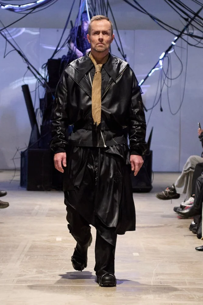
 
LE MILE Magazine Berlin Fashion Week SS26 shot by Nicolai Sauer brand Buzigahill

BUZIGAHILL
SS26

 
LE MILE Magazine Berlin Fashion Week SS26 shot by Nicolai Sauer brand Kilian Kerner

KILIAN KERNER
SS26


KILIAN KERNER
SS26


Raw hems extended like emotional fractures reframed in yarn, sculptural knits pulled across bodies like shifting tectonic plates of memory, each thread stretched to a threshold where clothing blurred into dermal residue, folding and refolding itself around the possibility of a future identity written in texture alone. MARIA LUEDER’s SS26 emerged less as a collection than as a living rehearsal of shapeshift, a choreography of cloth trained on the tension between form and potential, silhouettes built from the question of how much resistance can soften before it becomes architecture. Tailoring dissolved under the pressure of generative rhythm, folds moving like sap through bark, bloom emerging not from seams but from a kind of textile metabolism that refused inheritance, a cellular rhythm expanding past blueprint and structure, creating silhouettes that no longer asked permission to hold form, simply arriving already in motion.
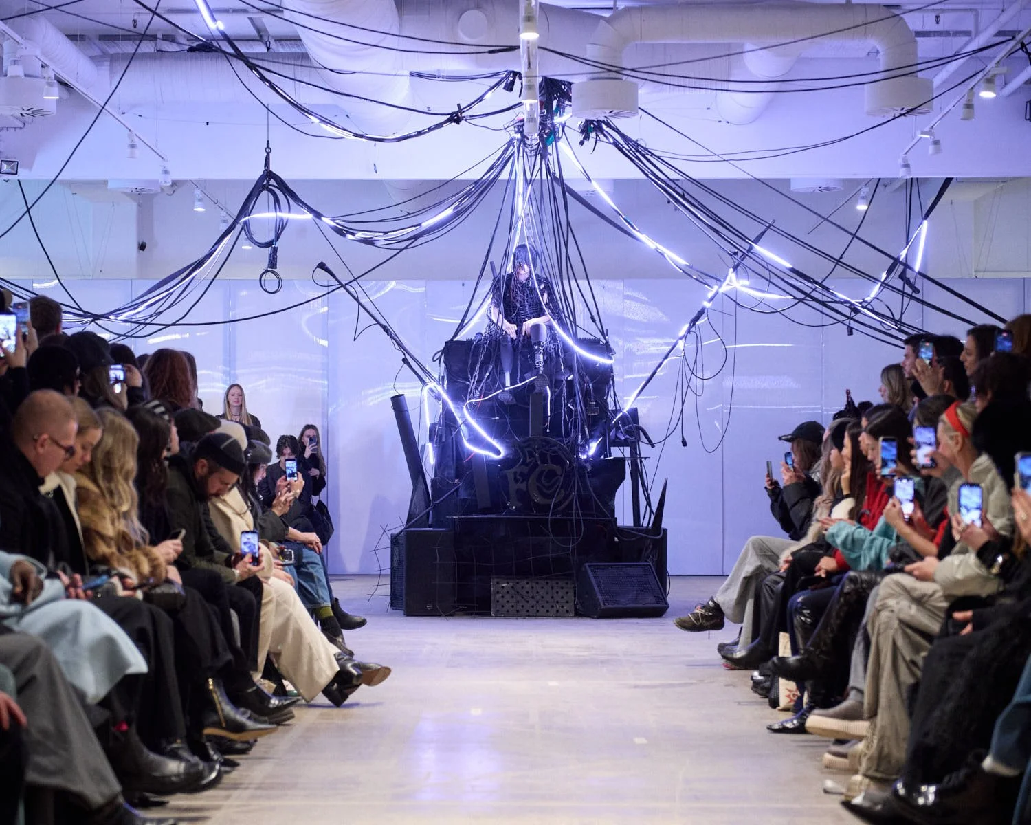
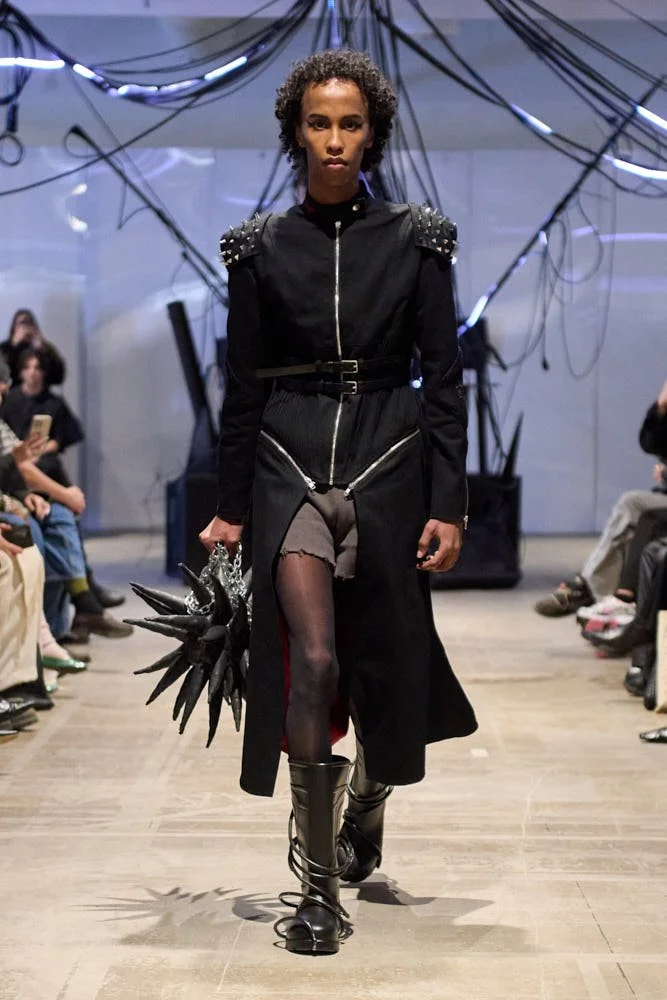
 
LE MILE Magazine Berlin Fashion Week SS26 shot by Nicolai Sauer brand Maria Lueder

MARIA LUEDER
SS26


MARIA LUEDER
SS26


They burned their own silhouettes and showed us what survived. Threads extended like live wires dragged through the ash of their own origin, seams unraveling not from weakness but from an intentional logic of undoing, OTTOLINGER’s SS26 refusing structure in favour of combustion performed as elegance, collapse choreographed with precision, fabrics shredded in midair before reassembling themselves into silhouettes that glowed with the aftermath of friction. A love letter not written but scorched into the margins of utility, garments performing the precise moment when tension releases, when structure breaks, when what remains continues to hold the shape of motion.

OTTOLINGER
SS26


OTTOLINGER
SS26


LE MILE Magazine Berlin Fashion Week SS26 shot by Nicolai Sauer brand Ottolinger

OTTOLINGER
SS26


Unicorn tapestries stretching like echoes across the room, their faded grandeur mirrored in brocades and deadstock silks gathered by DANNY REINKE as if excavated from a cathedral of memory, each fold steeped in liturgical sorrow and stitched devotion. The Hunt unraveled like a ritual caught mid-incantation, spiraling slowly, breath suspended between velvet and vision, garments thick with the weight of fable, corsetry drawn from the pulse of medieval mysticism filtered through a contemporary yearning to embody the sacred without sanctimony. This wasn’t capture, neither was it reverence—it was myth metabolised, desire embroidered into form, forgiveness draped as silhouette, repentance whispered through lace, silk breathing in the rhythm of belief.

LE MILE Magazine Berlin Fashion Week SS26 shot by Nicolai Sauer brand Danny Reinke

DANNY REINKE
SS26


Emerging queer alchemy in full orchestral pomp. Bows the size of grief unfurled across ballroom echoes, latex sleeves gleaming like archival secrets resurfaced beneath moonlit marble, silhouettes thick with sighs that began long before the runway existed and continued somewhere deep inside the fabric’s pulse; ANDREJ GRONAU, with his SS26 symphony of queer monumentality, scored every garment like a scoreless opera, collapsing baroque nostalgia into sculptural provocation, each movement stitched with the audacity of soft futures made flamboyant and serious in equal measure, parading down stone corridors like myth reborn in tulle, confession dressed in gloss, contradiction elevated to sacred discipline.

 
LE MILE Magazine Berlin Fashion Week SS26 shot by Nicolai Sauer brand Andrej Gronau

ANDREJ GRONAU
SS26

 
LE MILE Magazine Berlin Fashion Week SS26 shot by Nicolai Sauer brand Andrej Gronau

ANDREJ GRONAU
SS26


ANDREJ GRONAU
SS26


Fashion arrived in Berlin already whispering in tongues, unraveling with precision across industrial concrete like a hymn half-recalled, mascara trailing down cheekbones carved from afterparties and prophecy, silk folding into smoke with the choreography of ritual fatigue, breath looping into structure just long enough to shimmer before spilling into exhaustion’s embrace. Spring/Summer 2026 consumed the script in full mouthfuls of shredded satin and handed it back with glossed fingernails and eyes glazed from knowing too much too early, the language spoken entirely in gesture, movement, shadow, thread.

Nicolai Sauer caught it all, the residue and the rave, the gestures caught mid-morph, that split-second where fabric becomes echo and sweat becomes syntax. This was a week of a fever dreaming in public, a series of silhouettes mutating into biography with every step. What Berlin offered was contagion—sensation stitched into choreography, archive bleeding into immediacy, garments rising from dust like sentences never finished. The runway was never meant to end; it only flickers, folds, spills outward. Somewhere between the flash and the fold, between the hemline and the held breath, SS26 continues to ripple.


credit all images
(c) Nicolai Sauer

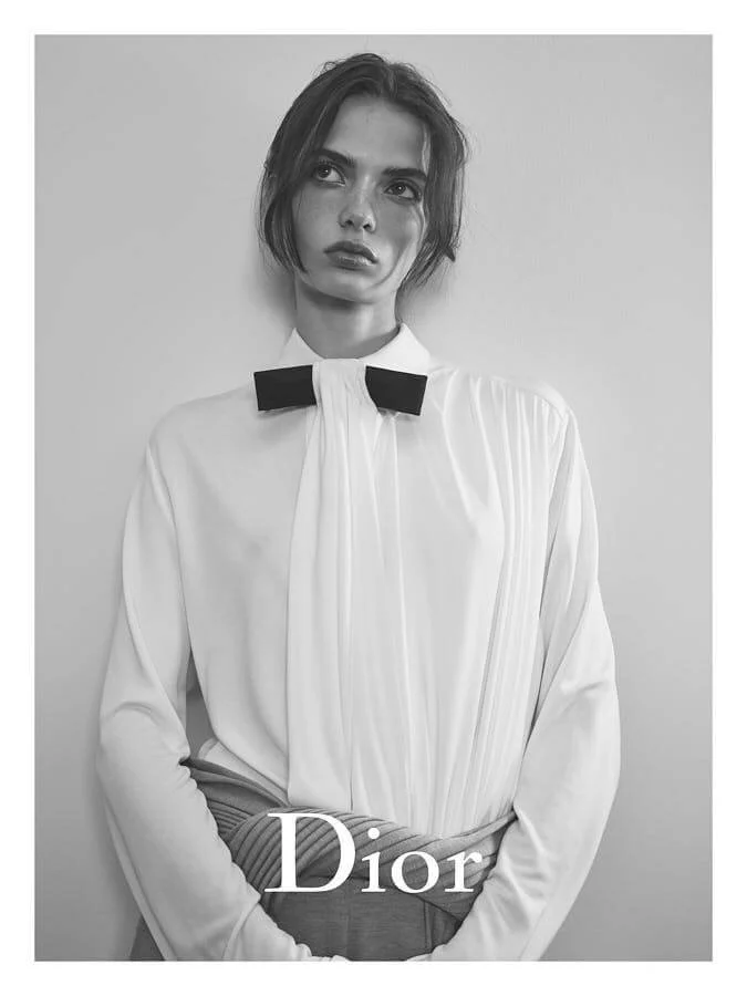
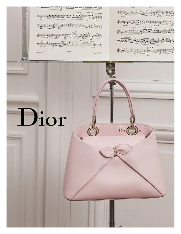
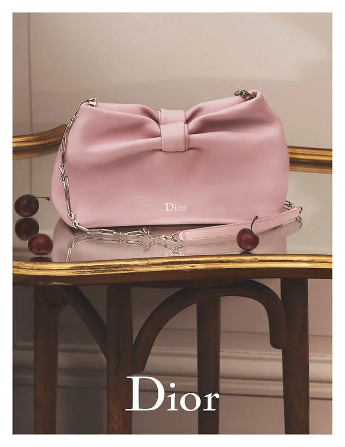
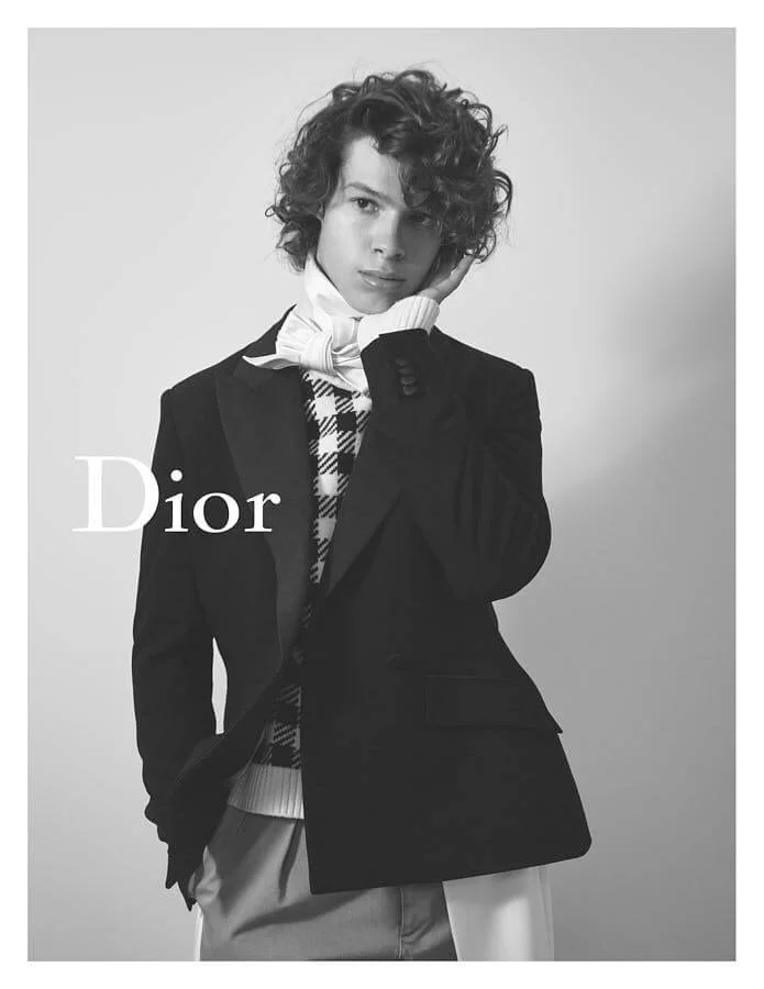
Dior SS26

Dior SS26

.second campaign
Anderson Begins Dior
Dior in Velvet, Dior in Blood, Dior in Fiction


written Amanda Mortenson


Everything begins in velvet. Heavy velvet, red velvet, velvet with history pressed into its folds like pressed flowers too soft for cataloguing.


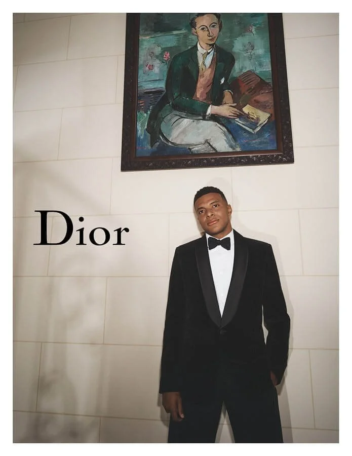
Dior builds a room, Berlin builds a memory, the Gemäldegalerie breathes through the walls like someone reading Baudelaire aloud in an empty hallway. Paintings hang, modest and glinting, Chardin’s hands still holding onto domestic stillness while outside, the fabrics whisper and the tailoring plots a gentle upheaval. There’s no irony in this, just layers. There’s always another layer.

 
LE MILE Magazine DIOR MEN'S SUMMER 26 INDOOR SCENOGRAPHY BY ADRIEN DIRAND

DIOR MEN'S
Summer 26
Indoor Scenography seen by Adrien Dirand

 
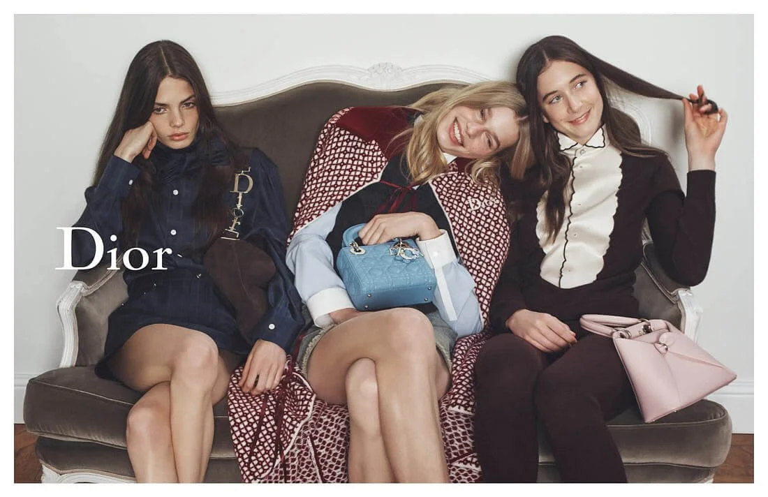
LE MILE Magazine DIOR SUMMER 2026 COLLECTION VISUELS LOOKS

DIOR MEN'S
Summer 26


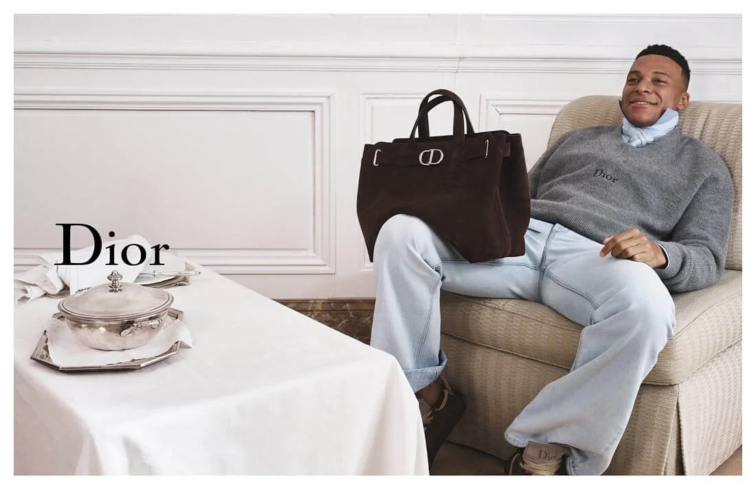
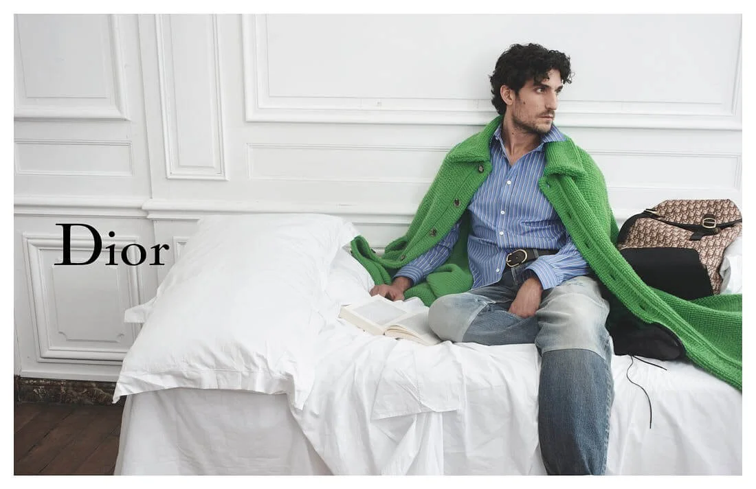
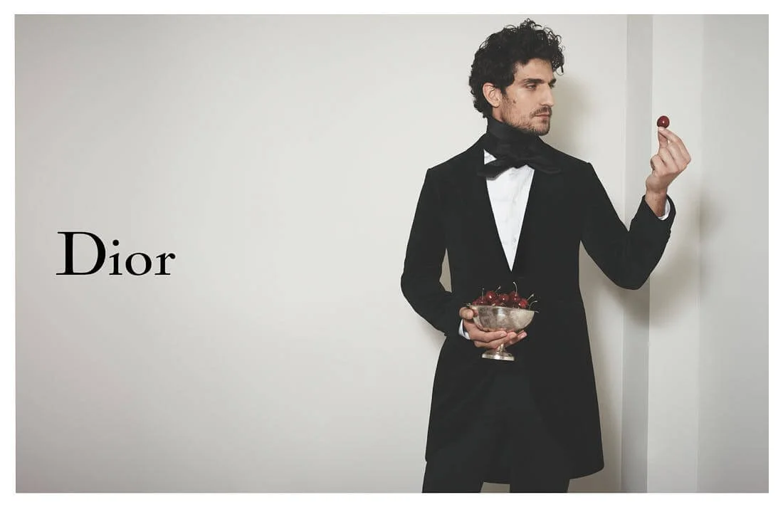
Jonathan Anderson stands somewhere behind it all, somewhere beneath a Donegal tweed, somewhere inside a 19th-century waistcoat with a tie that knows its own power. The trousers stretch with the weight of time. The tailcoats carry too much and choose to carry more. The past feels present, loud, unfiltered, embroidered in the way only garments speak when language steps aside. The clothes speak in codes older than sound. They tell stories with buttons and collars and hems that remember how to behave in candlelight. No one argues, the room listens.

The collection arrives in waves. Caprice stares from a corner. Delft spins, unsure whether to seduce or confess. La Cigale lingers like a perfume trapped in architecture. Every dress carries a title, every title carries a timeline, every timeline opens up a drawer of private references and aristocratic gossip. The Bar jacket shrugs over it all, comfortable in its own elegance, aware of its origins, aware of the way form fits when structure takes over and softness submits.


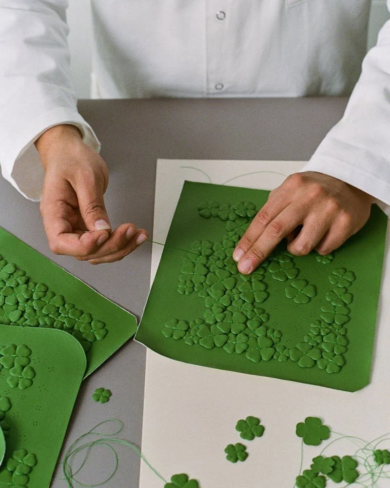
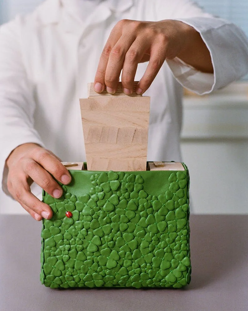
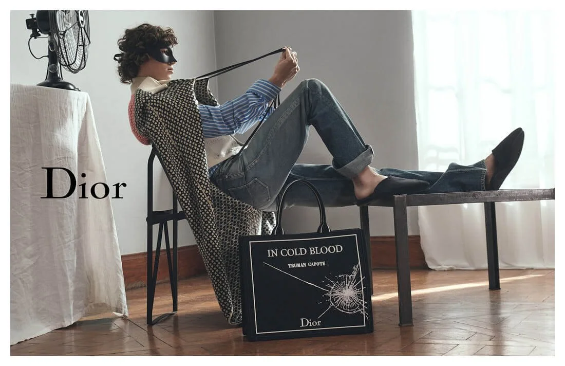
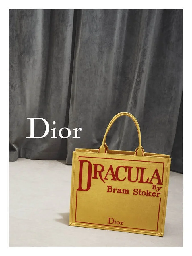
A Book Tote enters, unread but fully understood. First edition Baudelaire, Truman Capote, the kind of library that wears its covers proudly. A crossbody arrives, Dracula tucked inside, blood in the stitching, literature clinging to the lining like it belongs there. Sheila Hicks lends her hands to the Lady Dior, transforming it into a nest, ponytails of linen blooming in every direction. The bag turns feral, beautiful, certain. Accessories carry fiction better than plotlines ever could.

 
LE MILE Magazine DIOR SUMMER 2026 COLLECTION VISUELS LOOKS

DIOR MEN'S
Summer 26

LE MILE Magazine DIOR SUMMER 2026 COLLECTION VISUELS LOOKS

DIOR MEN'S
Summer 26


Charms dangle. Diorette details scatter across collars and wrists. And roses erupt from seams without warning. Embroidery blooms where thought once sat, the collection breathes deeply, exhales rococo, exhales restraint dressed as exuberance. No moment escapes embellishment, but everything wants to shimmer, and everything does. The show offered style as posture, style as attitude, style as inheritance passed through instinct and silhouette. A museum becomes a mirror and a garment becomes a ghost. There’s a gesture here, a lift of the shoulder, a tilt of the head, a pause in the fabric that allows the wearer to become someone they met once in a book or a dream or a hallway with too much velvet. Style lives in that space between and Dior stretches the horizon, Jonathan Anderson tapes it back together with thread dyed in memory.


Every model walks like they’ve done this before, in another life, under another monarchy. Formalwear tells jokes only archives understand and the trench coat plots. The shirt sighs, the trousers hold secrets without flinching and nothing tries to be wearable. Everything demands to be worn.

The music glows beneath it all, the kind that touches the hem of ceremony. There are no instructions. There are no summaries. Dior sends out clothes with blood in their pleats and novels in their pockets. The audience watches, some lean forward, some breathe through their teeth and others already remember this from a future they haven’t reached yet. Anderson moves like a curator lost in his own collection. Every piece arrives curated, arranged, unraveled slightly. The hemline flutters with purpose.

 
LE MILE Magazine DIOR SUMMER 2026 COLLECTION VISUELS LOOKS

DIOR MEN'S
Summer 26

 
LE MILE Magazine DIOR SUMMER 2026 COLLECTION VISUELS LOOKS

DIOR MEN'S
Summer 26

LE MILE Magazine DIOR MEN'S SUMMER 26 FINALE BY ADRIEN DIRAND

DIOR MEN'S
Finals, Summer 26
seen by Adrien Dirand


credits for images
(c) DIOR / scenography and finale images seen by ADRIEN DIRAND

Mercedes Benz x KidSuper

Mercedes Benz x KidSuper

.new collection
CLASS OF CREATORS
*The Mercedes That Grew Up On Cartoons


written Monica de Luna


Someone gave Colm Dillane a car, which is already funny, but then he turned it into something with turbine wings, cartoon lungs, balloon veins, and a winch on the front like it’s planning a very glamorous rescue or pulling something heavy from the past. The CLA, but make it handmade. Superhero-coded.


F200 wheels, 300 SL mirrors, patched like it got into a fight with nostalgia and came out the other side grinning. It sat in the Louvre, obviously, at the Musée des Arts Décoratifs, where objects already know they’re being watched, and now this car, full of references and jokes and ideas that maybe only Colm gets, but that’s the point, because why explain when you can install.


LE MILE Magazine Mercedes Benz Class of Creators Art Piece Capsule Collection by KidSuper PFW

Mercedes Benz x KidSuper
Campaign

 
LE MILE Magazine Mercedes Benz Class of Creators Art Piece Capsule Collection by KidSuper PFW

Mercedes Benz x KidSuper
Campaign


They call it “Class of Creators” but it feels more like a sandbox with corporate approval and very good lighting. Before this it was Ice Spice in Manhattan. Gustaf Westman in London. Next it’s Hot Wheels or Riot Games or both. Colm went full Colm, gave the car a childhood, let it speak in KidSuper. Then made clothes to match.

 
LE MILE Magazine Mercedes Benz Class of Creators Art Piece Capsule Collection by KidSuper PFW

Mercedes Benz x KidSuper
Campaign

LE MILE Magazine Mercedes Benz Class of Creators Art Piece Capsule Collection by KidSuper PFW

Mercedes Benz x KidSuper
Campaign

 
LE MILE Magazine Mercedes Benz Class of Creators Art Piece Capsule Collection by KidSuper PFW

Mercedes Benz x KidSuper
Class of Creators
Art Piece Capsule Collection


There’s a trench coat that looks like it could fix your engine or steal your boyfriend. Trousers that mumble in mechanic. A t-shirt nodding politely to the world’s first automobile. Bags that look like they carry tools or secrets. Thirteen pieces, soft power, stitched from canvas, jersey, cotton, poplin, wool, vegan leather. The logo is vintage, but the feeling is future. Everything smells faintly of burnout and joy.

And the car? Still there, still grinning, still dressed like the first day of school when you try too hard but somehow pull it off.


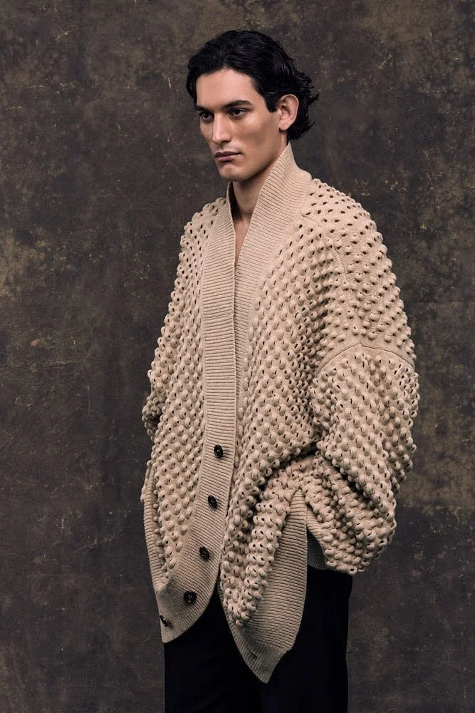
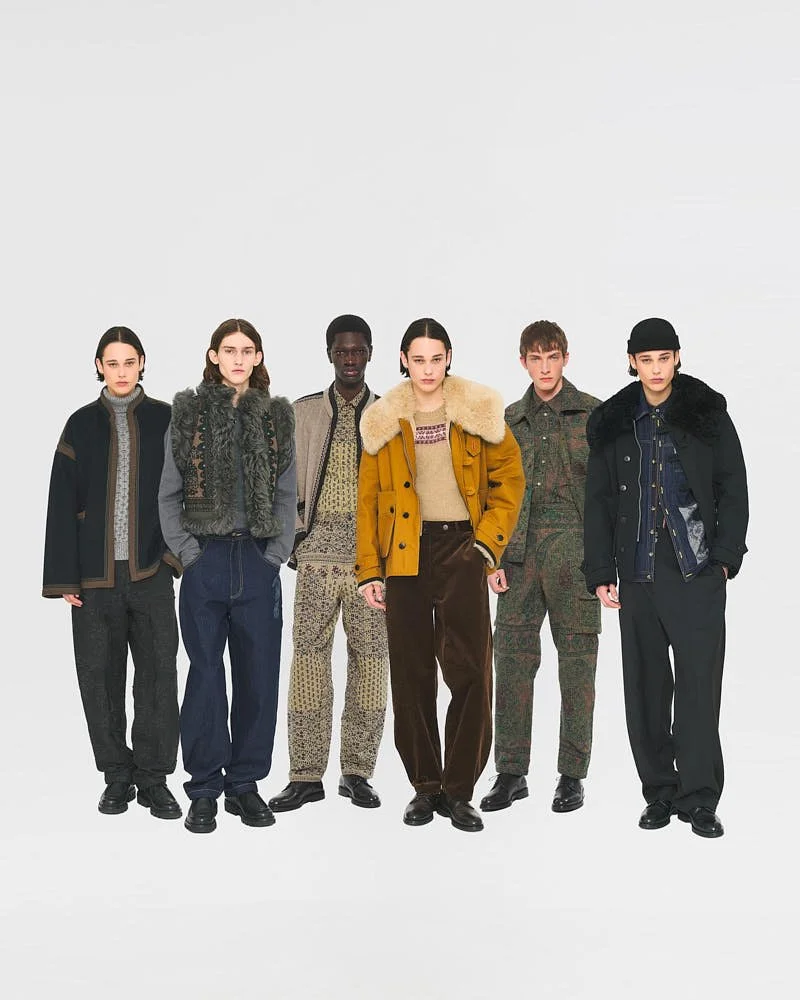
TAAKK SS26

TAAKK SS26

.new collection
TAAKK SS26
*The Quiet Confidence


written Malcolm Thomas


It's been five years since I attended Paris Fashion Week. In my absence, brands have come and gone, and the industry has crowned new creative directors yet TAKKK remains exactly how I remember it. Intentional. 


Intentional like the creation of a simple TAAKK Spring/Summer 2026 show tee, a gift to its guests. Made from recycled nylon resin, processed and spun from discarded fishing nets collected across Japan. The band in which the tee is wrapped and program both made of recycled materials.

 
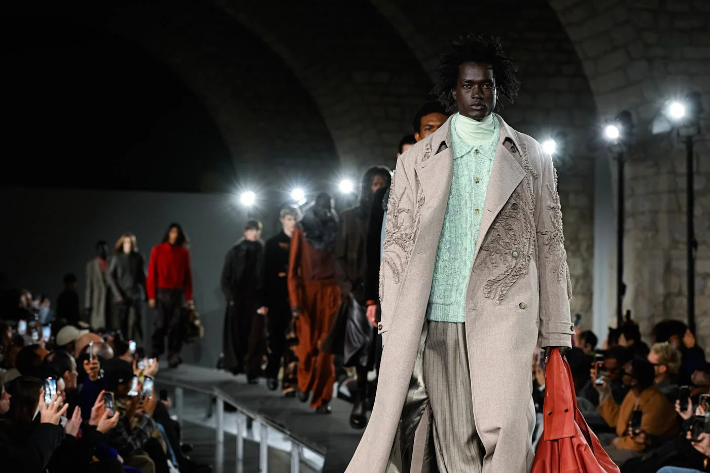
LE MILE Magazine PFW TAAKK SS26 looks

TAAKK
SS26 Show during PFW

 
LE MILE Magazine PFW TAAKK SS26 looks

TAAKK
SS26 Show during PFW

LE MILE Magazine PFW TAAKK SS26 looks

TAAKK
SS26 Show during PFW


Already a master of textiles, Taakk has now added a deeper dive into sculptural embroidery and gradients, for which they're known, first with colors, now with materials, i.e. shifting a shirt to a suit, to their oeuvre. Yes, they're magicians, too.

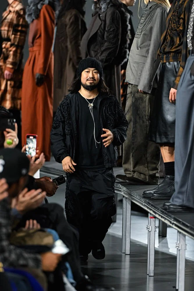
Yet, despite this, Taakk remains elusively under the radar with a quiet confidence that I can only attribute to the mores of Japanese culture. Humble, polite, and inconspicuous. But Creative Director Takuya Morikawa, in my humble opinion, has lots to brag about.

 
LE MILE Magazine PFW TAAKK SS26 looks

TAAKK
SS26 Show during PFW

LE MILE Magazine PFW TAAKK SS26 looks

TAAKK
SS26 Show during PFW

 
LE MILE Magazine PFW TAAKK SS26 looks

TAAKK
SS26 Show during PFW


Titled "The Common Baseline of Art and The Ordinary," the program mentions an evolving quest for "the essence of creation." A less lofty interpretation, "Everyday wear and art. Necessity and disruption." It's easy to wax poetic about the many processes and the impressive self-awareness of this small brand, but I'll let the clothes speak for themselves. So, I encourage you to have a look around, and maybe you'll see why Taakk remains one of my favorites.


about the editor
When not reviewing shows or writing features for Le Mile Magazine, (or constantly hitting refresh on his wardrobe), Malcolm spends his time as Founder & Editorial Director of Malcolm + Friends Agency. A full-service agency powered by a global community of freelancers, consultants, and creative partners from leading brands and institutions. 

Wooyoungmi SS26

Wooyoungmi SS26

.new collection
Wooyoungmi SS26
*A Little Bit of Romance


written Malcolm Thomas


Enjoying a glass of cold champagne to the sounds of a violin rendition of Philip Glass in the beautiful stately courtyard of the Maison de la Chimie.


There is, quite frankly, no better way to end a very hot menswear season (and I'm not just talking about the shows). Mix in perfumed guests (many in Wooyoungmi themselves) with a discreet celebrity or two, and you have subtle cues that even before the runway music starts, you're in for something good.


LE MILE Magazine PFW Wooyoungmi SS26 looks

Wooyoungmi
SS26 Show during PFW

 
LE MILE Magazine PFW Wooyoungmi SS26 looks

Wooyoungmi
SS26 Show during PFW

LE MILE Magazine PFW Wooyoungmi SS26 looks

Wooyoungmi
SS26 Show during PFW


Then the moment comes. It begins with a sultry jazz melody and as soon as the first look is shown, a pulsating backbeat. Inspired by Seoul summers, which according to the program are equally hot, and the joys of dressing, the offerings this season are meant to be filled with "levity" and "elegance", of course. 

The collection—light on pants but heavy on sex appeal took to task many renditions of the men's Edwardian bathing suit. A once modest early 20th century essential subverted for the 21st century man. Another notch to add to the bedpost of menswear’s liberation.

 
LE MILE Magazine PFW Wooyoungmi SS26 looks

Wooyoungmi
SS26 Show during PFW

LE MILE Magazine PFW Wooyoungmi SS26 looks

Wooyoungmi
SS26 Show during PFW

 
LE MILE Magazine PFW Wooyoungmi SS26 looks

Wooyoungmi
SS26 Show during PFW


Most importantly, this is a man who has places to go and beaches to see. Lounging on a private beach in Monte Carlo by day and enjoying an old-fashioned or two in a members-only lounge, by night, perhaps. Think jumpers, vests, and knitted tops paired with oversized intarsia raffia bags and backpacks paired with silk viscose tailcoat button-ups. Did I mention he's also a multitasker?

Rooted in staples: smart tailoring, fine fabrics, and elevated colorways—Wooyoungmi is not here to tell you what to wear but to suggest it. Wooyoungmi is not here to tell you who you are but to remind you. 

Who said romance was dead?


about the editor
When not reviewing shows or writing features for Le Mile Magazine, (or constantly hitting refresh on his wardrobe), Malcolm spends his time as Founder & Editorial Director of Malcolm + Friends Agency. A full-service agency powered by a global community of freelancers, consultants, and creative partners from leading brands and institutions. 

KVRT STVFF Women

KVRT STVFF Women

.new collection
Her Body. Their Rules.
KVRT STVFF Underwear.


written Sarah Arendts


First there were briefs. Then there were viral briefs. Then there were viral briefs on viral boys. Now there’s KVRT STVFF WOMEN — a proper new chapter, fully formed and stretching in every direction. A full-bodied rewrite stitched with intent, flesh, and very good lighting.


The brand that made swimwear feel like a controlled substance is no longer just for the male-coded torso. They’ve taken what already existed — Chad, Core, Mechanic, those infamous swim briefs that looked like they were designed by a Greek god with a design degree — and turned them, carefully but not cautiously, toward bodies that haven’t traditionally been at the centre of the KVRT STVFF lens. Until now. There are 100 new pieces. Underwear, swimwear, and that slinky category they’re calling bodywear — all made to mix, match, or ignore entirely. Sizes run from XS to XXL. Some cuts are unisex, some aren’t. It doesn’t really matter, because everything stretches.


LE MILE Magazine KVRT STVFF Espresso Core Bikini Shorts W02

KVRT STVFF
Espresso Core Bikini Shorts

 
LE MILE Magazine KVRT STVFF Macchiato KVRT Cheeky Bikini Bottom W02

KVRT STVFF
Macchiato KVRT Cheeky Bikini Bottom


Announcing nothing, explaining even less — just new shapes arriving like they’ve always belonged. The lines stay minimal, the energy moves forward, the proportions land exactly where they should. It’s KVRT STVFF, rerouted through hips, heat, and instinct. Like something a really hot science teacher would wear if science teachers taught physics in thongs.

It still starts in Barcelona, stitched and prototyped under the sharp eye of the KVRT STVFF STVDIO. The aesthetic remains tight, part techno nostalgia, part ‘90s sportswear fantasy, part softcore reconstruction. Not trying to be viral. Just inherently designed that way.

 
LE MILE Magazine KVRT STVFF Black Chad Cami Crop Top W01

KVRT STVFF
Black Chad Cami Crop Top

LE MILE Magazine KVRT STVFF Ecru Mechanic Crop Top W02

KVRT STVFF
Ecru Mechanic Crop Top

 
LE MILE Magazine KVRT STVFF Black Chad Classic Boxer Brief W01

KVRT STVFF
Black Chad Classic Boxer Brief


Sexiness speaks the same dialect, still cut in confidence, still built like it knows exactly what it’s doing. Now it lives in more bodies, stretches across more shapes, travels through more ways of standing in a room and taking up space. Underwear, system, uniform, suggestion — call it whatever fits. It shows up stitched to the point, ready before the question even lands. This isn’t a rebrand. This is the body, centre stage, lit from every angle. The frame just got bigger, thanks KVRT STVFF!


Christian Louboutin *PFW

Christian Louboutin *PFW

Pin Me Down, I’m Louboutin
*Everyone at Hôtel de Crillon Was Looking at Shoes, Obviously


written AMANDA MORTENSON
documented BELLA SPANTZEL


They set up shop at Hôtel de Crillon. Three salons. Carpeted floors. High ceilings. Everything smelling faintly of inherited wealth and new soles. Louboutin called it Sartorial. No one asked what that meant. Everyone nodded.


First room: Batailles. Men hunched over shoes like the Enlightenment depended on it. One was patina-ing. Another was glazing. Someone whispered something about “le glaçage” and nodded like they were at a wine tasting. In a corner: butterflies. Not metaphorical. Real ones, stitched from organza and rhinestones and beads and sequins and probably quiet guilt. Maison Lesage. 55 hours per shoe. Do the math. No one blinked.

 
LE MILE Magazine PFW Christian Louboutin Bella Spantzel
 
LE MILE Magazine PFW Christian Louboutin Bella Spantzel


Second room: Salon des Aigles, where four men—beautiful in that way people are when they look like they’ve never waited in line for anything—were performing something loosely resembling a day in the life of someone too stylish to explain their job. They moved just enough to make it clear they were alive, but not enough to suggest they had anywhere to be. On their feet: Lord Chamb boots with a vaguely horsey superiority, the O Louvre loafers wrapped in moiré gros-grain like they just stepped out of an inheritance, and the Circus Booty Perla, which looked like a party trick from 1973 involving 10,000 rhinestones, some pearls, suede, and a memory of a harlequin no one really invited but everyone admired. Around them: glass vitrines displaying dissected shoes like scientific curiosities—Farfaman and Farfarock cracked open in slices, frozen mid-explanation. Someone near the back said “craftsmanship” under their breath like it was a secret. Someone else took a picture, shook their head slightly, and walked into the next room without looking up.


LE MILE Magazine PFW Christian Louboutin Bella Spantzel
 
LE MILE Magazine PFW Christian Louboutin Bella Spantzel
 

Third room: Salon Marie Antoinette, where the vibe shifted from performative to ceremonial. A green billiard table, because of course, held the entire Chambeliss line arranged like disciplined heirs waiting for the will to be read. Derby, Moc, Monk, Monk Boot, and one that looked like it simply couldn’t decide. The shoes didn’t speak, but they absolutely judged. All were adorned with the Chambelink, a sharp little metal pin stretched across the upper like a smirk—some minimal, some dripping in rhinestones, 200 if anyone’s counting, but no one was.

Each shoe had a matching shirt collar placed beside it, as if the collar had decided to go solo and the shoe was still getting over it. Someone whispered something about tailoring. Someone else responded with “elegance,” but their voice gave out halfway through, probably because the shoes were too close and listening.


LE MILE Magazine PFW Christian Louboutin Bella Spantzel
 
LE MILE Magazine PFW Christian Louboutin Bella Spantzel
 

There was a general atmosphere of reverence mixed with mild confusion, the kind where everyone agrees something is brilliant without needing to understand why. The shoes gleamed under the light like they had somewhere better to be, the rooms carried themselves like sets from a film where no one makes eye contact, and outside, Paris didn’t notice because Paris was busy being Paris. Christian Louboutin didn’t explain. There were no speeches, no signs, no marketing slogans. Just rooms filled with shoes that fully expected to be looked at.


all visuals produced for LE MILE .Digital
Bella Spanzel / www.bellaspantzel.com


Fashion Week SS26 *Highlights

Fashion Week SS26 *Highlights

Fashion’s Latest Side Quest
*In Fashion, the Outlandish and the Quotidian


written Chidozie Obasi


From Antwerp to Milan, designers are toying with convention and flamboyance. LE MILE rounds up key moments from the season.


Fashion’s fearless pursuit of the next trend continues apace, as the season — now in Paris — keeps gaining momentum, redefining classic silhouettes with a breezier, and softer approach. Volumes are getting looser and shapes are higher: menswear is all about functionality and soft practicality for next Spring.


LE MILE Magazine Paul Smith Menswear SS26 Milan Runway Show

PAUL SMITH
SS26

 
LE MILE Magazine Paul Smith Menswear SS26 Milan Runway Show

PAUL SMITH
SS26


Paul Smith charts a course through Paul’s own personal history of travel, with colours, prints and textures conjuring memories from his many voyagesIn an intimate salon-style show at the company’s Milan headquarters, Paul Smith presented a louche, sophisticated vision for the SS26 season through a series of 30 looks. A palette of warm, nostalgic tones like lime green, fuchsia, and coral evoked a fondly remembered summer voyage, but also brought to mind the practice of hand-dyeing which gives fabrics an exceptional depth of colour.

Above all, the palette elicited an impression of heat, with the bright standout colours complemented by an array of sun-bleached earth tones, inspired by a book of Cairo street photography which caught Paul’s attention during the early design phases. The collages incorporated fragments of photographs taken by Paul, his keen eye seeking out those things that others miss. This collage theme was echoed in a double-breasted jacket with applique birds, and a leather blouson with applique flora rendered in suede, offering a textural counterpoint.


“Clothing that holds a modern flair and heritage.”

Herbert Hofmann, Vice President of Creative and Buying at Highsnobility

 
LE MILE Magazine SIMON CRACKER SS26 Lookbook

SIMON CRACKER
SS26

 
LE MILE Magazine SIMON CRACKER SS26 Lookbook

SIMON CRACKER
SS26

LE MILE Magazine SIMON CRACKER SS26 Lookbook

SIMON CRACKER
SS26


For Simon Cracker, we live in a world where incompetence reigns supreme, and where the only way forward is to dig deeper. The result is a cleaner, more focused collection from the brand this season.

The colours are exclusively shades of white, rope, ecru and shades of grey and black, obtained by dyeing, painting and bleaching. There are no flashy fabrics, aside from the first Simon Cracker all-over pattern. The basic uniform consists of a square T-shirt and shorts inspired by men's tailoring. Each outfit highlights a single garment and its unique features. Crocs' iconic models complete the uniform, in the same palette but ’crackerised’ one by one with graffiti, patches and customized charms.

“We are bringing the focus back to the clothes, with few distractions,” the said. “The collection revives some of our iconic garments (the Siamese T- shirt, the earthworm jacket, the posture shirt...), with the clear objective of creating unique, upcycled pieces that can be reproduced: the same but always different.”


A different, flamboyant throughline that takes centre stage in the Royal Academy of Fine Arts Antwerp show, which presented the collections of its new guard of creatives that were straddling between craft, poise and optimism. This year’s show had a newfound ease to it, coupled with the eclecticism of the collections that brimmed with technical know-how and tons of playfulness. This year, designers seemed to be navigating two competing urges: experimenting with new shapes while delivering a “meaningful” look. Or, as Highsnobiety’s Vice President of Creative and Buying, Herbert Hofmann, puts it: “Clothing that holds a modern flair and heritage.”

As a member of this year’s jury, Hofmann’s role lies in weighing creativity against commercial viability — seeing whether students have the urge, or the ability, to turn great design into something today’s customer will actually wear.

 
LE MILE Magazine dunhill SS26 Milan SHow by SIMON HOLLOWAY

dunhill
SS26

 
LE MILE Magazine dunhill SS26 Milan SHow by SIMON HOLLOWAY

dunhill
SS26


“I’m keen on what’s new, what’s innovative, and how a designer addresses today’s challenges: sustainability, sourcing, marketing, and creative identity,” he says. “It’s interesting because sometimes you see someone who has the whole package but is quieter than others. We think about how we can push those talents — give them the tools to survive in this crazy market.” In Antwerp, Hofmann sees a balance of modernity and heritage passed down from Simons, Van Noten, and Van Beirendonck protégés.

“You look at the kids on the street and they’re wearing the most amazing outfits. There’s a lot of vintage, and it’s meticulously handpicked and layered. There’s a cosy speciality in the air,” he says. “I always associate Denmark or Sweden with furniture, interiors, and architecture — but here, it’s about fashion. Compared to other major fashion cities, you realize Milan, Paris, and others tend to follow overarching commercial trends. But here, creativity pushes past convention.”


Bally wanted to revisit its sports heritage as it celebrates the release of the new Tennis Collection. Since its inception in 1851, the Swiss brand has always had an affinity with the technical requirements of performance wear, as well as the artisanal expertise to make exercise elegant. In this latest collection, a number of the house’s legendary styles are undergoing a redux, marrying the brand’s history with its evolving visual identity.

The dunhill Spring Summer 2026 season from Creative Director Simon Holloway draws from a distinctly British duality, the rarefied dress codes of English aristocracy and their influence on the louche, cultivated rebellion of British rock icons.

Taking cues from the sartorial expression of the Windsor men - figures that continue to be a central inspiration to the evolving dunhill wardrobe - this formal code is interjected with the effortless attitude of Bryan Ferry and Charlie Watts, the most classically dressed British rock stars, resulting in a collection that transcends the referential. These culturally iconic men inherited societal elegance but wear it with disobedient grace. For Spring Summer 2026 dunhill embodies this tension: the formal undone, the classic made rakish.

In perpetuity, craftsmanship remains central to the practice of design in this storied House. The collection is grounded in a dunhillian legacy of handwork and provenance, with a deep reverence for artisanal fabric mills, traditional craft and only the most excellent materials. The collection moves through the season in chapters: Car coats, driving blazers and motoring trench coats - drawn from the House’s Motorities legacy - are sculpted in butter soft French lambskin, supple suedes, coated Linen or cotton-silk twill in various shades of British drab.


credit all images
(c) Paul Smith, Dunhill, Simon Cracker, Bally SS26